


数据和代码获取:请查看主页个人信息!!!
大家好,今天我将介绍如何使用R语言ggplot2包绘制精美的文本表+气泡组合图。

大家在分析绘图的时候是否看到过类似这样的图片,该图在气泡图的基础上增加了文本信息,属于“表格+图片”组合体,
展示了很多信息:
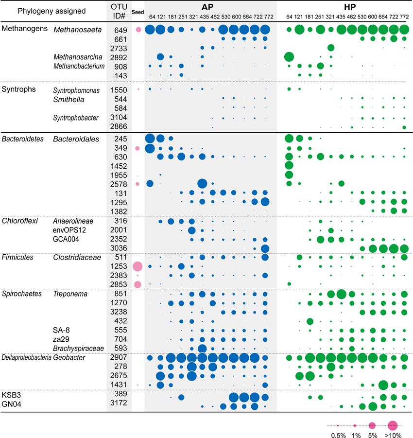
图片来源:Microbial community analysis of anaerobic reactors treating soft drink wastewater
今天我们使用微生物组数据进行模仿展示,接下来我们来进行分析和可视化展示:
Step1:数据载入
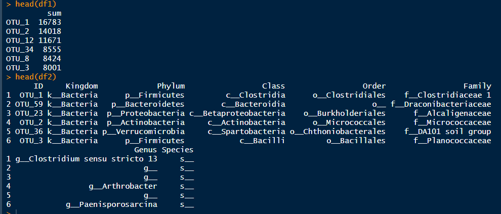
rm(list = ls())pacman::p_load(tidyverse,reshape2,cowplot,aplot)otu <- read.csv("OTU.csv")sample_info <- read.csv("sample_info.csv",row.names = 1)tax <- read.csv("tax.csv")
Step2:数据准备
df1 <-otu %>%column_to_rownames(var = "ID") %>%mutate(sum = rowSums(.)) %>%select(sum) %>%arrange(desc(sum)) %>%top_n(20)df2 <-tax %>%filter(ID %in% rownames(df1))
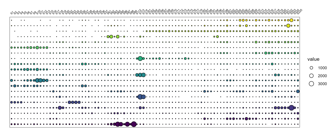
Step3:绘制气泡图
p1 <-otu %>%left_join(df2) %>%mutate(ID = factor(ID, levels = ID, ordered = T)) %>%filter(ID %in% rownames(df1)) %>%reshape2::melt() %>%filter(value != 0) %>%ggplot() +geom_point(aes(x = variable, y = ID, fill = ID, size = value), shape = 21) +scale_size_area(max_size = 5) +scale_x_discrete(position = "top") +geom_point(aes(x = variable, y = ID,fill = ID, size = value), shape = 21) +labs(x = "", y = "") +guides(fill = "none",size = guide_legend(ncol = 1)) +theme_bw() +theme(panel.grid = element_blank(),axis.text.x.top = element_text(size = 6, angle = 45, hjust = 0, color = "black"),axis.text.y.right = element_text(size = 10, color = "black"),axis.ticks = element_blank(),axis.text.y = element_blank())
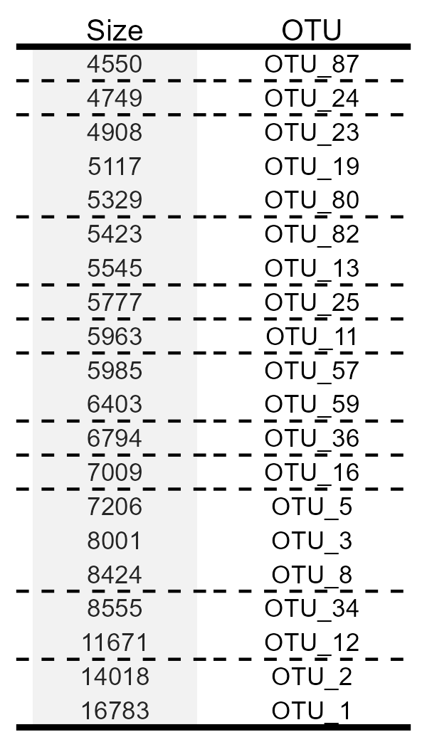
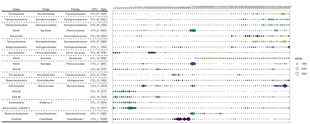
Step4:绘制OTU汇总信息
# 绘制OTU信息p2 <-df1 %>%mutate(ID = factor(rownames(.), levels = rownames(.), ordered = T)) %>%ggplot() +geom_text(aes(x = "Size", y = ID, label = sum), size = 3) +scale_x_discrete(position = "top") +labs(x = "", y = "") +annotate(geom = "rect", xmin = 0.5, xmax = 1.5, ymin = 0.5, ymax = Inf, fill = "grey", alpha = 0.2) +theme_nothing() +theme(panel.grid = element_blank(),axis.text.x.top = element_text(size = 10),axis.ticks = element_blank())p_size <-p2 +geom_hline(yintercept = c(21.5, 20.5, 0.5), size = 1) +geom_hline(yintercept = c(19.5, 18.5, 15.5, 13.5, 12.5, 11.5, 9.5, 8.5, 7.5, 4.5, 2.5), size = 0.5, linetype = 'dashed', color = 'black')p3 <-df2 %>%ggplot() +geom_text(aes(x = 'OTU', y = ID, label = ID), size = 3) +scale_x_discrete(position = "top") +labs(x = "", y = "") +theme_nothing() +theme(panel.grid = element_blank(),axis.text.x.top = element_text(size = 10),axis.ticks = element_blank())p_OTU <-p3 +geom_hline(yintercept = c(22.5, 21.5, 20.5, 0.5), size = 1) +geom_hline(yintercept = c(19.5, 18.5, 15.5, 13.5, 12.5, 11.5, 9.5, 8.5, 7.5, 4.5, 2.5), size = 0.5, linetype = 'dashed', color = 'black')p_size %>%insert_right(p_OTU)ggsave('pic2.png', width = 2, height = 3.5, bg = 'white')
Step5:绘制OTU分类信息
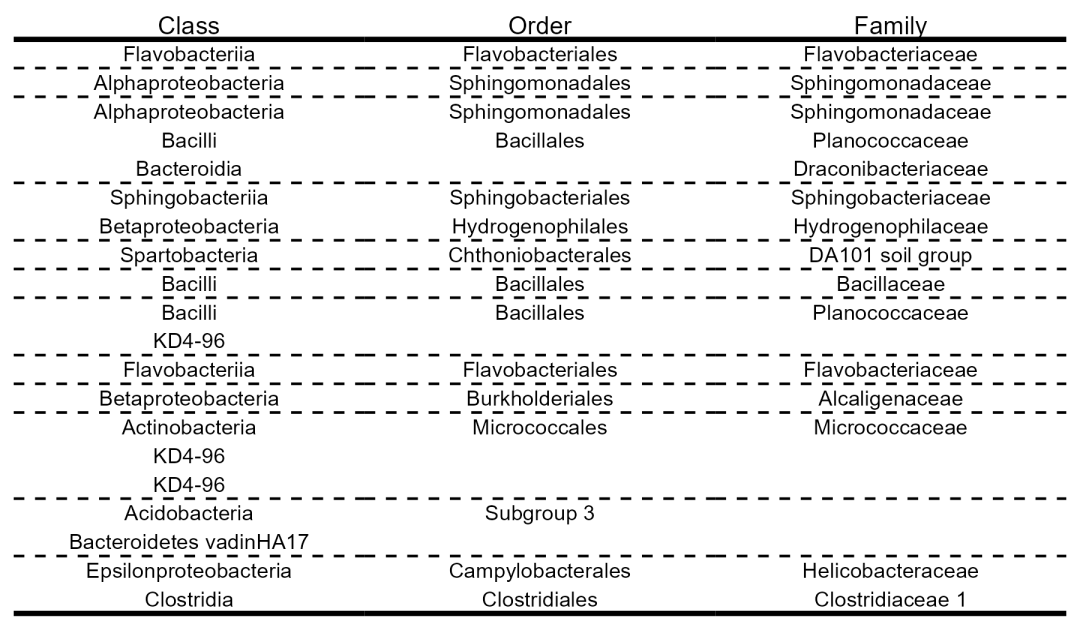
pic <- function(level){df2 %>%select(c(level, 'ID')) %>%set_names(c('label', 'ID')) %>%mutate(Info = str_split(label, pattern = "_", simplify = T)[,3]) %>%ggplot() +geom_text(aes(x = level, y = ID, label = Info), size = 3) +scale_x_discrete(position = "top") +labs(x = "", y = "") +theme_nothing() +theme(panel.grid = element_blank(),axis.text.x.top = element_text(size = 10),axis.ticks = element_blank())}p_Class <-pic('Class') +geom_hline(yintercept = c(21.5, 20.5, 0.5), size = 1) +geom_hline(yintercept = c(19.5, 18.5, 15.5, 13.5, 12.5, 11.5, 9.5, 8.5, 7.5, 4.5, 2.5), size = 0.5, linetype = 'dashed', color = 'black')p_Order <-pic('Order') +geom_hline(yintercept = c(21.5, 20.5, 0.5), size = 1) +geom_hline(yintercept = c(19.5, 18.5, 15.5, 13.5, 12.5, 11.5, 9.5, 8.5, 7.5, 4.5, 2.5), size = 0.5, linetype = 'dashed', color = 'black')p_Family <-pic('Family') +geom_hline(yintercept = c(21.5, 20.5, 0.5), size = 1) +geom_hline(yintercept = c(19.5, 18.5, 15.5, 13.5, 12.5, 11.5, 9.5, 8.5, 7.5, 4.5, 2.5), size = 0.5, linetype = 'dashed', color = 'black')p_Class %>%insert_right(p_Order) %>%insert_right(p_Family)ggsave('pic3.png', width = 6, height = 3.5, bg = 'white')
因为微生物Class/Order/Family数据结构一样,因此我们定义了一个pic()函数,达到简化代码的目的,可视化效果如下:
Step6:组合
p_Class %>%insert_right(p_Order) %>%insert_right(p_Family) %>%insert_right(p_OTU, width = 0.3) %>%insert_right(p_size, width = 0.3) %>%insert_right(p1, width = 6)ggsave(filename = "plot.png", height = 6, width = 15)
由于样品数量较多,所以效果比较差,接下来我们尝试按照样本分组求和绘图:
Step7:组合(分组)
p_type <-otu %>%filter(ID %in% rownames(df1)) %>%column_to_rownames('ID') %>%t() %>%as.data.frame() %>%rownames_to_column('SampleID') %>%left_join(sample_info) %>%group_by(Type) %>%summarise_if(is.numeric, sum, na.rm = TRUE) %>%reshape2::melt() %>%ggplot() +geom_point(aes(x = Type, y = variable,fill = Type, size = value), shape = 21) +scale_size_area(max_size = 10) +annotate(geom = "rect", xmin = 0.5, xmax = 1.5, ymin = 0.5, ymax = Inf, fill = "grey", alpha = 0.2) +annotate(geom = "rect", xmin = 2.5, xmax = 3.5, ymin = 0.5, ymax = Inf, fill = "grey", alpha = 0.2) +annotate(geom = "rect", xmin = 4.5, xmax = 5.5, ymin = 0.5, ymax = Inf, fill = "grey", alpha = 0.2) +scale_x_discrete(position = "top") +ggsci::scale_fill_nejm() +labs(x = "", y = "") +guides(fill = "none",size = guide_legend(ncol = 1)) +theme_bw() +theme(panel.grid = element_blank(),axis.text.x.top = element_text(size = 10, angle = 45, hjust = 0, color = "black"),axis.text.y.right = element_text(size = 10, color = "black"),axis.ticks = element_blank(),axis.text.y = element_blank())p_typep_Class %>%insert_right(p_Order) %>%insert_right(p_Family) %>%insert_right(p_OTU, width = 0.3) %>%insert_right(p_size, width = 0.3) %>%insert_right(p_type, width = 2)ggsave(filename = "plot_by_type.png", height = 6, width = 10)
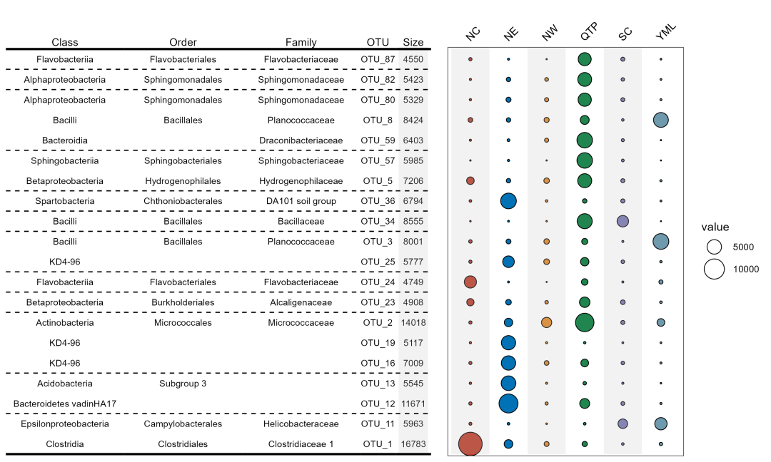
现在整体效果看上去舒服多了~
数据和代码获取:请查看主页个人信息!!!
关键词“气泡图”获得本期代码和数据。


 279
279

 被折叠的 条评论
为什么被折叠?
被折叠的 条评论
为什么被折叠?
 到【灌水乐园】发言


