


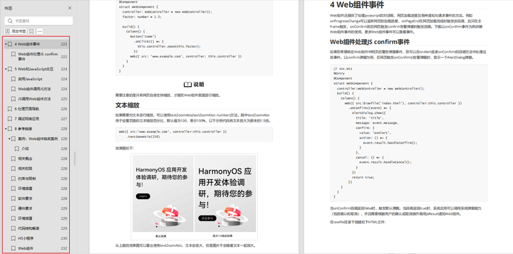
Popup属性可绑定在组件上显示气泡弹窗提示,设置弹窗内容、交互逻辑和显示状态。主要用于屏幕录制、信息弹出提醒等显示状态。
气泡分为两种类型,一种是系统提供的气泡PopupOptions,一种是开发者可以自定义的气泡CustomPopupOptions。其中PopupOptions为系统提供的气泡,通过配置primaryButton、secondaryButton来设置带按钮的气泡。CustomPopupOptions通过配置builder参数来设置自定义的气泡。
文本提示气泡
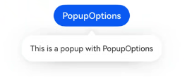
文本提示气泡常用于只展示带有文本的信息提示,不带有任何交互的场景。Popup属性需绑定组件,当bindPopup属性中参数show为true时会弹出气泡提示。
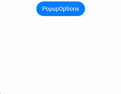
在Button组件上绑定Popup属性,每次点击Button按钮,handlePopup会切换布尔值,当值为true时,触发bindPopup弹出气泡。
@Entry
@Component
struct PopupExample {
  @State handlePopup: boolean = false

  build() {
    Column() {
      Button('PopupOptions')
        .onClick(() => {
          this.handlePopup = !this.handlePopup
        })
        .bindPopup(this.handlePopup, {
          message: 'This is a popup with PopupOptions',
        })
    }.width('100%').padding({ top: 5 })
  }
}
添加气泡状态变化的事件
通过onStateChange参数为气泡添加状态变化的事件回调,可以判断当前气泡的显示状态。
@Entry
@Component
struct PopupExample {
  @State handlePopup: boolean = false

  build() {
    Column() {
      Button('PopupOptions')
        .onClick(() => {
          this.handlePopup = !this.handlePopup
        })
        .bindPopup(this.handlePopup, {
          message: 'This is a popup with PopupOptions',
          onStateChange: (e)=> { // 返回当前的气泡状态
            if (!e.isVisible) {
              this.handlePopup = false
            }
          }
        })
    }.width('100%').padding({ top: 5 })
  }
}
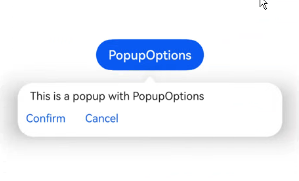
带按钮的提示气泡
通过primaryButton、secondaryButton属性为气泡最多设置两个Button按钮,通过此按钮进行简单的交互,开发者可以通过配置action参数来设置想要触发的操作。
@Entry
@Component
struct PopupExample22 {
  @State handlePopup: boolean = false

  build() {
    Column() {
      Button('PopupOptions').margin({ top: 200 })
        .onClick(() => {
          this.handlePopup = !this.handlePopup
        })
        .bindPopup(this.handlePopup, {
          message: 'This is a popup with PopupOptions',
          primaryButton: {
            value: 'Confirm',
            action: () => {
              this.handlePopup = !this.handlePopup
              console.info('confirm Button click')
            }
          },
          secondaryButton: {
            value: 'Cancel',
            action: () => {
              this.handlePopup = !this.handlePopup
            }
          },
          onStateChange: (e) => {
            if (!e.isVisible) {
              this.handlePopup = false
            }
          }
        })
    }.width('100%').padding({ top: 5 })
  }
}
气泡的动画
气泡通过定义transition控制气泡的进场和出场动画效果。
// xxx.ets
@Entry
@Component
struct PopupExample {
  @State handlePopup: boolean = false
  @State customPopup: boolean = false

  // popup构造器定义弹框内容
  @Builder popupBuilder() {
    Row() {
      Text('Custom Popup with transitionEffect').fontSize(10)
    }.height(50).padding(5)
  }

  build() {
    Flex({ direction: FlexDirection.Column }) {
      // PopupOptions 类型设置弹框内容
      Button('PopupOptions')
        .onClick(() => {
          this.handlePopup = !this.handlePopup
        })
        .bindPopup(this.handlePopup, {
          message: 'This is a popup with transitionEffect',
          placementOnTop: true,
          showInSubWindow: false,
          onStateChange: (e) => {
            console.info(JSON.stringify(e.isVisible))
            if (!e.isVisible) {
              this.handlePopup = false
            }
          },
          // 设置弹窗显示动效为透明度动效与平移动效的组合效果,无退出动效
          transition:TransitionEffect.asymmetric(
            TransitionEffect.OPACITY.animation({ duration: 1000, curve: Curve.Ease }).combine(
              TransitionEffect.translate({ x: 50, y: 50 })),
            TransitionEffect.IDENTITY)
        })
        .position({ x: 100, y: 150 })

      // CustomPopupOptions 类型设置弹框内容
      Button('CustomPopupOptions')
        .onClick(() => {
          this.customPopup = !this.customPopup
        })
        .bindPopup(this.customPopup, {
          builder: this.popupBuilder,
          placement: Placement.Top,
          showInSubWindow: false,
          onStateChange: (e) => {
            if (!e.isVisible) {
              this.customPopup = false
            }
          },
          // 设置弹窗显示动效与退出动效为缩放动效
          transition:TransitionEffect.scale({ x: 1, y: 0 }).animation({ duration: 500, curve: Curve.Ease })
        })
        .position({ x: 80, y: 300 })
    }.width('100%').padding({ top: 5 })
  }
}
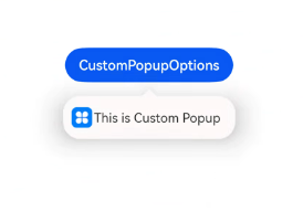
自定义气泡
开发者可以使用构建器CustomPopupOptions创建自定义气泡,@Builder中可以放自定义的内容。除此之外,还可以通过popupColor等参数控制气泡样式。
@Entry
@Component
struct Index {
  @State customPopup: boolean = false
  // popup构造器定义弹框内容
  @Builder popupBuilder() {
    Row({ space: 2 }) {
      Image($r("app.media.icon")).width(24).height(24).margin({ left: 5 })
      Text('This is Custom Popup').fontSize(15)
    }.width(200).height(50).padding(5)
  }
  build() {
    Column() {
      Button('CustomPopupOptions')
        .position({x:100,y:200})
        .onClick(() => {
          this.customPopup = !this.customPopup
        })
        .bindPopup(this.customPopup, {
          builder: this.popupBuilder, // 气泡的内容
          placement:Placement.Bottom, // 气泡的弹出位置
          popupColor:Color.Pink, // 气泡的背景色
          onStateChange: (e) => {
            console.info(JSON.stringify(e.isVisible))
            if (!e.isVisible) {
              this.customPopup = false
            }
          }
        })
    }
    .height('100%')
  }
}
使用者通过配置placement参数将弹出的气泡放到需要提示的位置。弹窗构造器会触发弹出提示信息,来引导使用者完成操作,也让使用者有更好的UI体验。
最后
有很多小伙伴不知道学习哪些鸿蒙开发技术?不知道需要重点掌握哪些鸿蒙应用开发知识点?而且学习时频繁踩坑,最终浪费大量时间。所以有一份实用的鸿蒙(HarmonyOS NEXT)资料用来跟着学习是非常有必要的。
点击领取→【纯血版鸿蒙全套最新学习资料】希望这一份鸿蒙学习资料能够给大家带来帮助
鸿蒙(HarmonyOS NEXT)最新学习路线
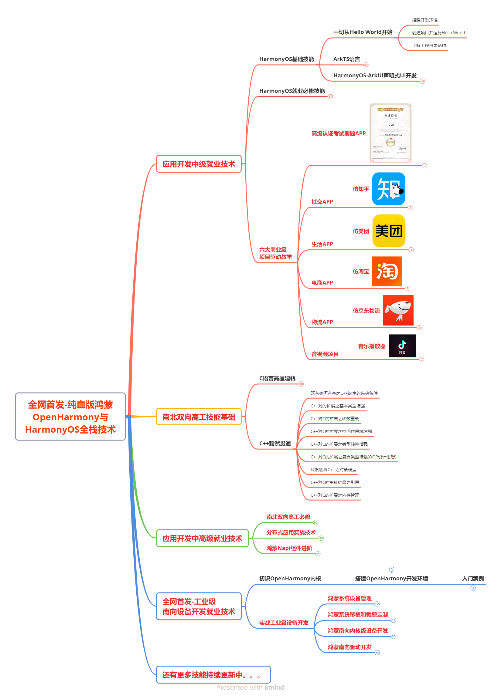
该路线图包含基础技能、就业必备技能、多媒体技术、六大电商APP、进阶高级技能、实战就业级设备开发,不仅补充了华为官网未涉及的解决方案
路线图适合人群:
IT开发人员:想要拓展职业边界
零基础小白:鸿蒙爱好者,希望从0到1学习,增加一项技能。
技术提升/进阶跳槽:发展瓶颈期,提升职场竞争力,快速掌握鸿蒙技术
获取以上完整版高清学习路线,请点击→纯血版全套鸿蒙HarmonyOS学习资料
2.视频学习资料+学习PDF文档
这份鸿蒙(HarmonyOS NEXT)资料包含了鸿蒙开发必掌握的核心知识要点,内容包含了(ArkTS、ArkUI开发组件、Stage模型、多端部署、分布式应用开发、音频、视频、WebGL、OpenHarmony多媒体技术、Napi组件、OpenHarmony内核、(南向驱动、嵌入式等)鸿蒙项目实战等等)鸿蒙(HarmonyOS NEXT)技术知识点。
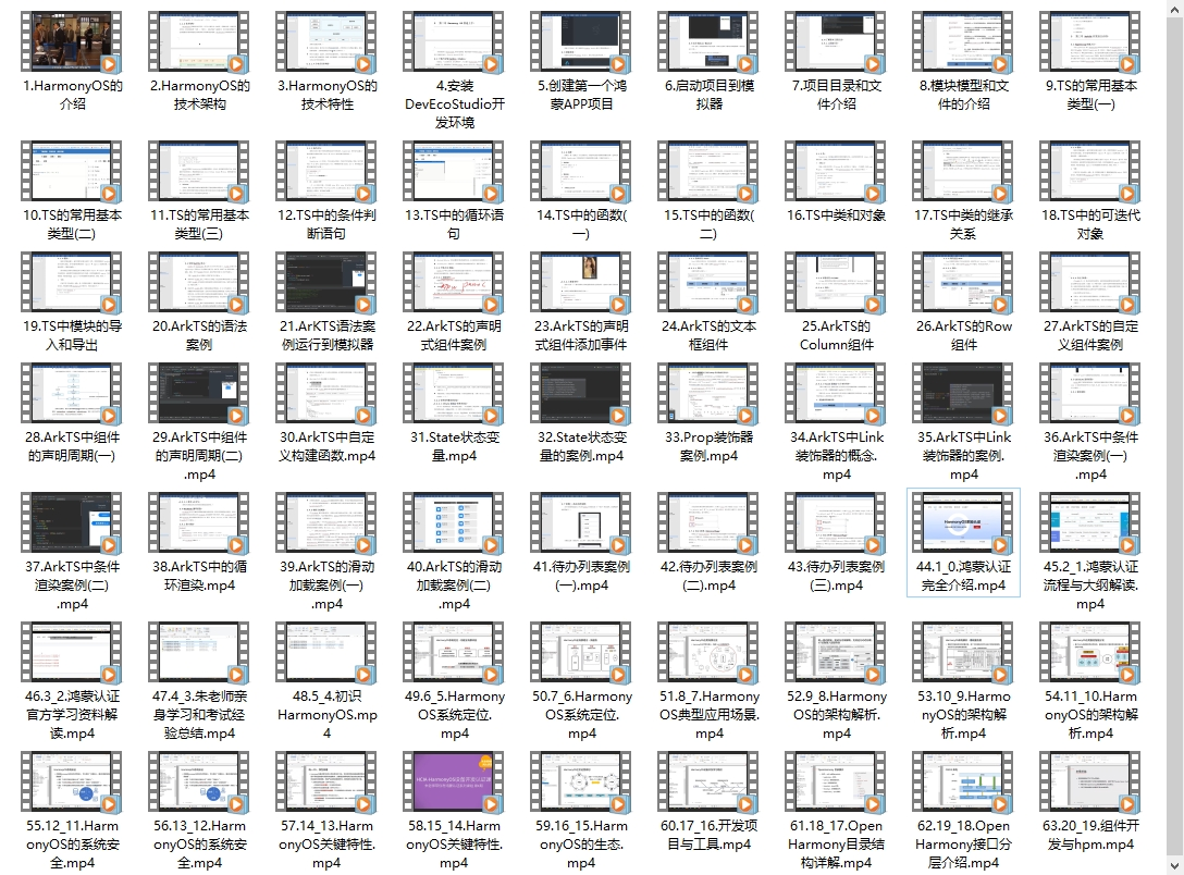
HarmonyOS Next 最新全套视频教程
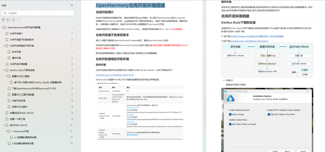
《鸿蒙 (OpenHarmony)开发基础到实战手册》
OpenHarmony北向、南向开发环境搭建
《鸿蒙开发基础》

《鸿蒙开发进阶》
《鸿蒙进阶实战》
大厂面试必问面试题
鸿蒙南向开发技术
鸿蒙APP开发必备
请点击→纯血版全套鸿蒙HarmonyOS学习资料
总结
总的来说,华为鸿蒙不再兼容安卓,对程序员来说是一个挑战,也是一个机会。只有积极应对变化,不断学习和提升自己,才能在这个变革的时代中立于不败之地。


 990
990

 被折叠的 条评论
为什么被折叠?
被折叠的 条评论
为什么被折叠?
 到【灌水乐园】发言


