


 本文介绍了如何使用R语言中的ggplot2和相关库(如ggrepel、corrplot等)创建相关性气泡图,展示了如何处理数据(生成dataframe、计算相关性R和P值),并用气泡大小和颜色编码展示相关系数和显著性。
目录
核心:气泡的信息主要体现在气泡大小和气泡颜色变化。
普通气泡图ggplot2
rm(list = ls())
library(ggrepel)
library(ggplot2)
dat <- mtcars
数据格式查看:
head(dat)
                   mpg cyl disp  hp drat    wt  qsec vs am gear carb
Mazda RX4         21.0   6  160 110 3.90 2.620 16.46  0  1    4    4
Mazda RX4 Wag     21.0   6  160 110 3.90 2.875 17.02  0  1    4    4
Datsun 710        22.8   4  108  93 3.85 2.320 18.61  1  1    4    1
Hornet 4 Drive    21.4   6  258
p1 <- ggplot(data=mtcars, aes(x=wt,y=mpg))+
  geom_point(aes(size=disp,fill=disp),    ##展示点的数据
             shape=21,colour="black",alpha=0.8)+
  # 绘制气泡图,填充颜色和面积大小
  scale_fill_gradient2(low="#377EB8",high="#E41A1C",
                       limits = c(0,max(mtcars$ disp)),
                       midpoint = mean(mtcars$disp))+ #设置填充颜色映射主题(colormap)
  scale_size_area(max_size=12)+ # 设置显示的气泡图气泡最大面积
  geom_text_repel(label = mtcars$disp)+ # 展示disp的具体数值
  theme_bw()
p1
dev.off()更多关于标签相关的设置:R语言可视化学习笔记之ggrepel包 - 简书 (jianshu.com)
R语言-ggplot自定义点的形状、线条的类型_ggplot点的形状-CSDN博客

相关性气泡图
气泡大小展示相关系数和气泡颜色都只有一个图例:
数据处理1:生成两个dataframe
rm(list = ls())
library(ggplot2)
library(tidyverse)
library(ggrepel)
library(corrplot)
library(reshape2)
library(Hmisc)
#生成模拟数据①:表达矩阵
data <- sample(1:15, 225, replace = TRUE)
matrix_data <- matrix(data, nrow = 15, ncol = 15)
df <- data.frame(matrix_data)
colnames(df) <- paste0("gene",1:ncol(df))
rownames(df) <- paste0("sample",1:nrow(df))

#生成模拟数据②:某种评分矩阵
data1 <- sample(50:100, 225,replace = TRUE)
matrix_data1 <- matrix(data1, nrow = 15, ncol = 15)
df1 <- data.frame(matrix_data1)
colnames(df1) <- paste0("score",1:ncol(df))
rownames(df1) <- paste0("sample",1:nrow(df))
head(df)
gene1 gene2 gene3 gene4 gene5 gene6 gene7 gene8 gene9 gene10 gene11
sample1 6 3 9 15 6 9 13 15 15 6 14
sample2 1 15 10 11 12 1 11 9 10 7 11
sample3 7 10 9 5 8 6 3 9 5 9 13
head(df1)
        score1 score2 score3 score4 score5 score6 score7 score8 score9
sample1     81     95     70     75     83     88     87     61     54
sample2     61     63     85     69     59     83     55     82     60
sample3     81     56     85     59     67     74     56     74     59
数据处理2:计算相关性R和P
##进行相关性R和P值计算
dat <- cbind(df,df1)
dat1 <- as.matrix(dat)##需要为matrix格式
rescor <- rcorr(dat1,type="spearman")#计算相关性 ("pearson","spearman")

##R值数据处理
rescor_R <- rescor$r
rescor_R1 <- as.data.frame(rescor_R[colnames(df),colnames(df1)])##提取相关性R值
rescor_R1$GENE <- rownames(rescor_R1)##转换为长数据
rescor_long <- melt(rescor_R1, id.vars = c("GENE"))
##P值数据处理
rescor_P <- rescor$P
rescor_P1 <- as.data.frame(rescor_P[colnames(df),colnames(df1)])##提取相关性P值
rescor_P1$GENE <- rownames(rescor_P1)##转换为长数据
rescor_longp <- melt(rescor_P1, id.vars = c("GENE"))
colnames(rescor_longp) <- c("GENEP","variableP","valueP")

identical(rescor_long$GENE,rescor_longp$GENE)#[1] TRUE  前两列数据一致,进行合并
identical(rescor_long$variable,rescor_longp$variable)#[1] TRUE
res <- cbind(rescor_long,rescor_longp)
res1 <- res[,c(1:3,6)]
head(res1)
   GENE variable        value    valueP
1 gene1   score1  0.069495604 0.8056036
2 gene2   score1  0.084838789 0.7637076
3 gene3   score1 -0.277011560 0.3175398
4 gene4   score1 -0.108011195 0.7016025
数据处理3:添加细节
colnames(res1) <- c("GENE","SCORE","correlation","pvalue")
#绘图添加分列#
#添加一列,来判断pvalue值范围
res1$sign<-case_when(res1$pvalue >0.05~">0.05",
                      res1$pvalue <0.05 &res1$pvalue>0.01 ~"<0.05",
                      res1$pvalue <0.01 &res1$pvalue>0.001 ~"<0.01",
                      res1$pvalue <0.001 &res1$pvalue>0.0001~"<0.001",
                      res1$pvalue <0.0001 ~"<0.0001")
#添加一列来判断correlation的正负
res1$core<-case_when(res1$correlation >0 ~"positive",
                      res1$correlation<0 ~"negtive")
head(res1) GENE SCORE correlation pvalue sign core 1 gene1 score1 0.069495604 0.8056036 >0.05 positive 2 gene2 score1 0.084838789 0.7637076 >0.05 positive 3 gene3 score1 -0.277011560 0.3175398 >0.05 negtive 4 gene4 score1 -0.108011195 0.7016025 >0.05 negtive
绘图
#主要是两种填充方式shape=21和shape=16
#主要是两种填充方式shape=21和shape=16
p <- ggplot(data=res1,aes(x=GENE,y=SCORE))+
  #正相关的点(正负相关的点分开绘制)
  geom_point(data=filter(res1,core=="positive"),
             aes(x=GENE,y=SCORE,size=abs(correlation),fill=sign),shape=21)+
  #负相关的点
  geom_point(data=filter(res1,core=="negtive"),
             aes(x=GENE,y=SCORE,size=abs(correlation),color=sign),shape=16)+
  #自定义颜色fill为正相关颜色填充
  scale_fill_manual(values=c("#FF6666","#FF9999","#FFCCCC","#FFCCCC","#CCCCCC"))+
  #自定义颜色负相关颜色
  scale_color_manual(values=c("#333366","#336699","#3399CC","#66CCFF","#CCCCCC"))+
  #去除x轴和y轴
  labs(x="",y="")+
  #修改主题
  theme_bw()+
  theme(axis.text.x=element_text(angle=45,hjust=1),
        axis.ticks.x=element_blank())+
  #修改legend,title表示标题,order表示标题的顺序,override.aes来设置大小
  guides(color=guide_legend(title="Negitive",order=1,override.aes=list(size=4)),
         size=guide_legend(title="Spearman's p",order=2),#为相关性大小
         fill=guide_legend(title="Positive",order=3,override.aes=list(size=4)))+#fill为正相关
  labs(title = "Spearman's p Correlation")
p
dev.off()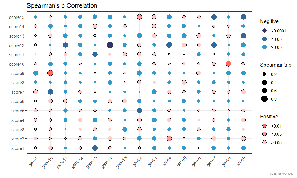


 1649
1649


 被折叠的 条评论
为什么被折叠?
被折叠的 条评论
为什么被折叠?
 到【灌水乐园】发言


