


from sklearn.metrics import roc_curve, auc
# 数据准备
>>> import numpy as np
>>> from sklearn import metrics
>>> y = np.array([1, 1, 2, 2])
>>> scores = np.array([0.1, 0.4, 0.35, 0.8])

# roc_curve的输入为
# y: 样本标签
# scores: 模型对样本属于正例的概率输出
# pos_label: 标记为正例的标签,本例中标记为2的即为正例
>>> fpr, tpr, thresholds = metrics.roc_curve(y, scores, pos_label=2)
# 假阳性率
>>> fpr
array([ 0. ,  0.5,  0.5,  1. ])
# 真阳性率
>>> tpr
array([ 0.5,  0.5,  1. ,  1. ])
# 阈值
>>> thresholds
array([ 0.8 ,  0.4 ,  0.35,  0.1 ])

# auc的输入为很简单,就是fpr, tpr值
>>> auc = metrics.auc(fpr, tpr)
>>> auc
0.75
接下来的事情就很简单了,调用plt即可,还是用官方的代码示例一步到底。
import matplotlib.pyplot as plt
plt.figure()
lw = 2
plt.plot(fpr, tpr, color='darkorange',
         lw=lw, label='ROC curve (area = %0.2f)' % auc)
plt.plot([0, 1], [0, 1], color='navy', lw=lw, linestyle='--')
plt.xlim([0.0, 1.0])
plt.ylim([0.0, 1.05])
plt.xlabel('False Positive Rate')
plt.ylabel('True Positive Rate')
plt.title('Receiver operating characteristic example')
plt.legend(loc="lower right")
plt.show()
即可出现ROC曲线图。
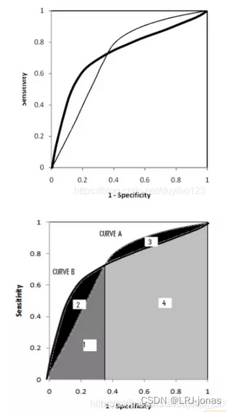
模型的选择
A、B对应的ROC曲线相交却AUC值相等,此时就需要具体问题具体分析:当需要高Sensitivity值时,A模型好过B;当需要高Specificity值时,B模型好过A


 2227
2227


 被折叠的 条评论
为什么被折叠?
被折叠的 条评论
为什么被折叠?
 到【灌水乐园】发言


