


欢迎关注 生信宝典 公众号,阅读系列文章
http://mp.weixin.qq.com/s/lKrhvYrwn93esC6MA3bHWw
Rstudio基础
R语言是比较常用的统计分析和绘图语言,拥有强大的统计库、绘图库和生信分析的Bioconductor库,是学习生物信息分析的必备语言之一。
Rstudio是编辑、运行R语言的最为理想的工具之一,支持纯R脚本、Rmarkdown (脚本文档混排)、Bookdown (脚本文档混排成书)、Shiny (交互式网络应用)等。
Rstudio版本
Rsdutio分为桌面版和服务器版,桌面版可以在单机使用,服务器版可以从浏览器访问供多人使用。
服务器版安装好之后,访问地址为<服务器IP:8787>,用户名和密码为Linux用户的用户名和密码。

Rstudio安装
R安装
Linux下安装
Rstudio安装前需要安装R,如果使用的是新版的操作系统。直接可以用sudo apt-get installl r-base 或者yum install r-base来安装。
若系统版本老,或没有根用户权限,则需要下载编译源码安装,最新地址为https://cran.r-project.org/src/base/R-3/R-3.4.0.tar.gz。
具体编译方式为 (Linux下软件安装见 http://blog.genesino.com/2016/06/bash1):
# --enable-R-shlib 需要设置,使得其他程序包括Rstudio可以使用R的动态库
# --prefix指定软件安装目录,需使用绝对路径
./configure --prefix=/home/ehbio/R/3.4.0 --enable-R-shlib

# 也可以使用这个命令,共享系统的blas库,提高运输速度
#./configure --prefix=/home/ehbio/R/3.4.0 --enable-R-shlib --with-blas --with-lapack
make
make install
Windows下安装
下载https://cran.r-project.org/bin/windows/双击就可以了。
Rstudio安装
Linux下安装服务器版
安装参考 https://www.rstudio.com/products/rstudio/download-server/
wget https://download2.rstudio.org/rstudio-server-rhel-1.0.136-x86_64.rpm
sudo yum install --nogpgcheck rstudio-server-rhel-1.0.136-x86_64.rpm
安装完之后的检测、启动和配置
sudo rstudio-server verify-installation #查看是否安装正确
sudo rstudio-server start ## 启动
sudo rstudio-server status ## 查看状态
sudo rstudio-server stop ## 停止
ifconfig | grep 'inet addr' ## 查看服务端ip地址
sudo rstudio-server start ## 修改配置文件后重启
sudo rstudio-server active-sessions ## 列出活跃的sessions:
sudo rstudio-server suspend-session <pid> ## 暂停session
sudo rstudio-server suspend-all ##暂停所有session
Rstudio日志目录,方便查看错误信息:/var/log/rstudio-server/
配置文件:
- /etc/rstudio/rserver.conf
www-port=8787 (default) www-address=0.0.0.0 (default) rsession-ld-library-path=/opt/local/lib:/opt/local/someapp/lib rsession-which-r=/usr/local/bin/R- /etc/rstudio/rsession.conf
Timeout
[user]
session-timeout-minutes=30
[@powerusers]
session-timeout-minutes=0
Windows下安装桌面版
下载之后 (https://www.rstudio.com/products/rstudio/download2/)双击安装,需要使用管理员权限,其它无需要注意的。
Rstudio 使用
Windows下桌面版直接双击打开即可使用,Linux服务器版访问地址为<服务器IP:8787>,用户名和密码为Linux用户的用户名和密码。
Rstudio 界面

Rstudio中新建或打开文件
如果是桌面版,直接就可以访问”我的电脑”去打开之前写过的脚本。如果是服务器版,可直接访问服务器上写过的脚本。Rstudio右下1/4部分可以切换目录,点击more,设置工作目录。可以上传本地的脚本到对应目录打开。
Rstudio还有其它的功能,不过这些对我们初学使用已经足够了。后续会根据需要推出基于ggplot2作图的R入门介绍。
热图绘制
热图是做分析时常用的展示方式,简单、直观、清晰。可以用来显示基因在不同样品中表达的高低、表观修饰水平的高低等。任何一个数值矩阵都可以通过合适的方式用热图展示。
本篇使用R的ggplot2包实现从原始数据读入到热图输出的过程,并在教程结束后提供一份封装好的命令行绘图工具,只需要提供矩阵,即可一键绘图。
上一篇讲述了Rstudio的使用作为R写作和编译环境的入门,后面的命令都可以拷贝到Rstudio中运行,或写成一个R脚本,使用Rscript heatmap.r运行。我们还提供了Bash的封装,在不修改R脚本的情况下,改变参数绘制出不同的图形。
生成测试数据
绘图首先需要数据。通过生成一堆的向量,转换为矩阵,得到想要的数据。
data <- c(1:6,6:1,6:1,1:6, (6:1)/10,(1:6)/10,(1:6)/10,(6:1)/10,1:6,6:1,6:1,1:6, 6:1,1:6,1:6,6:1) [1] 1.0 2.0 3.0 4.0 5.0 6.0 6.0 5.0 4.0 3.0 2.0 1.0 6.0 5.0 4.0 3.0 2.0 1.0 1.0
[20] 2.0 3.0 4.0 5.0 6.0 0.6 0.5 0.4 0.3 0.2 0.1 0.1 0.2 0.3 0.4 0.5 0.6 0.1 0.2
[39] 0.3 0.4 0.5 0.6 0.6 0.5 0.4 0.3 0.2 0.1 1.0 2.0 3.0 4.0 5.0 6.0 6.0 5.0 4.0
[58] 3.0 2.0 1.0 6.0 5.0 4.0 3.0 2.0 1.0 1.0 2.0 3.0 4.0 5.0 6.0 6.0 5.0 4.0 3.0
[77] 2.0 1.0 1.0 2.0 3.0 4.0 5.0 6.0 1.0 2.0 3.0 4.0 5.0 6.0 6.0 5.0 4.0 3.0 2.0
[96] 1.0
注意:运算符的优先级。
> 1:3+4
[1] 5 6 7
> (1:3)+4
[1] 5 6 7
> 1:(3+4)
[1] 1 2 3 4 5 6 7
Vector转为矩阵 (matrix),再转为数据框 (data.frame)。
# ncol: 指定列数
# byrow: 先按行填充数据
# ?matrix 可查看函数的使用方法
# as.data.frame的as系列是转换用的
data <- as.data.frame(matrix(data, ncol=12, byrow=T))
V1 V2 V3 V4 V5 V6 V7 V8 V9 V10 V11 V12
1 1.0 2.0 3.0 4.0 5.0 6.0 6.0 5.0 4.0 3.0 2.0 1.0
2 6.0 5.0 4.0 3.0 2.0 1.0 1.0 2.0 3.0 4.0 5.0 6.0
3 0.6 0.5 0.4 0.3 0.2 0.1 0.1 0.2 0.3 0.4 0.5 0.6
4 0.1 0.2 0.3 0.4 0.5 0.6 0.6 0.5 0.4 0.3 0.2 0.1
5 1.0 2.0 3.0 4.0 5.0 6.0 6.0 5.0 4.0 3.0 2.0 1.0
6 6.0 5.0 4.0 3.0 2.0 1.0 1.0 2.0 3.0 4.0 5.0 6.0
7 6.0 5.0 4.0 3.0 2.0 1.0 1.0 2.0 3.0 4.0 5.0 6.0
8 1.0 2.0 3.0 4.0 5.0 6.0 6.0 5.0 4.0 3.0 2.0 1.0
# 增加列的名字
colnames(data) <- c("Zygote","2_cell","4_cell","8_cell","Morula","ICM","ESC","4 week PGC","7 week PGC","10 week PGC","17 week PGC", "OOcyte")

# 增加行的名字
# 注意paste和paste0的使用
rownames(data) <- paste("Gene", 1:8, sep="_")

# 只显示前6行和前4列
head(data)[,1:4]
Zygote 2_cell 4_cell 8_cell
Gene_1 1.0 2.0 3.0 4.0
Gene_2 6.0 5.0 4.0 3.0
Gene_3 0.6 0.5 0.4 0.3
Gene_4 0.1 0.2 0.3 0.4
Gene_5 1.0 2.0 3.0 4.0
Gene_6 6.0 5.0 4.0 3.0
虽然方法比较繁琐,但一个数值矩阵已经获得了。
还有另外2种获取数值矩阵的方式。
- 读入字符串
# 使用字符串的好处是不需要额外提供文件
# 简单测试时可使用,写起来不繁琐,又方便重复
# 尤其适用于在线提问时作为测试案例
> txt <- "ID;Zygote;2_cell;4_cell;8_cell
+ Gene_1;1;2;3;4
+ Gene_2;6;5;4;5
+ Gene_3;0.6;0.5;0.4;0.4"

# 习惯设置quote为空,避免部分基因名字或注释中存在引号,导致读入文件错误。
# 具体错误可查看 http://blog.genesino.com/collections/R_tips/ 中的记录
> data2 <- read.table(text=txt,sep=";", header=T, row.names=1, quote="")
> head(data2)
       Zygote X2_cell X4_cell X8_cell
Gene_1    1.0     2.0     3.0     4.0
Gene_2    6.0     5.0     4.0     5.0
Gene_3 0.6 0.5 0.4 0.4可以看到列名字中以数字开头的列都加了X。一般要尽量避免行或列名字以数字开头,会给后续分析带去一些困难;另外名字中出现的非字母、数字、下划线、点的字符都会被转为点,也需要注意,尽量只用字母、下划线和数字。
# 读入时,增加一个参数`check.names=F`也可以解决问题。
# 这次数字前没有再加 X 了
> data2 <- read.table(text=txt,sep=";", header=T, row.names=1, quote="", check.names = F)
> head(data2)
       Zygote 2_cell 4_cell 8_cell
Gene_1    1.0    2.0    3.0    4.0
Gene_2    6.0    5.0    4.0    5.0
Gene_3 0.6 0.5 0.4 0.4- 读入文件
与上一步类似,只是改为文件名,不再赘述。
> data2 <- read.table("filename",sep=";", header=T, row.names=1, quote="")转换数据格式
数据读入后,还需要一步格式转换。在使用ggplot2作图时,有一种长表格模式是最为常用的,尤其是数据不规则时,更应该使用 (这点,我们在讲解箱线图时再说)。
# 如果包没有安装,运行下面一句,安装包
#install.packages(c("reshape2","ggplot2"))

library(reshape2)
library(ggplot2)

# 转换前,先增加一列ID列,保存行名字
data$ID <- rownames(data)

# melt:把正常矩阵转换为长表格模式的函数。工作原理是把全部的非id列的数值列转为1列,命名为value;所有字符列转为variable列。

# id.vars 列用于指定哪些列为id列;这些列不会被merge,会保留为完整一列。
data_m <- melt(data, id.vars=c("ID"))
head(data_m)
ID variable value
1 Gene_1 Zygote 1.0
2 Gene_2 Zygote 6.0
3 Gene_3 Zygote 0.6
4 Gene_4 Zygote 0.1
5 Gene_5 Zygote 1.0
6 Gene_6 Zygote 6.0
7 Gene_7 Zygote 6.0
8 Gene_8 Zygote 1.0
9 Gene_1 2_cell 2.0
10 Gene_2 2_cell 5.0
11 Gene_3 2_cell 0.5
12 Gene_4 2_cell 0.2
13 Gene_5 2_cell 2.0
14 Gene_6 2_cell 5.0
15 Gene_7 2_cell 5.0
16 Gene_8 2_cell 2.0
分解绘图
数据转换后就可以画图了,分解命令如下:
# data_m: 是前面费了九牛二虎之力得到的数据表
# aes: aesthetic的缩写,一般指定整体的X轴、Y轴、颜色、形状、大小等。
#      在最开始读入数据时,一般只指定x和y,其它后续指定
p <- ggplot(data_m, aes(x=variable,y=ID))

# 热图就是一堆方块根据其值赋予不同的颜色,所以这里使用fill=value, 用数值做填充色。
p <- p + geom_tile(aes(fill=value))

# ggplot2为图层绘制,一层层添加,存储在p中,在输出p的内容时才会出图。
p

## 如果你没有使用Rstudio或其它R图形版工具,而是在远程登录的服务器上运行的交互式R,需要输入下面的语句,获得输出图形 (图形存储于R的工作目录下的Rplots.pdf文件中)。

## 如何指定输出,后面会讲到。
#dev.off()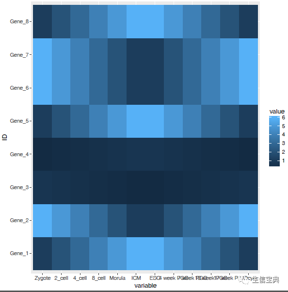
热图出来了,但有点不对劲,横轴重叠一起了。一个办法是调整图像的宽度,另一个是旋转横轴标记。
# theme: 是处理图美观的一个函数,可以调整横纵轴label的选择、图例的位置等。
# 这里选择X轴标签45度。
# hjust和vjust调整标签的相对位置,具体见 <https://stackoverflow.com/questions/7263849/what-do-hjust-and-vjust-do-when-making-a-plot-using-ggplot>。
# 简单说,hjust是水平的对齐方式,0为左,1为右,0.5居中,0-1之间可以取任意值。vjust是垂直对齐方式,0底对齐,1为顶对齐,0.5居中,0-1之间可以取任意值。

p <- p + theme(axis.text.x=element_text(angle=45,hjust=1, vjust=1))
p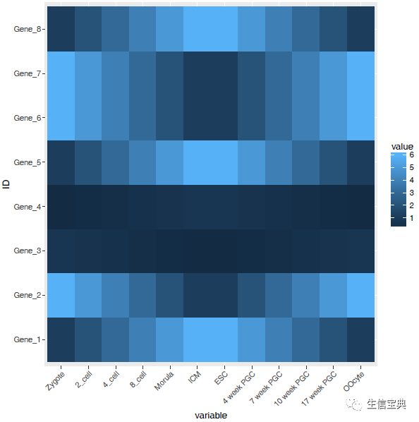
设置想要的颜色。
# 连续的数字,指定最小数值代表的颜色和最大数值赋予的颜色
# 注意fill和color的区别,fill是填充,color只针对边缘
p <- p + scale_fill_gradient(low = "white", high = "red")
p
调整legend的位置。
# postion可以接受的值有 top, bottom, left, right, 和一个坐标 c(0.05,0.8) (左上角,坐标是相对于图的左下角计算的)
p <- p + theme(legend.position="top")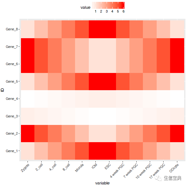
调整背景和背景格线以及X轴、Y轴的标题。
p <- p + xlab("samples") + theme_bw() + theme(panel.grid.major = element_blank()) + theme(legend.key=element_blank())
p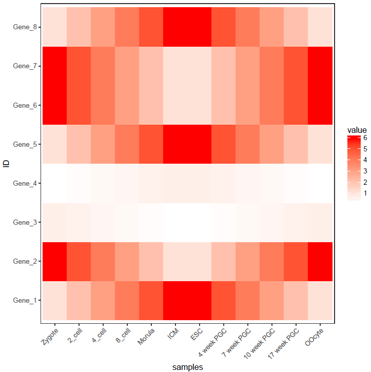
合并以上命令,就得到了下面这个看似复杂的绘图命令。
p <- ggplot(data_m, aes(x=variable,y=ID)) + xlab("samples") + theme_bw() + theme(panel.grid.major = element_blank()) + theme(legend.key=element_blank()) + theme(axis.text.x=element_text(angle=45,hjust=1, vjust=1)) + theme(legend.position="top") + geom_tile(aes(fill=value)) + scale_fill_gradient(low = "white", high = "red")图形存储
图形出来了,就得考虑存储了,
# 可以跟输出文件不同的后缀,以获得不同的输出格式
# colormode支持srgb (屏幕)和cmyk (打印,部分杂志需要,看上去有点褪色的感觉)格式
ggsave(p, filename="heatmap.pdf", width=10,
        height=15, units=c("cm"),colormodel="srgb")
至此,完成了简单的heatmap的绘图。但实际绘制时,经常会碰到由于数值变化很大,导致颜色过于集中,使得图的可读性下降很多。因此需要对数据进行一些处理,具体的下次再说。
R基础概念和困惑点
插播一点R的基础概念和疑难解释。
R的交互式运行
在bash命令行下输入大写字母R即可启动交互式界面
ct@ehbio:~$ R

R version 3.3.1 (2016-06-21) -- "Bug in Your Hair"
Copyright (C) 2016 The R Foundation for Statistical Computing
Platform: x86_64-redhat-linux-gnu (64-bit)

用'help.start()'通过HTML浏览器来看帮助文件。
用'q()'退出R.

> 1:3
[1] 1 2 3
> a <- 1:3
> a
[1] 1 2 3
# 使用source在交互式界面运行写好的R脚本
> source('scrtpt.r')
> quit()
Save workspace image? [y/n/c]: n

# ctrl+d也可退出R
R基本语法
获取帮助文档,查看命令或函数的使用方法、事例或适用范围
>>> ?command
>>> ??command #深度搜索或模糊搜索此命令

>>> example(command) #得到命令的例子
R中的变量
> # 数字变量
> a <- 10
> a
[1] 10
>
> # 字符串变量
> a <- "abc"
> a
[1] "abc"
>
> # 逻辑变量
> a <- TRUE
>
> a
[1] TRUE
>
> b <- T
>
> b
[1] TRUE
>
> d <- FALSE
>
> d
[1] FALSE
> # 向量
>
> a <- vector(mode="logical", length=5)
> a
[1] FALSE FALSE FALSE FALSE FALSE
>
> a <- c(1,2,3,4)
# 判断一个变量是不是vector
> is.vector(a)
[1] TRUE
>
> # 矩阵
>
> a <- matrix(1:20,nrow=5,ncol=4,byrow=T)
> a
     [,1] [,2] [,3] [,4]
[1,]    1    2    3    4
[2,]    5    6    7    8
[3,]    9   10   11   12
[4,]   13   14   15   16
[5,]   17   18   19   20
>
> is.matrix(a)
[1] TRUE
>
> dim(a) #查看或设置数组的维度向量
[1] 5 4
>
> # 错误的用法
> dim(a) <- c(4,4)
Error in dim(a) <- c(4, 4) : dims [product 16]与对象长度[20]不匹配
>
> # 正确的用法
> a <- 1:20
> dim(a) <- c(5,4) #转换向量为矩阵
> a
     [,1] [,2] [,3] [,4]
[1,]    1    6   11   16
[2,]    2    7   12   17
[3,]    3    8   13   18
[4,]    4    9   14   19
[5,]    5   10   15   20
>
> print(paste("矩阵a的行数", nrow(a)))
[1] "矩阵a的行数 5"
> print(paste("矩阵a的列数", ncol(a)))
[1] "矩阵a的列数 4"
>
> #查看或设置行列名
> rownames(a)
NULL
> rownames(a) <- c('a','b','c','d','e')
> a
  [,1] [,2] [,3] [,4]
a    1    6   11   16
b    2    7   12   17
c    3    8   13   18
d    4    9   14   19
e    5   10   15   20

# R中获取一系列的字母
> letters[1:4]
[1] "a" "b" "c" "d"
> colnames(a) <- letters[1:4]
> a
  a  b  c  d
a 1  6 11 16
b 2  7 12 17
c 3  8 13 18
d 4  9 14 19
e 5 10 15 20
>

# is系列和as系列函数用来判断变量的属性和转换变量的属性
# 矩阵转换为data.frame
> is.character(a)
[1] FALSE
> is.numeric(a)
[1] TRUE
> is.matrix(a)
[1] TRUE
> is.data.frame(a)
[1] FALSE
> is.data.frame(as.data.frame(a))
[1] TRUE
R中矩阵运算
# 数据产生
# rnorm(n, mean = 0, sd = 1) 正态分布的随机数
# runif(n, min = 0, max = 1) 平均分布的随机数
# rep(1,5) 把1重复5次
# scale(1:5) 标准化数据
> a <- c(rnorm(5), rnorm(5,1), runif(5), runif(5,-1,1), 1:5, rep(0,5), c(2,10,11,13,4), scale(1:5)[1:5])
> a
 [1] -0.41253556  0.12192929 -0.47635888 -0.97171653  1.09162243  1.87789657
 [7] -0.11717937  2.92953522  1.33836620 -0.03269026  0.87540920  0.13005744
[13]  0.11900686  0.76663940  0.28407356 -0.91251181  0.17997973  0.50452258
[19]  0.25961316 -0.58052230  1.00000000  2.00000000  3.00000000  4.00000000
[25]  5.00000000  0.00000000  0.00000000  0.00000000  0.00000000  0.00000000
[31]  2.00000000 10.00000000 11.00000000 13.00000000  4.00000000 -1.26491106
[37] -0.63245553  0.00000000  0.63245553  1.26491106
> a <- matrix(a, ncol=5, byrow=T)
> a
           [,1]       [,2]       [,3]       [,4]        [,5]
[1,] -0.4125356  0.1219293 -0.4763589 -0.9717165  1.09162243
[2,]  1.8778966 -0.1171794  2.9295352  1.3383662 -0.03269026
[3,]  0.8754092  0.1300574  0.1190069  0.7666394  0.28407356
[4,] -0.9125118  0.1799797  0.5045226  0.2596132 -0.58052230
[5,]  1.0000000  2.0000000  3.0000000  4.0000000  5.00000000
[6,]  0.0000000  0.0000000  0.0000000  0.0000000  0.00000000
[7,]  2.0000000 10.0000000 11.0000000 13.0000000  4.00000000
[8,] -1.2649111 -0.6324555  0.0000000  0.6324555  1.26491106

# 求行的加和
> rowSums(a)
[1] -0.6470593  5.9959284  2.1751865 -0.5489186 15.0000000  0.0000000 40.0000000
[8]  0.0000000

## 注意检查括号的配对
> a <- a[rowSums(abs(a)!=0,]
错误: 意外的']' in "a <- a[rowSums(abs(a)!=0,]"

# 去除全部为0的行
> a <- a[rowSums(abs(a))!=0,]

# 另外一种方式去除全部为0的行
> #a[rowSums(a==0)<ncol(a),]
> a
           [,1]       [,2]       [,3]       [,4]        [,5]
[1,] -0.4125356  0.1219293 -0.4763589 -0.9717165  1.09162243
[2,]  1.8778966 -0.1171794  2.9295352  1.3383662 -0.03269026
[3,]  0.8754092  0.1300574  0.1190069  0.7666394  0.28407356
[4,] -0.9125118  0.1799797  0.5045226  0.2596132 -0.58052230
[5,]  1.0000000  2.0000000  3.0000000  4.0000000  5.00000000
[6,]  2.0000000 10.0000000 11.0000000 13.0000000  4.00000000
[7,] -1.2649111 -0.6324555  0.0000000  0.6324555  1.26491106

# 矩阵运算,R默认针对整个数据进行常见运算

# 所有值都乘以2

> a * 2
           [,1]       [,2]       [,3]       [,4]        [,5]
[1,] -0.8250711  0.2438586 -0.9527178 -1.9434331  2.18324487
[2,]  3.7557931 -0.2343587  5.8590704  2.6767324 -0.06538051
[3,]  1.7508184  0.2601149  0.2380137  1.5332788  0.56814712
[4,] -1.8250236  0.3599595  1.0090452  0.5192263 -1.16104460
[5,]  2.0000000  4.0000000  6.0000000  8.0000000 10.00000000
[6,]  4.0000000 20.0000000 22.0000000 26.0000000  8.00000000
[7,] -2.5298221 -1.2649111  0.0000000  1.2649111  2.52982213

# 所有值取绝对值,再取对数 (取对数前一般加一个数避免对0或负值取对数)
> log2(abs(a)+1)
          [,1]      [,2]      [,3]      [,4]      [,5]
[1,] 0.4982872 0.1659818 0.5620435 0.9794522 1.0646224
[2,] 1.5250147 0.1598608 1.9743587 1.2255009 0.0464076
[3,] 0.9072054 0.1763961 0.1622189 0.8210076 0.3607278
[4,] 0.9354687 0.2387621 0.5893058 0.3329807 0.6604014
[5,] 1.0000000 1.5849625 2.0000000 2.3219281 2.5849625
[6,] 1.5849625 3.4594316 3.5849625 3.8073549 2.3219281
[7,] 1.1794544 0.7070437 0.0000000 0.7070437 1.1794544

# 取出最大值、最小值、行数、列数
> max(a)
[1] 13
> min(a)
[1] -1.264911
> nrow(a)
[1] 7
> ncol(a)
[1] 5

# 增加一列或一行
# cbind: column bind
> cbind(a, 1:7)
           [,1]       [,2]       [,3]       [,4]        [,5] [,6]
[1,] -0.4125356  0.1219293 -0.4763589 -0.9717165  1.09162243    1
[2,]  1.8778966 -0.1171794  2.9295352  1.3383662 -0.03269026    2
[3,]  0.8754092  0.1300574  0.1190069  0.7666394  0.28407356    3
[4,] -0.9125118  0.1799797  0.5045226  0.2596132 -0.58052230    4
[5,]  1.0000000  2.0000000  3.0000000  4.0000000  5.00000000    5
[6,]  2.0000000 10.0000000 11.0000000 13.0000000  4.00000000    6
[7,] -1.2649111 -0.6324555  0.0000000  0.6324555  1.26491106    7
> cbind(a, seven=1:7)
                                                             seven
[1,] -0.4125356  0.1219293 -0.4763589 -0.9717165  1.09162243     1
[2,]  1.8778966 -0.1171794  2.9295352  1.3383662 -0.03269026     2
[3,]  0.8754092  0.1300574  0.1190069  0.7666394  0.28407356     3
[4,] -0.9125118  0.1799797  0.5045226  0.2596132 -0.58052230     4
[5,]  1.0000000  2.0000000  3.0000000  4.0000000  5.00000000     5
[6,]  2.0000000 10.0000000 11.0000000 13.0000000  4.00000000     6
[7,] -1.2649111 -0.6324555  0.0000000  0.6324555  1.26491106     7

# rbind: row bind
> rbind(a,1:5)
           [,1]       [,2]       [,3]       [,4]        [,5]
[1,] -0.4125356  0.1219293 -0.4763589 -0.9717165  1.09162243
[2,]  1.8778966 -0.1171794  2.9295352  1.3383662 -0.03269026
[3,]  0.8754092  0.1300574  0.1190069  0.7666394  0.28407356
[4,] -0.9125118  0.1799797  0.5045226  0.2596132 -0.58052230
[5,]  1.0000000  2.0000000  3.0000000  4.0000000  5.00000000
[6,]  2.0000000 10.0000000 11.0000000 13.0000000  4.00000000
[7,] -1.2649111 -0.6324555  0.0000000  0.6324555  1.26491106
[8,]  1.0000000  2.0000000  3.0000000  4.0000000  5.00000000

# 计算每一行的mad (中值绝对偏差,一般认为比方差的鲁棒性更强,更少受异常值的影响,更能反映数据间的差异)
> apply(a,1,mad)
[1] 0.7923976 2.0327283 0.2447279 0.4811672 1.4826000 4.4478000 0.9376786

# 计算每一行的var (方差)
# apply表示对数据(第一个参数)的每一行 (第二个参数赋值为1) 或每一列 (2)操作
#      最后返回一个列表
> apply(a,1,var)
[1]  0.6160264  1.6811161  0.1298913  0.3659391  2.5000000 22.5000000  1.0000000

# 计算每一列的平均值
> apply(a,2,mean)
[1] 0.4519068 1.6689045 2.4395294 2.7179083 1.5753421

# 取出中值绝对偏差大于0.5的行
> b = a[apply(a,1,mad)>0.5,]
> b
           [,1]       [,2]       [,3]       [,4]        [,5]
[1,] -0.4125356  0.1219293 -0.4763589 -0.9717165  1.09162243
[2,]  1.8778966 -0.1171794  2.9295352  1.3383662 -0.03269026
[3,]  1.0000000  2.0000000  3.0000000  4.0000000  5.00000000
[4,]  2.0000000 10.0000000 11.0000000 13.0000000  4.00000000
[5,] -1.2649111 -0.6324555  0.0000000  0.6324555  1.26491106

# 矩阵按照mad的大小降序排列
> c = b[order(apply(b,1,mad), decreasing=T),]
> c
           [,1]       [,2]       [,3]       [,4]        [,5]
[1,]  2.0000000 10.0000000 11.0000000 13.0000000  4.00000000
[2,]  1.8778966 -0.1171794  2.9295352  1.3383662 -0.03269026
[3,]  1.0000000  2.0000000  3.0000000  4.0000000  5.00000000
[4,] -1.2649111 -0.6324555  0.0000000  0.6324555  1.26491106
[5,] -0.4125356  0.1219293 -0.4763589 -0.9717165  1.09162243

> rownames(c) <- paste('Gene', letters[1:5], sep="_")
> colnames(c) <- toupper(letters[1:5])
> c
                A          B          C          D           E
Gene_a  2.0000000 10.0000000 11.0000000 13.0000000  4.00000000
Gene_b  1.8778966 -0.1171794  2.9295352  1.3383662 -0.03269026
Gene_c  1.0000000  2.0000000  3.0000000  4.0000000  5.00000000
Gene_d -1.2649111 -0.6324555  0.0000000  0.6324555  1.26491106
Gene_e -0.4125356  0.1219293 -0.4763589 -0.9717165  1.09162243

# 矩阵转置
> expr = t(c)
> expr
  Gene_a      Gene_b Gene_c     Gene_d     Gene_e
A      2  1.87789657      1 -1.2649111 -0.4125356
B     10 -0.11717937      2 -0.6324555  0.1219293
C     11  2.92953522      3  0.0000000 -0.4763589
D     13  1.33836620      4  0.6324555 -0.9717165
E      4 -0.03269026      5  1.2649111  1.0916224

# 矩阵值的替换
> expr2 = expr
> expr2[expr2<0] = 0
> expr2
  Gene_a   Gene_b Gene_c    Gene_d    Gene_e
A      2 1.877897      1 0.0000000 0.0000000
B     10 0.000000      2 0.0000000 0.1219293
C     11 2.929535      3 0.0000000 0.0000000
D     13 1.338366      4 0.6324555 0.0000000
E      4 0.000000      5 1.2649111 1.0916224

# 矩阵中只针对某一列替换
# expr2是个矩阵不是数据框,不能使用列名字索引
> expr2[expr2$Gene_b<1, "Gene_b"] <- 1
Error in expr2$Gene_b : $ operator is invalid for atomic vectors
# str是一个最为常用、好用的查看变量信息的工具,尤其是对特别复杂的变量,
#    可以看清其层级结构,便于提取数据
> str(expr2)
 num [1:5, 1:5] 2 10 11 13 4 ...
 - attr(*, "dimnames")=List of 2
  ..$ : chr [1:5] "A" "B" "C" "D" ...
  ..$ : chr [1:5] "Gene_a" "Gene_b" "Gene_c" "Gene_d" ...

# 转换为数据库,再进行相应的操作
> expr2 <- as.data.frame(expr2)
> str(expr2)
'data.frame':   5 obs. of  5 variables:
 $ Gene_a: num  2 10 11 13 4
 $ Gene_b: num  1.88 1 2.93 1.34 1
 $ Gene_c: num  1 2 3 4 5
 $ Gene_d: num  0 0 0 0.632 1.265
 $ Gene_e: num  0 0.122 0 0 1.092
> expr2[expr2$Gene_b<1, "Gene_b"] <- 1
> expr2
> expr2
  Gene_a   Gene_b Gene_c    Gene_d    Gene_e
A      2 1.877897      1 0.0000000 0.0000000
B     10 1.000000      2 0.0000000 0.1219293
C     11 2.929535      3 0.0000000 0.0000000
D     13 1.338366      4 0.6324555 0.0000000
E      4 1.000000      5 1.2649111 1.0916224
R中矩阵筛选合并
# 读入样品信息
> sampleInfo = "Samp;Group;Genotype
+ A;Control;WT
+ B;Control;WT
+ D;Treatment;Mutant
+ C;Treatment;Mutant
+ E;Treatment;WT
+ F;Treatment;WT"
> phenoData = read.table(text=sampleInfo,sep=";", header=T, row.names=1, quote="")
> phenoData
      Group Genotype
A   Control       WT
B   Control       WT
D Treatment   Mutant
C Treatment   Mutant
E Treatment       WT
F Treatment       WT

# 把样品信息按照基因表达矩阵中的样品信息排序,并只保留有基因表达信息的样品
# match() returns a vector of the positions of (first) matches of
          its first argument in its second.
> phenoData[match(rownames(expr), rownames(phenoData)),]
      Group Genotype
A   Control       WT
B   Control       WT
C Treatment   Mutant
D Treatment   Mutant
E Treatment       WT

# ‘%in%’ is a more intuitive interface as a binary operator, which
     returns a logical vector indicating if there is a match or not for
     its left operand.

# 注意顺序,%in%比match更好理解一些
> phenoData = phenoData[rownames(phenoData) %in% rownames(expr),]
> phenoData
      Group Genotype
A   Control       WT
B   Control       WT
C Treatment   Mutant
D Treatment   Mutant
E Treatment       WT

# 合并矩阵
# by=0 表示按照行的名字排序
# by=columnname 表示按照共有的某一列排序
# 合并后多出了新的一列Row.names
> merge_data = merge(expr, phenoData, by=0, all.x=T)
> merge_data
  Row.names Gene_a      Gene_b Gene_c     Gene_d     Gene_e     Group Genotype
1         A      2  1.87789657      1 -1.2649111 -0.4125356   Control       WT
2         B     10 -0.11717937      2 -0.6324555  0.1219293   Control       WT
3         C     11  2.92953522      3  0.0000000 -0.4763589 Treatment   Mutant
4         D     13  1.33836620      4  0.6324555 -0.9717165 Treatment   Mutant
5         E      4 -0.03269026      5  1.2649111  1.0916224 Treatment       WT

> rownames(merge_data) <- merge_data$Row.names
> merge_data
  Row.names Gene_a      Gene_b Gene_c     Gene_d     Gene_e     Group Genotype
A         A      2  1.87789657      1 -1.2649111 -0.4125356   Control       WT
B         B     10 -0.11717937      2 -0.6324555  0.1219293   Control       WT
C         C     11  2.92953522      3  0.0000000 -0.4763589 Treatment   Mutant
D         D     13  1.33836620      4  0.6324555 -0.9717165 Treatment   Mutant
E         E      4 -0.03269026      5  1.2649111  1.0916224 Treatment       WT

# 去除一列;-1表示去除第一列
> merge_data = merge_data[,-1]
> merge_data
  Gene_a      Gene_b Gene_c     Gene_d     Gene_e     Group Genotype
A      2  1.87789657      1 -1.2649111 -0.4125356   Control       WT
B     10 -0.11717937      2 -0.6324555  0.1219293   Control       WT
C     11  2.92953522      3  0.0000000 -0.4763589 Treatment   Mutant
D     13  1.33836620      4  0.6324555 -0.9717165 Treatment   Mutant
E      4 -0.03269026      5  1.2649111  1.0916224 Treatment       WT

# 提取出所有的数值列
> merge_data[sapply(merge_data, is.numeric)]
  Gene_a      Gene_b Gene_c     Gene_d     Gene_e
A      2  1.87789657      1 -1.2649111 -0.4125356
B     10 -0.11717937      2 -0.6324555  0.1219293
C     11  2.92953522      3  0.0000000 -0.4763589
D     13  1.33836620      4  0.6324555 -0.9717165
E 4 -0.03269026 5 1.2649111 1.0916224str的应用
str: Compactly display the internal *str*ucture of an R object, a
diagnostic function and an alternative to ‘summary (and to some
extent, ‘dput’). Ideally, only one line for each ‘basic’
structure is displayed. It is especially well suited to compactly
display the (abbreviated) contents of (possibly nested) lists.
The idea is to give reasonable output for any R object. It
calls ‘args’ for (non-primitive) function objects.
str用来告诉结果的构成方式,对于不少Bioconductor的包,或者复杂的R函数的输出,都是一堆列表的嵌套,str(complex_result)会输出每个列表的名字,方便提取对应的信息。
# str的一个应用例子
> str(list(a = "A", L = as.list(1:100)), list.len = 9)
List of 2
 $ a: chr "A"
 $ L:List of 100
  ..$ : int 1
  ..$ : int 2
  ..$ : int 3
  ..$ : int 4
  ..$ : int 5
  ..$ : int 6
  ..$ : int 7
  ..$ : int 8
  ..$ : int 9
  .. [list output truncated]

# 利用str查看pca的结果,具体的PCA应用查看http://mp.weixin.qq.com/s/sRElBMkyR9rGa4TQp9KjNQ

> pca_result <- prcomp(expr)
> pca_result
Standard deviations:
[1] 4.769900e+00 1.790861e+00 1.072560e+00 1.578391e-01 2.752128e-16

Rotation:
               PC1         PC2          PC3         PC4         PC5
Gene_a  0.99422750 -0.02965529  0.078809521  0.01444655  0.06490461
Gene_b  0.04824368 -0.44384942 -0.885305329  0.03127940  0.12619948
Gene_c  0.08258192  0.81118590 -0.451360828  0.05440417 -0.35842886
Gene_d -0.01936958  0.30237826 -0.079325524 -0.66399283  0.67897952
Gene_e -0.04460135  0.22948437 -0.002097256  0.74496081  0.62480128
> str(pca_result)
List of 5
 $ sdev    : num [1:5] 4.77 1.79 1.07 1.58e-01 2.75e-16
 $ rotation: num [1:5, 1:5] 0.9942 0.0482 0.0826 -0.0194 -0.0446 ...
  ..- attr(*, "dimnames")=List of 2
  .. ..$ : chr [1:5] "Gene_a" "Gene_b" "Gene_c" "Gene_d" ...
  .. ..$ : chr [1:5] "PC1" "PC2" "PC3" "PC4" ...
 $ center  : Named num [1:5] 8 1.229 3 0.379 0.243
  ..- attr(*, "names")= chr [1:5] "Gene_a" "Gene_b" "Gene_c" "Gene_d" ...
 $ scale   : logi FALSE
 $ x       : num [1:5, 1:5] -6.08 1.86 3.08 5.06 -3.93 ...
  ..- attr(*, "dimnames")=List of 2
  .. ..$ : chr [1:5] "A" "B" "C" "D" ...
  .. ..$ : chr [1:5] "PC1" "PC2" "PC3" "PC4" ...
 - attr(*, "class")= chr "prcomp"

# 取出每个主成分解释的差异
> pca_result$sdev
[1] 4.769900e+00 1.790861e+00 1.072560e+00 1.578391e-01 2.752128e-16
R的包管理
# 什么时候需要安装包
> library('unExistedPackage')
Error in library("unExistedPackage") :
  不存在叫‘unExistedPackage’这个名字的程辑包

# 安装包
> install.packages("package_name")
# 指定安装来源
> install.packages("package_name", repo="http://cran.us.r-project.org")

# 安装Bioconductor的包
> source('https://bioconductor.org/biocLite.R')
> biocLite('BiocInstaller')
> biocLite(c("RUVSeq","pcaMethods"))

# 安装Github的R包
> install.packages("devtools")
> devtools::install_github("JustinaZ/pcaReduce")

# 手动安装, 首先下载包的源文件(压缩版就可),然后在终端运行下面的命令。
ct@ehbio:~$ R CMD INSTALL package.tar.gz

# 移除包
>remove.packages("package_name")

# 查看所有安装的包
>library()

# 查看特定安装包的版本
> installed.packages()[c("DESeq2"), c("Package", "Version")]
 Package  Version
"DESeq2" "1.14.1"
>

# 查看默认安装包的位置
>.libPaths()


# 调用安装的包
>library(package_name)


#devtools::install_github("hms-dbmi/scde", build_vignettes = FALSE)
#install.packages(c("mvoutlier","ROCR"))
#biocLite(c("RUVSeq","pcaMethods","SC3","TSCAN","monocle","MultiAssayExperiment","SummarizedExperiment"))
#devtools::install_github("satijalab/seurat")
热图美化
上一期的绘图命令中,最后一行的操作抹去了之前设定的横轴标记的旋转,最后出来的图比较难看。
上次我们是这么写的
p <- p + xlab("samples") + theme_bw() + theme(panel.grid.major = element_blank()) + theme(legend.key=element_blank())为了使横轴旋转45度,需要把这句话theme(axis.text.x=element_text(angle=45,hjust=1, vjust=1))放在theme_bw()的后面。
p <- p + theme(axis.text.x=element_text(angle=45,hjust=1, vjust=1))最后的图应该是下边样子的。
上次的测试数据,数值的分布比较均一,相差不是太大,但是Gene_4和Gene_5由于整体的值低于其它的基因,从颜色上看,不仔细看,看不出差别。
data <- c(rnorm(5,mean=5), rnorm(5,mean=20), rnorm(5, mean=100), c(600,700,800,900,10000))
data <- matrix(data, ncol=5, byrow=T)
data <- as.data.frame(data)
rownames(data) <- letters[1:4]
colnames(data) <- paste("Grp", 1:5, sep="_")
data
Grp_1 Grp_2 Grp_3 Grp_4 Grp_5
a 5.958073 5.843652 3.225465 4.886184 3.411362
b 19.630582 20.376791 20.744580 18.534027 20.638288
c 100.351299 99.849900 102.197343 98.583629 99.540488
d 600.000000 700.000000 800.000000 900.000000 10000.000000
data$ID <- rownames(data)
data
Grp_1 Grp_2 Grp_3 Grp_4 Grp_5 ID
a 5.958073 5.843652 3.225465 4.886184 3.411362 a
b 19.630582 20.376791 20.744580 18.534027 20.638288 b
c 100.351299 99.849900 102.197343 98.583629 99.540488 c
d 600.000000 700.000000 800.000000 900.000000 10000.000000 d
data_m <- melt(data, id.vars=c("ID"))
head(data_m)
ID variable value
1 a Grp_1 5.958073
2 b Grp_1 19.630582
3 c Grp_1 100.351299
4 d Grp_1 600.000000
5 a Grp_2 5.843652
6 b Grp_2 20.376791
p <- ggplot(data_m, aes(x=variable,y=ID)) + xlab("samples") + theme_bw() + theme(panel.grid.major = element_blank()) + theme(legend.key=element_blank())  + theme(axis.text.x=element_text(angle=45,hjust=1, vjust=1)) + theme(legend.position="top") +  geom_tile(aes(fill=value)) + scale_fill_gradient(low = "white", high = "red")
p
dev.off()
输出的结果是这个样子的
图中只有右上角可以看到红色,其他地方就没了颜色的差异。这通常不是我们想要的。为了更好的可视化效果,需要对数据做些预处理,主要有 对数转换,Z-score转换,抹去异常值,非线性颜色等方式。
对数转换
假设下面的数据是基因表达数据,4个基因 (a, b, c, d)和5个样品 (Grp_1, Grp_2, Grp_3, Grp_4),矩阵中的值代表基因表达FPKM值。
data <- c(rnorm(5,mean=5), rnorm(5,mean=20), rnorm(5, mean=100), c(600,700,800,900,10000))
data <- matrix(data, ncol=5, byrow=T)
data <- as.data.frame(data)
rownames(data) <- letters[1:4]
colnames(data) <- paste("Grp", 1:5, sep="_")
data
Grp_1 Grp_2 Grp_3 Grp_4 Grp_5
a 6.61047 20.946720 100.133106 600.000000 5.267921
b 20.80792 99.865962 700.000000 3.737228 19.289715
c 100.06930 800.000000 6.252753 21.464081 98.607518
d 900.00000 3.362886 20.334078 101.117728 10000.000000
data_log <- log2(data+1)
data_log
Grp_1 Grp_2 Grp_3 Grp_4 Grp_5
a 2.927986 4.455933 6.660112 9.231221 2.647987
b 4.446780 6.656296 9.453271 2.244043 4.342677
c 6.659201 9.645658 2.858529 4.489548 6.638183
d 9.815383 2.125283 4.415088 6.674090 13.287857
data_log$ID = rownames(data_log)
data_log_m = melt(data_log, id.vars=c("ID"))

p <- ggplot(data_log_m, aes(x=variable,y=ID)) + xlab("samples") + ylab(NULL) + theme_bw() + theme(panel.grid.major = element_blank()) + theme(legend.key=element_blank()) + theme(axis.text.x=element_text(angle=45,hjust=1, vjust=1)) + theme(legend.position="top") +  geom_tile(aes(fill=value)) + scale_fill_gradient(low = "white", high = "red")
ggsave(p, filename="heatmap_log.pdf", width=8, height=12, units=c("cm"),colormodel="srgb")
对数转换后的数据,看起来就清晰的多了。而且对数转换后,数据还保留着之前的变化趋势,不只是基因在不同样品之间的表达可比 (同一行的不同列),不同基因在同一样品的值也可比 (同一列的不同行) (不同基因之间比较表达值存在理论上的问题,即便是按照长度标准化之后的FPKM也不代表基因之间是完全可比的)。

Z-score转换
Z-score又称为标准分数,是一组数中的每个数减去这一组数的平均值再除以这一组数的标准差,代表的是原始分数距离原始平均值的距离,以标准差为单位。可以对不同分布的各原始分数进行比较,用来反映数据的相对变化趋势,而非绝对变化量。
data_ori <- "Grp_1;Grp_2;Grp_3;Grp_4;Grp_5
a;6.6;20.9;100.1;600.0;5.2
b;20.8;99.8;700.0;3.7;19.2
c;100.0;800.0;6.2;21.4;98.6
d;900;3.3;20.3;101.1;10000"

data <- read.table(text=data_ori, header=T, row.names=1, sep=";", quote="")

# 去掉方差为0的行,也就是值全都一致的行
data <- data[apply(data,1,var)!=0,]

data
Grp_1 Grp_2 Grp_3 Grp_4 Grp_5
a 6.6 20.9 100.1 600.0 5.2
b 20.8 99.8 700.0 3.7 19.2
c 100.0 800.0 6.2 21.4 98.6
d 900.0 3.3 20.3 101.1 10000.0
# 标准化数据,并转换为data.frame
data_scale <- as.data.frame(t(apply(data,1,scale)))

# 重命名列
colnames(data_scale) <- colnames(data)
data_scale
Grp_1 Grp_2 Grp_3 Grp_4 Grp_5
a -0.5456953 -0.4899405 -0.1811446 1.7679341 -0.5511538
b -0.4940465 -0.2301542 1.7747592 -0.5511674 -0.4993911
c -0.3139042 1.7740182 -0.5936858 -0.5483481 -0.3180801
d -0.2983707 -0.5033986 -0.4995116 -0.4810369 1.7823177
data_scale$ID = rownames(data_scale)
data_scale_m = melt(data_scale, id.vars=c("ID"))

p <- ggplot(data_scale_m, aes(x=variable,y=ID)) + xlab("samples") + ylab(NULL) + theme_bw() + theme(panel.grid.major = element_blank()) + theme(legend.key=element_blank()) + theme(axis.text.x=element_text(angle=45,hjust=1, vjust=1)) +  geom_tile(aes(fill=value)) + scale_fill_gradient(low = "white", high = "red")
ggsave(p, filename="heatmap_scale.pdf", width=8, height=12, units=c("cm"),colormodel="srgb")Z-score转换后,颜色分布也相对均一了,每个基因在不同样品之间的表达的高低一目了然。但是不同基因之间就完全不可比了。

抹去异常值
粗暴一点,假设检测饱和度为100,大于100的值都视为100对待。
data_ori <- "Grp_1;Grp_2;Grp_3;Grp_4;Grp_5
a;6.6;20.9;100.1;600.0;5.2
b;20.8;99.8;700.0;3.7;19.2
c;100.0;800.0;6.2;21.4;98.6
d;900;3.3;20.3;101.1;10000"

data <- read.table(text=data_ori, header=T, row.names=1, sep=";", quote="")

data[data>100] <- 100
data
Grp_1 Grp_2 Grp_3 Grp_4 Grp_5
a 6.6 20.9 100.0 100.0 5.2
b 20.8 99.8 100.0 3.7 19.2
c 100.0 100.0 6.2 21.4 98.6
d 100.0 3.3 20.3 100.0 100.0
data$ID = rownames(data)
data_m = melt(data, id.vars=c("ID"))

p <- ggplot(data_m, aes(x=variable,y=ID)) + xlab("samples") + ylab(NULL) + theme_bw() + theme(panel.grid.major = element_blank()) + theme(legend.key=element_blank()) + theme(axis.text.x=element_text(angle=45,hjust=1, vjust=1)) +  geom_tile(aes(fill=value)) + scale_fill_gradient(low = "white", high = "red")
ggsave(p, filename="heatmap_nooutlier.pdf", width=8, height=12, units=c("cm"),colormodel="srgb")
虽然损失了一部分信息,但整体模式还是出来了。只是在选择异常值标准时需要根据实际确认。

非线性颜色
正常来讲,颜色的赋予在最小值到最大值之间是均匀分布的。非线性颜色则是对数据比较小但密集的地方赋予更多颜色,数据大但分布散的地方赋予更少颜色,这样既能加大区分度,又最小的影响原始数值。通常可以根据数据模式,手动设置颜色区间。为了方便自动化处理,我一般选择用四分位数的方式设置颜色区间。
data_ori <- "Grp_1;Grp_2;Grp_3;Grp_4;Grp_5
a;6.6;20.9;100.1;600.0;5.2
b;20.8;99.8;700.0;3.7;19.2
c;100.0;800.0;6.2;21.4;98.6
d;900;3.3;20.3;101.1;10000"

data <- read.table(text=data_ori, header=T, row.names=1, sep=";", quote="")

data
Grp_1 Grp_2 Grp_3 Grp_4 Grp_5
a 6.6 20.9 100.1 600.0 5.2
b 20.8 99.8 700.0 3.7 19.2
c 100.0 800.0 6.2 21.4 98.6
d 900.0 3.3 20.3 101.1 10000.0
data$ID = rownames(data)
data_m = melt(data, id.vars=c("ID"))
# 获取数据的最大、最小、第一四分位数、中位数、第三四分位数
summary_v <- summary(data_m$value)
summary_v
Min. 1st Qu. Median Mean 3rd Qu. Max.
3.30 16.05 60.00 681.40 225.80 10000.00
# 在最小值和第一四分位数之间划出6个区间,第一四分位数和中位数之间划出6个区间,中位数和第三四分位数之间划出5个区间,最后的数划出5个区间
break_v <- unique(c(seq(summary_v[1]*0.95,summary_v[2],length=6),seq(summary_v[2],summary_v[3],length=6),seq(summary_v[3],summary_v[5],length=5),seq(summary_v[5],summary_v[6]*1.05,length=5)))
break_v
[1] 3.135 5.718 8.301 10.884 13.467 16.050 24.840
[8] 33.630 42.420 51.210 60.000 101.450 142.900 184.350
[15] 225.800 2794.350 5362.900 7931.450 10500.000
# 安照设定的区间分割数据
# 原始数据替换为了其所在的区间的数值
data_m$value <- cut(data_m$value, breaks=break_v,labels=break_v[2:length(break_v)])
break_v=unique(data_m$value)

data_m
ID variable value
1 a Grp_1 8.301
2 b Grp_1 24.84
3 c Grp_1 101.45
4 d Grp_1 2794.35
5 a Grp_2 24.84
6 b Grp_2 101.45
7 c Grp_2 2794.35
8 d Grp_2 5.718
9 a Grp_3 101.45
10 b Grp_3 2794.35
11 c Grp_3 8.301
12 d Grp_3 24.84
13 a Grp_4 2794.35
14 b Grp_4 5.718
15 c Grp_4 24.84
16 d Grp_4 101.45
17 a Grp_5 5.718
18 b Grp_5 24.84
19 c Grp_5 101.45
20 d Grp_5 10500
# 虽然看上去还是数值,但已经不是数字类型了
# 而是不同的因子了,这样就可以对不同的因子赋予不同的颜色了
> is.numeric(data_m$value)
[1] FALSE
> is.factor(data_m$value)
[1] TRUEbreak_v[1] 8.301 24.84 101.45 2794.35 5.718 10500
18 Levels: 5.718 8.301 10.884 13.467 16.05 24.84 33.63 42.42 51.21 … 10500
# 产生对应数目的颜色
gradientC=c('green','yellow','red')
col <- colorRampPalette(gradientC)(length(break_v))
col
[1] "#00FF00" "#66FF00" "#CCFF00" "#FFCB00" "#FF6500" "#FF0000"
p <- ggplot(data_m, aes(x=variable,y=ID)) + xlab("samples") + ylab(NULL) + theme_bw() + theme(panel.grid.major = element_blank()) + theme(legend.key=element_blank()) + theme(axis.text.x=element_text(angle=45,hjust=1, vjust=1)) +  geom_tile(aes(fill=value))

# 与上面不同的地方,使用的是scale_fill_manual逐个赋值
p <- p + scale_fill_manual(values=col)
ggsave(p, filename="heatmap_nonlinear.pdf", width=8, height=12, units=c("cm"),colormodel="srgb")
调整行的顺序或列
如果想保持图中每一行的顺序与输入的数据框一致,需要设置因子的水平。这也是ggplot2中调整图例或横纵轴字符顺序的常用方式。
data_rowname <- rownames(data)
data_rowname <- as.vector(rownames(data))
data_rownames <- rev(data_rowname)
data_log_m$ID <- factor(data_log_m$ID, levels=data_rownames, ordered=T)
p <- ggplot(data_log_m, aes(x=variable,y=ID)) + xlab(NULL) + ylab(NULL) + theme_bw() + theme(panel.grid.major = element_blank()) + theme(legend.key=element_blank()) + theme(axis.text.x=element_text(angle=45,hjust=1, vjust=1)) + theme(legend.position="top") +  geom_tile(aes(fill=value)) + scale_fill_gradient(low = "white", high = "red")
ggsave(p, filename="heatmap_log.pdf", width=8, height=12, units=c("cm"),colormodel="srgb")
基于ggplot2的heatmap绘制到现在就差不多了,但总是这么画下去也会觉得有点累,有没有办法更简化呢? 且听下回分解。
热图绘制 - pheatmap
绘制热图除了使用ggplot2,还可以有其它的包或函数,比如pheatmap::pheatmap (pheatmap包中的pheatmap函数)、gplots::heatmap.2等。
相比于ggplot2作heatmap, pheatmap会更为简单一些,一个函数设置不同的参数,可以完成行列聚类、行列注释、Z-score计算、颜色自定义等。那我们来看看效果怎样。
data_ori <- "Grp_1;Grp_2;Grp_3;Grp_4;Grp_5
a;6.6;20.9;100.1;600.0;5.2
b;20.8;99.8;700.0;3.7;19.2
c;100.0;800.0;6.2;21.4;98.6
d;900;3.3;20.3;101.1;10000"

data <- read.table(text=data_ori, header=T, row.names=1, sep=";", quote="")
Grp_1 Grp_2 Grp_3 Grp_4 Grp_5
a 6.6 20.9 100.1 600.0 5.2
b 20.8 99.8 700.0 3.7 19.2
c 100.0 800.0 6.2 21.4 98.6
d 900.0 3.3 20.3 101.1 10000.0
pheatmap::pheatmap(data, filename="pheatmap_1.pdf")虽然有点丑,但一步就出来了。

在heatmap美化篇提到的数据前期处理方式,都可以用于pheatmap的画图。此外Z-score计算在pheatmap中只要一个参数就可以实现。
pheatmap::pheatmap(data, scale="row", filename="pheatmap_1.pdf")
有时可能不需要行或列的聚类,原始展示就可以了。
pheatmap::pheatmap(data, scale="row", cluster_rows=FALSE, cluster_cols=FALSE, filename="pheatmap_1.pdf")
给矩阵 (data)中行和列不同的分组注释。假如有两个文件,第一个文件为行注释,其第一列与矩阵中的第一列内容相同 (顺序没有关系),其它列为第一列的不同的标记,如下面示例中(假设行为基因,列为样品)的2,3列对应基因的不同类型 (TF or enzyme)和不同分组。第二个文件为列注释,其第一列与矩阵中第一行内容相同,其它列则为样品的注释。
row_anno = data.frame(type=c("TF","Enzyme","Enzyme","TF"), class=c("clu1","clu1","clu2","clu2"), row.names=rownames(data))
row_anno
type class
a TF clu1
b Enzyme clu1
c Enzyme clu2
d TF clu2
col_anno = data.frame(grp=c("A","A","A","B","B"), size=1:5, row.names=colnames(data))
col_anno
grp size
Grp_1 A 1
Grp_2 A 2
Grp_3 A 3
Grp_4 B 4
Grp_5 B 5
pheatmap::pheatmap(data, scale="row",
cluster_rows=FALSE,
annotation_col=col_anno,
annotation_row=row_anno,
filename="pheatmap_1.pdf")
自定义下颜色吧。
# <bias> values larger than 1 will give more color for high end.
# Values between 0-1 will give more color for low end.
pheatmap::pheatmap(data, scale="row",
cluster_rows=FALSE,
annotation_col=col_anno,
annotation_row=row_anno,
color=colorRampPalette(c('green','yellow','red'), bias=1)(50),
filename="pheatmap_1.pdf")
heatmap.2的使用就不介绍了,跟pheatmap有些类似,而且也有不少教程。
不改脚本的热图绘制
绘图时通常会碰到两个头疼的问题:
1. 需要画很多的图,唯一的不同就是输出文件,其它都不需要修改。如果用R脚本,需要反复替换文件名,繁琐又容易出错。
- 每次绘图都需要不断的调整参数,时间久了不用,就忘记参数放哪了;或者调整次数过多,有了很多版本,最后不知道用哪个了。
为了简化绘图、维持脚本的一致,我用bash对R做了一个封装,然后就可以通过修改命令好参数绘制不同的图了。
先看一看怎么使用
首先把测试数据存储到文件中方便调用。数据矩阵存储在heatmap_data.xls文件中;行注释存储在heatmap_row_anno.xls文件中;列注释存储在heatmap_col_anno.xls文件中。
# tab键分割,每列不加引号
write.table(data, file="heatmap_data.xls", sep="\t", row.names=T, col.names=T,quote=F)
# 如果看着第一行少了ID列不爽,可以填补下
system("sed -i '1 s/^/ID\t/' heatmap_data.xls")

write.table(row_anno, file="heatmap_row_anno.xls", sep="\t", row.names=T, col.names=T,quote=F)
write.table(col_anno, file="heatmap_col_anno.xls", sep="\t", row.names=T, col.names=T,quote=F)然后用程序sp_pheatmap.sh绘图。
# -f: 指定输入的矩阵文件
# -d:指定是否计算Z-score,<none> (否), <row> (按行算), <col> (按列算)
# -P: 行注释文件
# -Q: 列注释文件
ct@ehbio:~/$ sp_pheatmap.sh -f heatmap_data.xls -d row -P heatmap_row_anno.xls -Q heatmap_col_anno.xls
一个回车就得到了下面的图

字有点小,是因为图太大了,把图的宽和高缩小下试试。
# -f: 指定输入的矩阵文件
# -d:指定是否计算Z-score,<none> (否), <row> (按行算), <col> (按列算)
# -P: 行注释文件
# -Q: 列注释文件
# -u: 设置宽度,单位是inch
# -v: 设置高度,单位是inch
ct@ehbio:~/$ sp_pheatmap.sh -f heatmap_data.xls -d row -P heatmap_row_anno.xls -Q heatmap_col_anno.xls -u 8 -v 12
横轴的标记水平放置
# -A: 0, X轴标签选择0度
# -C: 自定义颜色,注意引号的使用,最外层引号与内层引号不同,引号之间无交叉
# -T: 指定给定的颜色的类型;如果给的是vector (如下面的例子), 则-T需要指定为vector; 否则结果会很怪异,只有俩颜色。
# -t: 指定图形的题目,注意引号的使用;参数中包含空格或特殊字符等都要用引号引起来作为一个整体。
ct@ehbio:~/$ sp_pheatmap.sh -f heatmap_data.xls -d row -P heatmap_row_anno.xls -Q heatmap_col_anno.xls -u 8 -v 12 -A 0 -C 'c("white", "blue")' -T vector -t "Heatmap of gene expression profile" 
sp_pheatmap.sh的参数还有一些,可以完成前面讲述过的所有热图的绘制,具体如下:
***CREATED BY Chen Tong (chentong_biology@163.com)***

----Matrix file--------------
Name    T0_1    T0_2    T0_3    T4_1    T4_2
TR19267|c0_g1|CYP703A2  1.431   0.77    1.309   1.247   0.485
TR19612|c1_g3|CYP707A1  0.72    0.161   0.301   2.457   2.794
TR60337|c4_g9|CYP707A1  0.056   0.09    0.038   7.643   15.379
TR19612|c0_g1|CYP707A3  2.011   0.689   1.29    0   0
TR35761|c0_g1|CYP707A4  1.946   1.575   1.892   1.019   0.999
TR58054|c0_g2|CYP707A4  12.338  10.016  9.387   0.782   0.563
TR14082|c7_g4|CYP707A4  10.505  8.709   7.212   4.395   6.103
TR60509|c0_g1|CYP707A7  3.527   3.348   2.128   3.257   2.338
TR26914|c0_g1|CYP710A1  1.899   1.54    0.998   0.255   0.427
----Matrix file--------------

----Row annorarion file --------------
------1. At least two columns--------------
------2. The first column should be the same as the first column in
         matrix (order does not matter)--------------
Name    Clan    Family
TR19267|c0_g1|CYP703A2  CYP71   CYP703
TR19612|c1_g3|CYP707A1  CYP85   CYP707
TR60337|c4_g9|CYP707A1  CYP85   CYP707
TR19612|c0_g1|CYP707A3  CYP85   CYP707
TR35761|c0_g1|CYP707A4  CYP85   CYP707
TR58054|c0_g2|CYP707A4  CYP85   CYP707
TR14082|c7_g4|CYP707A4  CYP85   CYP707
TR60509|c0_g1|CYP707A7  CYP85   CYP707
TR26914|c0_g1|CYP710A1  CYP710  CYP710
----Row annorarion file --------------

----Column annorarion file --------------
------1. At least two columns--------------
------2. The first column should be the same as the first row in
---------matrix (order does not matter)--------------
Name    Sample
T0_1    T0
T0_2    T0
T0_3    T0
T4_1    T4
T4_2    T4
----Column annorarion file --------------


Usage:

sp_pheatmap.sh options

Function:

This script is used to do heatmap using package pheatmap.

The parameters for logical variable are either TRUE or FALSE.

OPTIONS:
    -f  Data file (with header line, the first column is the
        rowname, tab seperated. Colnames must be unique unless you
        know what you are doing.)[NECESSARY]
    -t  Title of picture[Default empty title]
        ["Heatmap of gene expression profile"]
    -a  Display xtics. [Default TRUE]
    -A  Rotation angle for x-axis value (anti clockwise)
        [Default 90]
    -b  Display ytics. [Default TRUE]
    -H  Hieratical cluster for columns.
        Default FALSE, accept TRUE
    -R  Hieratical cluster for rows.
        Default TRUE, accept FALSE
    -c  Clustering method, Default "complete".
        Accept "ward.D", "ward.D2","single", "average" (=UPGMA),
        "mcquitty" (=WPGMA), "median" (=WPGMC) or "centroid" (=UPGMC)
    -C  Color vector.
        Default pheatmap_default.
        Aceept a vector containing multiple colors such as
        <'c("white", "blue")'> will be transferred
        to <colorRampPalette(c("white", "blue"), bias=1)(30)>
        or an R function
        <colorRampPalette(rev(brewer.pal(n=7, name="RdYlBu")))(100)>
        generating a list of colors.

    -T  Color type, a vetcor which will be transferred as described in <-C> [vector] or
        a raw vector [direct vector] or a function [function (default)].
    -B  A positive number. Default 1. Values larger than 1 will give more color
        for high end. Values between 0-1 will give more color for low end.
    -D  Clustering distance method for rows.
        Default 'correlation', accept 'euclidean',
        "manhattan", "maximum", "canberra", "binary", "minkowski".
    -I  Clustering distance method for cols.
        Default 'correlation', accept 'euclidean',
        "manhattan", "maximum", "canberra", "binary", "minkowski".
    -L  First get log-value, then do other analysis.
        Accept an R function log2 or log10.
        [Default FALSE]
    -d  Scale the data or not for clustering and visualization.
        [Default 'none' means no scale, accept 'row', 'column' to
        scale by row or column.]
    -m  The maximum value you want to keep, any number larger willl
        be taken as this given maximum value.
        [Default Inf, Optional]
    -s  The smallest value you want to keep, any number smaller will
        be taken as this given minimum value.
        [Default -Inf, Optional]
    -k  Aggregate the rows using kmeans clustering.
        This is advisable if number of rows is so big that R cannot
        handle their hierarchical clustering anymore, roughly more than 1000.
        Instead of showing all the rows separately one can cluster the
        rows in advance and show only the cluster centers. The number
        of clusters can be tuned here.
        [Default 'NA' which means no
        cluster, other positive interger is accepted for executing
        kmeans cluster, also the parameter represents the number of
        expected clusters.]
    -P  A file to specify row-annotation with format described above.
        [Default NA]
    -Q  A file to specify col-annotation with format described above.
        [Default NA]
    -u  The width of output picture.[Default 20]
    -v  The height of output picture.[Default 20]
    -E  The type of output figures.[Default pdf, accept
        eps/ps, tex (pictex), png, jpeg, tiff, bmp, svg and wmf)]
    -r  The resolution of output picture.[Default 300 ppi]
    -F  Font size [Default 14]
    -p  Preprocess data matrix to avoid 'STDERR 0 in cor(t(mat))'.
        Lowercase <p>.
        [Default TRUE]
    -e  Execute script (Default) or just output the script.
        [Default TRUE]
    -i  Install the required packages. Normmaly should be TRUE if this is
your first time run s-plot.[Default FALSE]sp_pheatmap.sh是我写作的绘图工具s-plot的一个功能,s-plot可以绘制的图的类型还有一些,列举如下;在后面的教程中,会一一提起。
Usage:

s-plot options

Function:

This software is designed to simply the process of plotting and help
researchers focus more on data rather than technology.

Currently, the following types of plot are supported.

#### Bars
s-plot barPlot
s-plot horizontalBar
s-plot multiBar
s-plot colorBar

#### Lines
s-plot lines

#### Dots
s-plot pca
s-plot scatterplot
s-plot scatterplot3d
s-plot scatterplot2
s-plot scatterplotColor
s-plot scatterplotContour
s-plot scatterplotLotsData
s-plot scatterplotMatrix
s-plot scatterplotDoubleVariable
s-plot contourPlot
s-plot density2d

#### Distribution
s-plot areaplot
s-plot boxplot
s-plot densityPlot
s-plot densityHistPlot
s-plot histogram

#### Cluster
s-plot hcluster_gg (latest)
s-plot hcluster
s-plot hclust (depleted)

#### Heatmap
s-plot heatmapS
s-plot heatmapM
s-plot heatmap.2
s-plot pheatmap
s-plot pretteyHeatmap # obseleted
s-plot prettyHeatmap

#### Others
s-plot volcano
s-plot vennDiagram
s-plot upsetView为了推广,也为了激起大家的热情,如果想要sp_pheatmap.sh脚本的,还需要劳烦大家动动手,转发此文章到朋友圈,并留言索取。
Reference
3
2


 206
206

 被折叠的 条评论
为什么被折叠?
被折叠的 条评论
为什么被折叠?
 到【灌水乐园】发言


