


目录
scikit-learn (sklearn)是Python环境下常见的机器学习库,包含了常见的分类、回归和聚类算法。在训练模型之后,常见的操作是对模型进行可视化,则需要使用Matplotlib进行展示。
scikit-plot是一个基于sklearn和Matplotlib的库,主要的功能是对训练好的模型进行可视化,功能比较简单易懂。
一、安装
pip install scikit-plot -i https://pypi.tuna.tsinghua.edu.cn/simple二、案例绘图
1)评估指标可视化
1、混淆矩阵
import scikitplot as skplt
rf = RandomForestClassifier()
rf = rf.fit(X_train, y_train)
y_pred = rf.predict(X_test)

skplt.metrics.plot_confusion_matrix(y_test, y_pred, normalize=True)
plt.show()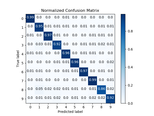
2、多类别ROC曲线
import scikitplot as skplt
nb = GaussianNB()
nb = nb.fit(X_train, y_train)
y_probas = nb.predict_proba(X_test)

skplt.metrics.plot_roc(y_test, y_probas)
plt.show()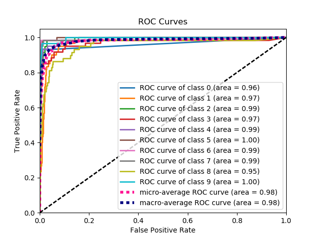
3、KS 统计图
import scikitplot as skplt
lr = LogisticRegression()
lr = lr.fit(X_train, y_train)
y_probas = lr.predict_proba(X_test)

skplt.metrics.plot_ks_statistic(y_test, y_probas)
plt.show()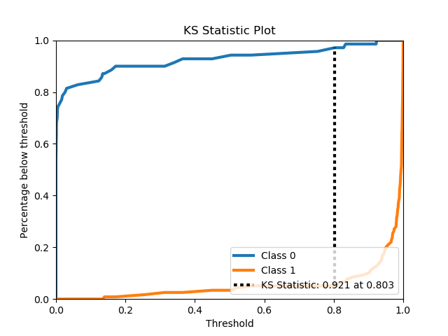
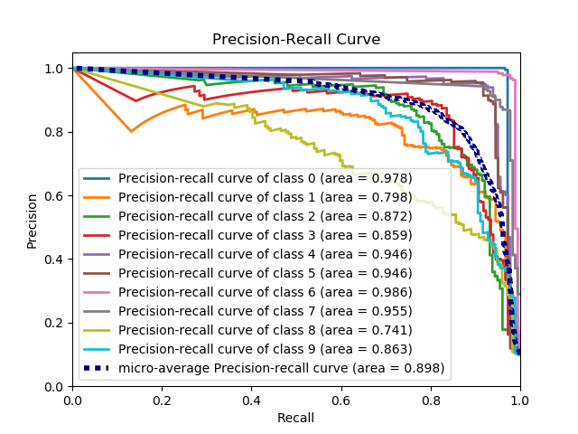
4、PR曲线
import scikitplot as skplt
nb = GaussianNB()
nb.fit(X_train, y_train)
y_probas = nb.predict_proba(X_test)

skplt.metrics.plot_precision_recall(y_test, y_probas)
plt.show()

"""
import scikitplot as skplt
# 设置全局字体为新罗马字体和修改字体大小(在开始绘图之前,即置于顶部)
plt.rcParams['font.family'] = 'Times New Roman'
plt.rcParams['font.size'] = 12

skplt.metrics.plot_precision_recall(y_test, y_score,figsize=(6, 4.5),
                                    title="Precision-recall curve of IP dataset")
plt.legend(prop={'size': 8.5})
plt.show()
"""
5、silhouette analysis分析
import scikitplot as skplt
kmeans = KMeans(n_clusters=4, random_state=1)
cluster_labels = kmeans.fit_predict(X)

skplt.metrics.plot_silhouette(X, cluster_labels)
plt.show()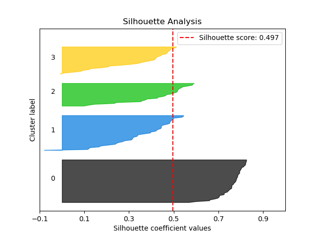
6、分类器的矫正曲线
import scikitplot as skplt
rf = RandomForestClassifier()
lr = LogisticRegression()
nb = GaussianNB()
svm = LinearSVC()
rf_probas = rf.fit(X_train, y_train).predict_proba(X_test)
lr_probas = lr.fit(X_train, y_train).predict_proba(X_test)
nb_probas = nb.fit(X_train, y_train).predict_proba(X_test)
svm_scores = svm.fit(X_train, y_train).decision_function(X_test)
probas_list = [rf_probas, lr_probas, nb_probas, svm_scores]
clf_names = ['Random Forest', 'Logistic Regression',
              'Gaussian Naive Bayes', 'Support Vector Machine']

skplt.metrics.plot_calibration_curve(y_test,
                                      probas_list,
                                      clf_names)
plt.show()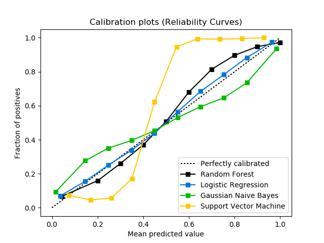
2)模型可视化
1、不同训练样本下的训练和测试学习曲线图
import scikitplot as skplt
rf = RandomForestClassifier()

skplt.estimators.plot_learning_curve(rf, X, y)
plt.show()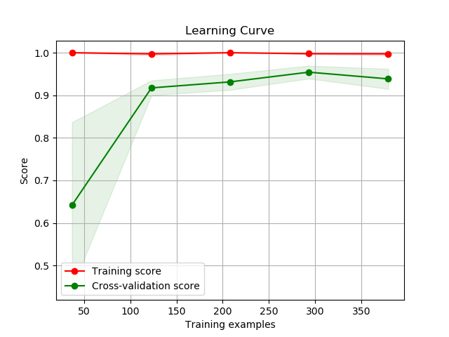
2、可视化特征重要性
import scikitplot as skplt
rf = RandomForestClassifier()
rf.fit(X, y)

skplt.estimators.plot_feature_importances(
     rf, feature_names=['petal length', 'petal width',
                        'sepal length', 'sepal width'])
plt.show()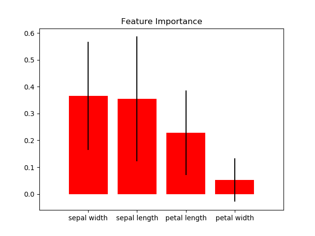
3)聚类可视化
1、聚类的肘步图
import scikitplot as skplt
kmeans = KMeans(random_state=1)

skplt.cluster.plot_elbow_curve(kmeans, cluster_ranges=range(1, 30))
plt.show()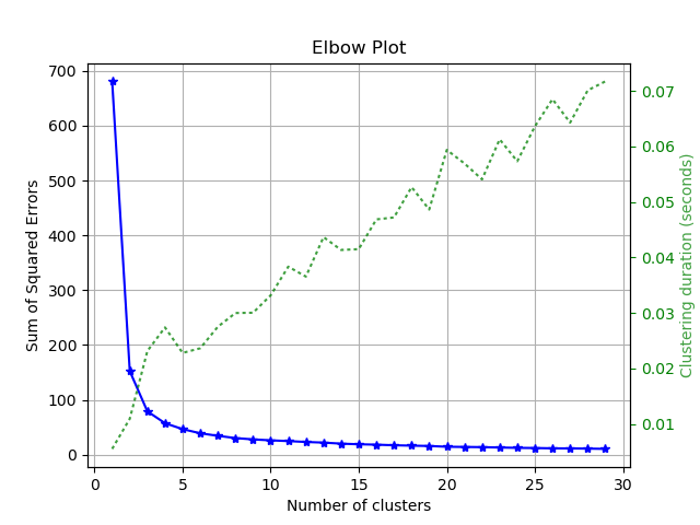
4)降维可视化
1、 PCA 分量的解释方差比
import scikitplot as skplt
pca = PCA(random_state=1)
pca.fit(X)

skplt.decomposition.plot_pca_component_variance(pca)
>plt.show()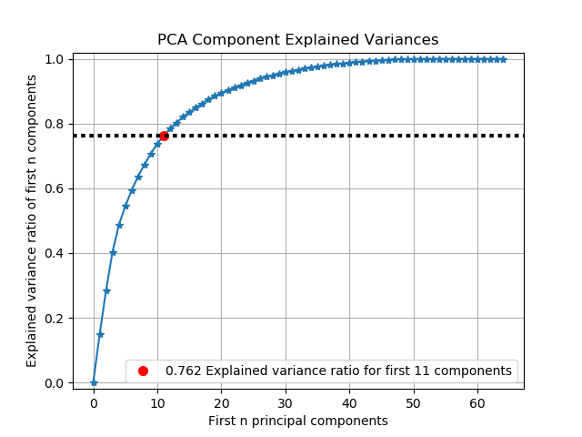
2、PCA降维之后的散点图
import scikitplot as skplt
pca = PCA(random_state=1)
pca.fit(X)

skplt.decomposition.plot_pca_2d_projection(pca, X, y)
plt.show()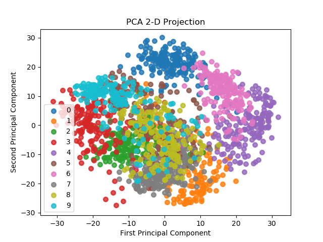


 1万+
1万+


 被折叠的 条评论
为什么被折叠?
被折叠的 条评论
为什么被折叠?
 到【灌水乐园】发言


