


设立这个模块的初衷是为了方便一些使用python画图的小伙伴,不太会画图,下面我提供的代码是可以直接使用的,把下面代码复制下来按照我给的注释进行几个参数修改即可使用,输出高质量的科研图表。
一、折线图基础版
import pandas as pd
import matplotlib.pyplot as plt
import matplotlib.colors as mcolors

# 数据准备
# 假设 是用example.xlsx文件
df = pd.read_excel('mae.xlsx')  # 读取数据,替换为你的文件路径
A = df.to_numpy()  # 转换为 NumPy 数组

# 定义线上点的x坐标
x = [0.1 * i for i in range(1, 11)]

# 分别定义不同线条上点的y坐标
samp1 = A[1:11, 2]
samp2 = A[14:24, 2]
samp3 = A[27:37, 2]
samp4 = A[40:50, 2]
samp5 = A[53:63, 2]

# 颜色定义
# 使用预定义的颜色或者定义自己的颜色
colors = list(mcolors.TABLEAU_COLORS)  # 这里用了 Tableau 的颜色,你可以选择其他的或自定义

# 图片尺寸设置(单位:英寸),1厘米约等于0.393701英寸
figureWidth, figureHeight = 12 * 0.393701, 8 * 0.393701

# 线条绘制
plt.figure(figsize=(figureWidth, figureHeight))
#RGB颜色数组定义
colors = ['#ffe119', '#4363d8', '#a9a9a9', '#ffffff', '#000000']
# 分别绘制直线
plt.plot(x, samp1, linestyle='--', marker='d', color=colors[0])
plt.plot(x, samp2, linestyle='--', marker='o', color=colors[1])
plt.plot(x, samp3, linestyle='--', marker='^', color=colors[2])
plt.plot(x, samp4, linestyle='--', marker='v', color=colors[3])
plt.plot(x, samp5, linestyle='--', marker='d', color=colors[4])

# 坐标区调整
plt.grid(True)
plt.xlabel('Point spacing (m)')
plt.ylabel('MAE (m)')
plt.xlim(0, 1.1)
plt.ylim(0.1, 0.35)
plt.xticks([i * 0.1 for i in range(12)])
plt.yticks([i * 0.05 for i in range(8)])
#loc='upper right', 'upper left', 'lower left', 'lower right',
#'right', 'center left', 'center right', 'lower center', 'upper center', 'center'
#best可以自动给出最好的
#ncol设置一行多少个图例
plt.legend(['samp1', 'samp2', 'samp3', 'samp4', 'samp5'], loc='best',ncol=3)
plt.gca().set_facecolor([1, 1, 1])

# 图片输出
plt.savefig('eg.png', dpi=300)
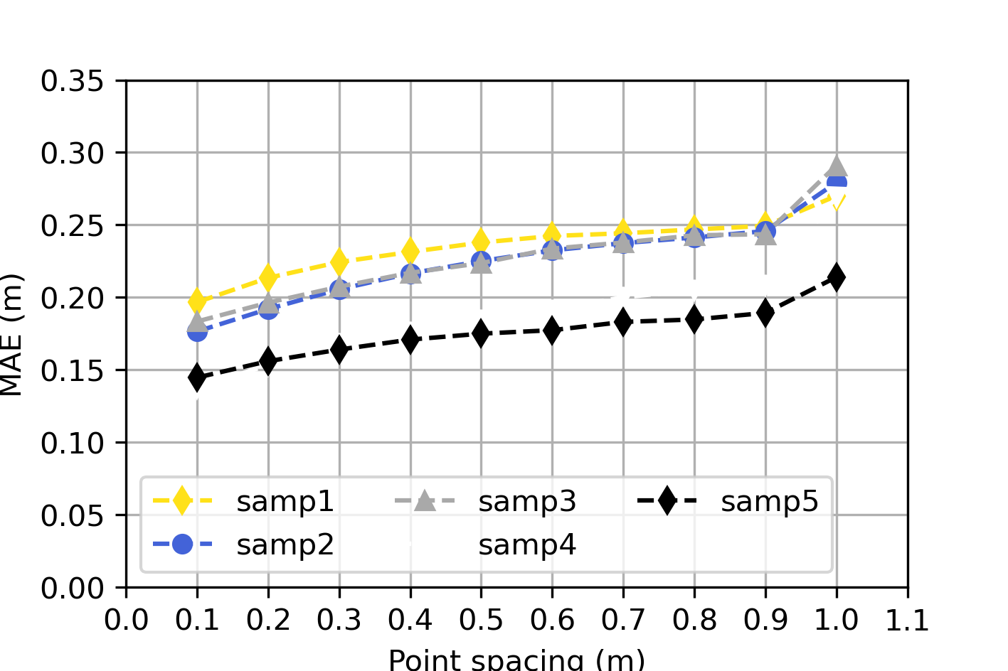
效果实例:
二、函数三维折线图
import numpy as np
import matplotlib.pyplot as plt
from matplotlib.colors import to_rgba
from cycler import cycler

# 定义函数
def xt(t):
    return np.exp(-t / 9) * np.cos(6 * t)

def yt(t):
    return np.exp(-t / 9) * np.sin(6 * t)

def zt(t):
    return t

# 颜色定义
# 颜色可能需要根据具体的颜色代码调整,这里给了很多你们可以自己调
colors = ['#ffe119', '#4363d8', '#f58231', '#dcbeff', '#800000', '#000075', '#a9a9a9', '#ffffff', '#000000']
# 设置颜色循环
plt.rc('axes', prop_cycle=(cycler('color', colors)))

# 创建图形和轴
fig = plt.figure()
ax = fig.add_subplot(111, projection='3d')

# 绘图
t = np.linspace(0, 2*np.pi, 1000)
ax.plot(xt(t), yt(t), zt(t), label='samp1', linewidth=2.5)

t = np.linspace(2*np.pi, 4*np.pi, 1000)
ax.plot(xt(t), yt(t), zt(t), label='samp2', linewidth=2.5)

t = np.linspace(4*np.pi, 6*np.pi, 1000)
ax.plot(xt(t), yt(t), zt(t), label='samp3', linewidth=2.5)

t = np.linspace(6*np.pi, 8*np.pi, 1000)
ax.plot(xt(t), yt(t), zt(t), label='samp4', linewidth=2.5)

# 设置标题和坐标轴标签
ax.set_title('biaoti', fontweight='bold', fontsize=12)
ax.set_xlabel('x', fontsize=10)
ax.set_ylabel('y', fontsize=10)
ax.set_zlabel('z', fontsize=10)

# 设置图例
ax.legend(loc='best', fontsize=10)

# 设置网格
ax.grid(True)

# 设置背景颜色
ax.set_facecolor('white')

# 设置图形尺寸和保存
fig.set_size_inches(8, 6)  # 这里你可以调整尺寸
plt.savefig('test.png', dpi=300)

# 显示图形
plt.show()
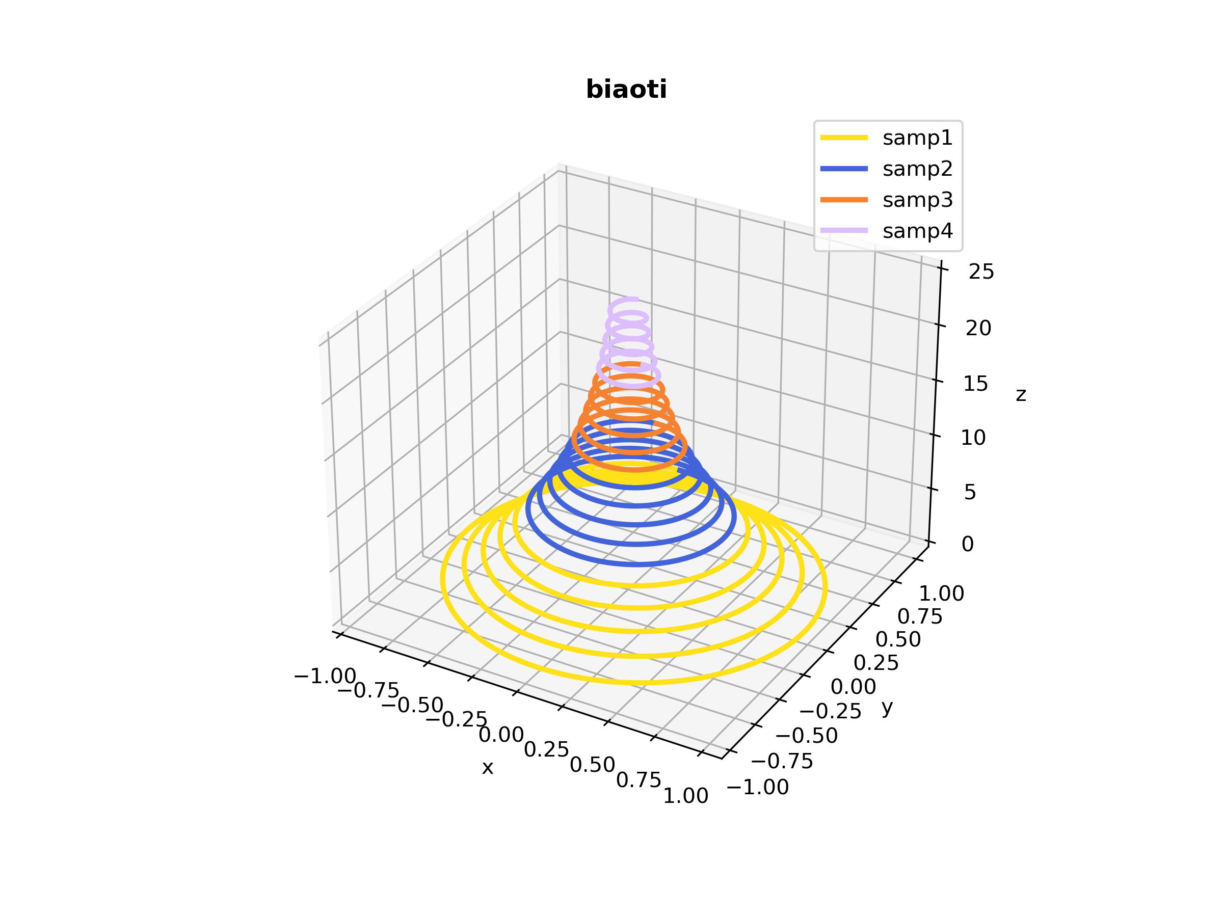
效果展示:
三、矩阵热力图
import numpy as np
import matplotlib.pyplot as plt
import seaborn as sns

# 读取数据
rho = np.array([
    [1.00, 0.16, 0.29, 0.05, 0.34, 0.41, 0.29, 0.22, 0.25, 0.56],
    [0.16, 1.00, 0.44, 0.29, 0.13, 0.12, 0.19, 0.01, 0.26, 0.07],
    [0.29, 0.44, 1.00, 0.08, 0.32, 0.35, 0.36, 0.20, 0.02, 0.27],
    [0.05, 0.29, 0.08, 1.00, 0.21, 0.20, 0.26, 0.24, 0.20, 0.06],
    [0.34, 0.13, 0.32, 0.21, 1.00, 0.86, 0.45, 0.61, 0.06, 0.43],
    [0.41, 0.12, 0.35, 0.20, 0.86, 1.00, 0.54, 0.65, 0.17, 0.54],
    [0.29, 0.41, 0.36, 0.26, 0.45, 0.54, 1.00, 0.37, 0.14, 0.26],
    [0.22, 0.01, 0.34, 0.13, 0.32, 0.21, 0.37, 1.00, 0.03, 0.30],
    [0.25, 0.26, 0.13, 0.32, 0.35, 0.02, 0.14, 0.03, 1.00, 0.52],
    [0.56, 0.07, 0.27, 0.06, 0.43, 0.54, 0.26, 0.30, 0.52, 1.00]
])

# 转换数据为DataFrame
import pandas as pd
df = pd.DataFrame(data=rho, columns=['S1', 'S2', 'S3', 'S4', 'S5', 'S6', 'S7', 'S8', 'S9', 'S10'])

# 创建热图
plt.figure(figsize=(8, 6))
sns.set(font_scale=0.8)
ax = sns.heatmap(df, cmap="viridis", annot=True, fmt=".2f", linewidths=0.5, cbar=True, annot_kws={"size": 8})

# 添加标题和标签
ax.set_title('Correlation Coefficient')
ax.set_xlabel('XLabel')
ax.set_ylabel('YLabel')

# 设置背景颜色
plt.gca().set_facecolor((1, 1, 1))

# 保存图片
plt.savefig('test.png', dpi=300, bbox_inches='tight')

# 显示图形
plt.show()
四、气泡矩阵
import numpy as np

# 生成示例数据
data = np.array([[10, 20, 30, 40, 50],
                 [60, 70, 80, 90, 100],
                 [110, 120, 130, 140, 150],
                 [160, 170, 180, 190, 200],
                 [210, 220, 230, 240, 250]])


import numpy as np
import matplotlib.pyplot as plt
from matplotlib.offsetbox import AnchoredText
from matplotlib.colors import LinearSegmentedColormap

# 读取数据
#data = np.load('data.npy')  # 假设数据保存为Numpy数组

# 生成矩阵坐标数据
r, c = data.shape
x = np.arange(0, c)  # 注意这里从0开始
y = np.arange(0, r)  # 注意这里从0开始
xx, yy = np.meshgrid(x, y)
yy = np.flipud(yy)
f1 = data.flatten() * 10
f2 = data.flatten()

# 颜色定义
cmap = LinearSegmentedColormap.from_list('TheColor', [(1.0, 0.0, 0.0), (0.0, 0.0, 1.0)], N=2068)

# 创建图形和子图
fig, ax = plt.subplots(figsize=(8, 6))
bubble = ax.scatter(xx.flatten(), yy.flatten(), c=f1, s=f2, cmap=cmap, marker='o', alpha=0.8)

# 添加标题和标签
ax.set_title('BubbleMatrixPlus Plot')
ax.set_xlabel('XAxis')
ax.set_ylabel('YAxis')

# 调整坐标轴
ax.axis('equal')
ax.grid(True)
ax.tick_params(axis='both', which='both', direction='in', length=0, width=0, colors='k')
ax.set_xticks(np.arange(0, c))
ax.set_yticks(np.arange(0, r))
ax.set_xlim(0, c)
ax.set_ylim(0, r)
ax.set_xticklabels(['A1', 'A2', 'A3', 'A4', 'A5'])
ax.set_yticklabels(['B1', 'B2', 'B3', 'B4', 'B5'])
plt.xticks(rotation=90)

# 添加图例
cb = plt.colorbar(bubble)
cb.set_label('Feature2', rotation=270, labelpad=20)
cb.ax.yaxis.set_ticks_position('left')

# 气泡尺寸
bubble_legend = AnchoredText("Feature1", loc="upper left", frameon=False)
ax.add_artist(bubble_legend)

# 字体和字号
plt.rc('font', family='Arial', size=10)
ax.title.set_fontsize(13)
ax.title.set_fontweight('bold')

# 设置背景颜色
fig.patch.set_facecolor((1, 1, 1))

# 保存图片
fig.savefig('test.png', dpi=300, bbox_inches='tight')

# 显示图形
plt.show()
五、三维曲面图
import numpy as np
import matplotlib.pyplot as plt
from mpl_toolkits.mplot3d import Axes3D

# 构造函数
def fun(x, y):
    return np.sin(1.5 * x) + np.sin(1.5 * y) - (x**2 + y**2) / 10

# 创建网格
x = np.linspace(-10, 10, 100)
y = np.linspace(-10, 10, 100)
X, Y = np.meshgrid(x, y)
Z = fun(X, Y)

# 创建图形
fig = plt.figure(figsize=(8, 6))
ax = fig.add_subplot(111, projection='3d')

# 绘制网格
surf = ax.plot_surface(X, Y, Z, cmap='viridis', linewidth=1.2, antialiased=True)

# 添加标题和标签
ax.set_title('FMesh Plot')
ax.set_xlabel('x')
ax.set_ylabel('y')
ax.set_zlabel('z')

# 添加颜色条
fig.colorbar(surf)

# 调整坐标轴
ax.grid(True)
ax.tick_params(axis='both', which='both', direction='out', length=3, width=1, colors='k')

# 设置字体和字号
plt.rcParams['font.family'] = 'Arial'
plt.rcParams['font.size'] = 11
ax.set_title('FMesh Plot', fontsize=12, fontweight='bold')

# 设置背景颜色
fig.patch.set_facecolor((1, 1, 1))

# 保存图片
fig.savefig('test.png', dpi=300, bbox_inches='tight')

# 显示图形
plt.show()

六、横向柱状图
import numpy as np
import matplotlib.pyplot as plt
from matplotlib.colors import LinearSegmentedColormap

# 数据准备
x = np.array([1980, 1990, 2000])
y = np.array([
    [50, 63, 52],
    [55, 50, 48],
    [30, 20, 44]
])

# 颜色定义
C1 = LinearSegmentedColormap.from_list('Color1', [(0.0, 0.0, 0.0), (0.0, 0.0, 1.0)], N=193)
C2 = LinearSegmentedColormap.from_list('Color2', [(0.0, 0.0, 0.0), (0.0, 1.0, 0.0)], N=194)
C3 = LinearSegmentedColormap.from_list('Color3', [(0.0, 0.0, 0.0), (1.0, 0.0, 0.0)], N=195)

# 创建图形和子图
fig, ax = plt.subplots()

# 原始横向柱状图
for i in range(len(x)):
    GO = ax.barh(x[i], y[i], height=0.8, edgecolor='k')
    GO[0].set_facecolor(C1(i / len(x)))
    GO[1].set_facecolor(C2(i / len(x)))
    GO[2].set_facecolor(C3(i / len(x)))

plt.xlabel('Snowfall')
plt.ylabel('Year')

# 图片输出
plt.savefig('barh_plot.png', dpi=300, bbox_inches='tight')
plt.show()


 680
680


 被折叠的 条评论
为什么被折叠?
被折叠的 条评论
为什么被折叠?
 到【灌水乐园】发言


