


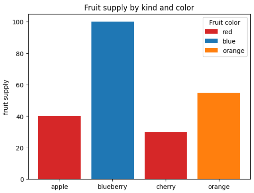
简单柱状图的绘制
下面的示例展示了如何使用 bar 的 color 和 label 参数来控制条形图的颜色和图例项。请注意,带下划线的标签不会显示在图例中。
import matplotlib.pyplot as plt

fig, ax = plt.subplots()

fruits = ['apple', 'blueberry', 'cherry', 'orange']
counts = [40, 100, 30, 55]
bar_labels = ['red', 'blue', '_red', 'orange']
bar_colors = ['tab:red', 'tab:blue', 'tab:red', 'tab:orange']

ax.bar(fruits, counts, label=bar_labels, color=bar_colors)

ax.set_ylabel('fruit supply')
ax.set_title('Fruit supply by kind and color')
ax.legend(title='Fruit color')

plt.show()
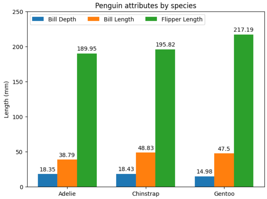
带标签的分组条形图
此示例演示如何创建分组条形图以及如何使用标签对条形进行批注。
# data from https://allisonhorst.github.io/palmerpenguins/

import matplotlib.pyplot as plt
import numpy as np

species = ("Adelie", "Chinstrap", "Gentoo")
penguin_means = {
    'Bill Depth': (18.35, 18.43, 14.98),
    'Bill Length': (38.79, 48.83, 47.50),
    'Flipper Length': (189.95, 195.82, 217.19),
}

x = np.arange(len(species))  # the label locations
width = 0.25  # the width of the bars
multiplier = 0

fig, ax = plt.subplots(layout='constrained')

for attribute, measurement in penguin_means.items():
    offset = width * multiplier
    rects = ax.bar(x + offset, measurement, width, label=attribute)
    ax.bar_label(rects, padding=3)
    multiplier += 1

# Add some text for labels, title and custom x-axis tick labels, etc.
ax.set_ylabel('Length (mm)')
ax.set_title('Penguin attributes by species')
ax.set_xticks(x + width, species)
ax.legend(loc='upper left', ncols=3)
ax.set_ylim(0, 250)

plt.show()
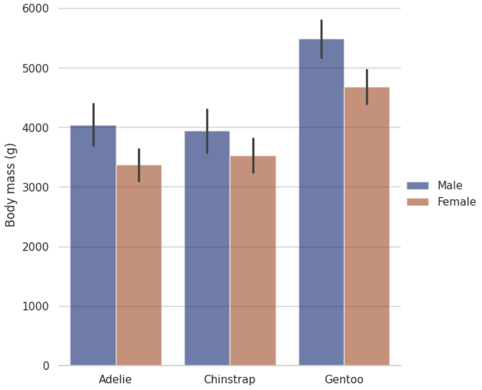
分组条形图
seaborn components used: set_theme(), load_dataset(), catplot()
import seaborn as sns
sns.set_theme(style="whitegrid")

penguins = sns.load_dataset("penguins")

# Draw a nested barplot by species and sex
g = sns.catplot(
    data=penguins, kind="bar",
    x="species", y="body_mass_g", hue="sex",
    errorbar="sd", palette="dark", alpha=.6, height=6
)
g.despine(left=True)
g.set_axis_labels("", "Body mass (g)")
g.legend.set_title("")
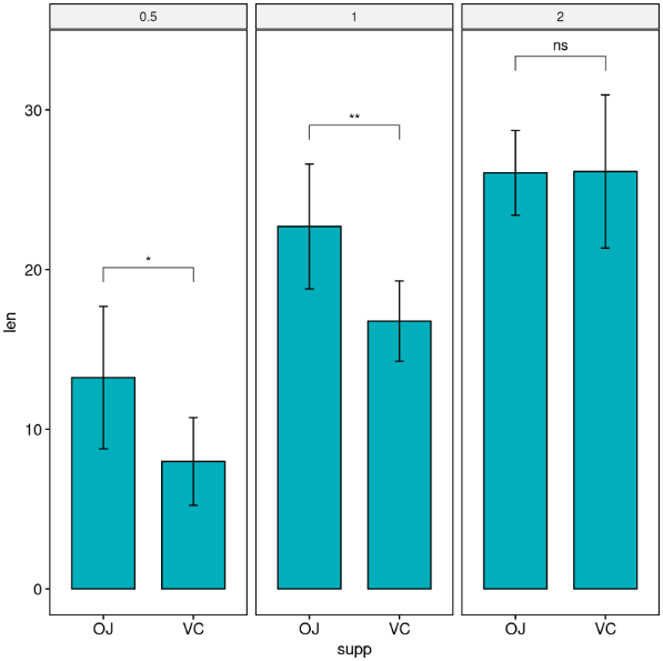
绘制带有显著性的柱状图
前提条件
确保已安装以下 R 软件包:
-
tidyverse 用于数据操作和可视化的 -
ggpubr 用于创建易于出版的图表 -
rstatix 提供管道式 R 函数,便于进行统计分析。
library(ggpubr)
library(rstatix)


# 准备数据

# Transform `dose` into factor variable
df <- ToothGrowth
df$dose <- as.factor(df$dose)
# Add a random grouping variable
df$group <- factor(rep(c("grp1", "grp2"), 30))
head(df, 3)
按面板绘制包含两组的多面板图
条形图函数中指定了 add = “mean_sd ”选项,用于创建带误差条(均值 +/- SD)的条形图。
您需要在 add_xy_position() 中使用选项 fun 指定相同的汇总统计函数来自动计算 p 值标签位置。
# Facet wrap by one variable

stat.test <- df %>%
  group_by(dose) %>%
  t_test(len ~ supp) %>%
  adjust_pvalue(method = "bonferroni") %>%
  add_significance()
stat.test

# Create a bar plot with error bars (mean +/- sd)
bp <- ggbarplot(
  df, x = "supp", y = "len", add = "mean_sd",
  fill = "#00AFBB", facet.by = "dose"
  )

# Add p-values onto the bar plots
stat.test <- stat.test %>% add_xy_position(fun = "mean_sd", x = "supp")
bp + stat_pvalue_manual(stat.test)
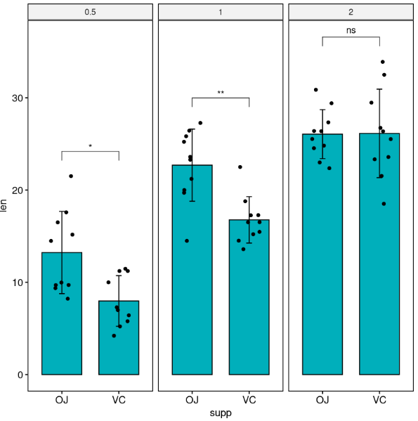
带有数据点(jitter points)的条形图
在计算 p 值标签位置时,需要指定 fun =“max”,这样第一个括号将从数据点的最大值开始。
这样可以避免数据点与括号重叠。
# Create a bar plot with error bars (mean +/- sd)
bp <- ggbarplot(
  df, x = "supp", y = "len", add = c("mean_sd", "jitter"),
  fill = "#00AFBB", facet.by = "dose"
  )

# Add p-values onto the bar plots
stat.test <- stat.test %>% add_xy_position(fun = "max", x = "supp")
bp + stat_pvalue_manual(stat.test)
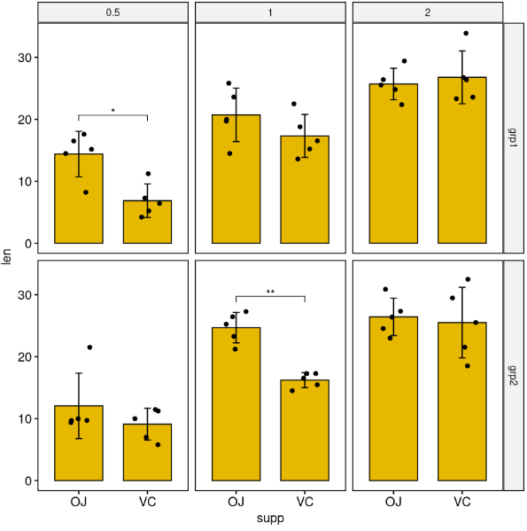
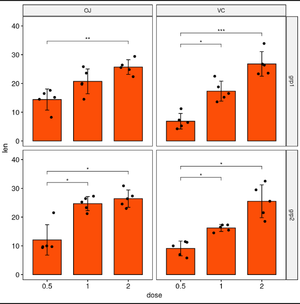
通过两个变量对网格进行切分
按dose和group变量分格,在 x 轴上比较supp变量的水平。
stat.test <- df %>%
  group_by(group, dose) %>%
  t_test(len ~ supp) %>%
  adjust_pvalue(method = "bonferroni") %>%
  add_significance()
stat.test

# Create bar plots with significance levels
# Hide ns (non-significant)
stat.test <- stat.test %>% add_xy_position(x = "supp", fun = "mean_sd")
ggbarplot(
  df, x = "supp", y = "len", fill = "#E7B800",
  add = c("mean_sd", "jitter"), facet = c("group", "dose")
  ) +
  stat_pvalue_manual(stat.test, hide.ns = TRUE)
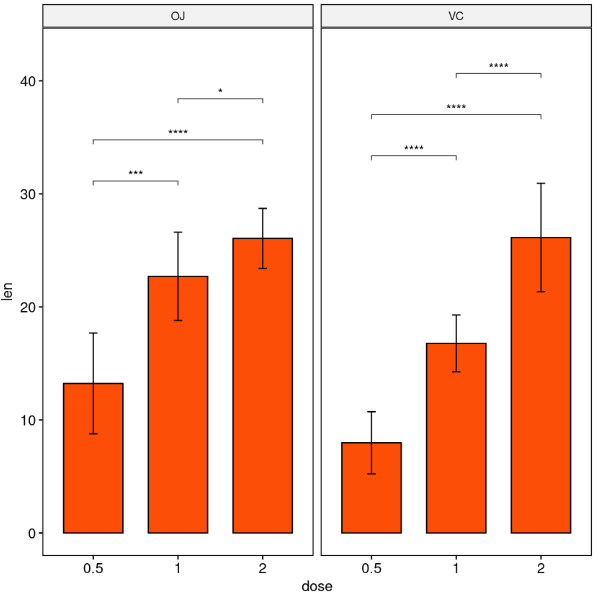
按面板绘制包含三个或更多组的多面板图
按一个变量进行面状包络
进行所有成对比较
按supp变量分组,然后对dose变量的水平进行成对比较。
stat.test <- df %>%
  group_by(supp) %>%
  t_test(len ~ dose)
stat.test

# Bar plot with p-values
# Add 10% space on the y-axis above the box plots
stat.test <- stat.test %>% add_y_position(fun = "mean_sd")
ggbarplot(
  df, x = "dose", y = "len", fill = "#FC4E07",
  add = "mean_sd", facet.by = "supp"
  ) +
  stat_pvalue_manual(stat.test,  label = "p.adj.signif", tip.length = 0.01) +
  scale_y_continuous(expand = expansion(mult = c(0.05, 0.1)))
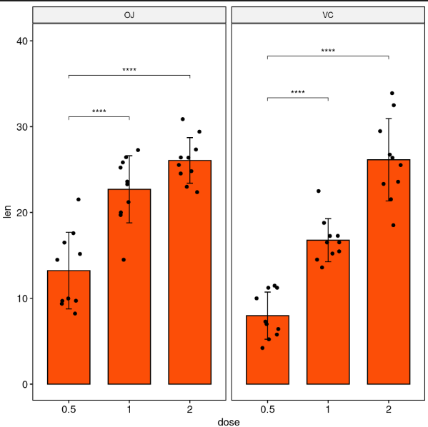
与参照组进行配对比较
stat.test <- df %>%
  group_by(supp) %>%
  t_test(len ~ dose, ref.group = "0.5")
stat.test

# Bar plot with p-values
# Add 10% space on the y-axis above the box plots
stat.test <- stat.test %>% add_y_position(fun = "mean_sd")
ggbarplot(
  df, x = "dose", y = "len", fill = "#FC4E07",
  add = c("mean_sd", "jitter"), facet.by = "supp"
  ) +
  stat_pvalue_manual(stat.test,  label = "p.adj.signif", tip.length = 0.01) +
  scale_y_continuous(expand = expansion(mult = c(0.05, 0.1)))
通过两个变量对网格进行分面
通过supp变量和group变量进行分格,并在 x 轴上比较dose变量的水平。
stat.test <- df %>%
  group_by(group, supp) %>%
  t_test(len ~ dose) %>%
  adjust_pvalue(method = "bonferroni") %>%
  add_significance()
stat.test

# Create bar plots with significance levels
# Hide ns (non-significant)
# Add 15% space between labels and the plot top border
stat.test <- stat.test %>% add_xy_position(x = "dose", fun = "mean_sd")
ggbarplot(
  df, x = "dose", y = "len", fill = "#FC4E07",
  add = c("mean_sd", "jitter"), facet = c("group", "supp")
  ) +
  stat_pvalue_manual(stat.test, hide.ns = TRUE) +
  scale_y_continuous(expand = expansion(mult = c(0.05, 0.15)))
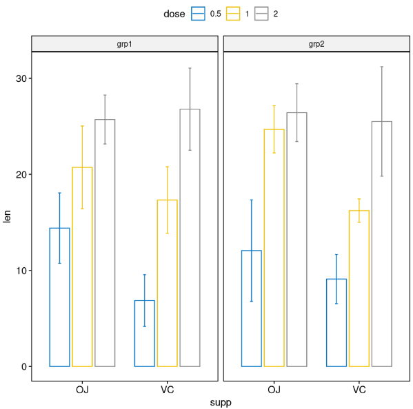
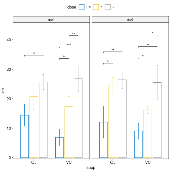
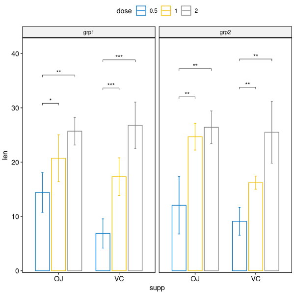
分面分组绘图
# Simple plots
# Bar plots
bp <- ggbarplot(
  df, x = "supp", y = "len", color = "dose",
  palette = "jco", add = "mean_sd",
  position = position_dodge(0.8),
  facet.by = "group"
  )
bp
# Perform all pairwise comparisons

stat.test <- df %>%
  group_by(supp, group) %>%
  t_test(len ~ dose)
stat.test

# Bar plots with p-values
stat.test <- stat.test %>%
  add_xy_position(x = "supp", fun = "mean_sd", dodge = 0.8)
bp +
  stat_pvalue_manual(
    stat.test, label = "p.adj.signif", tip.length = 0.01,
    hide.ns = TRUE
    ) +
  scale_y_continuous(expand = expansion(mult = c(0.01, 0.1)))
# Pairwise comparisons against a reference group

stat.test <- df %>%
  group_by(supp, group) %>%
  t_test(len ~ dose, ref.group = "0.5")
stat.test

# Bar plots with p-values
stat.test <- stat.test %>%
  add_xy_position(x = "supp", fun = "mean_sd", dodge = 0.8)
bp +
  stat_pvalue_manual(
    stat.test, label = "p.adj.signif", tip.length = 0.01
    ) +
  scale_y_continuous(expand = expansion(mult = c(0.01, 0.1)))
参考:
[1] https://www.datanovia.com/en/blog/how-to-add-p-values-to-ggplot-facets/#pairwise-comparisons-against-a-reference-group-1
[2] https://seaborn.pydata.org/examples/index.html
[3] https://matplotlib.org/stable/gallery/index.html
更多 生物信息学 信息,请关注微信公众号:Life 生命
持续更新中。。。

本文由 mdnice 多平台发布


 8384
8384

 被折叠的 条评论
为什么被折叠?
被折叠的 条评论
为什么被折叠?
 到【灌水乐园】发言


