


figma button
Modern web solutions use responsive layouts that adapt to different devices, and it can be hard to design for it if you haven’t coded them yourself. If you setup your Design System Components in Figma correctly, you can make designing for responsiveness easier to understand and quicker to do. I’m going to show you how to design responsive Figma Components using the ‘double-glazing’ technique, and some limitations with a step-by-step worked example.
现代的Web解决方案使用适应于不同设备的响应式布局,如果您自己没有编写代码,可能很难为其设计。 如果在Figma中正确设置了“设计系统组件”,则可以使响应设计更加容易理解和快速进行。 我将向您展示如何使用“双层玻璃”技术设计响应式Figma组件,并通过逐步的示例演示一些限制。
所需技术 (Techniques required)
To create your responsive Components, you need to have some mastery of these concepts:
要创建您的自适应组件 ,您需要掌握以下概念:
- Frames and Groups 框架和组
When these three techniques are combined together effectively, you can create a flexible Component set that enables you to design for different screens at speed. I’ll be using the Breadcrumb UI pattern as a worked example.
当这三种技术有效地结合在一起时,您可以创建一个灵活的组件集,使您能够快速设计不同的屏幕。 我将使用面包屑UI模式作为工作示例。
基本面包屑 (Basic breadcrumbs)
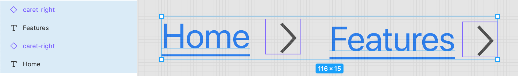
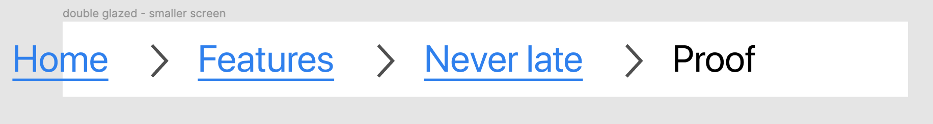
Let’s create a two-depth Breadcrumb Component. Start by creating a text layer, adding some text such as ‘Home’, and making it look like a hyperlink. Draw or import a right-caret icon, then duplicate the hyperlink text layers and the right-caret icons until you have two of each. It should look like this:
让我们创建一个两层深度的面包屑组件。 首先创建一个文本层,添加一些文本,例如“ Home”,并使它看起来像超链接。 绘制或导入右尖号图标,然后复制超链接文本层和右尖号图标,直到每个都有两个。 它看起来应该像这样:
Protip: you can highlight the text and icon layers, hold down the
Optionbutton on Mac ofAlton Windows, and click and drag them to create duplicates.提示:您可以突出显示文本和图标层,在Windows的
AltMac上AltOption键,然后单击并拖动它们以创建重复项。
Next, add in one more text layer at the end with regular body text. You should now have a mix of five layers—don’t worry too much about alignment just yet.
接下来,在末尾添加一个带有常规正文的文本层。 现在,您应该混合使用五层-不必太担心对齐问题。
添加自动布局 (Adding a Auto layout)
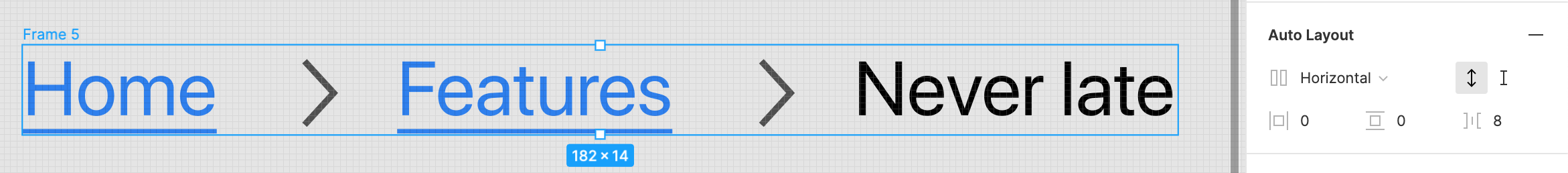
Next we want to automate spacing with Auto Layout. Highlight all of those items and Frame this selection with the right-click menu, or use the keyboard shortcutCmd + Option + G on Mac or Ctrl + Alt + G on Windows. With this new Frame still selected, click the ‘Auto layout’ option in the Design tab on the right. Configure the spacing options until it looks right; I like to use a power of two number. The table below shows you how that scale works.
接下来,我们要使用“自动布局”自动执行间距。 突出显示所有这些项目,然后在右键菜单上用Cmd + Option + G显示此选择,或者在Mac上使用键盘快捷键Cmd + Option + G ,在Windows上使用Ctrl + Alt + G 。 在仍然选择此新框架的情况下,单击右侧“设计”选项卡中的“自动布局”选项。 配置间距选项,直到看起来正确为止; 我喜欢使用两个数的幂。 下表显示了该秤的工作原理。
It should now look something like this, and we can now place it on various screen sizes to craft our mockups and prototypes. If you edit the text inside, it’ll adjust the spacing automatically to fit.
现在看起来应该是这样,我们现在可以将其放置在各种屏幕尺寸上,以制作我们的模型和原型。 如果您在其中编辑文本,它将自动调整间距以适合。
Most people would turn this into a Component, stop here and rely on careful placement of the breadcrumb to align it to different sizes. We can take this one step further to make our lives even easier.
大多数人会把它变成一个组件,在这里停下来,然后依靠仔细放置面包屑将其调整为不同的大小。 我们可以更进一步,使我们的生活更加轻松。
容器概念 (The Container concept)
With Frontend UI systems such as Bootstrap there is a basic building block called the layout Container. When screen sizes get too wide it can make browsing and reading content tricky, as your eyes will strain and require you to move your neck to read the content. Containers have break points and go to a maximum width in order to mitigate this problem.
对于诸如Bootstrap之类的前端UI系统,有一个称为布局容器的基本构建块。 当屏幕尺寸过大时,可能会使浏览和阅读内容变得棘手,因为您的眼睛会紧张,需要您动动脖子才能阅读内容。 容器具有断点,并达到最大宽度以减轻此问题。

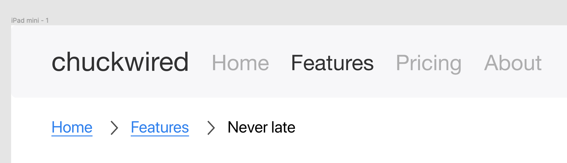
In fact, you’re seeing this concept in practice on this very Medium article right now. You can match this behaviour in your Breadcrumb Component by adding what I like to call the ‘double-glazing’ technique.
实际上,您现在在这篇非常中等的文章中已经在实践中看到了这个概念。 通过添加我喜欢的“双层玻璃”技术,可以在面包屑组件中匹配此行为。
双层面包屑 (Double-glazed Breadcrumbs)
When set up correctly, this technique allows you to resize the breadcrumbs with respect to your Container. It’s important to note that this ties it to a single screen size — here we’ll focus on a desktop Container of 980px.
正确设置后,此技术可让您根据容器调整面包屑的大小。 重要的是要注意,这将它与单个屏幕尺寸相关联-在这里,我们将重点放在980px的桌面Container上。
First, turn your Breadcrumbs into a Component and make a new instance of it. You can do a copy-paste from your Master Component or hold down Option on Mac or Alt on Windows and drag.
首先,将面包屑变成一个组件,并为其创建新实例。 您可以从主组件进行复制粘贴,也可以在Mac上按住Option或在Windows上Alt并拖动。
Next you want to Frame this instance and name it ‘Internal Frame’. Set it to 980px in width, then Frame this again and name this new Frame ‘External Frame’.
接下来,您要构图此实例并将其命名为“ Internal Frame”。 将其设置为980px的宽度,然后再次对其进行构图,并将其命名为“外部框架”。
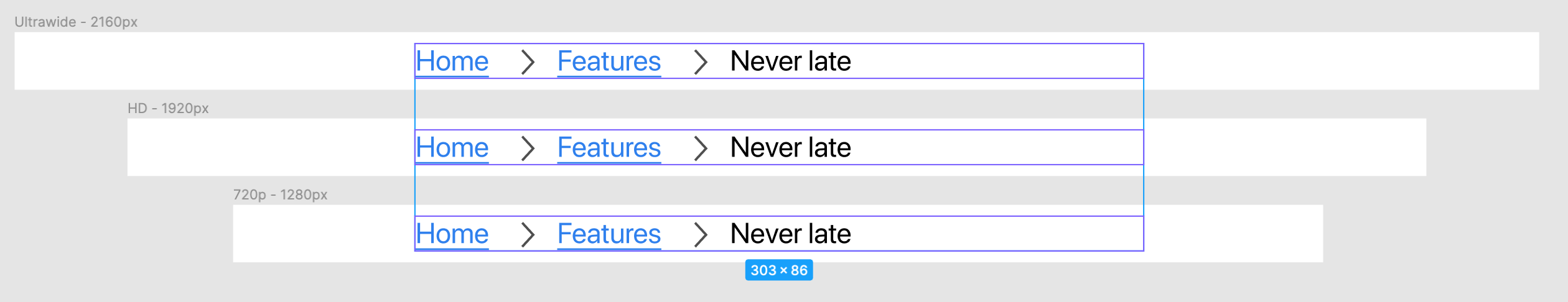
Finally you’ll want to stretch the External Frame a little wider, and move the Internal Frame to the center. Below is a screenshot showing how each stage should have looked from top to bottom.
最后,您需要将外部框架拉伸得更宽一些,然后将内部框架移动到中心。 下面的屏幕截图显示了每个阶段从上到下的外观。
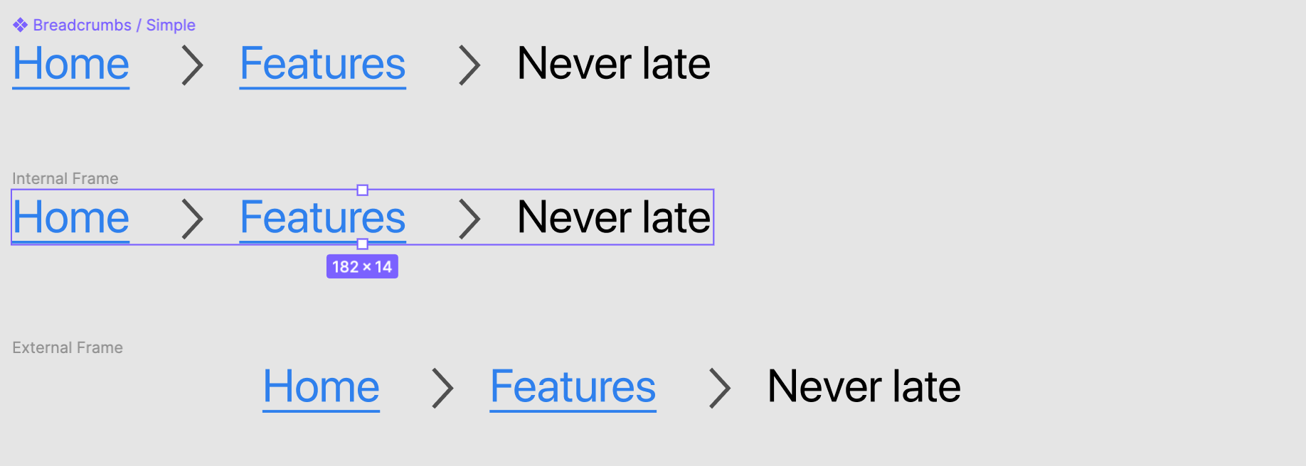
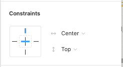
To complete the Container effect, you will want to set the Constraints of the Internal Frame to be in the Center horizontally.
要完成“容器”效果,您需要将“内部框架的约束”设置为水平居中。
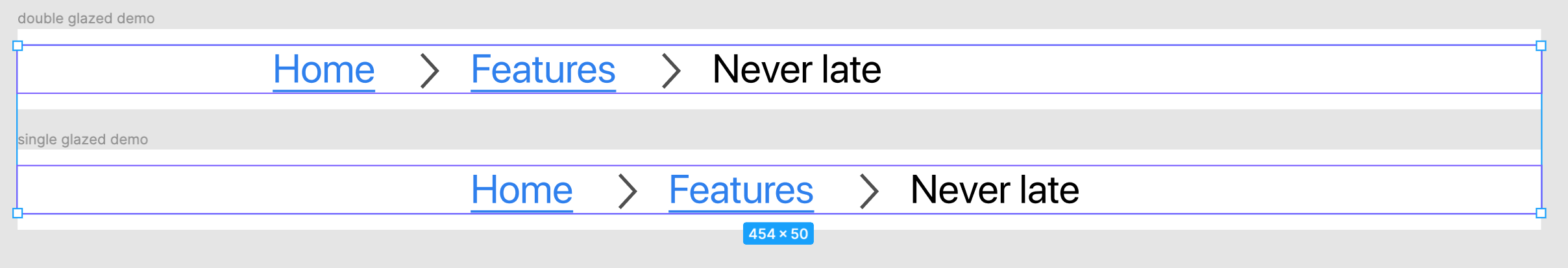
All that’s left to do is turn your double-glazed into a new Component, tag it as a desktop item, and use it across a variety of desktop sizes. No matter how wide the screen is, resizing this new double-glazed breadcrumb ensures your page will follow the configured container size.
剩下要做的就是将双层玻璃变成一个新的组件,将其标记为桌面项,并在各种桌面大小中使用它。 无论屏幕有多宽,重新调整此双层玻璃面包屑的大小都会确保您的页面符合配置的容器大小。
中心约束,无双层玻璃 (Center constraints without double-glazing)
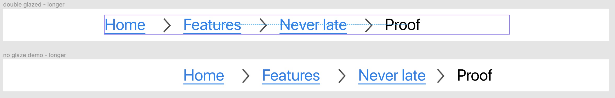
You may be thinking that you could get away with single-glazing, but it won’t mimic the Container effect properly. Since the Breadcrumbs internally are spaced using Auto layout, the width of it is variable and its center will change depending on the contents. For things like an image that needs to be centered this is okay, but Breadcrumbs need to be left-aligned with respect to the Container.
您可能会认为您可以摆脱单层玻璃的使用,但是它无法正确模仿“容器”效果。 由于面包屑内部使用“自动”布局隔开,因此其宽度是可变的,其中心将根据内容而变化。 对于像图像这样需要居中的事情来说,这是可以的,但是面包屑需要相对于容器左对齐。
Furthermore, when you extend your breadcrumb the single-glaze solution will at best still be centered on the page or at worst require manual alignment. That introduces human-error and thus less efficient prototyping workflows.
此外,当您扩展面包屑时,单釉解决方案最多仍将居中放置在页面上,或者最糟糕的情况是需要手动对齐。 这就引入了人为错误,从而降低了原型工作流程的效率。
局限性 (Limitations)
There are some things you can’t achieve using this technique, and need other techniques to help you design for responsiveness.
使用此技术,有些事情无法实现,需要其他技术来帮助您设计响应能力。
组件是特定于屏幕的 (Components are screen specific)
Earlier I mentioned that we’d focus on the desktop screen size, and that’s because Components using this technique are tied to the maximum Container size. An Internal Frame of 980px is not going to fit on half of the tablet screen sizes, and would not fit on any mobile screen in portrait mode. You’ll need one for each breakpoint you support, usually resulting in three versions.
之前我提到过,我们将重点放在桌面屏幕的大小上,这是因为使用此技术的组件与最大的Container大小相关。 980像素的内部框架不适合平板电脑屏幕尺寸的一半,也不适合纵向模式下的任何移动屏幕。 每个支持的断点都需要一个,通常会产生三个版本。
这些组件按比例放大,而不是按比例缩小 (These Components scale up, not down)
If you’re designing for a larger screen then double-glazed Components know how to respond, but they aren’t made to respond when shrinking. Putting a desktop Component with an Internal Frame on a screen less than 980px, as I did here, your content will fall off the screen. You’ll need a different set of techniques to make Components that can scale down gracefully, with its own limitations.
如果您要设计更大的屏幕,那么双层玻璃组件将知道如何响应,但是缩小时并没有使其响应。 像我在此处所做的那样,将带有内部框架的桌面组件放置在小于980px的屏幕上,您的内容将从屏幕上掉落。 您将需要一套不同的技术来制作可以按比例缩小的组件,但有其自身的局限性。
您只能垂直或水平响应 (You can only be vertically or horizontally responsive)
Unless the content you’re designing with is static in size, you’ll have to pick vertical or horizontal responsiveness. In this example of a breadcrumb, the content flows horizontally, whereas most other Components will want to be vertically responsive. In short, follow the direction of your content. Aim for vertically responsive Components for content led items, and UI and controls should be horizontally responsive.
除非您要设计的内容大小是静态的,否则您必须选择垂直或水平响应。 在面包屑的此示例中,内容是水平流动的,而其他大多数组件都希望垂直响应。 简而言之,请遵循内容的方向。 垂直响应的目标内容主导项目的组件,UI和控件应水平响应。
Despite the limitations and needing to maintain three sets of Components for Desktop, Tablet, and Mobile, I still think it’s well worth the investment. It allows you to design responsively within those three screen categories when creating mockups and prototypes. The most important thing is that you keep in mind the audience you’re designing for, and User Research is a key step to unlocking the core value of discovering what works and what doesn’t for your users and customers.
尽管存在局限性,并且需要维护三组用于台式机,平板电脑和移动设备的组件,但我仍然认为这是值得的投资。 它允许您在创建模型和原型时在这三个屏幕类别中进行响应式设计。 最重要的是,您要牢记要为其设计的受众,而“用户研究”是释放发现有价值的核心价值的关键步骤,这些价值对您的用户和客户而言是行之有效的。

翻译自: https://uxdesign.cc/building-responsive-components-in-figma-using-double-glazing-a4ec42feaf95
figma button


 863
863


 被折叠的 条评论
为什么被折叠?
被折叠的 条评论
为什么被折叠?
 到【灌水乐园】发言


