


A hands-on to create a .mplstyle
动手创建.mplstyle
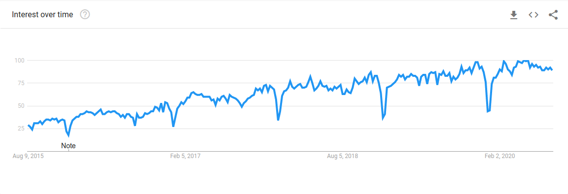
Matplotlib is an open-source 2D plotting library for Python. With its support for various types of graphs and charts, Matplotlib is primarily used for data analysis and data visualisation. Being a versatile data visualisation tool with endless customisation options, the popularity of Matplotlib has seen a steady increase over the past five years which is evident from the google trends graph shown below.
M atplotlib是Python的开源2D绘图库。 Matplotlib支持各种图形和图表,主要用于数据分析和数据可视化。 作为具有无限自定义选项的通用数据可视化工具,Matplotlib的受欢迎程度在过去五年中一直稳定增长,这从下面显示的google趋势图中可以明显看出。
Though it has its advantages, Matplotlib has a major drawback. It has an extremely low-level interface, requiring greater effort to make visualisations look appealing to the audience.
尽管Matplotlib有其优点,但它还有一个主要缺点。 它具有一个非常低级的界面,需要付出更多的努力才能使可视化效果吸引听众。
After reading this tutorial, you would gain the ability to create a custom style for your Matplotlib projects. Basic knowledge of Matplotlib is needed to understand this tutorial.
阅读完本教程后,您将能够为Matplotlib项目创建自定义样式。 需要Matplotlib的基础知识才能理解本教程。
Matplotlib提供的样式 (Styles provided by Matplotlib)
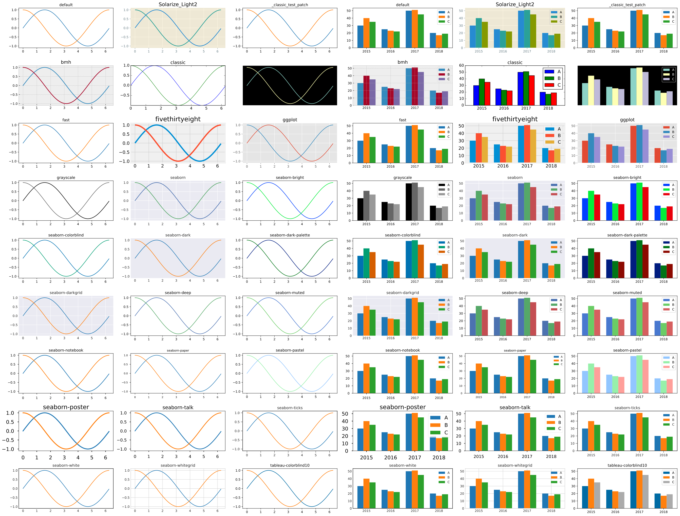
To handle its major drawback, Matplotlib provides its users with some built-in styles to make graphs and charts more appealing. The following command lists the styles provided by Matplotlib.
为了解决其主要缺点,Matplotlib为用户提供了一些内置样式,以使图形和图表更具吸引力。 以下命令列出了Matplotlib提供的样式。
import matplotlib as pltprint(plt.style.available)['Solarize_Light2', '_classic_test_patch', 'bmh', 'classic', 'dark_background', 'fast', 'fivethirtyeight', 'ggplot', 'grayscale', 'seaborn', 'seaborn-bright', 'seaborn-colorblind', 'seaborn-dark', 'seaborn-dark-palette', 'seaborn-darkgrid', 'seaborn-deep', 'seaborn-muted', 'seaborn-notebook', 'seaborn-paper', 'seaborn-pastel', 'seaborn-poster', 'seaborn-talk', 'seaborn-ticks', 'seaborn-white', 'seaborn-whitegrid', 'tableau-colorblind10']What good would come from knowing the names of the built-in styles? Matplotlib is a visualisation tool. Let us visually see these styles by plotting a line graph and a bar chart.
知道内置样式的名称有什么好处? Matplotlib是一个可视化工具。 让我们通过绘制折线图和条形图直观地看到这些样式。
What if you did not like any of these built-in styles? You can create your style. But first, you need to understand how and where the styles are applied. To accomplish this, let us look at the layers in Matplotlib.
如果您不喜欢这些内置样式怎么办? 您可以创建自己的样式。 但是首先,您需要了解样式的应用方式和位置。 为此,让我们看看Matplotlib中的各层。
Matplotlib中的图层 (Layers in Matplotlib)
Matplotlib architecture comprises of 3 distinct layers, which can be visualised as a stack.
Matplotlib体系结构包含3个不同的层,可以将它们可视化为一个堆栈。
- Scripting Layer 脚本层
- Artist Layer 艺术家层
- Backend Layer 后端层
后端层 (Backend Layer)
This is the bottom layer of the stack consisting of 3 interfaces.
这是由3个接口组成的堆栈的最底层。
FigureCanvasrepresents the surface to draw (eg. the paper).FigureCanvas表示要绘制的表面(例如,纸张)。Rendererdoes the drawing (eg. the paintbrush).Renderer绘制图形(例如画笔)。Eventhandles user inputs from keyboard and mouse.Event处理来自键盘和鼠标的用户输入。
艺术家层 (Artist Layer)
This is the middle layer of the stack that does most of the heavy lifting. Artist knows how to use the Renderer (the paintbrush) and paint on the FigureCanvas (the paper). Every component in a Matplotlib Figure is a Artist instance i.e. the title, the labels, the lines, the axes, the ticks, etc. are individual Artist instances. This layer is meant for professional developers who like to utilise the versatile functionalities of Artist.
这是完成大部分繁重任务的堆栈中间层。 Artist知道如何使用Renderer (画笔)和FigureCanvas (纸)上的FigureCanvas 。 Matplotlib Figure中的每个组件都是一个Artist实例,即标题,标签,线条,轴,刻度等都是单个Artist实例。 该层适用于喜欢使用Artist的多功能功能的专业开发人员。
脚本层(pyplot) (Scripting Layer (pyplot))
This is the top layer of the stack and uses APIs to draw graphs. This layer is designed for programmers who focus on creating graphs and does not wish to tinker with the various functionalities. To know more about the layers, please follow this link.
这是堆栈的顶层,并使用API绘制图形。 该层是为那些专注于创建图形并且不希望修改各种功能的程序员而设计的。 要了解有关图层的更多信息,请点击此链接 。
在哪里应用定制? (Where are customisations applied?)
All the components of a Matplotlib Figure marked in the below image are customisable. And, these customisations are carried out in the Artist layer of Matplotlib.
下Figure标记的Matplotlib Figure所有组件都是可定制的。 并且,这些自定义在Matplotlib的Artist层中进行。

创建自定义样式 (Creating a custom style)
Now that you know where customisations take place, allow me to show you how to customise your graphs. But first, we need to decide on the components of Figure that need to be customised. Let us, for example, make the following customisations in our graphs.
现在您知道了进行定制的位置,让我向您展示如何定制图形。 但是首先,我们需要确定需要定制的Figure的组件。 例如,让我们在图形中进行以下定制。
- Set a default figure size of 5 x 4 inches with white background. 将白色背景的默认图形尺寸设置为5 x 4英寸。
- Use a four-colour cycle based on cyan, magenta, yellow and black. 使用基于青色,品红色,黄色和黑色的四色循环。
- Remove the top and the right spines. 除去顶部和右侧的刺。
- Move the tick marks to the inside of the axis line. 将刻度线移到轴线内侧。
- Increase the major tick width to 2. 将主刻度线宽度增加到2。
- Increase the tick label’s size. 增加刻度线标签的大小。
- Change the title font to Arial and make it bigger. 将标题字体更改为Arial并使其更大。
- Change both the axes label’s font to Arial and make it bigger. 将两个轴标签的字体都更改为Arial并使其更大。
You can find the Jupyter notebooks for this tutorial in my GitHub repository.
您可以在以下位置找到本教程的Jupyter笔记本 GitHub存储库 。
最坏情况的定制 (Worst-case customisation)
Let us create a simple bar chart comparing the yearly performance of three departments of an imaginary educational institution.
让我们创建一个简单的条形图,比较一个虚构的教育机构的三个部门的年度绩效。
import matplotlib.pyplot as plt
import numpy as npdata = [[30, 25, 50, 20],
[40, 23, 51, 17],
[35, 22, 45, 19]]X = np.arange(4)
width = 0.25fig = plt.figure()ax = fig.add_axes([0,0,1,1])ax.bar(X + 0.00, data[0], width = 0.25)
ax.bar(X + 0.25, data[1], width = 0.25)
ax.bar(X + 0.50, data[2], width = 0.25)ax.set_xticks(X+width)
ax.set_xticklabels(('2015','2016','2017','2018'))ax.set_title('Performance Comparison')
ax.set_xlabel('Departments')
ax.set_ylabel('Average')ax.legend(labels=["CS", "IT", "ECE"])plt.show()
Running this code snippet would produce a bar chart with the default style.
运行此代码段将生成具有默认样式的条形图。

Let us modify the same bar chart by customising the components decided earlier.
让我们通过自定义先前确定的组件来修改同一条形图。
import matplotlib.pyplot as plt
import numpy as np
import math
from cycler import cyclerdata = [[30, 25, 50, 20],
[40, 23, 51, 17],
[35, 22, 45, 19]]X = np.arange(4)
width = 0.25# Set a default figure size of 5 x 4 inches with white background
fig = plt.figure(figsize=(5,4), facecolor='w')ax = fig.add_axes([0,0,1,1])# Change color cycle to cyan, magenta, yellow and black
custom_cycler = (cycler(color=['c', 'm', 'y', 'k']))
ax.set_prop_cycle(custom_cycler)# Remove right and top spine
ax.spines['right'].set_visible(False)
ax.spines['top'].set_visible(False)# Both axis tick customisations
ax.xaxis.set_tick_params(direction='in', which='major', width=2, labelsize='medium')
ax.yaxis.set_tick_params(direction='in', which='major', width=2, labelsize='medium')ax.bar(X + 0.00, data[0], width = 0.25)
ax.bar(X + 0.25, data[1], width = 0.25)
ax.bar(X + 0.50, data[2], width = 0.25)ax.set_xticks(X+width)
ax.set_xticklabels(('2015','2016','2017','2018'))# Change font and font size for title and both axis labels
ax.set_title('Performance Comparison', fontname='Arial', fontsize='x-large')
ax.set_xlabel('Departments', fontname='Arial', fontsize='large')
ax.set_ylabel('Average', fontname='Arial', fontsize='large')ax.legend(labels=["CS", "IT", "ECE"])plt.show()
Executing the above code snippet would produce a bar chart with the customisations that we needed.
执行上面的代码片段将生成带有我们所需定制的条形图。

10 lines of code were added to the original code to make these 8 customisations in 1 graph. Imagine a scenario where your data visualisation project comprises of 10 such graphs. To do these 8 customisations, you must add these 10 lines of code to all the 10 graphs. It would be a tiring process of copying and pasting these 10 lines. Moreover, doing this would be the worst-case scenario and would also affect the readability of your code. I shall show you the best-case scenario, wherein you need to add only one line of code to your entire project to perform not only these 8 but also many more customisations that you may need. This best-case scenario would hold to any number of your future projects.
将10行代码添加到原始代码中,以在1张图中进行这8种自定义。 想象一个场景,您的数据可视化项目包含10个这样的图。 要进行这8种自定义,必须将这10行代码添加到所有10张图中。 复制和粘贴这10行将是一个令人厌烦的过程。 此外,这样做将是最坏的情况,并且还会影响代码的可读性。 我将向您展示最佳情况,在这种情况下,您只需向整个项目中添加一行代码即可不仅执行这8条代码,还执行您可能需要的更多自定义设置。 这种最佳情况适用于您将来的任何项目。
最佳情况的自定义:创建.mplstyle文件 (Best-case customisation: Creating .mplstyle file)
Creating a .mplsyle file would be the best-case scenario. This is the file that holds all the customisations to be applied to your Figure. One file to rule them all! - Kudos to you, if you get the reference.
创建.mplsyle文件将是最好的情况。 这是包含要应用于您的Figure所有自定义文件的文件。 一个文件来统治他们! -如果获得参考,对您表示敬意。
Let us create a demo_style.mplstyle file in your data visualisation project folder. And in this file, we shall do the 8 customisations as follows.
让我们在您的数据可视化项目文件夹中创建一个demo_style.mplstyle文件。 在此文件中,我们将按以下方式进行8种自定义。
# demo_syle.mplstyle# Set figure size to 5x4 inches with white background
figure.figsize:     5,4             # figure size in inches
figure.facecolor:   white           # figure facecolor# Change to cyan, magenta, yellow and black color palette
axes.prop_cycle:   cycler('color', ['c', 'm', 'y', 'k'])# Remove top and right spines
axes.spines.left:   True            # display axis spines
axes.spines.bottom: True
axes.spines.top:    False
axes.spines.right:  False# Both axis tick customisations
xtick.direction:    in              # direction: {in, out, inout}
ytick.direction:    in              # direction: {in, out, inout}
xtick.major.width:  2               # major tick width in points
ytick.major.width:  2               # major tick width in points
xtick.labelsize:    medium          # fontsize of the tick labels
ytick.labelsize:    medium          # fontsize of the tick labels# Change font and font size of title and both axis labels
font.family:        Arial
font.size:          14.0
axes.titlesize:     x-large         # fontsize of the axes title
axes.labelsize:     large           # fontsize of the x and y labels
With the one file created, let us re-create the bar chart from the previous section.
创建一个文件后 ,让我们从上一节重新创建条形图。
import matplotlib.pyplot as plt
import numpy as np# Applying the custom style sheet to all of the graphs to be created in this notebook
plt.style.use('demo_style.mplstyle')data = [[30, 25, 50, 20],
[40, 23, 51, 17],
[35, 22, 45, 19]]X = np.arange(4)
width = 0.25fig = plt.figure()ax = fig.add_axes([0,0,1,1])ax.bar(X + 0.00, data[0], width = 0.25)
ax.bar(X + 0.25, data[1], width = 0.25)
ax.bar(X + 0.50, data[2], width = 0.25)ax.set_xticks(X+width)
ax.set_xticklabels(('2015','2016','2017','2018'))ax.set_title('Performance Comparison')
ax.set_xlabel('Departments')
ax.set_ylabel('Average')ax.legend(labels=["CS", "IT", "ECE"])plt.show()
Executing this code creates a bar chart with all the 8 customisations. But that is not the interesting part. Did you notice the above code snippet is the same as the code snippet without any customisation, except for the one line?
执行此代码将创建具有所有8种自定义的条形图。 但这不是有趣的部分。 您是否注意到上面的代码段与未经任何定制的代码段相同(除了一行) ?
That one line is plt.style.use('demo_style.mplstyle'). This command instructs Matplotlib to use the .mplstyle file to perform customisations on all the graphs in that Jupyter notebook or python script. Isn't it easy and efficient to add one line of code to customise all of your graphs?
那一行是plt.style.use('demo_style.mplstyle') 。 此命令指示Matplotlib使用.mplstyle文件在该Jupyter笔记本或python脚本中的所有图形上执行自定义。 添加一行代码来自定义所有图形既简单又有效吗?
This is not the only way of customizing Matplotlib graphs. But this is the best way. This link describes various other ways of customising your graphs.
这不是定制Matplotlib图的唯一方法。 但这是最好的方法。 该链接描述了自定义图形的其他各种方式。
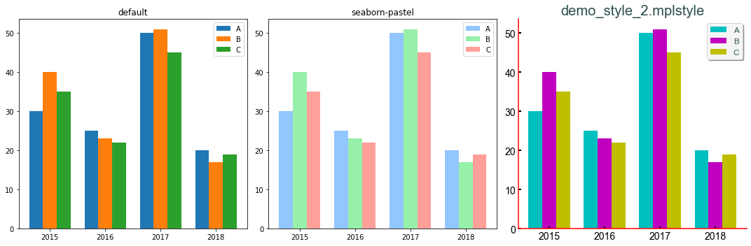
I have created another demo_syle_2.mplsyle file to show more customizations. The output of this customisation is shown below in comparison with built-in styles. Both the .mplstyle files and Jupyter notebooks for this tutorial can be found in my GitHub repository.
我创建了另一个demo_syle_2.mplsyle文件以显示更多自定义设置。 与内置样式相比,下面显示了此定制的输出。 本教程的.mplstyle文件和Jupyter笔记本均可在我的GitHub存储库中找到。

Note: If you wish to change the style of a single graph or chart while using .mplstyle, you can always override the custom style using inline customisations. Using inline customisation does not affect the .mplstyle file and the customisation will apply only to that graph or chart. We had previously used inline customisations in the worst-case customisation section.
注意: 如果希望在使用.mplstyle时更改单个图形或图表的样式,则始终可以使用内联自定义设置覆盖自定义样式。 使用内联自定义不会影响.mplstyle文件,并且自定义仅适用于该图形或图表。 我们之前在最坏情况的定制部分中使用了内联定制。
结束语 (Closing remarks)
I have shown you how to create your custom style in Matplotlib. Creating and perfecting a custom .mplstyle file takes time and many tries, but it is worth the effort. It will save you time and effort in all your future data visualisation and data analysis projects.
我已经向您展示了如何在Matplotlib中创建自定义样式。 创建和完善自定义.mplstyle文件需要花费时间和很多尝试,但是值得付出努力。 这将节省您未来所有数据可视化和数据分析项目中的时间和精力。
A kind request: While choosing colours for your style, kindly choose colour blind friendly colours. You never know if your audience includes a colour blind. You can use websites like https://colorbrewer2.org/ to choose colour blind friendly colours.
一种要求:在为您的样式选择颜色时,请选择对色盲友好的颜色。 您永远不会知道您的听众是否包括色盲。 您可以使用https://colorbrewer2.org/之类的网站选择对色盲友好的颜色。
Until next time, good luck. Stay safe and happy learning.!
直到下次,祝你好运。 保持安全愉快的学习!!
翻译自: https://medium.com/analytics-vidhya/create-your-custom-matplotlib-style-701f0e080250


 7174
7174


 被折叠的 条评论
为什么被折叠?
被折叠的 条评论
为什么被折叠?
 到【灌水乐园】发言


