


柱状图简介
柱状图(Bar Chart)是一种常用于显示分类变量数据的图形表示方式,主要通过矩形柱的长度或高度来反映各分类的数值大小。柱状图能够有效展示不同类别之间的对比情况,并直观地体现各类目之间的差异。其横轴通常用于表示分类变量,而纵轴则代表某种度量(如频率、百分比或其他数值)。每一个分类的柱子长度与其对应的数值成正比,从而使得不同类别之间的数据量可视化。
标签:#微生物组数据分析 #MicrobiomeStatPlot #基本柱状图 #R语言可视化 #Basic bar Plot
作者:First draft(初稿):Defeng Bai(白德凤);Proofreading(校对):Ma Chuang(马闯) and Jiani Xun(荀佳妮);Text tutorial(文字教程):Defeng Bai(白德凤)
源代码及测试数据链接:
https://github.com/YongxinLiu/MicrobiomeStatPlot/项目中目录 3.Visualization_and_interpretation/BasicBarPlot
或公众号后台回复“MicrobiomeStatPlot”领取
柱状图案例
这是Xuehui Huang课题组2021年发表于Nature Genetics上的文章,第一作者为Xin Wei,题目为:A quantitative genomics map of rice provides genetic insights and guides breeding https://doi.org/10.1038/s41588-020-00769-9

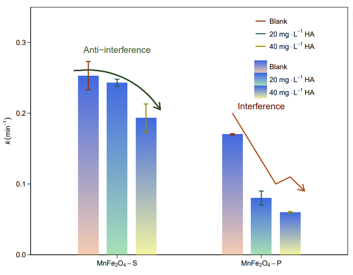
图 4 | QTNs 的遗传调查。
e,东亚、南亚和东南亚籼稻 QTNs 的等位基因频率;f,东亚、东南亚和东北亚粳稻 QTNs 的等位基因频率。所示的所有 QTG 都具有高度差异的等位基因频率(AF > 0.4)。各 QTG 的详细功能等位基因频率见补充数据集 4 和 5。
结果
在籼稻方面,东亚地区具有较多的早穗期等位基因、较多的抗稻瘟病等位基因和较强的抗低温发芽能力,但较少的高矿质营养利用效率等位基因(图4e),这与该地区昼长、病害胁迫严重、低温和大量施肥的特点相一致。同时,东北亚地区的粳稻耐寒性和早穗期等位基因频率较高(图4f),这与东北亚地区种植季节气温低、昼长的特点相一致。
柱状图R语言实战
源代码及测试数据链接:
https://github.com/YongxinLiu/MicrobiomeStatPlot/
或公众号后台回复“MicrobiomeStatPlot”领取
软件包安装
# 基于CRAN安装R包,检测没有则安装
p_list = c("ggplot2", "dplyr", "readxl", "cols4all", "patchwork", "scales",
           "patchwork", "reshape2", "ggsignif","tidyverse","ggh4x","grid","showtext","Cairo","ggpattern","ggpubr","ggbreak","dagitty","brms","broom","broom.mixed","ggdag","MetBrewer","latex2exp","readxl","ggsci")
for(p in p_list){if (!requireNamespace(p)){install.packages(p)}
    library(p, character.only = TRUE, quietly = TRUE, warn.conflicts = FALSE)}


# 加载R包 Load the package
suppressWarnings(suppressMessages(library(ggplot2)))
suppressWarnings(suppressMessages(library(dplyr)))
suppressWarnings(suppressMessages(library(readxl)))
suppressWarnings(suppressMessages(library(cols4all)))
suppressWarnings(suppressMessages(library(patchwork)))
suppressWarnings(suppressMessages(library(scales)))
suppressWarnings(suppressMessages(library(patchwork)))
suppressWarnings(suppressMessages(library(reshape2)))
suppressWarnings(suppressMessages(library(ggsignif)))
suppressWarnings(suppressMessages(library(tidyverse)))
suppressWarnings(suppressMessages(library(ggh4x)))
suppressWarnings(suppressMessages(library(MetBrewer)))
suppressWarnings(suppressMessages(library(latex2exp)))
suppressWarnings(suppressMessages(library(readxl)))
suppressWarnings(suppressMessages(library(ggsci)))
suppressWarnings(suppressMessages(library(ggdag)))
suppressWarnings(suppressMessages(library(broom.mixed)))
suppressWarnings(suppressMessages(library(broom)))
suppressWarnings(suppressMessages(library(grid)))
suppressWarnings(suppressMessages(library(showtext)))
suppressWarnings(suppressMessages(library(Cairo)))
suppressWarnings(suppressMessages(library(ggpattern)))
suppressWarnings(suppressMessages(library(ggpubr)))
suppressWarnings(suppressMessages(library(ggbreak)))
suppressWarnings(suppressMessages(library(dagitty)))
suppressWarnings(suppressMessages(library(brms)))
实战1
参考:
https://mp.weixin.qq.com/s/_7eCtIbvNChngVOhNuIfVA
参考:
https://mp.weixin.qq.com/s/44lUo1Ncsd7Ef_7Luj5pHA
参考:
https://mp.weixin.qq.com/s/N0KPinMiTS-9zRB8XcfZrA
# 数据
# Creat data
df <- data.frame(
  group = c("A", "B", "C","D","F"),
  value1 = c(10, 20, 30, 20, 15),
  value2 = c(15, 25, 35, 15, 20)
)
df1 <- melt(df)


# 添加误差数据
# Add error data
df1$sd <- c(1,2,3,2.5,1,1,2,3,2,1.5)


# 误差线位置
# Error bar position
df1 <- df1 %>%
  group_by(group) %>%
  mutate(xx=cumsum(value))


# 保证误差线可以对应其正确位置
# Ensure that the error bars correspond to their correct positions
df1$variable <- factor(df1$variable,levels = c("value2","value1"))


# 转换为因子,指定绘图顺序
# Convert to factors and specify drawing order
df1$group <- factor(df1$group, levels = unique(df1$group))


# 美化与主题调整
# Beautification and theme adjustment
mycol1 <- c("#4E79A7","#F28E2B")
mycol2 <- c("#85D4E3","#F4B5BD")


# 分组柱形图,添加误差棒
# Grouping bar graphs, adding error bars
p1 <- ggplot(df1, aes(x = group, y = value, fill = variable)) +
  geom_bar(position = position_dodge(), stat = "identity", color = NA, width = 0.8) +
  scale_fill_manual(values = mycol1) +
  scale_y_continuous(expand = c(0, 0)) +
  theme_classic() +
  geom_errorbar(aes(ymin = value - sd, ymax = value + sd),
                position = position_dodge(width = 0.8),
                width = 0.4) +
  labs(y = 'Value') +
  theme(axis.text = element_text(size = 12),
        axis.title = element_text(size = 14))


# 堆叠柱形图,添加误差棒
# Stacked bar chart with error bars added
df1 <- df1 %>%
  group_by(group) %>%
  mutate(position = cumsum(value))


p2 <- ggplot(df1, aes(x = group, y = value, fill = variable)) +
  geom_bar(position = "stack", stat = "identity", color = NA, width = 0.8) +
  scale_fill_manual(values = mycol2) +
  scale_y_continuous(expand = c(0, 0)) +
  theme_classic() +
  geom_errorbar(aes(ymin = position - sd, ymax = position + sd),
                width = 0.4) +
  labs(y = 'Value') +
  theme(axis.text = element_text(size = 12),
        axis.title = element_text(size = 14))


# 保存图形为PDF文件
# Save graphics as PDF files
ggsave("results/p1.pdf", plot = p1, width = 6, height = 4)
ggsave("results/p2.pdf", plot = p2, width = 6, height = 4)


# 组合图
library(cowplot)
width = 89
height = 59
p0 = plot_grid(p1, p2, labels = c("A", "B"), ncol = 2)
ggsave("results/Simple_bar_plot1.pdf", p0, width = width * 3, height = height * 2, units = "mm")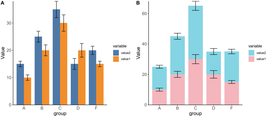
实战2
利用ggpattern软件包绘制柱状图
# 测试使用内置数据集ToothGrowth
# Test using the dataset ToothGrowth
head(ToothGrowth)
table(ToothGrowth$supp)
#>
#> OJ VC
#> 30 30
table(ToothGrowth$dose)
#>
#> 0.5   1   2
#>  20  20  20


# gradient/plasma 渐变色
# gradient
p21 <- ggplot(ToothGrowth, aes(x = factor(dose), y = len)) +
  geom_bar_pattern(aes(pattern_fill = factor(dose)),
                   stat = "summary", fun = mean, position = "dodge", linewidth = 0.7,
                   pattern = 'gradient', pattern_key_scale_factor = 1.5,
                   pattern_fill2 = NA, fill = NA) +
  stat_summary(fun.data = 'mean_sd', geom = "errorbar", width = 0.15, linewidth = 0.6) +
  #theme_minimal(base_size = 16) +
  theme_classic()+
  scale_y_continuous(expand = c(0,0), limits = c(0, 35), breaks = seq(0, 35, 5)) +
  scale_pattern_fill_manual(values = c("#89A66D", "#538DB7", "#D8898A")) +
  labs(x = NULL, title = "Gradient Pattern", subtitle = 'Pattern Fill = Dose') +
  theme(legend.position = 'none') +
  geom_signif(comparisons = list(c("0.5", "1"), c("0.5", "2")),
              y_position = c(24, 30), map_signif_level = TRUE,
              test = wilcox.test, textsize = 6)
#p21


# plasma
p22 <- ggplot(ToothGrowth, aes(x = factor(d
最低0.47元/天 解锁文章


 被折叠的 条评论
为什么被折叠?
被折叠的 条评论
为什么被折叠?
 到【灌水乐园】发言


