


Interaction Components
交互组件在UI系统中处理交互事件,比如鼠标或者触摸事件
Selectable Base Class
此类是交互组件的基类
Property:
Interactible:组件是否接受输入,当设置为false,组件将不可用
Transition:在可选组件中这又几个状态转换选项,其取决于选中的状态。不同的状态有:normal、highLighted、pressed和disabled
Navigation:这又许多导航选项控制键盘的导航如何实现
Transition Options
设置Transition Options来改变在状态改变时候的效果
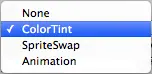
Transition Options:
- None :按钮没有效果
- Color Tint:根据按钮的状态,改变按钮的颜色。可以改变不同状态之间转换的速度。
- Sprite Swap:根据不同状态显示不同的精灵图片
- Animation:按钮状态不同,播放不同的动画。
Color Tint
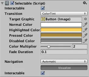
Property:
Target Graphic:交互组件的显示图形
Normal Color:组件的普通颜色
Highlighted Color:组件高亮的颜色
Pressed Color:组件按下的颜色
Disabled Color:组件不可用的颜色
Color Multiplier:原有颜色乘以tint color的系数
Fade Duration:颜色切换的时间
Sprite Swap
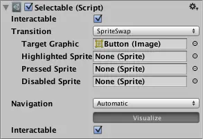
Property:
Target Graphic:normal状态的精灵图片
Highlighted Sprite:高亮的图片
Pressed Sprite:按钮按下的图片
Disabled Sprite:按钮不可用的图片
Animation
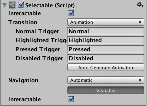
Property:
Normal Trigger:
Highlighted Trigger:
Pressed Trigger:
Disabled Trigger:
Navigation Options
Property:
Navigation:
Button
用于相应用户的点击事件,用于初始化或者确认行为。
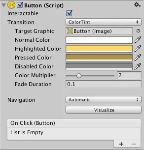
Properties:
Interactable:组件是否接受输入
Transition:控件相应的方式
Navigation:控件队列
Events:
On Click:当用户点击按钮和释放的时候
Details:
On Click的使用场景:
- 确认决定
- GUI中是否打开子菜单
- 取消行为
Toggle
Toggle允许用户切换状态在On和Off之间

Property:
Interactable:
Transition:
Navigation:
Is On:Toggle开始的时候是开还是关
Toggle Transition:Toggle Transition变化是否有Fade效果
Graphic:check mark的图片
Group:Toggle属于哪个组
Details:
使用Toggle的时候可以将他们放入一个组,这样在组中同时只能有一个Toggle是被选中的状态
当用户改变当前的值的时候,Toggle触发事件OnValueChanged
Toggle使用场景:
- 切换选择
- 让用户确认他们已经阅读了法律免责声明
- 在Toggle Group中选择一个
Note:Toggle是提供了一片可以选择的区域给子物体,如果Toggle没有子物体,那么它是不可选择的
Toggle Group:
使用Toggle的时候可以将他们放入一个组,这样在组中同时只能有一个Toggle是被选中的状态
Property:
Allow Switch Off:允许Toggle被关闭状态。此选项选中,Toggle就可以被取消勾选
Slider:
Slider Control允许玩家选择可调整的数值在一个区间范围内,这个组件和ScrollBar比较相似。

Property:
Fill Rect:填充控件区域的图片
Handle Rect:sliding handle的图片
Direction:slider的增加的方向
Min Value :slider在最左边的时候的最小值
Max Value:slider在最右边的时候的值
Whole Numbers:slider的值是否为整数
Value:当前的slider的数值
Events:
On Value Changed:当Slider的数值发生改变的时候,调用此方法
Scrollbar
Scrollbar 控件允许用户滑动图片,图片太大显示不完整。

Property:
Value:初始位置,范围从0到1
Size:handle占Scrollbar的大小,范围从0到1
Number Of Steps:滚动条允许的不同滚动位置的数量。
Events:
On Value Changed:Scrollbar 变化的时候
Dropdown:


Property:
Caption text:当前选中的option的text
Caption Image:当前选中的option的iamge
Item text:选项的文本
Item Image:
Value:index of current selected option
Options:可能选项的列表,显示的文本和图片都可以被自定义
Events:
On Value Changed:
Details
The template system:
Dropdown控件被设计有子物体作为一个临时变量
Template必须有一个item带有Toggle组件,当实际的dropdown的list被创建的时候,item被复制多次,
Input Field
可编辑的Text组件,必须结合visual UI元素使用

Property:
Text Component:Input Field包含的Text元素
Text:开始的值,编辑开始之前显示的值
Character Limit:Input Field的最大字数限制
Content Type:设置要传入的字符的类型(来检测要输入的字符串的,用于做一些限制)
Line Type:换行的设置Single Line/Multi Line Submit/Multi Line NewLine
Placeholder:当Input Field的text为空的使用,显示的内容
Selection Color:选中编辑的文字的时候的背景颜色
Hide Mobile Input(iOS only): Hides the native input field attached to the onscreen keyboard on mobile devices. Note that this only works on iOS devices.
Event:
On Value Change:Input Field的文本变化的时候,事件传一个当前的文本值作为动态变量
End Edit:用户结束编辑的时候(确认信息)或者点击其他位置。传一个当前的文本内容作为一个动态变量
Hints:读取Edit Input中的文本的时候,使用InputField中的text属性,不要用Text component组件中的text
Scroll Rect
当我们需要在较小的空间展示较多的内容的时候,Scroll Rect提供了对内容的滑动。
通常Scroll Rect配合Mask和Scrollbars一起使用

Property:
Content:要Scrolled的元素
Horizontal:允许横向拖动
Vertical:允许竖向拖动
Movement Type:Unrestricted,Elastic或Clamped,使用Elastic或Clamped强制元素在Scroll Rect的范围内
Inertia:惯性,拖动结束后仍然会移动一小段
Deceleration Rate:当Inertia勾选后,设置减速率,为0,立刻停止,为1,永不停止
Scroll Senesitivity:scroll wheel的灵敏度和轨迹板滚动事件
View:Rectangle Transform的parent
Horizontal Scrollbar:
Vertical Scrollbar:
Events:
On Value Changed:
Details:
- The root GameObject has the Scroll Rect component.
- The viewport has a Mask component. The viewport can either be the root GameObject, or a separate GameObject that’s a child to the root. If auto-hiding scrollbars are used, it must be a child. The viewport Rect Transform needs to be referenced in the Viewport property of the Scroll Rect.
- All the scrolling content must be children of a single content GameObject that is a child to the viewport. The content Rect Transform needs to be referenced in the Content property of the Scroll Rect.
- The scrollbars - if used - are children to the root GameObject. See the Scrollbar page for more details on the setup of a scrollbar and see the section Scrollbar setup below for information about setup of scrollbars with a scroll view.
Auto Layout
自动布局系统提供了几种内嵌的布局方式,horizontal groups、vertical groups或grids。
Layout Element
如果想改变Layout element的minimum、preferred或者flexible大小,给游戏物体添加layout Element组件。

Property:
Min Width:
Min Height:
Preferred Width:
Preferred Height:
Flexible Width:
Flexible Height:
几种大小的分配原则:
- 首先分配最小尺寸。
- 如果有足够的可用空间,则分配首选大小。
- 如果有额外的可用空间,则分配灵活的大小。
Content Size Fitter

Property:
Horizontal Fit:宽度如何控制 Unconstrained(Do not drive the width based on the layout element.)/MinSize/PreferredSize
Vertical Fit:高度如何控制Unconstrained/MinSize/PreferredSize
描述:
Content Size Fitter作为一个布局控制器控制布局元素的大小,大小通过layout element组件提供的minimum 或 preferred sizes决定,layout element可以是Image 或 Text组件、layout group。
Content Size Fitter对Rect Transform的大小定义是通过pivot(轴),这意味着中心轴将控制resize的方向。
Aspect Ratio Fitter

Property:
Aspect Mode:如何调整矩形大小通过长宽比
None:不对长宽比做任何适配
Width Controls Height:宽度控制高度
Height Controls Width:高度控制宽度
Fit In Parent:宽高、位置、锚点自动适配根据父Rect Transform。
Envelope Parent:自动调整宽度、高度、位置和锚点,使矩形覆盖父矩形的整个区域,同时保持长宽比。此矩形可以比父矩形扩展得更远。
Aspect Ratio:要执行的长宽比。这是宽度除以高度。
Horizontal Layout Group / Vertical Layout Group

Property:
Padding:布局组边缘内的填充,距离边缘隔出的距离
Spacing:元素之间的间距
Child Alignment:如果子布局元素之间没有填满,使用子元素布局
Child Controls Size:是否布局组控制子元素的宽高
Child Force Expand:是否子元素适配多余的可用空间
使用细节:
所有子布局元素的最小宽度被添加到一起,它们之间的间距也被添加。结果是水平布局组的最小宽度。
所有子布局元素的首选宽度被添加到一起,它们之间的间距也被添加。结果是水平布局组的首选宽度。
如果水平布局组位于其最小宽度或更小,则所有子布局元素也将具有其最小宽度。
水平布局组越接近其首选宽度,每个子布局元素也将越接近其首选宽度。
如果水平布局组的宽度大于其首选宽度,则将根据子布局元素的灵活宽度按比例分配额外可用空间。
Grid Layout Group

Property:
Padding:边缘距离
Cell Size:每一个Cell在group中的大小
Spacing:layout elements元素之间的距离
Start Corner:元素开始的角落
Start Axis:水平还是竖直排列
Child Alignment:如果元素没有填满整个空间,使用布局元素控制layout元素
Constraint:将网格约束到固定的行或列以辅助自动布局系统
描述:
与其他布局组不同,网格布局组忽略其包含的布局元素的最小,首选和灵活大小属性,而是为所有这些属性分配固定大小,这是使用网格布局组本身的“单元大小”属性定义的。
Content Size Fitter的一些使用情况
Flexible width and fixed height
To setup a grid with a flexible width and fixed height, where the grid expands horizontally as more elements are added, you can set these properties as follows:
Grid Layout Group Constraint: Fixed Row Count
Content Size Fitter Horizontal Fit: Preferred Size
Content Size Fitter Vertical Fit: Preferred Size or Unconstrained
If unconstrained Vertical Fit is used, it’s up to you to give the grid a height that is big enough to fit the specified row count of cells.
Fixed width and flexible height
To setup a grid with a fixed width and flexible height, where the grid expands vertically as more elements are added, you can set these properties as follows:
Grid Layout Group Constraint: Fixed Column Count
Content Size Fitter Horizontal Fit: Preferred Size or Unconstrained
Content Size Fitter Vertical Fit: Preferred Size
If unconstrained Horizontal Fit is used, it’s up to you to give the grid a width that is big enough to fit the specified column count of cells.
Both flexible width and height
If you want a grid with both a flexible width and height you can do that, but you will have no control over the specific number of rows and columns. The grid will attempt to make the row and column count approximately the same. You can set these properties as follows:
Grid Layout Group Constraint: Flexible
Content Size Fitter Horizontal Fit: Preferred Size
Content Size Fitter Vertical Fit: Preferred Size


 1269
1269


 被折叠的 条评论
为什么被折叠?
被折叠的 条评论
为什么被折叠?
 到【灌水乐园】发言


