


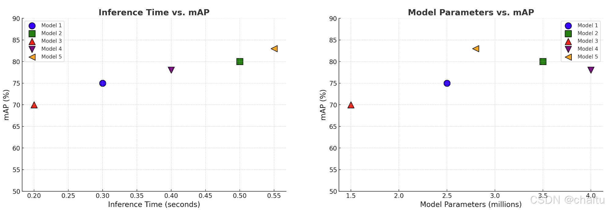
绘制模型参数量、推理时间以及检测精度mAP的图
显示效果如下图所示
代码如下:
import matplotlib.pyplot as plt
import numpy as np

# 定义更新后的函数以绘制性能图表
def plot_model_performance(data):
	# 输入:data矩阵
	# 每一行代表一个模型,第一列为模型参数量(百万),第二列为推理时间,第三列为mAP
    # 检查数据是否为二维且至少有三列
    if data.shape[1] < 3:
        raise ValueError("Data must have at least three columns (model params, inference time, and mAP)")
    # 预定义颜色和标记列表
    colors = ['blue', 'green', 'red', 'purple', 'orange', 'brown', 'cyan', 'magenta', 'yellow', 'black']
    markers = ['o', 's', '^', 'v', '<', '>', 'p', '*', '+', 'x']
    # 创建图表并设置尺寸
    plt.figure(figsize=(20, 6))

    # 第一个图:推理时间 vs. mAP
    plt.subplot(1, 2, 1)
    for idx in range(data.shape[0]):
        plt.scatter(data[idx, 1], data[idx, 2], s=150, color=colors[idx % len(colors)], label=f'Model {idx+1}', marker=markers[idx % len(markers)], edgecolors='black')
    plt.title('Inference Time vs. mAP', fontsize=16, fontweight='bold')
    plt.xlabel('Inference Time (seconds)', fontsize=14)
    plt.ylabel('mAP (%)', fontsize=14)
    plt.ylim(50, 90)
    plt.grid(True, linestyle='--', alpha=0.6)
    plt.legend()

    # 第二个图:模型参数量 vs. mAP
    plt.subplot(1, 2, 2)
    for idx in range(data.shape[0]):
        plt.scatter(data[idx, 0], data[idx, 2], s=150, color=colors[idx % len(colors)], label=f'Model {idx+1}', marker=markers[idx % len(markers)], edgecolors='black')
    plt.title('Model Parameters vs. mAP', fontsize=16, fontweight='bold')
    plt.xlabel('Model Parameters (millions)', fontsize=14)
    plt.ylabel('mAP (%)', fontsize=14)
    plt.ylim(50, 90)
    plt.grid(True, linestyle='--', alpha=0.6)
    plt.legend()

    # 显示图表
    plt.show()


if __name__ == '__main__':
    # 模拟一些数据,第一列为模型参数量(百万),第二列为推理时间,第三列为mAP
    data = np.array([
        [2.5, 0.3, 75],
        [3.5, 0.5, 80],
        [1.5, 0.2, 70],
        [4.0, 0.4, 78],
        [2.8, 0.55, 83]
    ])

    # 调用函数绘制性能图表
    plot_model_performance(data)


 2104
2104

 被折叠的 条评论
为什么被折叠?
被折叠的 条评论
为什么被折叠?
 到【灌水乐园】发言


