


前言
讲到这里,Python 的数据处理部分已经写的差不多了。
学完了前面的部分,差不多已经能够熟练的处理各种各样的数据了。
在本系列的最后,我们将介绍如何展示数据,当然,并不是数据的可视化,而是像 Excel 表格一样,设置数据的颜色、字体、大小等样式
在 pandas 中,通过 DataFrame.style 属性,可以获取一个 Styler 对象,该对象提供了方法,让我们很方便的格式化和展示 DataFrame 数据
样式的设置是通过 CSS 来完成,所以,所有的代码需要在 Jupyter Notebook 中运行
介绍
1 创建样式
将你的样式函数传递给下面两个方法之一:
Styler.applymap:逐元素- 是将函数应用于每个元素上的
- 函数接受一个标量值,返回一个属性-值对的
CSS样式字符串
Styler.apply:按行、列或按表设置- 根据
axis参数,将函数应用于行(axis=0)、列(axis=1)或整个表(axis=None) - 接受一个
Series或DataFrame,返回一个具有相同形状的Series或DataFrame。每个值都是CSS样式字符串
- 根据
这两个方法都接受一个函数(以及其他一些关键字参数),并以某种方式应用到 DataFrame 中。
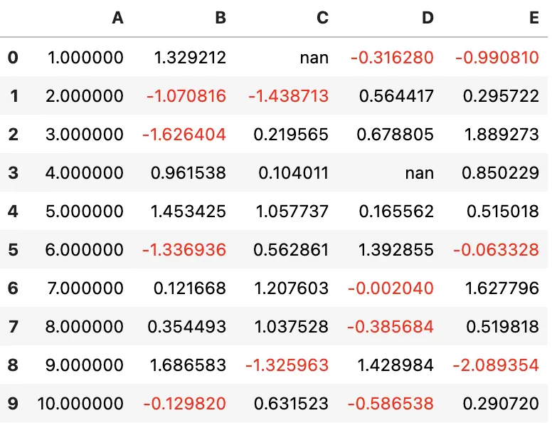
对于如下例子
import pandas as pd
import numpy as np
np.random.seed(24)
df = pd.DataFrame({'A': np.linspace(1, 10, 10)})
df = pd.concat([df, pd.DataFrame(np.random.randn(10, 4), columns=list('BCDE'))],
axis=1)
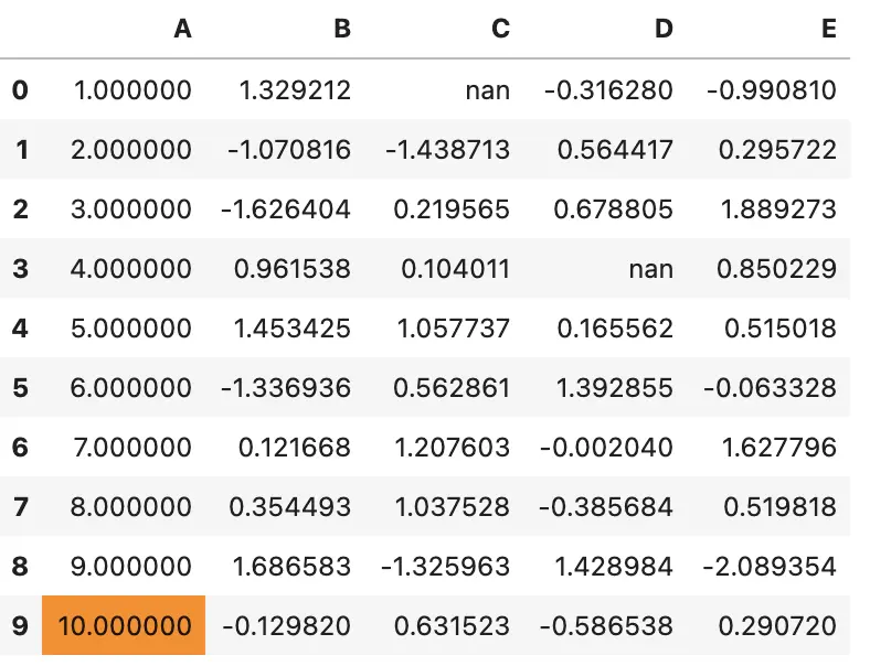
df.iloc[3, 3] = np.nan
df.iloc[0, 2] = np.nan
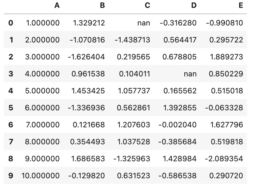
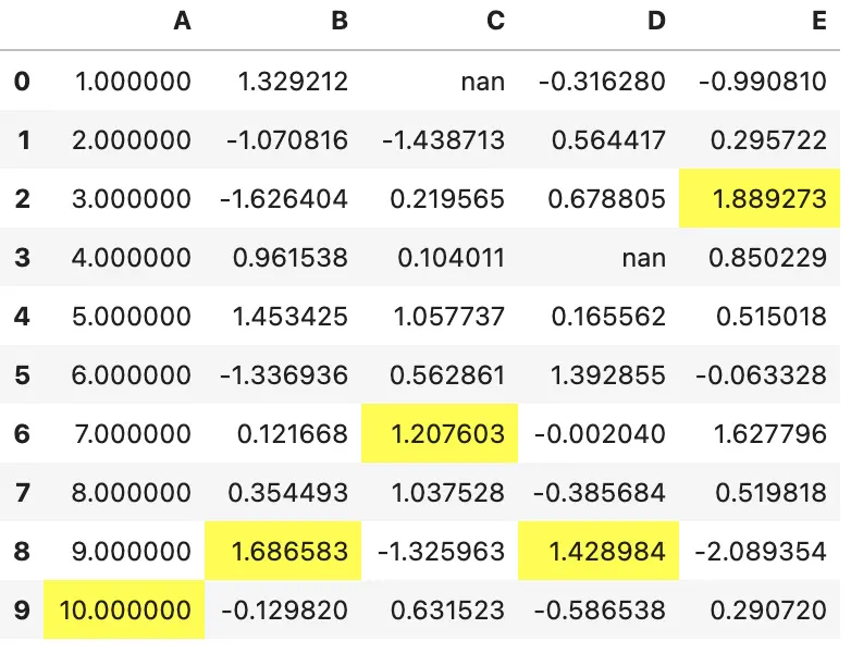
这是一个没有任何渲染的样式
df.style
上面的输出看起来和标准的 DataFrame 非常相似,但其实有些操作是在后台完成的,将 CSS 类附加到了每个单元格。
我们可以通过调用 .render 方法来查看
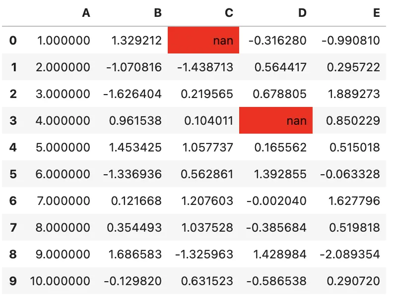
>>> df.style.highlight_null().render().split('\n')[:10]
['<style  type="text/css" >',
 '#T_69f90_row0_col2,#T_69f90_row3_col3{',
 '            background-color:  red;',
 '        }</style><table id="T_69f90_" ><thead>    <tr>        <th class="blank level0" ></th>        <th class="col_heading level0 col0" >A</th>        <th class="col_heading level0 col1" >B</th>        <th class="col_heading level0 col2" >C</th>        <th class="col_heading level0 col3" >D</th>        <th class="col_heading level0 col4" >E</th>    </tr></thead><tbody>',
 '                <tr>',
 '                        <th id="T_69f90_level0_row0" class="row_heading level0 row0" >0</th>',
 '                        <td id="T_69f90_row0_col0" class="data row0 col0" >1.000000</td>',
 '                        <td id="T_69f90_row0_col1" class="data row0 col1" >1.329212</td>',
 '                        <td id="T_69f90_row0_col2" class="data row0 col2" >nan</td>',
 '                        <td id="T_69f90_row0_col3" class="data row0 col3" >-0.316280</td>']
row0_col2 是特定单元格的标识,同时为每个 DataFrame 的每行、每列添加了唯一标识的 UUID,使其在同一个 notebook 里面是唯一标识的,不会与其他样式重名
在编写样式函数时,需要注意返回值是 CSS 属性-值的形式,pandas 会自动匹配到相应的单元格。
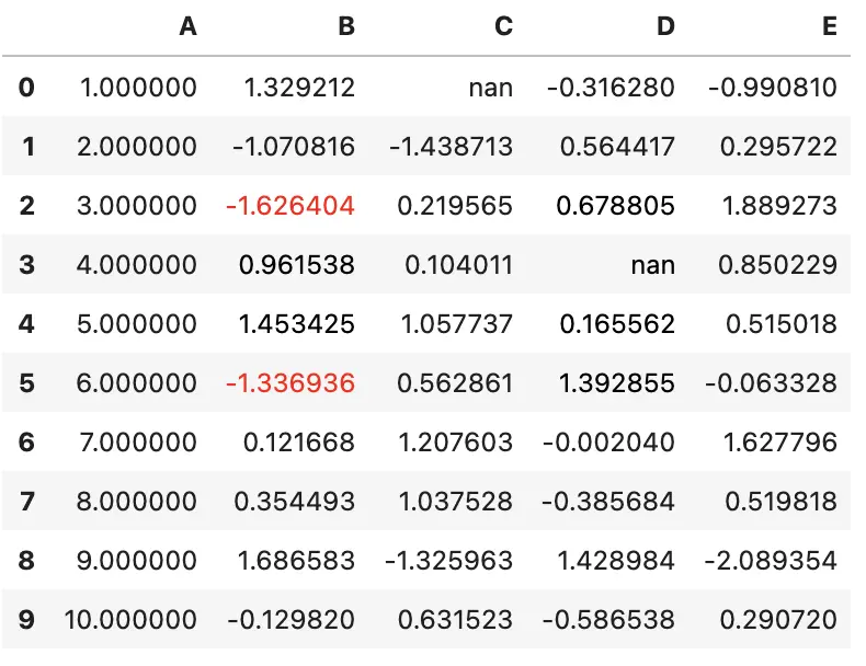
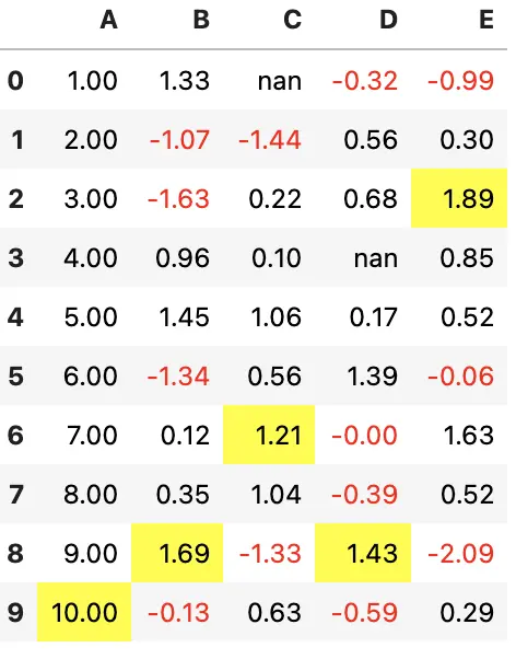
来看一个简单的例子,将负数涂成红色,整数涂成黑色
def color_negative_red(val):
    """
    Takes a scalar and returns a string with
    the css property `'color: red'` for negative
    strings, black otherwise.
    """
    color = 'red' if val < 0 else 'black'
    return 'color: %s' % color
在这个例子中,我们需要对每个元素应用样式,所以,应该使用 Styler.applymap 方法
s = df.style.applymap(color_negative_red)
s
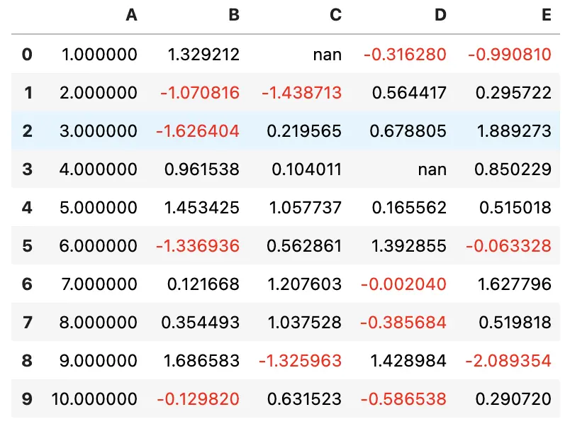
注意,该函数与 df.applymap 是类似的
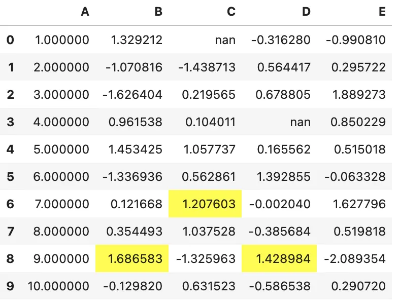
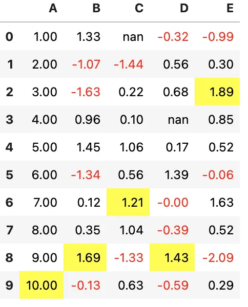
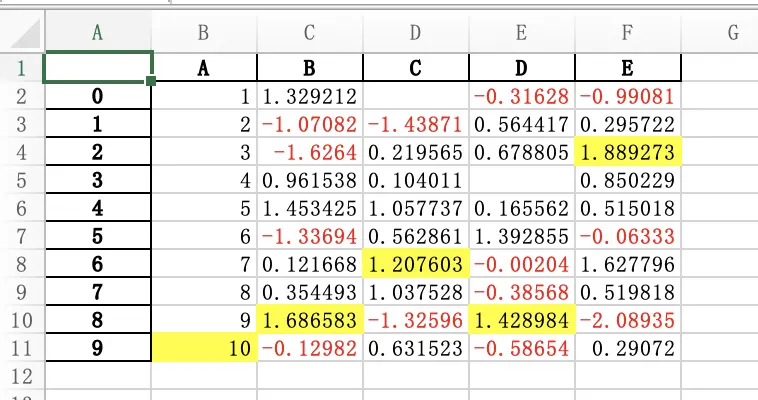
现在,假设我们想要突出显示每一列的最大值,就不能再使用 .applymap 了
应该使用 .apply 并指定 axis=0。我们先定义样式函数
def highlight_max(s):
    '''
    highlight the maximum in a Series yellow.
    '''
    is_max = s == s.max()
    return ['background-color: yellow' if v else '' for v in is_max]
显示样式
df.style.apply(highlight_max)
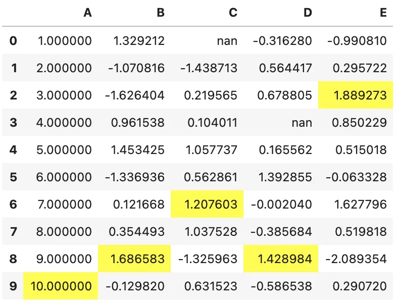
在这个例子中,输入的是 Series,一次处理一列。返回的结果与输入的数据形状一样
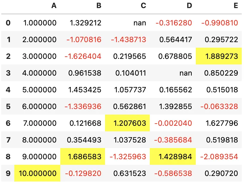
更优雅的方式是使用链式调用来组合多个样式
df.style.\
    applymap(color_negative_red).\
    apply(highlight_max)
如果想高亮整个 DataFrame 的最大值,该怎么做?
我们可以使用 .apply(function, axis=None) 将函数应用于整个表
下面,我们重写一下高亮最大值的函数,使其支持不同的应用场景(按行、按列等),以及颜色的调整
def highlight_max(data, color='yellow'):
    '''
    highlight the maximum in a Series or DataFrame
    '''
    attr = 'background-color: {}'.format(color)
    if data.ndim == 1:  # Series from .apply(axis=0) or axis=1
        is_max = data == data.max()
        return [attr if v else '' for v in is_max]
    else:  # from .apply(axis=None)
        is_max = data == data.max().max()
        return pd.DataFrame(np.where(is_max, attr, ''),
                            index=data.index, columns=data.columns)
高亮最大值
df.style.apply(highlight_max, color='darkorange', axis=None)
2 精细控制:切片
Styler.apply 和 Styler.applymap 都接受一个 subset 参数,用于控制将样式应用于指定的行或列,而无需在样式函数中编写代码
其行为类似于 DataFrame 切片
- 标量被视为列名
- 一个列名(或
Series或numpy array) - 一个元组(
(row_indexer, column_indexer)),可以使用pd.IndexSlice构造
df.style.apply(highlight_max, subset=['B', 'C', 'D'])
同时指定行列切片,任何在 .loc 能够使用的切片操作都可以使用
df.style.applymap(color_negative_red,
                  subset=pd.IndexSlice[2:5, ['B', 'D']])
注意:目前还不支持位置切片
如果你的样式函数使用了 subset 或 axis,可以考虑使用 functools.partial 来封装
my_func2 = functools.partial(my_func, subset=42)
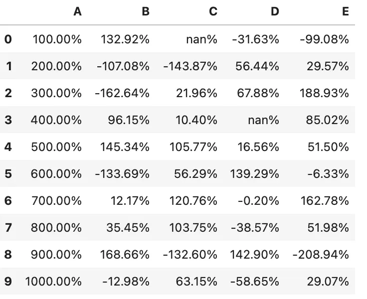
3 精细控制:显示值
我们可以使用 Styler.format 控制值的显示,注意并不是修改原始值
df.style.format("{:.2%}")
使用字典来格式化指定的列
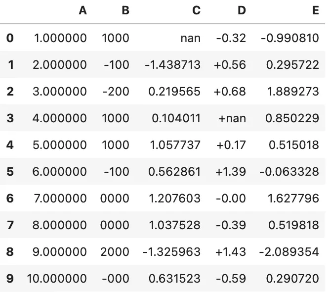
df.style.format({'B': "{:0<4.0f}", 'D': '{:+.2f}'})
或传入一个可调用对象(或可调用对象字典),以实现更灵活的处理。
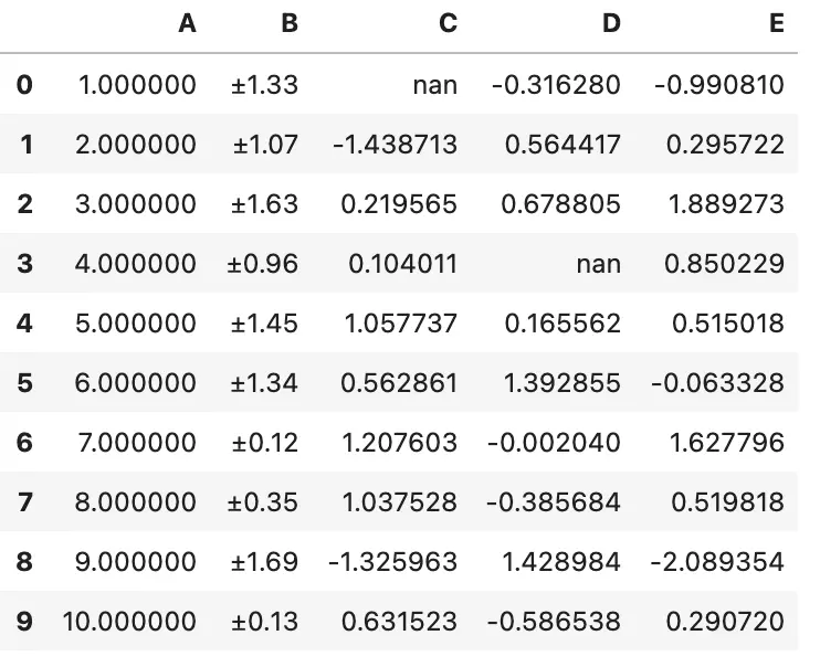
df.style.format({"B": lambda x: "±{:.2f}".format(abs(x))})
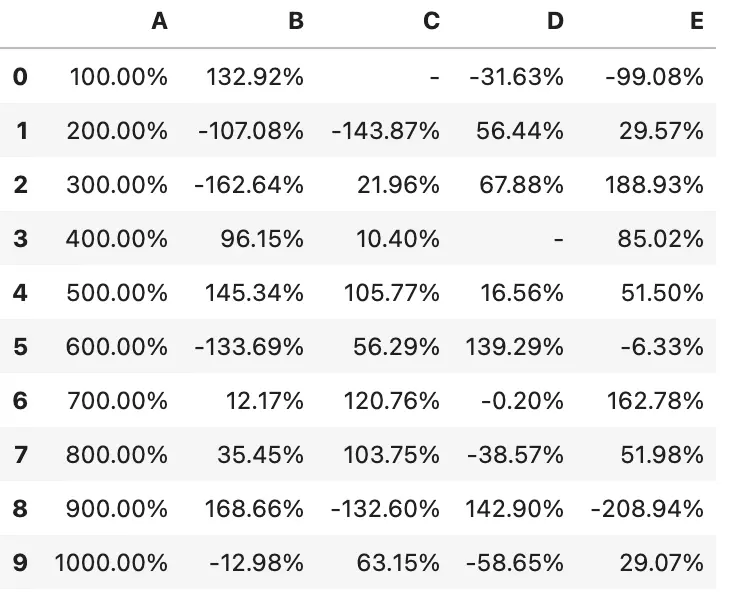
您可以通过 na_rep 对缺失值进行格式化。
df.style.format("{:.2%}", na_rep="-")
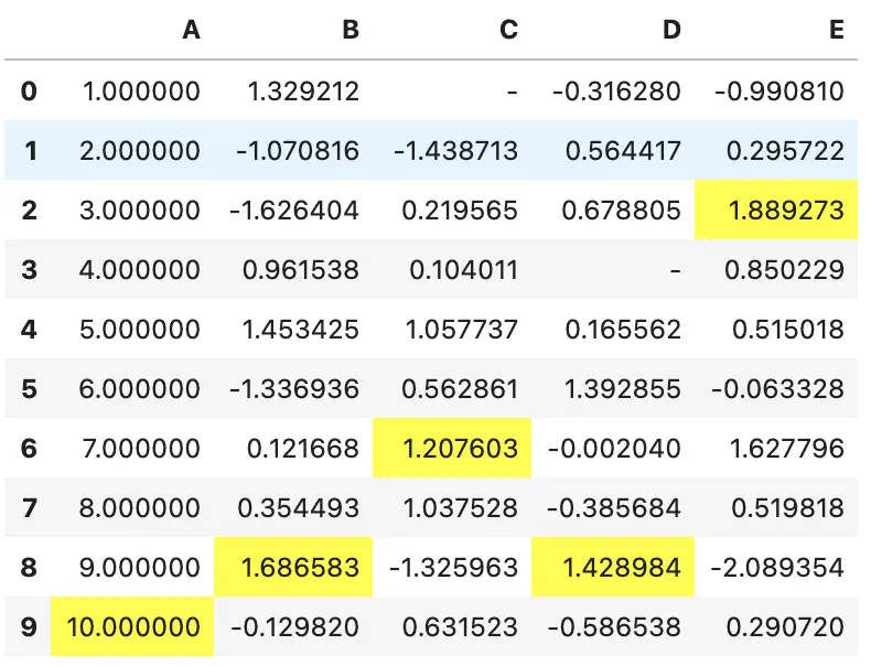
可以将格式化与样式结合起来
df.style.highlight_max().format(None, na_rep="-")
4 内建样式
对于一些常用的样式,已经在 Styler 中加入了相应的内建函数,不需要自己手动实现
df.style.highlight_null(null_color='red')
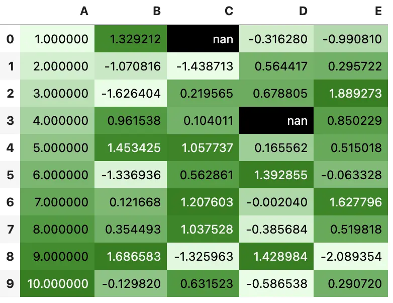
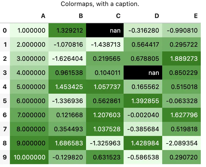
你可以使用 background_gradient 方法构建热图,需要 matplotlib 库,在这里,我们使用 seaborn 获取一个漂亮的 colormap
import seaborn as sns

cm = sns.light_palette("green", as_cmap=True)

s = df.style.background_gradient(cmap=cm)
s
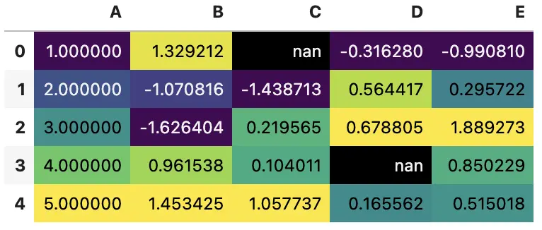
Styler.background_gradient 接受 low 和 high 关键字参数,用于扩大数据的范围,这样就可以使用 colormap 部分范围来绘制图像
使用全部颜色范围
df.loc[:4].style.background_gradient(cmap='viridis')
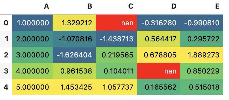
压缩颜色范围
(df.loc[:4]
    .style
    .background_gradient(cmap='viridis', low=.5, high=0)
    .highlight_null('red'))
还有 .highlight_min 和 .highlight_max
df.style.highlight_max(axis=0)
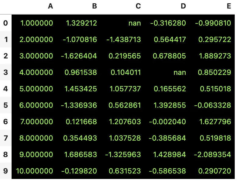
当需要的样式不依赖于值时,可以使用 Styler.set_properties 来设置
df.style.set_properties(**{'background-color': 'black',
                           'color': 'lawngreen',
                           'border-color': 'white'})
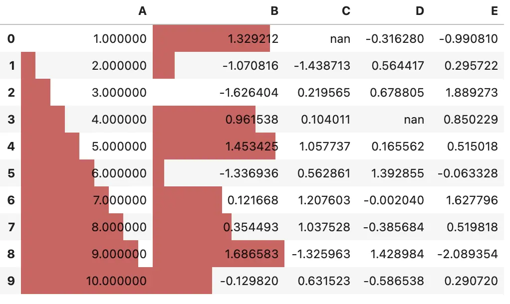
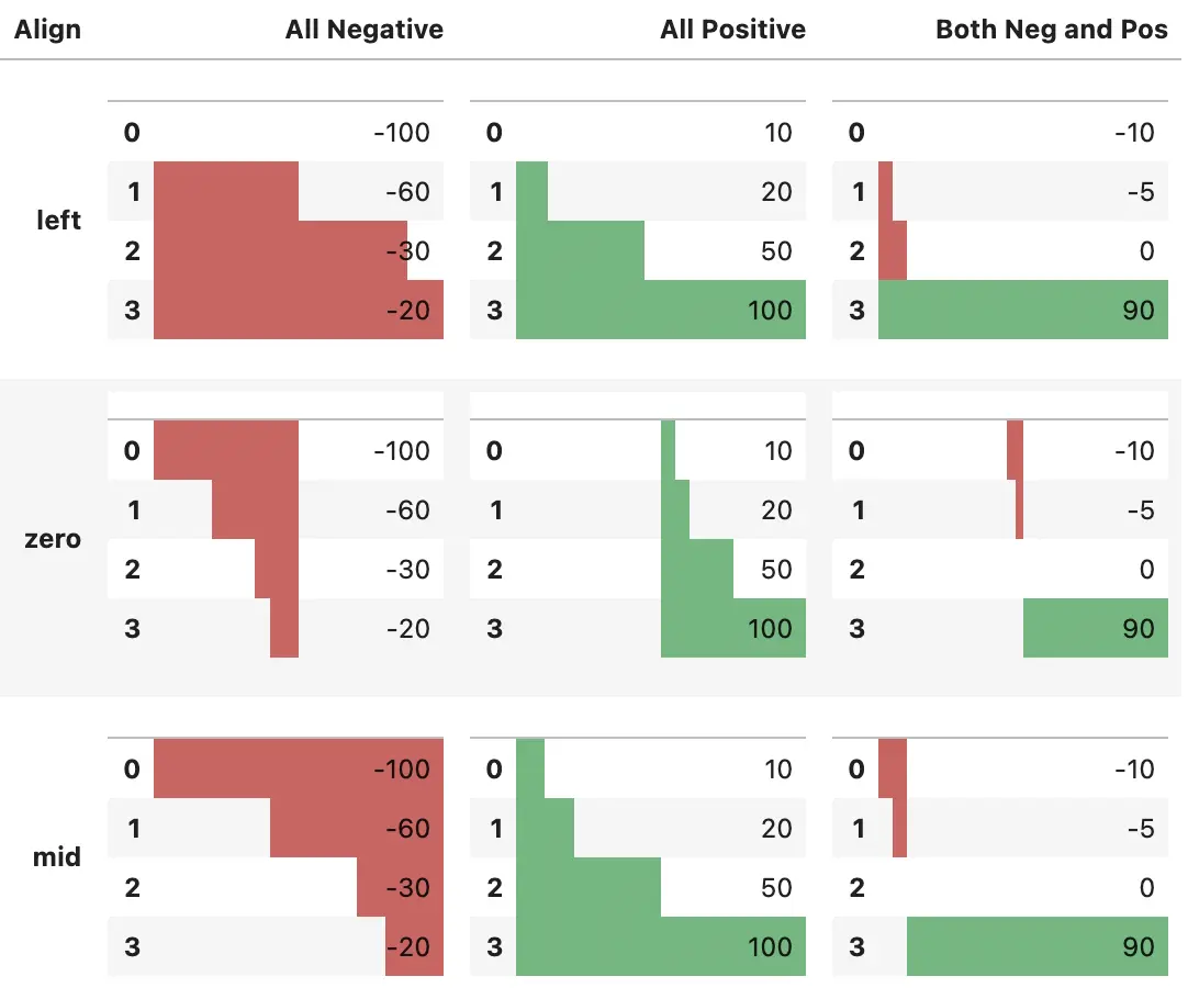
4.1 条形图
可以在 DataFrame 上绘制条形图
df.style.bar(subset=['A', 'B'], color='#d65f5f')
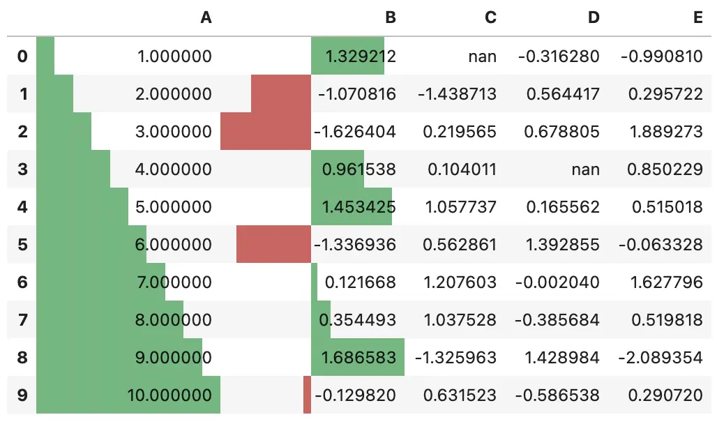
在 0.20.0 版本之后,你可以使用 df.style.bar 将中心点设置为 0 或中点值,还可以使用 [color_negative, color_positive] 设置中心点左右值的颜色
df.style.bar(subset=['A', 'B'], align='mid', color=['#d65f5f', '#5fba7d'])
下面的例子用于突出显示 align 参数的行为
import pandas as pd
from IPython.display import HTML

# Test series
test1 = pd.Series([-100,-60,-30,-20], name='All Negative')
test2 = pd.Series([10,20,50,100], name='All Positive')
test3 = pd.Series([-10,-5,0,90], name='Both Pos and Neg')

head = """
<table>
    <thead>
        <th>Align</th>
        <th>All Negative</th>
        <th>All Positive</th>
        <th>Both Neg and Pos</th>
    </thead>
    </tbody>

"""

aligns = ['left','zero','mid']
for align in aligns:
    row = "<tr><th>{}</th>".format(align)
    for series in [test1,test2,test3]:
        s = series.copy()
        s.name=''
        row += "<td>{}</td>".format(s.to_frame().style.bar(align=align,
                                                           color=['#d65f5f', '#5fba7d'],
                                                           width=100).render()) #testn['width']
    row += '</tr>'
    head += row

head+= """
</tbody>
</table>"""


HTML(head)
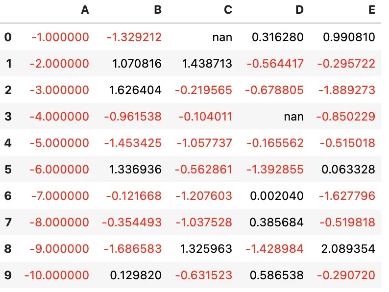
5 共享样式
假设你为一个 DataFrame 设置了一个非常漂亮的样式,现在希望将该样式应用于另一个 DataFrame。该怎么做呢?
首先,使用 df1.style.export 导出样式,然后在第二个 DataFrame 上用 df1.style.set 导入样式
df2 = -df
style1 = df.style.applymap(color_negative_red)
style1
style2 = df2.style
style2.use(style1.export())
style2
6 其他选项
您已经看到了一些用于数据驱动样式化的方法。Styler 还为不依赖于数据的样式提供了一些其他选项
- 精度
- 题注
- 表格样式
- 缺失值表示
- 隐藏索引或列
每一个都可以用两种方式指定
Styler.__init__的关键字参数- 调用一个
.set_或.hide_方法,如.set_caption或.hide_columns
6.1 精度
可以使用 pandas 常规的 display.precision 选项来控制浮点数的精度
with pd.option_context('display.precision', 2):
    html = (df.style
              .applymap(color_negative_red)
              .apply(highlight_max))
html
或者使用 set_precision 方法
df.style\
  .applymap(color_negative_red)\
  .apply(highlight_max)\
  .set_precision(2)
设置精度只会影响打印的值
6.2 题注
可以使用以下几种方式添加常规的表格题注
df.style.set_caption('Colormaps, with a caption.')\
    .background_gradient(cmap=cm)
6.3 表格样式
表格样式适用于整个表格,但是不关注数据的值。对于某些样式,包括像 :hover 这样的伪选择器只能以这种方式使用
这些也可以用来设置特定的基于行或列的类选择器,如
from IPython.display import HTML

def hover(hover_color="#ffff99"):
    return dict(selector="tr:hover",
                props=[("background-color", "%s" % hover_color)])

styles = [
    hover(),
    dict(selector="th", props=[("font-size", "150%"),
                               ("text-align", "center")]),
    dict(selector="caption", props=[("caption-side", "bottom")])
]
html = (df.style.set_table_styles(styles)
          .set_caption("Hover to highlight."))
html
注意:pandas 版本 1.2.0
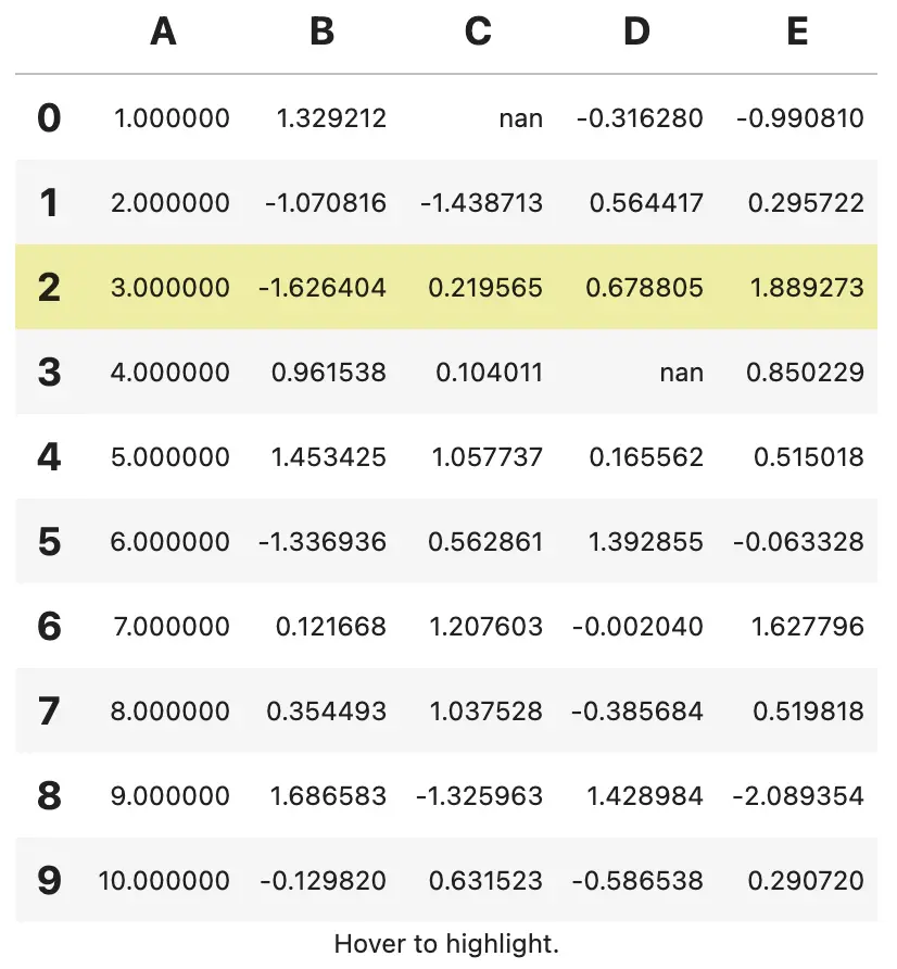
如图所示,当鼠标悬停在某一行时,该行会变为黄色。使用选择器选择了 th 和 caption,分别为 th 标签和题注设置样式
table_styles 应该是一个字典列表。每个字典的键应该为 selector 和 props。selector 的值应该是一个有效的 CSS 选择器。props 应该是 ('attribute', 'value') 元组形式
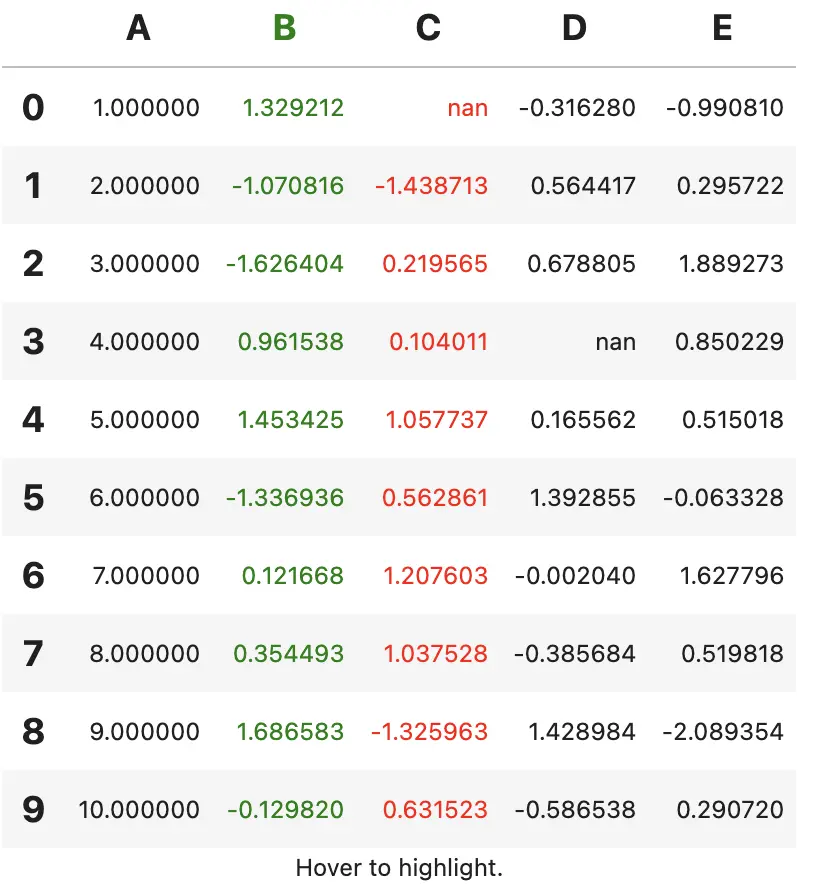
table_styles 可以用来添加基于列和行的类描述符。对于大型表,这样可以避免对每个单元重复使用单个 css,从而提高性能,而且在某些情况下还可以简化样式的构造。
如果 table_styles 是一个字典,每个键应该是一个指定的列或索引值,这将映射到指定列或行的特定类 CSS 选择器
注意:Styler.set_table_styles 会覆盖现有样式,可以设置 overwrite=False 取消该行为
html = html.set_table_styles({
    'B': [dict(selector='', props=[('color', 'green')])],
    'C': [dict(selector='td', props=[('color', 'red')])],
    }, overwrite=False)
html
6.4 缺失值
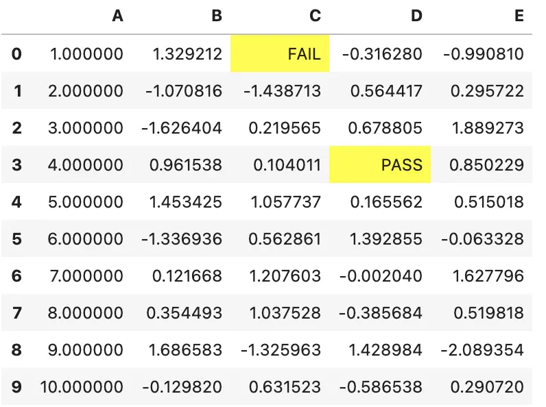
可以使用 set_na_rep 控制整个表的默认缺失值表示
(df.style
   .set_na_rep("FAIL")
   .format(None, na_rep="PASS", subset=["D"])
   .highlight_null("yellow"))
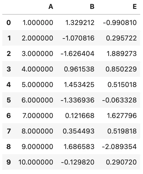
6.5 隐藏索引或列
可以使用 Styler.hide_index 来隐藏索引,在 Styler.hide_columns 中传入列名或列切片来隐藏列
df.style.hide_index()
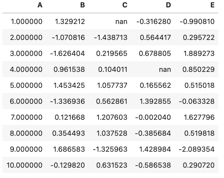
df.style.hide_columns(['C','D'])
6.6 CSS 类
一些 CSS 类会自动附加到单元格中
- 索引或列名包含
index_name和level<k>(k为MultiIndex的第k个level) - 索引标签单元格包含:
row_headingrow<n>(n为行的数字位置)level<k>(k为MultiIndex的第k个level)
- 列标签包含:
col_headingcol<n>(n 为列的数字位置)level<k>(k为MultiIndex的第k个level)
- 空单元格包含
blank - 数据单元格包含
data
6.7 限制
- 只适用于
DataFrame(Series可以使用Series.to_frame().style) - 索引和列必须唯一
- 为汇总的
DataFrames设计的,不要在大的DataFrames中使用,性能不好 - 只能应用样式,不能插入新的
HTML标签
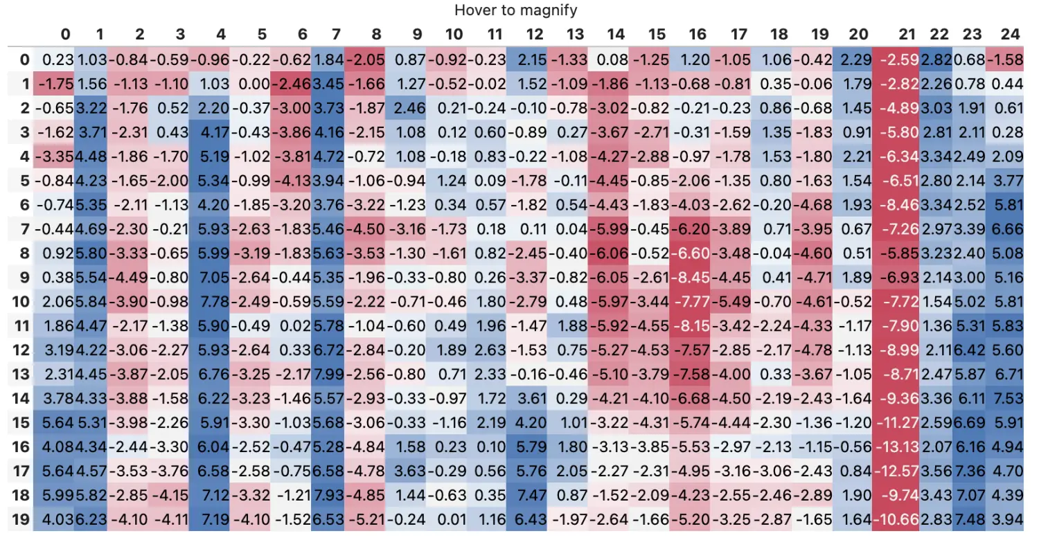
7 例子
下面介绍一个有趣的例子
def magnify():
    return [dict(selector="th",
                 props=[("font-size", "4pt")]),
            dict(selector="td",
                 props=[('padding', "0em 0em")]),
            dict(selector="th:hover",
                 props=[("font-size", "12pt")]),
            dict(selector="tr:hover td:hover",
                 props=[('max-width', '200px'),
                        ('font-size', '12pt')])
]
np.random.seed(25)
cmap = sns.diverging_palette(5, 250, as_cmap=True)
bigdf = pd.DataFrame(np.random.randn(20, 25)).cumsum()

bigdf.style.background_gradient(cmap, axis=1)\
    .set_properties(**{'max-width': '80px', 'font-size': '1pt'})\
    .set_caption("Hover to magnify")\
    .set_precision(2)\
    .set_table_styles(magnify())
8 导出到 Excel
注意:版本 0.20.0,这是一个新特性,仍在开发中
可以使用 OpenPyXL 或 XlsxWriter 引擎将样式化的 DataFrame 导出到 Excel 工作表。
CSS2.2 处理的属性包括:
background-colorborder-style,border-width,border-color以及 {top,right,bottom,left}colorfont-familyfont-stylefont-weighttext-aligntext-decorationvertical-alignwhite-space:nowrap- 目前只支持
CSS2命名的颜色和形式为#rgb或#rrggbb的十六进制颜色 - 下面的伪
CSS属性也可以用来设置excel特定的样式属性number-format
df.style.\
    applymap(color_negative_red).\
    apply(highlight_max).\
    to_excel('styled.xlsx', engine='openpyxl')
excel 结果为


 750
750

 被折叠的 条评论
为什么被折叠?
被折叠的 条评论
为什么被折叠?
 到【灌水乐园】发言


