


测试版本:Qt5.15.2 ,参考Qt源码及文档示例
代码链接:https://github.com/gongjianbo/QmlComponentStyle.git
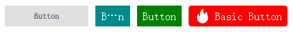
自定义样式与默认样式的对比,第一个为默认样式:
扁平样式的实现代码:
import QtQuick 2.15
import QtQuick.Templates 2.15 as T
import QtQuick.Controls 2.15
import QtQuick.Controls.impl 2.15

// Qt5按钮样式自定义
// 龚建波 2025-03-05
// 参考:qt-everywhere-src-5.15.2\qtquickcontrols2\src\imports\controls\Button.qml
// Button继承自AbstractButton,只增加了flat和highlighted两个不常用的属性
T.Button {
    id: control

    // 可以像源码一样,定义一个全局的样式,然后取全局样式中对应的颜色
    // 定义主题颜色
    property color themeColor: "darkCyan"
    // 定义文本颜色
    property color textColor: "white"
    // 定义背景颜色
    // pressed按下,hovered鼠标悬停,highlighted高亮,checked选中
    property color backgroundColor: (control.pressed || control.checked)
                                    ? Qt.darker(themeColor)
                                    : (control.hovered || control.highlighted)
                                      ? Qt.lighter(themeColor)
                                      : themeColor
    // 定义边框宽度
    property int borderWidth: 0
    // 定义边框颜色
    property color borderColor: Qt.darker(themeColor)
    // 定义边框圆角
    property int radius: 0

    // 默认宽度,参考Qt源码的写法,实际应用可以删减
    // Math.max表示取两者中最大值,1为默认背景宽度+左右偏移值,2为默认内容宽度+左右边距
    // inset和padding都是Control基类定义的,默认为0
    // implicitWidth: Math.max(implicitBackgroundWidth + leftInset + rightInset,
    //                         implicitContentWidth + leftPadding + rightPadding)
    // 默认高度
    // implicitHeight: Math.max(implicitBackgroundHeight + topInset + bottomInset,
    //                          implicitContentHeight + topPadding + bottomPadding)
    // 通过内容计算宽高可能会导致一组按钮的宽高都不齐,可以用固定的默认宽高,或者固定高但是宽度自适应
    implicitWidth: implicitContentWidth + leftPadding + rightPadding
    implicitHeight: implicitContentHeight + topPadding + bottomPadding
    // 边距
    padding: 0
    // 左右边距可以直接用horizontalPadding,因为遇到过相关bug就单独设置下
    leftPadding: 8
    rightPadding: 8
    // 图标和文字间距
    spacing: 6
    // checkable: true
    // 字体设置
    // 也可以给QApplication设置全局的默认字体
    font{
        family: "SimSun"
        pixelSize: 16
    }
    // 按钮图标设置
    // icon.width: 24
    // icon.height: 24
    // icon.source: "url"
    icon.color: textColor

    // Control组件点击之后,后续按空格也会触发点击,可以把空格过滤掉
    Keys.onPressed: event.accepted = (event.key === Qt.Key_Space)
    Keys.onReleased: event.accepted = (event.key === Qt.Key_Space)
    // 可以绑定一个Action到按钮,这样点击后直接触发Action的逻辑,Action一般和菜单或者快捷键相关
    // action: Action {  }
    // 在内容contentItem和背景background图层间可以设置indicator来实现一些样式效果,如点击时的水波纹
    // 三者的堆叠关系可以通过设置z值来调节谁在前谁在后
    // indicator: Rectangle { anchors.fill: parent; color: "red" }
    // 独占性,即同父时达到ButtonGroup那种单选效果
    autoExclusive: false
    // 是否可以选中
    checkable: false
    // 是否选中
    checked: false
    // 是否检测hover鼠标悬停,默认会跟随父组件的设置
    hoverEnabled: true
    // 按住后是否重复触发点击
    autoRepeat: false
    // 按住后重复触发点击的初次判断延时ms
    autoRepeatDelay: 300
    // 按住后重复触发点击的间隔时间ms
    autoRepeatInterval: 100
    // 组件默认样式下的显示方式,可以纯文本、纯图标、上下组合、左右组合
    // display: AbstractButton.TextBesideIcon
    // 文本内容
    // text: "Button"
    // 组件在视觉上是否处于按下状态,而pressed只读属性是物理意义上的按下
    // down: false
    // pressed和hovered只读属性,反应按键的按下或者鼠标悬停状态
    // pressX和pressY只读属性,反应按键按下时点击的位置

    // 按下后移出按钮范围触发取消
    // onCanceled: console.log("canceled")
    // 按钮点击信号
    // onClicked: console.log("clicked")
    // 按钮双击信号,会先触发一次clicked
    // onDoubleClicked: console.log("double clicked")
    // 按钮长按信号
    // onPressAndHold: console.log("press and hold")
    // 按钮按下信号
    // onPressed: console.log("pressed")
    // 按钮弹起信号
    // onReleased: console.log("released")

    // 按钮中显示的内容
    // 源码用的impl里的IconLabel,带图标和文字,但不能单独设置renderType: Text.NativeRendering
    // 但可以用QQuickWindow设置全局的renderType
    // contentItem: IconLabel {
    //     spacing: control.spacing
    //     mirrored: control.mirrored
    //     display: control.display
    //     icon: control.icon
    //     text: control.text
    //     font: control.font
    //     color: control.textColor
    // }
    contentItem: Item {
        implicitWidth: btn_text.implicitWidth + btn_icon.iconWidth
        implicitHeight: 30
        // Row会根据内容计算出implicitWidth
        Row {
            id: btn_row
            // 居中显示
            anchors.centerIn: parent
            // 图标和文字间隔
            spacing: control.spacing
            // 用impl模块的ColorImage,便于设置图标颜色
            ColorImage {
                id: btn_icon
                // 除了text外的内容宽度
                property int iconWidth: (btn_icon.implicitWidth > 0 ? btn_icon.implicitWidth + btn_row.spacing : 0)
                // 在Row内上下居中
                anchors.verticalCenter: parent.verticalCenter
                // 借用Button已有的icon接口设置图标url
                source: control.icon.source
                // 借用Button已有的icon接口设置图标尺寸
                sourceSize: Qt.size(control.icon.width, control.icon.height)
                // 借用Button已有的icon接口设置图标颜色
                color: control.icon.color
            }
            Text {
                id: btn_text
                // 如果按钮宽度小于默认宽度文字需要显示省略号,得先设置Text宽度
                width: (control.width - btn_icon.iconWidth - control.leftPadding - control.rightPadding)
                // 在Row内上下居中
                anchors.verticalCenter: parent.verticalCenter
                // 按钮文字内容
                text: control.text
                // 文字颜色
                color: control.textColor
                // 单独设置文本组件的渲染方式
                renderType: Text.NativeRendering
                // 文字对齐方式,设置Text宽高后设置才有意义
                verticalAlignment: Text.AlignVCenter
                horizontalAlignment: Text.AlignHCenter
                // 换行设置,按钮一般没有换行
                // wrapMode: Text.NoWrap
                // 文字超出按钮范围显示省略号
                elide: Text.ElideMiddle
                // 字体设置
                font: control.font
            }
        }
    }

    // 背景
    background: Rectangle {
        // control设置了背景无关的宽高,这里也可以不设置默认宽高
        implicitWidth: control.implicitWidth
        implicitHeight: control.implicitHeight
        // 背景圆角
        radius: control.radius
        // 背景颜色
        color: control.backgroundColor
        // 背景边框
        border.width: control.borderWidth
        border.color: control.borderColor
    }
}
//main.qml
        Row {
            id: button_row
            spacing: 10
            Text {
                width: 90
                height: 30
                renderType: Text.NativeRendering
                text: "Button:"
            }
            Button {
                text: "Button"
                width: 120
                height: 30
            }
            BasicButton {
                width: 50
                text: "Button"
            }
            BasicButton {
                text: "Button"
                textColor: "white"
                themeColor: "green"
            }
            BasicButton {
                text: "Basic Button"
                icon.source: "qrc:/fire.png"
                textColor: "white"
                radius: 4
                backgroundColor: (pressed || checked)
                                 ? Qt.darker("purple")
                                 : (hovered || highlighted)
                                   ? Qt.lighter("darkCyan")
                                   : "red"
            }
            BasicButton {
                width: 200
                text: "Basic Button"
                icon.source: "qrc:/fire.png"
                textColor: "white"
                themeColor: "red"
                radius: 4
            }
        }


 扫一扫
扫一扫


 713
713

 被折叠的 条评论
为什么被折叠?
被折叠的 条评论
为什么被折叠?
 到【灌水乐园】发言


