


📢 欢迎点赞、评论、关注!VX公众号”生信小鹏“ 🔥🔥🔥
单细胞数据中细胞比例的可视化 | Figure1中应有的图 | 单细胞分析基本功
在单细胞转录组数据分析中,细胞类型的比例分布可以通过饼图、甜甜圈图和堆积柱状图来直观展示。这些图表可以用于比较不同样本、组别或条件下的细胞组成情况。
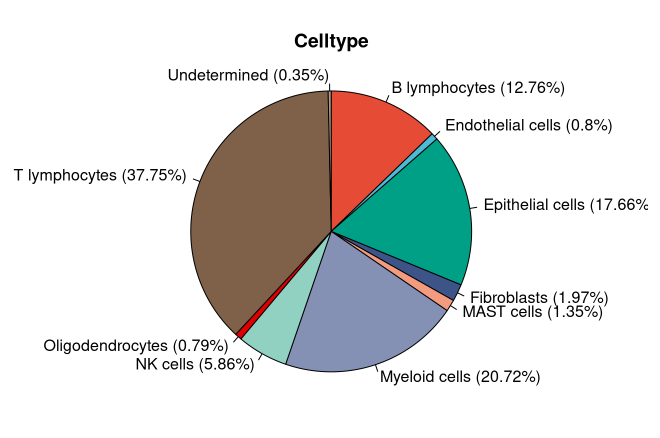
1. 绘制饼图(Pie Chart)
饼图适用于展示单个样本或多个样本合并后的细胞类型比例。
代码示例
# 加载必要的包
library(ggplot2)
library(dplyr)

# 计算各细胞类型的数量
cell_counts <- table(scRNA$Cell_type)
df <- as.data.frame(cell_counts)

# 计算比例
pielabel <- paste0(df$Var1, " (", round(df$Freq / sum(df$Freq) * 100, 2), "%)")

# 绘制2D饼图
pie(df$Freq,
    labels = pielabel,
    col = rainbow(length(df$Freq)),
    main = "Cell Type Proportion")
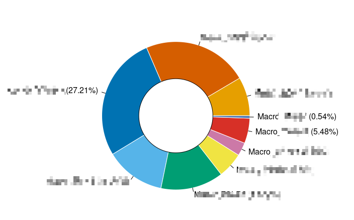
2. 绘制甜甜圈图(Doughnut Chart)
甜甜圈图是带有空心中心的饼图,视觉上更清晰,适合强调各类别之间的对比。
代码示例
# 甜甜圈图的自定义函数
doughnut <- function(x, labels = names(x), outer.radius = 0.8, inner.radius = 0.4, col = NULL, border = "white") {
  pie(x, labels = labels, radius = outer.radius, col = col, border = border)
  symbols(0, 0, circles = inner.radius, inches = FALSE, add = TRUE, bg = "white")
}

# 计算细胞比例
df <- table(scRNA$Cell_type) %>% as.data.frame()
labs <- paste0(df$Var1, " (", round(df$Freq / sum(df$Freq) * 100, 2), "%)")

# 绘制甜甜圈图
doughnut(df$Freq, labels = labs, col = rainbow(length(df$Freq)), inner.radius = 0.4)
3. 绘制堆积柱状图(Stacked Bar Chart)
堆积柱状图适用于比较不同样本组之间的细胞类型比例,如对照组和实验组的细胞分布。
代码示例
# 加载ggplot2包
library(ggplot2)

# 计算各细胞类型在不同组别中的数量
cellnum <- table(scRNA$Cell_type, scRNA$Group)
cell.prop <- as.data.frame(prop.table(cellnum))

# 设定列名
colnames(cell.prop) <- c("Celltype", "Group", "Proportion")

# 绘制堆积柱状图
p.bar <- ggplot(cell.prop, aes(x = Group, y = Proportion, fill = Celltype)) +
  geom_bar(stat = "identity", position = "fill") +
  scale_fill_manual(values = rainbow(length(unique(cell.prop$Celltype)))) + # 自定义颜色
  ggtitle("Cell Type Proportion by Group") +
  theme_bw() +
  theme(axis.ticks.length = unit(0.5, 'cm')) +
  guides(fill = guide_legend(title = NULL))

print(p.bar)
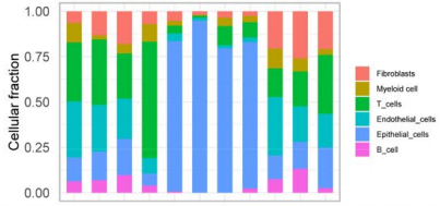
以上代码可以用于单细胞数据分析的可视化,帮助直观展示细胞比例在不同实验条件下的变化。
📢 欢迎点赞、评论、关注!VX公众号”生信小鹏“ 🔥🔥🔥


 2539
2539

 被折叠的 条评论
为什么被折叠?
被折叠的 条评论
为什么被折叠?
 到【灌水乐园】发言


