


一、研究背景
随着全球航空运输业的快速发展,航空旅行已经成为人们生活中不可或缺的一部分。特别是在中国,航空客运量持续增长,航空公司间的竞争也日益激烈。不同航空公司的价格策略和航班服务质量直接影响到乘客的选择和出行体验。在这个背景下,航班价格数据的分析和预测显得尤为重要。
航班价格不仅受航空公司自身的定价策略影响,还与多个因素密切相关,如航线、出发地和目的地、停站次数、起飞时间、到达时间、航班持续时间以及乘客的预订时间等。通过对这些因素的深入分析,可以帮助航空公司优化定价策略,提高市场竞争力;同时也可以为乘客提供价格预测服务,帮助他们在合适的时间购买机票,节省旅行成本。
本研究旨在通过Python数据分析技术,对航班价格数据进行探索性数据分析(EDA)和预测建模,找出影响航班价格的关键因素,并建立预测模型,为航班价格的动态定价和预测提供科学依据。
二、研究意义
-
优化航空公司定价策略:通过对航班价格数据的分析,航空公司可以了解影响价格的关键因素,从而优化定价策略,提高收益管理水平。在市场竞争激烈的环境中,合理的价格策略不仅可以吸引更多乘客,还可以提高公司的盈利能力。
-
提升乘客购票体验:价格预测模型可以帮助乘客在最合适的时间购买机票,避免支付过高的票价,从而节省旅行成本。特别是对于经常出差的商务人士和旅游爱好者,价格预测服务将极大地提升他们的购票体验。
-
促进航空市场透明度:通过公开的价格分析和预测,乘客可以对市场价格有更清晰的认知,避免因信息不对称而造成的价格歧视,促进航空市场的透明化和健康发展。
-
提供决策支持:政府相关部门和行业监管机构可以利用本研究的成果,监测和调控航空市场价格,保障消费者权益,维护市场公平竞争。
三、实证分析
该数据集提供了航班详细信息的全面概述,
航空公司:运营航班的航空公司的名称。
始发地和目的地:航班始发地和降落的城市。
总停靠站数:航班停靠的次数。
价格:相应航班的机票价格。
日期、月份和年份:安排航班的具体日期。
出发和到达时间:出发和到达的详细小时数和分钟数。
持续时间:以小时和分钟为单位的飞行总持续时间。
首先读取数据
import pandas as pd
import numpy as np
import seaborn as sns
from matplotlib import pyplot as plt
import networkx as nx

df = pd.read_csv('flight_dataset.csv')
df.head()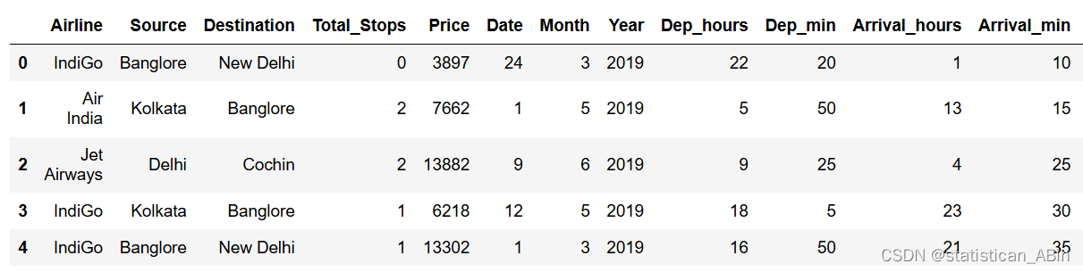
接下来对数据进行基本的分析
描述性统计分析
df.describe()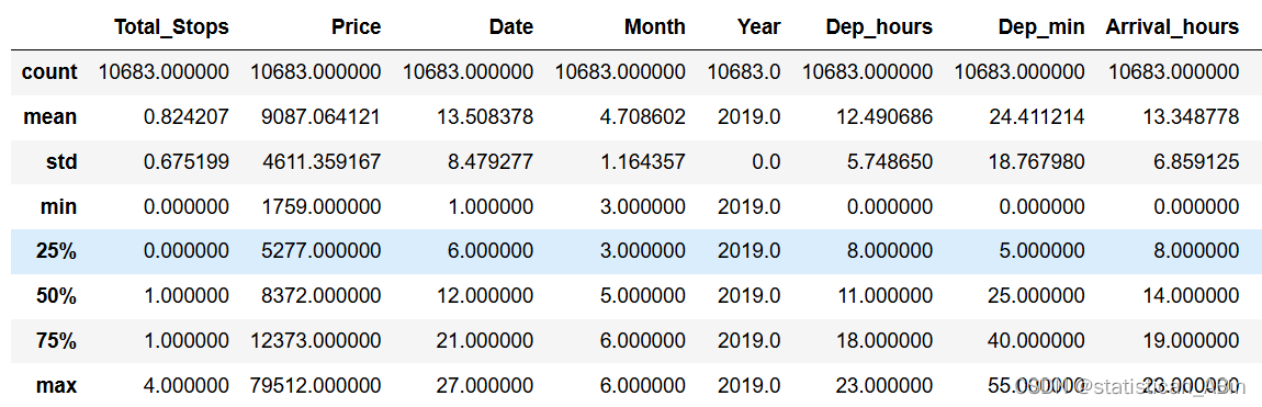
数据类型查看
df.info() 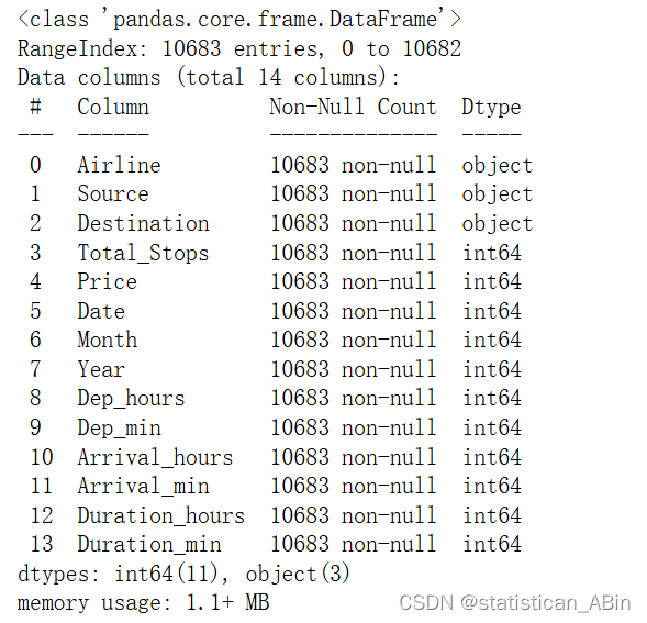
发现有字符型和数值型
接下来缺失值查看
df.isna().sum() 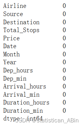
接下来查看重复行的数量
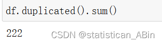
发现还不少,处理一下
df.drop_duplicates(inplace = True)接下来查看数据形状
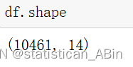
发现数据有10461行,14个特征
接下来清洗数据
接下来从价格列中删除异常值,以四分位数来判断
q1 = df['Price'].quantile(0.25)
q3 = df['Price'].quantile(0.75)

iqr = q3 - q1

ll = q1 - 1.5 * iqr
ul = q3 + 1.5 * iqr

outliers = (df['Price'] < ll ) |( df['Price'] > ul)
df = df[~outliers]
从列中删除异常值Duration_hours
q1 = df['Duration_hours'].quantile(0.25)
q3 = df['Duration_hours'].quantile(0.75)

iqr = q3 - q1

ll = q1 - 1.5 * iqr
ul = q3 + 1.5 * iqr

outliers = (df['Duration_hours'] < ll ) |( df['Duration_hours'] > ul)
df = df[~outliers]
从列中删除异常值Total_Stops
q1 = df['Total_Stops'].quantile(0.25)
q3 = df['Total_Stops'].quantile(0.75)
iqr = q3 - q1
ll = q1 - 1.5 * iqr
ul = q3 + 1.5 * iqr
outliers = (df['Total_Stops'] < ll ) |( df['Total_Stops'] > ul)
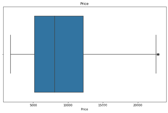
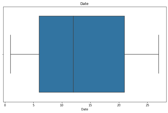
df = df[~outliers]接下来可视化一下特征(箱线图)
num_cols = df.select_dtypes(include=['int64'])
for i in num_cols.columns:
    plt.figure(figsize=(10,6))
    sns.boxplot(df[i])
    plt.title(i)
    plt.show()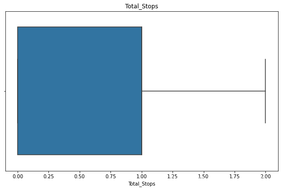
接下来绘制价格的直方图
plt.figure(figsize=(12,10))
sns.histplot(df['Price'], kde = True , color = 'orange')
plt.show()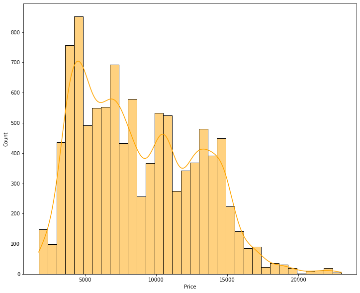
航线的柱状图
df['Airline'].value_counts().plot(kind = 'bar')
plt.show()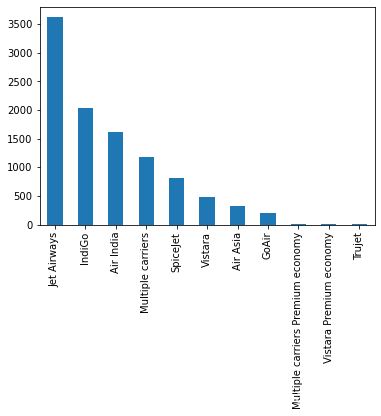
接下来查看最受欢迎的路线
route_freq = df.groupby(['Source','Destination']).size().reset_index(name='count')
route_freq = route_freq.sort_values(by = 'count' , ascending = False)
G = nx.from_pandas_edgelist(route_freq, 'Source', 'Destination', ['count'], create_using=nx.DiGraph())
plt.figure(figsize=(15, 10))
pos = nx.spring_layout(G, k=0.5, iterations=50)
nx.draw_networkx_nodes(G, pos, node_size=3000, node_color='skyblue', edgecolors='black')
nx.draw_networkx_edges(G, pos, arrowstyle='-|>', arrowsize=20, edge_color='gray', width=2)
nx.draw_networkx_labels(G, pos, font_size=12, font_weight='bold')
edge_labels = nx.get_edge_attributes(G, 'count')
nx.draw_networkx_edge_labels(G, pos, edge_labels=edge_labels, font_size=10, font_color='red')
plt.title('Airline Route Network', size=20)
plt.axis('off')
plt.show() 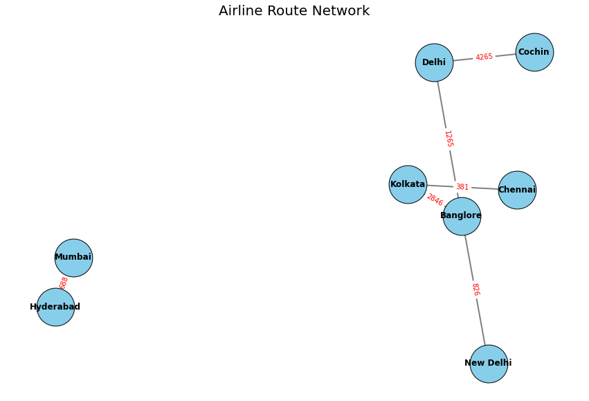
接下来查看路线频率
plt.figure(figsize=(12, 6))
sns.barplot(data=route_freq, x='count', y='Source' + ' -> ' + df['Destination'])
plt.xlabel('Frequency')
plt.ylabel('Route')
plt.title('Route Frequency')
plt.show()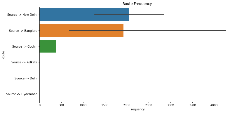
总停靠点与航空公司的航线
总停靠点与源和目的地的情况
plt.figure(figsize=(10, 6))
sns.barplot(x='Total_Stops', y=route_stops['Source'] + ' to ' + route_stops['Destination'], data=route_stops, palette='magma')

plt.xlabel('Total Stops')
plt.ylabel('Route')
plt.title('Total Stops by Route')

plt.show() 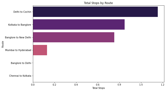
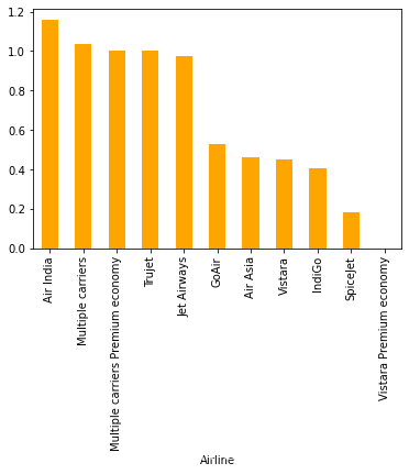
接下来查看航线与价格的关系
plt.figure(figsize=(10,6))
sns.barplot(x = airline_price.index , y = airline_price.values , palette='magma')

plt.xticks(rotation = 90)
plt.show() 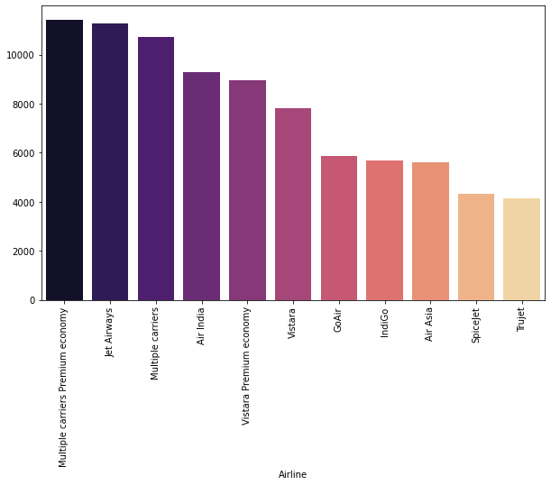
路线与价格
route_price = df.groupby(['Source','Destination']).Price.mean().reset_index(name='price')
route_price = route_price.sort_values(by = 'price' , ascending = False)

plt.figure(figsize=(10,6))
sns.barplot(x = route_price['Source'] +" to "+ route_price['Destination'], y = route_price['price'] , palette='pastel')

plt.xticks(rotation = 45)
plt.show()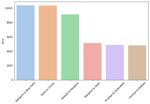
接下来查看路线与持续时间的关系
route_dur = df.groupby(['Source','Destination']).duration.mean().reset_index(name='duration')
route_dur = route_dur.sort_values(by = 'duration' , ascending = False)

plt.figure(figsize=(10,6))
sns.barplot(y = route_dur['Source'] +" - "+ route_dur['Destination'], x = route_dur['duration'] , palette='cool')

plt.xticks(rotation = 45)
plt.show() 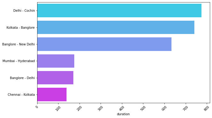
飞行时间与价格的关系
df_sorted = df.sort_values(by='duration')
plt.figure(figsize=(12, 10))
plt.plot(df_sorted['duration'], df_sorted['Price'], marker='o', color='skyblue', linewidth=2, markersize=8)
plt.xlabel('Duration')
plt.ylabel('Price')
plt.title('Duration vs Price')
plt.grid(True)
plt.show()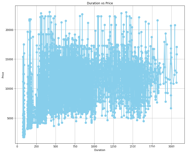 查看一下特征之间的相关性热力图
plt.figure(figsize=(10, 8))
num_cols = df.select_dtypes('int64')
heatmap = sns.heatmap(num_cols.corr(), annot=True, cmap='coolwarm', fmt=".2f", linewidths=.5)
heatmap.set_title('Correlation Heatmap')
plt.show()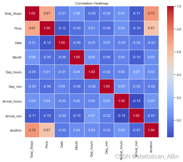
可以发现价格与持续时间和总止损高度相关,这是有道理的
接下来建立模型和对模型评价
标准化数据
def normalize_columns(df, columns):
    for col in columns:
        min_val = df[col].min()
        max_val = df[col].max()
        df[col] = (df[col] - min_val) / (max_val - min_val)

columns_to_normalize = ['Total_Stops', 'Date',
       'Month', 'Dep_hours', 'Dep_min', 'Arrival_hours', 'Arrival_min',
       'duration']

normalize_columns(df, columns_to_normalize)
独热编码
categorical_cols = df.select_dtypes(include=['object']).columnsfrom sklearn.model_selection import train_test_split
from sklearn.linear_model import LinearRegression, Ridge, Lasso
from sklearn.tree import DecisionTreeRegressor
from sklearn.ensemble import RandomForestRegressor, GradientBoostingRegressor
from sklearn.metrics import mean_squared_error, mean_absolute_error, median_absolute_error, r2_score, explained_variance_score
X = df.drop(columns=['Price'])
y = df['Price']
X_train, X_test, y_train, y_test = train_test_split(X, y, test_size=0.2, random_state=42)
models = {
'Linear Regression': LinearRegression(),
'Ridge Regression': Ridge(),
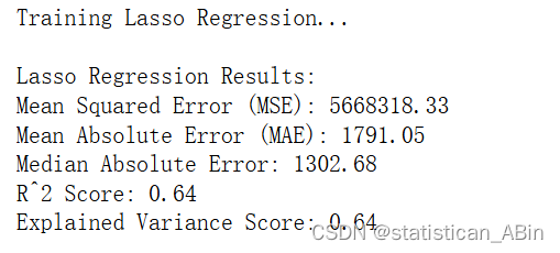
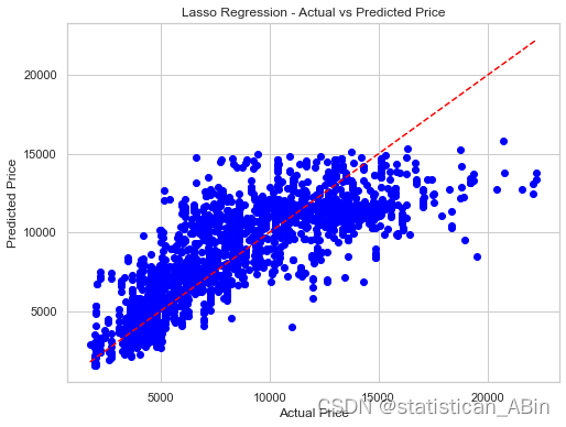
'Lasso Regression': Lasso(),
'Decision Tree Regressor': DecisionTreeRegressor(random_state=42),
'Random Forest Regressor': RandomForestRegressor(random_state=42),
'Gradient Boosting Regressor': GradientBoostingRegressor(random_state=42)
}
for model_name, model in models.items():
print(f"Training {model_name}...")
model.fit(X_train, y_train)
y_pred = model.predict(X_test)
mse = mean_squared_error(y_test, y_pred)
mae = mean_absolute_error(y_test, y_pred)
medae = median_absolute_error(y_test, y_pred)
r2 = r2_score(y_test, y_pred)
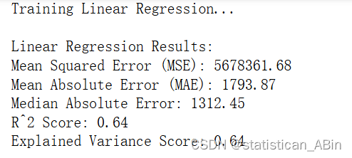
evs = explained_variance_score(y_test, y_pred)线性回归结果:

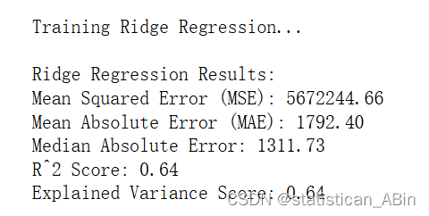
岭回归

逻辑回归
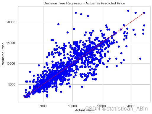
决策树

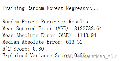
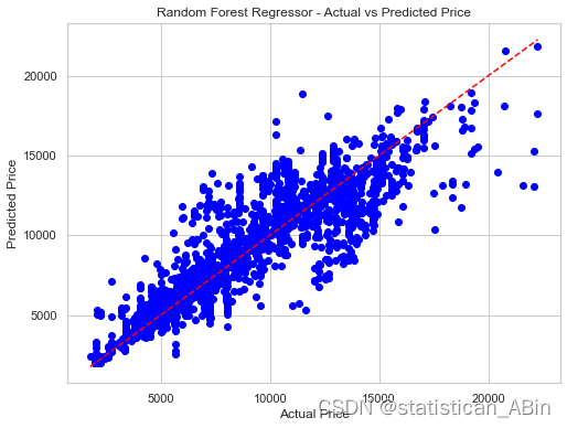
随机森林
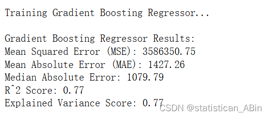
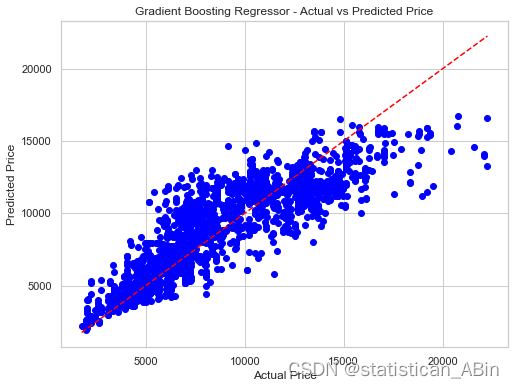
梯度提升
模型拟合优度比较:
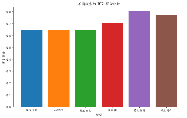
可见随机森林模型的预测效果要好一点,其次是梯度提升和决策树。
四、结论
通过对航班价格数据的探索性数据分析和预测建模,本研究得出以下主要结论:
-
影响价格的主要因素:航班价格受到多个因素的影响,包括但不限于航空公司、出发地和目的地、停站次数、起飞和到达时间、航班持续时间以及预订时间等。不同航空公司和不同航线的价格差异显著,停站次数和航班持续时间对价格有显著影响。
-
预测模型的有效性:基于所选取的特征变量,使用机器学习算法建立的价格预测模型在测试数据上表现良好,具有较高的预测准确性。通过对模型的调优和验证,可以进一步提高预测效果,为航班价格预测提供可靠的技术支持。
-
数据驱动的定价策略:利用数据分析结果,航空公司可以制定更加科学和灵活的定价策略,结合市场需求和竞争态势,动态调整票价,提高市场竞争力和盈利水平。
-
乘客购票建议:基于价格预测模型,乘客可以在预订时间上做出更明智的选择,避开价格高峰期,节省旅行成本。通过了解价格波动规律,乘客可以选择在价格较低的时间段购买机票,获得更优惠的票价。
本研究为航班价格的分析和预测提供了有效的方法和工具,具有重要的应用价值和参考意义。未来可以进一步结合更多的外部数据,如季节、节假日、航班载客率等,提升模型的预测精度和适用性。
创作不易,希望大家多点赞关注评论!!!(类似代码或报告定制可以私信)


 7468
7468

 被折叠的 条评论
为什么被折叠?
被折叠的 条评论
为什么被折叠?
 到【灌水乐园】发言


