


网上学习资料一大堆,但如果学到的知识不成体系,遇到问题时只是浅尝辄止,不再深入研究,那么很难做到真正的技术提升。
一个人可以走的很快,但一群人才能走的更远!不论你是正从事IT行业的老鸟或是对IT行业感兴趣的新人,都欢迎加入我们的的圈子(技术交流、学习资源、职场吐槽、大厂内推、面试辅导),让我们一起学习成长!
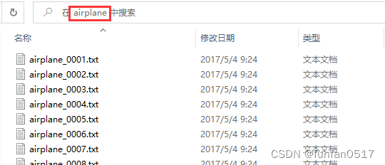
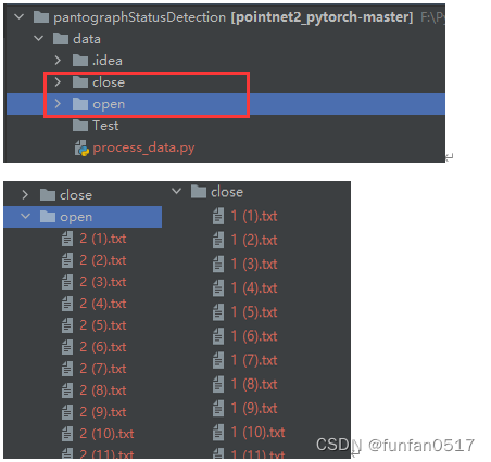
1.1分类点云数据
1.1.1原数据集介绍
每个点云类别文件夹下有若干个txt的点云数据
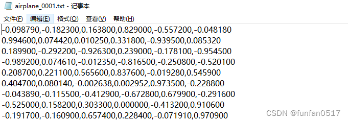
每个点云数据有若干行点数据,每行点数据包含x,y,z,nx,ny,nz等6个数据。
x、y、z为点云的空间坐标,nx、ny、nz为点云的法向量。
安装 CloudCompare软件可以打开txt点云文件

1.1.2制作个性化数据集
本次实验目标是检测受电弓开合状态,需要采集open和close两类点云数据,Test是一个存放最终真实无标签测试数据的空目录,process_data.py是一个自动生成数据集配置文件的脚本,后续会介绍
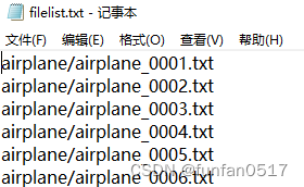
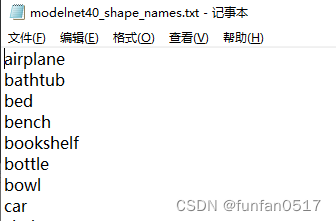
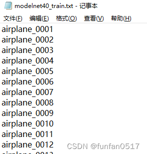
1.2 记录点云数据的配置文件
1.2.1原数据集介绍
除了分类点云数据外,还需要一些记录点云数据文件路径、类别、训练集、测试集的配置文件。
(1)filelist.txt记录了点云数据的相对文件路径
(2)modelnet40_shape_names.txt记录了全部类别
(3)modelnet40_train.txt记录了从数据集中划分的训练集
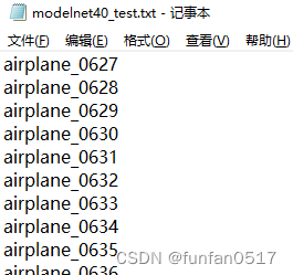
(4)modelnet40_test.txt记录了从数据集中划分的测试集
1.2.2制作个性化数据集
编写process_data.py数据集预处理脚本文件
import os
import random
import shutil
from pathlib import Path
# 获取当前程序执行的工作目录
current_directory = os.getcwd()
directory_name = os.path.basename(current_directory)
# 带类别标签的数据集所在目录
folder_paths = [Path(current_directory + "/open"), Path(current_directory + "/close")]
# 初始化目录中文件
test_folder_path = Path(current_directory + "/Test")
shutil.rmtree(test_folder_path)
os.mkdir(test_folder_path)
for folder\_path in folder_paths:
file_list = list(folder_path.glob("\*"))
for i, file_path in enumerate(file_list, start=1):
new_file_name = f"{str(i).zfill(4)}{file\_path.suffix}"
new_file_path = folder_path / new_file_name
if new_file_path.exists():
continue
file_path.rename(new_file_path)
# 生成以下目标文件(配置文件)
txt_file_path = Path(current_directory + "/filelist.txt") # 记录全部带标签的数据集文件(带后缀名)
txt_file_path2 = Path(current_directory + f"/{directory\_name}\_train.txt") # 记录全部带标签的训练文件(不带后缀名)
txt_file_path3 = Path(current_directory + f"/{directory\_name}\_test.txt") # 记录全部带标签的测试文件(不带后缀名)
txt_file_path4 = Path(current_directory + f"/{directory\_name}\_shape\_names.txt") # 记录全部类别(不带后缀名)
txt_file_path5 = Path(current_directory + f"/{directory\_name}\_realtest.txt") # 记录不带标签的真实测试文件(不带后缀名)
# 打开目标文件
with txt_file_path.open("w") as txt_file, txt_file_path2.open("w") as txt_file2, txt_file_path3.open(
"w") as txt_file3, txt_file_path4.open("w") as txt_file4:
for folder\_path in folder_paths:
folder_name = folder_path.name
file_list = list(folder_path.glob("\*"))
random.shuffle(file_list) # 随机打乱文件列表
total_files = len(file_list)
train_files_count = int(total_files * 0.8) # 80% of the files for training


**网上学习资料一大堆,但如果学到的知识不成体系,遇到问题时只是浅尝辄止,不再深入研究,那么很难做到真正的技术提升。**
**[需要这份系统化的资料的朋友,可以戳这里获取](https://bbs.csdn.net/forums/4f45ff00ff254613a03fab5e56a57acb)**
**一个人可以走的很快,但一群人才能走的更远!不论你是正从事IT行业的老鸟或是对IT行业感兴趣的新人,都欢迎加入我们的的圈子(技术交流、学习资源、职场吐槽、大厂内推、面试辅导),让我们一起学习成长!**
**
**一个人可以走的很快,但一群人才能走的更远!不论你是正从事IT行业的老鸟或是对IT行业感兴趣的新人,都欢迎加入我们的的圈子(技术交流、学习资源、职场吐槽、大厂内推、面试辅导),让我们一起学习成长!**


 1106
1106

 被折叠的 条评论
为什么被折叠?
被折叠的 条评论
为什么被折叠?
 到【灌水乐园】发言


