


R:https://www.r-project.org/
Rstudio: https://posit.co/products/open-source/rstudio/
一.数据准备
-
下载探针矩阵probe.txt和平台注释ann.txt
部分平台注释文件不能下载,解决办法:
- gset <- getGEO("GSE149507",destdir = ".",getGPL = T)→gset[["GSE149507_series_matrix.txt.gz"]]@featureData@data
- 下载soft文件:soft <-getGEO(filename="GSE149507_family.soft")→soft@gpls[["GPL23270"]]@dataTable@table#getGEO()可下载网页文件,也可读取soft文件
二. 探针矩阵转换为基因矩阵
!setwd("D:\\immune cell infiltration\\GEO")
getwd()
2.在GEO数据库中下载GSE信息
#install.packages("tidyverse")
library(GEOquery)
!gset <- getGEO(GEO = "GSE124226",destdir = ".",getGPL = F)#destdir="."表示下载到当前路径
e2 <- gset[[1]]
phe <- e2@phenoData@data  #提取临床信息
exp <- e2@assayData[["exprs"]]  #提取表达矩阵

3.在GEO数据库中下载对应平台信息:(平台信息含探针对应的基因名)  该处ID_symbol处需替换
library(data.table)
ann=fread("ann.txt",sep="\t",header=T,data.table = F)#能在excel中打开的文件都可以用fread函数读取
ID_symbol <- ann[,c("ID","Gene Symbol")]

4.部分探针对应的基因名有两个(如"DDR1 /// MIR4640" ),将排在后面的去掉 该处ID_symbol、ID_gene_symbol处需替换
symbol <- ID_symbol$`Gene Symbol`
symbol1 <- strsplit(symbol,split=" /// ",fixed=T)#fixed=T表示精确查找
gene_symbol <- sapply(symbol1,function(x){x[1]})#提取每一个子列表中的第一个元素
ID_gene_symbol <- data.frame(ID_symbol$ID,gene_symbol)
rm(ID_symbol,symbol,symbol1,gene_symbol)

5.将表达矩阵与基因名合并
library(dplyr)
exp <- as.data.frame(exp)#merge函数只对两个data.frame进行合并
exp1 <- merge(ID_gene_symbol,exp,by.x = 1,by.y = 0)
exp2 <- distinct(exp1,gene_symbol,.keep_all=T)
exp3 <- na.omit(exp2)#将缺失的基因名去除
rownames(exp3) <- exp3$gene_symbol
exp4 <- exp3[,-c(1,2)]

6.将对照组样本放在前面并进行批次校正
!control <- c()#对照样本所在列
!treat <- c(seq(1,35,2))##查看tumor样本所在列
exp5 <- exp4[,c(control,treat)]#将对照样本放在前面
!group_list <- c(rep("control",18),rep("treat",18))
group_list <- factor(group_list)
group_list <- relevel(group_list,ref="control")#强制限定顺序,control在前

library(limma)
exp6 <- normalizeBetweenArrays(exp5)#除去批次效应
boxplot(exp5,outline=F,notch=T,col=group_list,las=2)
boxplot(exp6,outline=F,notch=T,col=group_list,las=2)#绘制出的图形相同,说明样本已经进行过归一化处理
rm(ID_gene_symbol,exp,exp1,exp2,exp3,exp4,exp5,control,treat)
至此,我们获得了想要的横坐标为基因名,纵坐标为样本名的表达矩阵exp6
查看数据是否已经取了log2
ex <- exp6
qx <- as.numeric(quantile(ex, c(0., 0.25, 0.5, 0.75, 0.99, 1.0), na.rm=T))
LogC <-(qx[5]>100)||
(qx[6]-qx[1] > 50 && qx[2] > 0) ||
(qx[2]>0&&qx[2]<1&&qx[4]>1&&qx[4]<2)

if(LogC){
ex[which(ex<=0)]<-NaN
exprSet <- log2(ex)
print("需要取log2")}else{print("无需取log2")}
rm(ex,exp6,LogC,qx)
exp6 <- exprSet
write.csv(exp6,"GSE34526.NORMALIZE.CSV")
三、多芯片数据合并
- 准备处理好的多个芯片数据
setwd("D:\\hebing")
getwd()
BiocManager::install("sva")
# 安装包
install.packages("FactoMineR")
install.packages("factoextra")

library(sva)
library(FactoMineR)
library(factoextra)

GSE1=read.csv(file = "GSE34526.NORMALIZE.csv",header = T,row.names = 1)
GSE2=read.csv(file = "GSE137684.NORMALIZE.csv",header = T,row.names = 1)
GSE3=read.csv(file = "GSE80432.NORMALIZE.csv",header = T,row.names = 1)


#GEO数据数据合并
name1 <- intersect(rownames(GSE1),rownames(GSE2))
expr <- cbind(GSE1[name1,],GSE2[name1,])
#若是多个数据(>2),则执行如下命令
name1 <- intersect(rownames(GSE1),rownames(GSE2))
name2 <- intersect(name1,rownames(GSE3))
expr <- cbind(GSE1[name2,],GSE2[name2,],GSE3[name2,])

batch <- c(rep("GSE5090",17),rep("GSE43264",15),rep("GSE6798",29),rep("GSE34526",10),rep("GSE10946",23))
tissue <- c(rep(c("control","treat","control","treat","control","treat","control","treat","control","treat"),c(8,9,7,8,13,16,3,7,11,12)))
mode <- model.matrix(~tissue)

########combat去除批次效应
combat_expr <- ComBat(dat = expr,
                      batch = batch,
                      mod = mode)
#combat_expr就是校正后且合并后的GEO数据

####removeBatchEffect去除批次效应
limma_expr <- removeBatchEffect(expr,batch = batch,design = mode)

rm(expr,GSE1,GSE2,GSE3,name1,name2)

#矫正前PCA分析
pre.pca <- PCA(t(expr),graph = FALSE)#expr1与前文对应
fviz_pca_ind(pre.pca,
             geom= "point",
             col.ind = batch,#batch与前文对应
             addEllipses = TRUE,#添加椭圆
             legend.title="Group"  )#图例名为Group
#此处保存一下图片,方便后续对比

#矫正后PCA分析(1和2都运行,选择百分数值较小的一个进行后续分析)
#1
combat.pca <- PCA(t(combat_expr),graph = FALSE)
fviz_pca_ind(combat.pca,
             geom= "point",
             col.ind = batch,
             addEllipses = TRUE,
             legend.title="Group"  )

#2或
combat.pca <- PCA(t(limma_expr),graph = FALSE)
fviz_pca_ind(combat.pca,
             geom= "point",
             col.ind = batch,
             addEllipses = TRUE,
             legend.title="Group"  )
write.csv(limma_expr,"limma_expr.csv")
write.csv(combat_expr,"combat_expr.csv")

#箱线图查看前后对比
par(mfrow=c(1,2))
boxplot(as.data.frame(expr),main="Original")
boxplot(as.data.frame(combat_expr),main="Batch corrected")

选取较好的矫正方法进行后续分析
最终得到combat_expr.csv或limma_expr.csv,文件为合并后的GEO数据(行名样本名,列名基因名),样本名顺序按GSE1,GSE2,GSE3排列,每个GSE中对照组样本在前,疾病组样本在后
四、将多芯片数据整理为对照组在前,疾病组样本在后
tissue <- c(rep(c("control","treat","control","treat","control","treat"),c(3,7,4,8,8,8)))
setwd("C:\\Users\\LENOVO\\Desktop\\wgcna")
limma_expr <- read.table("limma_expr.csv",sep=",",header=T,row.names = 1)
data <- cbind(t(limma_expr),tissue)
conData <- subset(data,tissue=="control")
treatData <- subset(data,tissue=="treat")
conNum <- nrow(conData)
treatNum <- nrow(treatData)
data=rbind(conData,treatData)
data <- t(data[,-15068])
write.csv(data,"limma_expr_control+treat.csv")
rm(conData,treatData,limma_expr)

fenzu=data.frame(Normal=c(rep(1,conNum),rep(0,treatNum)),
                 Tumor=c(rep(0,conNum),rep(1,treatNum)))
row.names(fenzu)=colnames(data)
write.csv(fenzu,"fenzu.csv")#行名样品名,列名Normal和Tumor,是用1表示,否用0表示,分组也可用作临床信息
最终得到data(limma_expr_control+teart.csv),fenzu.csv
五、差异分析(第六节)
library(limma)
exprSet <- read.csv("limma_expr_control+treat.csv",row.names = 1)
#构建分组矩阵
fenzu <- read.csv("fenzu.csv",row.names = 1)
table(fenzu)
group <- c(rep("con",15),rep("treat",23))
group <- factor(group,levels = c("con","treat"))
design <- model.matrix(~0+group)
colnames(design) <- levels(group)
design

### 2.构建比较矩阵
contrast.matrix <- makeContrasts(treat - con,levels=design)


#线性拟合模型构建

fit <- lmFit(exprSet,design)#线性模型拟合
fit <- contrasts.fit(fit, contrast.matrix)
fit <- eBayes(fit)#贝叶斯检验

### 4.最终得到差异分析结果
allDiff=topTable(fit,number=Inf)


#输出所有基因的差异情况
write.table(allDiff,"allDiff.txt",sep="\t",col.names = NA)
#write.csv(allDiff,"allDiff.csv")

#基因上调和下调设定
data <- allDiff
data$significant <- "stable"
data$significant[data$logFC>=1 & data$P.Value<0.05]="up"
data$significant[data$logFC<=-1 & data$P.Value<0.05]="down"


#输出差异结果
diffSig=data[with(data,(abs(logFC)>1 & P.Value<0.05)),]
write.table(diffSig,"diff_1_0.05.txt",sep="\t",col.names = NA,quote=F)


#筛选差异基因(基础表达量高、变化明显、p值显著)
select.log2FC <- abs(data$logFC)>1
select.Pvalue <- data$P.Value<0.05
select.vec <- select.log2FC & select.Pvalue
table(select.vec)

degs.list <- as.character(rownames(data))[select.vec]  #筛选出的基因名
write.table(degs.list,"DEG.txt",sep="\t",quote=F,row.names=F,col.names = F)
图形绘制
4.1 火山图
图形绘制
library(ggplot2)
library(ggrepel)

#ggplot中的每一个+号代表加一个参数的内容
pdf("volcano.pdf",width = 6,height = 5)
ggplot(data,aes(logFC,-1*log10(P.Value)))+xlim(-2,2)+ylim(0,5)+ #x轴为logFC,p值越小,y值越大
  geom_point(aes(color=significant),size=0.8)+theme_classic()+  #画散点图,size代表点的大小,颜色分类按照significant
  scale_color_manual(values = c("green","black","red"))+  #点的颜色
  geom_hline(yintercept = -log10(0.05),linetype=4,size=0.3)+  #垂直于y轴的线
  geom_vline(xintercept = c(-1,1),linetype=4,size=0.3)+  #垂直于x轴的线
  theme(title = element_text(size=18),text = element_text(size=18))+
  labs(x="log2(foldchange)",y="-log10(P_Value)")
dev.off()
在火山图中标注基因名称
setwd("D:\\limma_expr\\limma差异分析")
BiocManager::install("ggrepel")
library(ggrepel)
data <- read.table("allDiff.txt",sep="\t",header=T,row.names = 1)
data$significant <- "stable"
data$significant[data$logFC>=1 & data$P.Value<0.05]="up"
data$significant[data$logFC<=-1 & data$P.Value<0.05]="down"
label.deg <- c("SYK","FCGR3A","TLR4",
                "TYROBP","FCER1G","CD4","ITGAM","PLCG2","ITGB2","VAV1")
p=ggplot(data,aes(logFC,-1*log10(P.Value)))+xlim(-1.5,2)+ylim(0,5)+
  geom_point(aes(color=significant),size=0.8)+theme_classic()+
  scale_color_manual(values = c("green","black","red"))+
  geom_hline(yintercept = -log10(0.05),linetype=4,size=0.3)+
  geom_vline(xintercept = c(-1,1),linetype=4,size=0.3)+
  theme(title = element_text(size=18),text = element_text(size=18))+
  labs(x="log2(foldchange)",y="-log10(P_Value)")
data_selected <- data[label.deg,] #筛选出的基因所在行

 p +  # 基于普通火山图p
   geom_point(data = data_selected,                             # 添加强调显示的散点,仅限于上调基因
              aes(x = logFC, y = -log10(P.Value)),
              color = 'red3', size = 4.5, alpha = 0.2) +  # 设置散点的颜色、大小和透明度
   geom_label_repel(data = data_selected,                       # 添加带边框的标签,仅限于上调基因
                    aes(x = logFC, y = -log10(P.Value), label = rownames(data_selected)),
                    seed = 233,                           # 设置随机数种子,用于确定标签位置
                    size = 3.5,                           # 设置标签的字体大小
                    color = 'black',                      # 设置标签的字体颜色
                    min.segment.length = 0,               # 始终为标签添加指引线段
                    force = 2,                            # 设置标签重叠时的排斥力
                    force_pull = 2,                       # 设置标签与数据点之间的吸引力
                    box.padding = 0.4,                    # 设置标签周围的填充量
                    max.overlaps = Inf)                   # 设置排斥重叠过多标签的阈值为无穷大,保持始终显示所有标签
4.2 热图
分组、选基因
!annotation_col1 <- data.frame(
  database <- c(rep("GEO",36)),
  CellType <- c(rep("control",18),rep("treatment",18))
)
rownames(annotation_col1) <- colnames(exp6)
class(exp6)
exp6 <- as.data.frame(exp6)
exprset.map <- exp6[label.deg,]#选取想要绘图的基因
绘图
install.packages("pheatmap")
library(pheatmap)
pheatmap::pheatmap(exprset.map,#热图的数据
                   cluster_rows = F,#行聚类(行间表达相似则聚类)
                   cluster_cols=F,#列聚类,可以看出样本之间的区分度
                   annotation_col = annotation_col1,
                   show_colnames = F,  #不展示样品名
                   scale="row",#以行标准化
                   color=colorRampPalette(c("blue","white","red"))(100))#100个渐变色
4.3 箱线图(某一个基因在对照组和疾病组中的差异)
exp.x=exp6["TTC32",]

z=t(exp.x)#行名为样本名,列为基因表达量
z=as.data.frame(z)
!z$type=c(rep("control",18),rep("treatment",18))

library(ggpubr)
library(ggsignif)
library(ggplot2)

ggboxplot(z,x="type",y="TTC32",
          width = 0.6,fill="type",
          notch = T,palette = c("#00AFBB", "red","#E7B800"),
          add = "jitter",shape="type")

###加个p值
p=ggboxplot(z,x="type",y="TTC32",
            width = 0.6,fill="type",
            notch = T,palette = c("#00AFBB", "red","#E7B800"),
            add = "jitter",shape="type")

p + stat_compare_means(aes(group =type))
若对照组和疾病组来自同一个人,可以在点与点之间连线
!z$pairinfo=pairinfo=rep(1:18,2) 第1个和第19个样本来自同一个人
!ggplot(z, aes(type,TTC32,fill=type)) +
  geom_boxplot() +
  geom_point(size=2, alpha=0.5) +
  geom_line(aes(group=pairinfo), colour="black", linetype="11") +
  xlab("") +
  ylab(paste("Expression of ","TTC32"))+
  theme_classic()+
  theme(legend.position = "none")
4.4 小提琴图
library(ggsignif)
compaired <- list(c("control", "treatment"))

library(ggsci)
ggplot(z,aes(type,TTC32,fill=type)) +
  geom_violin()+
  geom_signif(comparisons =compaired ,step_increase = 0.1,map_signif_level = c("***"=0.001, "**"=0.01, "*"=0.05),test =t.test,size=2,textsize = 6)+
  geom_jitter(shape=16, position=position_jitter(0.2))
六、 富集分析 (第九节)
5.1
#筛选差异基因(基础表达量高、变化明显、p值显著)
select.FPKM <- data$AveExpr>5  #筛选表达量>5的基因
select.log2FC <- abs(data$logFC)>1
select.Pvalue <- data$P.Value<0.05
select.vec <- select.FPKM & select.log2FC & select.Pvalue
table(select.vec)

degs.list <- as.character(rownames(data))[select.vec]  #筛选出的基因名
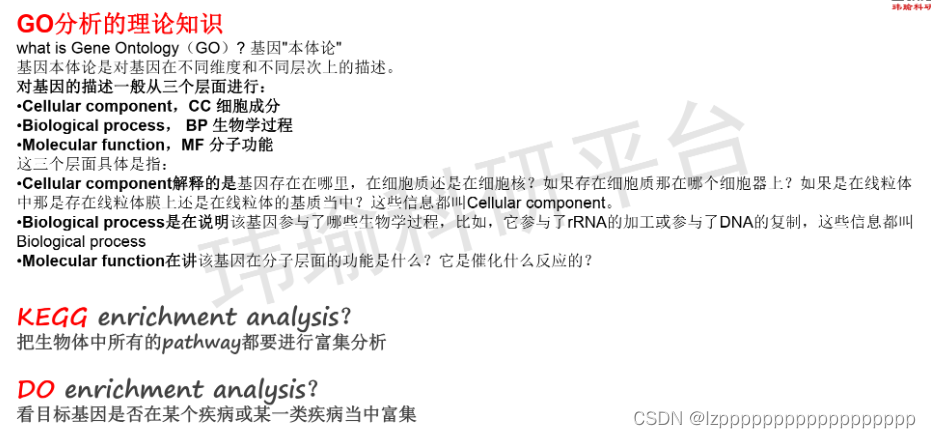
5.1.1 GO
##BP、CC、MF改ont值即可
library(org.Hs.eg.db)
library(clusterProfiler)
erich.go.BP = enrichGO(gene =degs.list,
                       OrgDb = org.Hs.eg.db,
                       keyType = "SYMBOL",
                       ont = "BP",
                       pvalueCutoff = 0.05,
                       qvalueCutoff = 0.05)
dotplot(erich.go.BP,showCategory = 8)#展示8个通路#横坐标为GeneRatio,代表差异基因占通路的百分比
#或barplot(erich.go.BP,showCategory = 8)

erich.go.BP=erich.go.BP@result#通路信息
write.table(erich.go.BP,"erich.go.BP.deg.con.hf.txt",sep = "\t",col.names = NA)
详细版
setwd("")

#install.packages("colorspace")
#install.packages("stringi")
#install.packages("ggplot2")
#install.packages("circlize")
#install.packages("RColorBrewer")

#if (!requireNamespace("BiocManager", quietly = TRUE))
#    install.packages("BiocManager")
#BiocManager::install("org.Hs.eg.db")
#BiocManager::install("DOSE")
#BiocManager::install("clusterProfiler")
#BiocManager::install("enrichplot")
#BiocManager::install("ComplexHeatmap")


library(clusterProfiler)
library(org.Hs.eg.db)
library(enrichplot)
library(ggplot2)
library(circlize)
library(RColorBrewer)
library(dplyr)
library(ComplexHeatmap)

pvalueFilter=0.05    #p值过滤条件
adjPvalFilter=0.05   #矫正后的p值过滤条件

#定义颜色
colorSel="p.adjust"
if(adjPvalFilter>0.05){
	colorSel="pvalue"
}

rt=read.table("interGenes.Type.txt", header=T, sep="\t", check.names=F)     #??ȡ?????ļ?

#提取差异基因的名称,并将其转换为entrezID
genes=unique(as.vector(rt[,1]))
entrezIDs=mget(genes, org.Hs.egSYMBOL2EG, ifnotfound=NA)
entrezIDs=as.character(entrezIDs)
rt=cbind(rt, entrezIDs)
rt=rt[rt[,"entrezIDs"]!="NA",]    #去除entrezID为NA的基因
gene=rt$entrezID
#gene=gsub("c\\(\"(\\d+)\".*", "\\1", gene)
geneFC=rt$logFC
names(geneFC)=gene

#GO富集分析
kk=enrichGO(gene=gene, OrgDb=org.Hs.eg.db, pvalueCutoff=1, qvalueCutoff=1, ont="all", readable=T)#ont="all"表示同时进行BP,CC,MF
GO=as.data.frame(kk)
GO=GO[(GO$pvalue<pvalueFilter & GO$p.adjust<adjPvalFilter),]
write.table(GO, file="GO.txt", sep="\t", quote=F, row.names = F)

#柱状图
pdf(file="barplot.pdf", width=8.5, height=7)
bar=barplot(kk, drop=TRUE, showCategory=10, label_format=130, split="ONTOLOGY", color=colorSel) + facet_grid(ONTOLOGY~., scale='free')
print(bar)
dev.off()

#气泡图
pdf(file="bubble.pdf", width=8.5, height=7)
bub=dotplot(kk, showCategory=10, orderBy="GeneRatio", label_format=130, split="ONTOLOGY", color=colorSel) + facet_grid(ONTOLOGY~., scale='free')
print(bub)
dev.off()

#基因和功能的关系图
pdf(file="cnetplot.pdf", width=8, height=5.25)
cnet=cnetplot(kk, circular=TRUE, foldChange=geneFC, showCategory=5, colorEdge=TRUE)
print(cnet)
dev.off()


###########GO圈图#############################
ontology.col=c("#00AFBB", "#E7B800", "#90EE90")
data=GO[order(GO$pvalue),]
datasig=data[data$pvalue<0.05,,drop=F]
BP = datasig[datasig$ONTOLOGY=="BP",,drop=F]
CC = datasig[datasig$ONTOLOGY=="CC",,drop=F]
MF = datasig[datasig$ONTOLOGY=="MF",,drop=F]
BP = head(BP,6)
CC = head(CC,6)
MF = head(MF,6)
data = rbind(BP,CC,MF)
main.col = ontology.col[as.numeric(as.factor(data$ONTOLOGY))]

#整理圈图数据
BgGene = as.numeric(sapply(strsplit(data$BgRatio,"/"),'[',1))
Gene = as.numeric(sapply(strsplit(data$GeneRatio,'/'),'[',1))
ratio = Gene/BgGene
logpvalue = -log(data$pvalue,10)
logpvalue.col = brewer.pal(n = 8, name = "Reds")
f = colorRamp2(breaks = c(0,2,4,6,8,10,15,20), colors = logpvalue.col)
BgGene.col = f(logpvalue)
df = data.frame(GO=data$ID,start=1,end=max(BgGene))
rownames(df) = df$GO
bed2 = data.frame(GO=data$ID,start=1,end=BgGene,BgGene=BgGene,BgGene.col=BgGene.col)
bed3 = data.frame(GO=data$ID,start=1,end=Gene,BgGene=Gene)
bed4 = data.frame(GO=data$ID,start=1,end=max(BgGene),ratio=ratio,col=main.col)
bed4$ratio = bed4$ratio/max(bed4$ratio)*9.5

#绘制圈图主体部分
pdf("GO.circlize.pdf",width=10,height=10)
par(omi=c(0.1,0.1,0.1,1.5))
circos.par(track.margin=c(0.01,0.01))
circos.genomicInitialize(df,plotType="none")
circos.trackPlotRegion(ylim = c(0, 1), panel.fun = function(x, y) {
  sector.index = get.cell.meta.data("sector.index")
  xlim = get.cell.meta.data("xlim")
  ylim = get.cell.meta.data("ylim")
  circos.text(mean(xlim), mean(ylim), sector.index, cex = 0.8, facing = "bending.inside", niceFacing = TRUE)
}, track.height = 0.08, bg.border = NA,bg.col = main.col)

for(si in get.all.sector.index()) {
  circos.axis(h = "top", labels.cex = 0.6, sector.index = si,track.index = 1,
              major.at=seq(0,max(BgGene),by=100),labels.facing = "clockwise")
}
f = colorRamp2(breaks = c(-1, 0, 1), colors = c("green", "black", "red"))
circos.genomicTrack(bed2, ylim = c(0, 1),track.height = 0.1,bg.border="white",
                    panel.fun = function(region, value, ...) {
                      i = getI(...)
                      circos.genomicRect(region, value, ytop = 0, ybottom = 1, col = value[,2],
                                         border = NA, ...)
                      circos.genomicText(region, value, y = 0.4, labels = value[,1], adj=0,cex=0.8,...)
                    })
circos.genomicTrack(bed3, ylim = c(0, 1),track.height = 0.1,bg.border="white",
                    panel.fun = function(region, value, ...) {
                      i = getI(...)
                      circos.genomicRect(region, value, ytop = 0, ybottom = 1, col = '#BA55D3',
                                         border = NA, ...)
                      circos.genomicText(region, value, y = 0.4, labels = value[,1], cex=0.9,adj=0,...)
                    })
circos.genomicTrack(bed4, ylim = c(0, 10),track.height = 0.35,bg.border="white",bg.col="grey90",
                    panel.fun = function(region, value, ...) {
                      cell.xlim = get.cell.meta.data("cell.xlim")
                      cell.ylim = get.cell.meta.data("cell.ylim")
                      for(j in 1:9) {
                        y = cell.ylim[1] + (cell.ylim[2]-cell.ylim[1])/10*j
                        circos.lines(cell.xlim, c(y, y), col = "#FFFFFF", lwd = 0.3)
                      }
                      circos.genomicRect(region, value, ytop = 0, ybottom = value[,1], col = value[,2],
                                         border = NA, ...)
                      #circos.genomicText(region, value, y = 0.3, labels = value[,1], ...)
                    })
circos.clear()
#绘制圈图中间的图例
middle.legend = Legend(
  labels = c('Number of Genes','Number of Select','Rich Factor(0-1)'),
  type="points",pch=c(15,15,17),legend_gp = gpar(col=c('pink','#BA55D3',ontology.col[1])),
  title="",nrow=3,size= unit(3, "mm")
)
circle_size = unit(1, "snpc")
draw(middle.legend,x=circle_size*0.42)
#绘制GO分类的图例
main.legend = Legend(
  labels = c("Biological Process", "Cellular Component", "Molecular Function"),  type="points",pch=15,
  legend_gp = gpar(col=ontology.col), title_position = "topcenter",
  title = "ONTOLOGY", nrow = 3,size = unit(3, "mm"),grid_height = unit(5, "mm"),
  grid_width = unit(5, "mm")
)
#绘制富集显著性pvalue的图例
logp.legend = Legend(
  labels=c('(0,2]','(2,4]','(4,6]','(6,8]','(8,10]','(10,15]','(15,20]','>=20'),
  type="points",pch=16,legend_gp=gpar(col=logpvalue.col),title="-log10(Pvalue)",
  title_position = "topcenter",grid_height = unit(5, "mm"),grid_width = unit(5, "mm"),
  size = unit(3, "mm")
)
lgd = packLegend(main.legend,logp.legend)
circle_size = unit(1, "snpc")
print(circle_size)
draw(lgd, x = circle_size*0.85, y=circle_size*0.55,just = "left")
dev.off()
5.1.2 KEGG(需要将基因名称转换为entrez_id)
DEG.entrez_id = mapIds(x = org.Hs.eg.db,
                       keys =  degs.list,
                       keytype = "SYMBOL",
                       column = "ENTREZID")

erich.kegg.res <- enrichKEGG(gene = DEG.entrez_id,
                             organism = "hsa",#组织名称,hsa表示人
                             keyType = "kegg")

dotplot(erich.kegg.res)

zzh=erich.kegg.res@result
write.table(zzh,"erich.kegg.res.6.19.txt",sep = "\t",col.names = NA)
详细版
setwd("")
#install.packages("colorspace")
#install.packages("stringi")
#install.packages("ggplot2")

#if (!requireNamespace("BiocManager", quietly = TRUE))
#    install.packages("BiocManager")
#BiocManager::install("org.Hs.eg.db")
#BiocManager::install("DOSE")
#BiocManager::install("clusterProfiler")
#BiocManager::install("enrichplot")


library("clusterProfiler")
library("org.Hs.eg.db")
library("enrichplot")
library("ggplot2")

pvalueFilter=0.05
adjPvalFilter=0.05

#定义图形的颜色
colorSel="p.adjust"
if(adjPvalFilter>0.05){
	colorSel="pvalue"
}


rt=read.table("interGenes.Type.txt", header=T, sep="\t", check.names=F)     #??ȡ?????ļ?

#提取差异基因名称,将基因名转换为entrezID
genes=unique(as.vector(rt[,1]))
entrezIDs=mget(genes, org.Hs.egSYMBOL2EG, ifnotfound=NA)
entrezIDs=as.character(entrezIDs)
rt=cbind(rt, entrezIDs)
rt=rt[rt[,"entrezIDs"]!="NA",]
gene=rt$entrezID
#gene=gsub("c\\(\"(\\d+)\".*", "\\1", gene)
geneFC=rt$logFC
names(geneFC)=gene

#kegg富集分析
kk <- enrichKEGG(gene=gene, organism="hsa", pvalueCutoff=1, qvalueCutoff=1)
KEGG=as.data.frame(kk)
KEGG$geneID=as.character(sapply(KEGG$geneID,function(x)paste(rt$genes[match(strsplit(x,"/")[[1]],as.character(rt$entrezID))],collapse="/")))
KEGG=KEGG[(KEGG$pvalue<pvalueFilter & KEGG$p.adjust<adjPvalFilter),]
#输出显著富集的结果
write.table(KEGG, file="KEGG.txt", sep="\t", quote=F, row.names = F)

#定义显示通路的数目
showNum=30
if(nrow(KEGG)<showNum){
	showNum=nrow(KEGG)
}

#柱状图
pdf(file="barplot.pdf", width=8, height=7)
barplot(kk, drop=TRUE, showCategory=showNum, label_format=100, color=colorSel)
dev.off()

#气泡图
pdf(file="bubble.pdf", width=8, height=7)
dotplot(kk, showCategory=showNum, orderBy="GeneRatio", label_format=100, color=colorSel)
dev.off()

#基因和通路的关系图
pdf(file="cnetplot.pdf", width=9, height=5.25)
kkx=setReadable(kk, 'org.Hs.eg.db', 'ENTREZID')
cnet=cnetplot(kkx, circular=TRUE, foldChange=geneFC, showCategory=5, colorEdge=TRUE)
print(cnet)
dev.off()
5.1.3 挑选感兴趣的通路进行绘图(以erich.kegg.res.6.19.txt为例)
- 用excel打开文档,复制粘贴感兴趣的通路包含列名到新文档1.27.txt,打开新的Rstudio
options(stringsAsFactors = FALSE)
rm(list=ls())
setwd("D:\\immune cell infiltration\\GEO")
kegg=read.table("1.27.txt",header = T,sep = "\t")
k = data.frame(kegg)
library(ggplot2)
library(dplyr)

#将GeneRatio转换为小数点样式
x=k$GeneRatio
x1=as.character(x)
a=strsplit(x1,split="/",fixed=T)
be=sapply(a,function(x){x[1]})
be1=as.numeric(be)
after=sapply(a,function(x){x[2]})
after=as.numeric(after)
?strsplit
k$GeneRatio = be1/after
rm(x,x1,a,be,be1,after)
#或者
before <- as.numeric(sub("/\\d+$",replacement = "", k$GeneRatio))
after <- as.numeric(sub("^\\d+/", "", k$GeneRatio))

font.size =10

k %>%
  ## 对进行p值排序
  arrange(p.adjust) %>%
  ##指定富集的通路数目(10个)
  slice(1:10) %>%
  ## 开始ggplot2 作图,其中fct_reorder调整因子level的顺序
  ggplot(aes(GeneRatio,forcats::fct_reorder(Description,Count)))+
  ## 画出点图,size=Count代表气泡越大,count数越高
  geom_point(aes(color=p.adjust, size = Count)) +
  ## 调整颜色,guide_colorbar调整色图的方向
  scale_color_continuous(low="red", high="blue", guide=guide_colorbar(reverse=TRUE))+
  ## 调整泡泡的大小
  scale_size_continuous(range=c(3, 8))+
  ## 如果用ylab("")或出现左侧空白
  labs(y=NULL) +
  ## 如果没有这一句,上方会到顶
  ggtitle("")+
  ## 设定主题
  theme_bw() +
  theme(axis.text.x = element_text(colour = "black",
                                   size = font.size, vjust =1 ),
        axis.text.y = element_text(colour = "black",
                                   size = font.size, hjust =1 ),
        axis.title = element_text(margin=margin(10, 5, 0, 0),
                                  color = "black",size = font.size),
        axis.title.y = element_text(angle=90))
5.2 GSEA
法一
select.FPKM <- data$AveExpr>5  #筛选表达量>5的基因
table(select.FPKM)
gs.list <- as.character(rownames(data))[select.FPKM]  #筛选出的基因名
f1=data[gs.list,]
f1$symbol <- rownames(f1)
exp.fc <- f1[,c(8,1)]#只含有基因名和logFC值
rm(f1)
###id转化
expm.id <- bitr(exp.fc$symbol, fromType = "SYMBOL", toType = "ENTREZID", OrgDb = "org.Hs.eg.db")
exp.fc.id <- merge(exp.fc, expm.id,by.x="symbol", by.y="SYMBOL", all=F)
exp.fc.id=na.omit(exp.fc.id)
exp.fc.id.sorted <- exp.fc.id[order(exp.fc.id$logFC, decreasing = T),]

id.fc <- exp.fc.id.sorted$logFC
names(id.fc) <- exp.fc.id.sorted$ENTREZID
head(id.fc)
rm(expm.id,exp.fc.id,exp.fc.id.sorted)
gsea <- gseKEGG(id.fc, organism = "hsa",pvalueCutoff = 0.5)
go_result <- gseGO(geneList = id.fc,
                   ont = "BP",
                   OrgDb = org.Hs.eg.db,
                   pvalueCutoff = 0.5)


####查看一下富集结果(NES绝对值大于1.5、p.adjust<0.05富集效果较好)
View(go_result@result)

gseaplot2(gsea, geneSetID = 1,title = "abc")#绘制gsea中的第一条通路
gseaplot2(gsea, geneSetID = c(2,3))#第二和第三条通路
法二
select.FPKM <- data$AveExpr>5  #筛选表达量>5的基因
table(select.FPKM)
gs.list <- as.character(rownames(data))[select.FPKM]  #筛选出的基因名
f1=data[gs.list,]
f1$symbol <- rownames(f1)
f1 <- distinct(f1,symbol,.keep_all = T)
exp.fc <- f1[,c(8,1)]#只含有基因名和logFC值
rm(f1)

deg = exp.fc$logFC
names(deg) = exp.fc$symbol
deg= sort(deg,decreasing = T)
head(deg)
install.packages("msigdbr")
library(msigdbr)
h.kegg= msigdbr(species ="Homo sapiens",category = "C2",subcategory = "KEGG")
length(unique(h.kegg$gs_exact_source))
h.kegg= h.kegg[,c(3,4)]
gsea <- GSEA(deg,pvalueCutoff = 0.5, TERM2GENE =h.kegg)
gseaplot2(gsea, geneSetID = 6, title = gsea$Description[6])
gsea1=gsea@result

write.table(gsea1,"gsea.res.txt",sep = "\t",col.names = NA)
七、核心基因(cytohubba12个打分类型的交集基因)
- 利用cytoscape(插件为cytoHubba):12个打分类型,每个打分类型分别找出打分最高的基因,取交集所得基因即为核心基因,若找不到核心基因,则删掉几个打分类型
- 准备输入文件:从string网站获得的网络关系文件
- 分析完成后得到评分文件score.csv
install.packages("UpSetR")
library(UpSetR)
setwd("D:\\immune cell infiltration\\multiarray")
rt=read.csv("score.csv", header=T, sep=",", check.names=F, row.names=1)
colnames(rt)=c(colnames(rt)[2:ncol(rt)], "N")
scoreType=c("MCC", "DMNC", "MNC", "Degree", "EPC","BottleNeck", "EcCentricity","Closeness", "Radiality", "Betweenness", "Stress","ClusteringCoefficient")

#对打分进行排序
upsetList=c()
for(i in scoreType){
	data=rt[order(rt[,i],decreasing=T),]
	hubGene=row.names(data)[1:50]   #筛选打分最高的前50个基因
	upsetList[[i]]=hubGene
}
upsetData=fromList(upsetList)


#输出图形
pdf(file="upset.pdf", width=9, height=6, onefile=FALSE)
upset(upsetData,
      nsets = length(scoreType),    #展示打分类型个数
      nintersects = 50,             #展示基因集数目
      order.by = "freq",            #排序的方式(按照基因数目排序)
      show.numbers = "yes",         #ֵ柱状图上方是否显示数值
      number.angles = 20,           #字体角度
      point.size = 1.5,             #点的大小
      matrix.color="red",           #点的颜色
      line.size = 0.8,              #线条粗细
      mainbar.y.label = "Gene Intersections",
      sets.x.label = "Set Size")
dev.off()

#获取交集基因,作为网络的核心基因
intersectGenes=Reduce(intersect, upsetList)
intersectGenes=as.data.frame(intersectGenes)
colnames(intersectGenes)="Gene"
write.csv(file="hubGenes.csv", intersectGenes, quote=F, row.names=F)
核心基因可视化
热图
#if (!requireNamespace("BiocManager", quietly = TRUE))
#    install.packages("BiocManager")
#BiocManager::install("limma")

#install.packages("pheatmap")
library(limma)
library(pheatmap)
setwd("")

exp=read.table("exp6.csv", header=T, sep=",", check.names=F,row.names = 1)
dimnames=list(rownames(exp),colnames(exp))
data=matrix(as.numeric(as.matrix(exp)),nrow=nrow(exp),dimnames=dimnames)
data=avereps(data)

geneRT=read.csv("hubGenes.csv", header=T, sep=",", check.names=F)
data=data[as.vector(geneRT[,1]),]#核心基因的表达矩阵
annotation_col1 <- data.frame(
  database <- c(rep("GEO124226",8)),
  Type <- c(rep("control",4),rep("treatment",4))
)
rownames(annotation_col1) <- colnames(data)
colnames(annotation_col1) <- c("database","Type")
#绘制核心基因热图
pdf(file="hubGene.heatmap.pdf", width=7.5, height=3.5)
pheatmap(data,
         annotation_col =annotation_col1,
         color = colorRampPalette(c(rep("blue",2), "white", rep("red",2)))(50),
         cluster_cols =F,
         show_colnames = F,
         scale="row",
         fontsize = 8,
         fontsize_row=7,
         fontsize_col=8)
dev.off()
7.1 核心基因绘制ROC曲线
#install.packages("glmnet")
#install.packages("pROC")

library(glmnet)
library(pROC)

expFile="limma_expr_control+treat.csv"
geneFile="cytohubba_0.9_10.csv"   #核心基因
setwd("D:\\limma_expr\\WGCNA1")

rt=read.table(expFile, header=T, sep=",", check.names=F, row.names=1)
geneRT=read.table(geneFile, header=T, sep=",", check.names=F)
geneRT <- data.frame(geneRT$Name)
#获取表达矩阵样品信息
y <- c(rep(0,15),rep(1,23))


#对核心基因进行循环,绘制ROC曲线
bioCol=rainbow(nrow(geneRT), s=0.9, v=0.9)    #定义图形颜色
aucText=c()
k=0
for(x in as.vector(geneRT[,1])){
	k=k+1
	绘制ROC曲线
	roc1=roc(y, as.numeric(rt[x,]))     #得到ROC曲线的参数
	if(k==1){
		pdf(file="ROC.genes.pdf", width=5, height=4.75)
		plot(roc1, print.auc=F, col=bioCol[k], legacy.axes=T, main="")
		aucText=c(aucText, paste0(x,", AUC=",sprintf("%.3f",roc1$auc[1])))
	}else{
		plot(roc1, print.auc=F, col=bioCol[k], legacy.axes=T, main="", add=TRUE)
		aucText=c(aucText, paste0(x,", AUC=",sprintf("%.3f",roc1$auc[1])))
	}
}
#绘制图例,得到ROC曲线下面积
legend("bottomright", aucText, lwd=2, bty="n", col=bioCol[1:(ncol(rt)-1)])
dev.off()

#构建逻辑模型
rt=rt[as.vector(geneRT[,1]),]      #提取核心基因表达量
rt=as.data.frame(t(rt))
logit=glm(y ~ ., family=binomial(link='logit'), data=rt)
pred=predict(logit, newx=rt)     #得到模型的打分

#绘制模型的ROC曲线
roc1=roc(y, as.numeric(pred))      #得到模型ROC曲线的参数
ci1=ci.auc(roc1, method="bootstrap")     #ROC曲线下面积的波动范围
ciVec=as.numeric(ci1)
pdf(file="ROC.model.pdf", width=5, height=4.75)
plot(roc1, print.auc=TRUE, col="red", legacy.axes=T, main="Model")
text(0.39, 0.43, paste0("95% CI: ",sprintf("%.03f",ciVec[1]),"-",sprintf("%.03f",ciVec[3])), col="red")
dev.off()
八、免疫细胞浸润分析与核心基因联合分析
准备矫正后的合并文件combat_expr.csv或limma_expr.csv
cytoscape评分结果文件hubGenes.csv,免疫细胞结果文件cibersort_result.txt和Diff.cell.txt
#if (!requireNamespace("BiocManager", quietly = TRUE))
#    install.packages("BiocManager")
#BiocManager::install("limma")

#install.packages("tidyverse")
#install.packages("ggplot2")
#install.packages("reshape2")
#install.packages("ggpubr")
install.packages("ggExtra")
#install.packages("corrplot")

library(limma)
library(reshape2)
library(tidyverse)
library(ggplot2)
library(ggpubr)
library(ggExtra)
library(corrplot)

corFilter=0.4                       #相关系数过滤文件
pvalueFilter=0.001                  #相关性检验pvalue过滤文件


exp=read.table("limma_expr.csv", header=T, sep=",", check.names=F,row.names = 1)
exp=as.matrix(exp)
dimnames=list(rownames(exp),colnames(exp))
data=matrix(as.numeric(as.matrix(exp)),nrow=nrow(exp),dimnames=dimnames)
data=avereps(data)

#提取核心基因的表达量
geneRT=read.csv("hubGenes.csv", header=T, sep=",", check.names=F)
data=data[as.vector(geneRT[,1]),]#行名基因名,列名样本名

#去除对照组样品
group <- data.frame(sample=character(38),group=character(38))
group$sample <- colnames(exp)
tissue <- c(rep(c("control","treat","control","treat","control","treat"),c(3,7,4,8,8,8)))
group$group <- tissue
data <- cbind(t(data),group)
data=data[data$group=="treat",]#行名为样本名,列名为基因名
data <- data[,-c(13,14)]
data <- as.matrix(data)


#读取核心免疫细胞的含量
immune=read.table("cibersort_result.txt", header=T, sep="\t", check.names=F, row.names=1)
cellRT=read.csv("Diff.cell.txt", header=F, sep="\t", check.names=F)
immune=immune[,as.vector(cellRT[,1])]#行名样本名,列名为免疫细胞名
#提取基因表达矩阵和免疫浸润结果文件中都包含的样本信息
sameSample=intersect(row.names(data), row.names(immune))
data=data[sameSample,,drop=F]
immune=immune[sameSample,,drop=F]#都只含实验组样品

#相关性分析
outTab=data.frame()
#对免疫细胞进行循环
for(cell in colnames(immune)){
  if(sd(immune[,cell])==0){next}
  #对核心基因进行循环
  for(gene in colnames(data)){
    x=as.numeric(data[,gene])
    y=as.numeric(immune[,cell])
    corT=cor.test(x,y,method="spearman")
    cor=corT$estimate
    pvalue=corT$p.value
    #对满足条件的免疫细胞进行可视化,绘制相关性图形
    if((abs(cor)>corFilter) & (pvalue<pvalueFilter)){
      df1=as.data.frame(cbind(x,y))
      p1=ggplot(df1, aes(x, y)) +
        xlab(paste0(gene, " expression")) + ylab(cell)+
        geom_point() + geom_smooth(method="lm",formula = y ~ x) + theme_bw()+
        stat_cor(method = 'spearman', aes(x =x, y =y))
      #相关性图形
      pdf(file=paste0("cor.", gene, "_", cell, ".pdf"), width=5, height=4.6)
      print(p1)
      dev.off()
    }
  }
}

#相关性热图ͼ
data=cbind(data, immune)#行名为实验组样品名,列名为基因名和免疫细胞名
write.csv(data,"data")
a <- read.csv("data",header=T,row.names = 1)
pdf("corHeatmap.pdf", width=9, height=9)
corrplot(corr=cor(a),
         method = "color",          #图形的展示形式
         order = "original",        #免疫细胞的排序方式
         tl.col="black",            #字体颜色
         addCoef.col = "black",     #相关系数字体颜色
         number.cex = 0.8,          #相关系数字体大小
         col=colorRampPalette(c("blue", "white", "red"))(50),     #ͼ????ɫ??????
)
dev.off()


 100
100


 被折叠的 条评论
为什么被折叠?
被折叠的 条评论
为什么被折叠?
 到【灌水乐园】发言


