


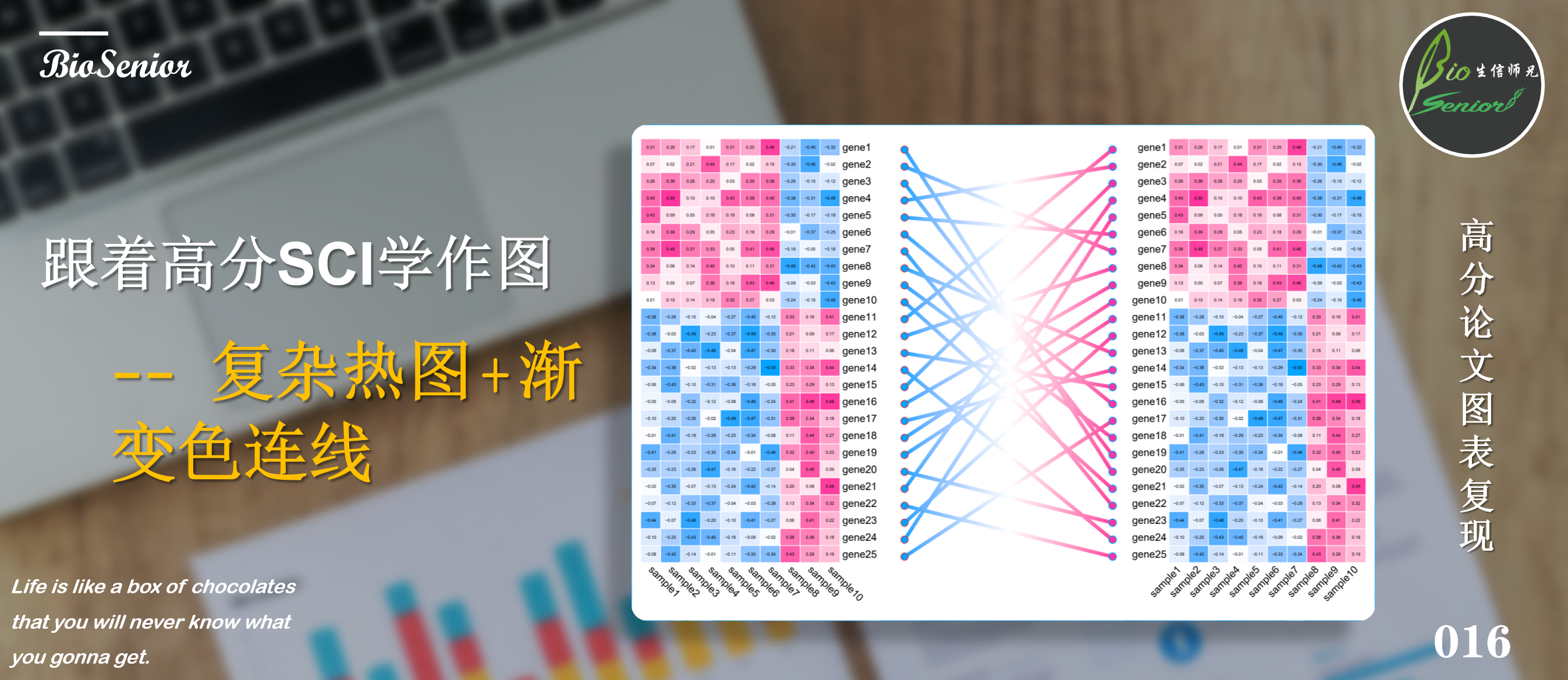
从这个系列开始,师兄就带着大家从各大顶级期刊中的Figuer入手,从仿照别人的作图风格到最后实现自己游刃有余的套用在自己的分析数据上!这一系列绝对是高质量!还不赶紧点赞+在看,学起来!
本期分享的是期刊:J Am Soc Nephrol上面一篇文章中的一个复杂热图+渐变色连线!
示例数据和代码获取

话不多说,直接上图!
读图
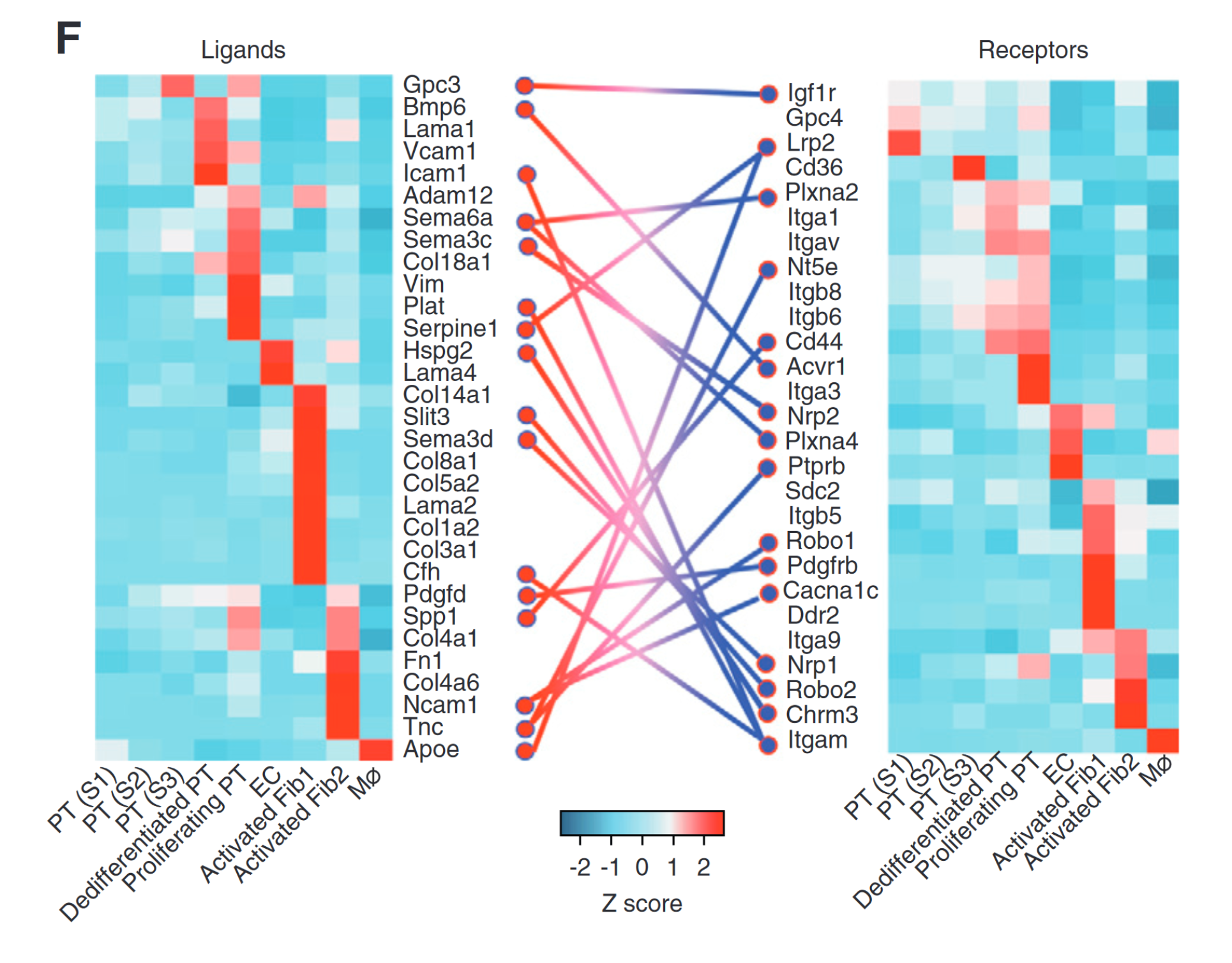
效果展示
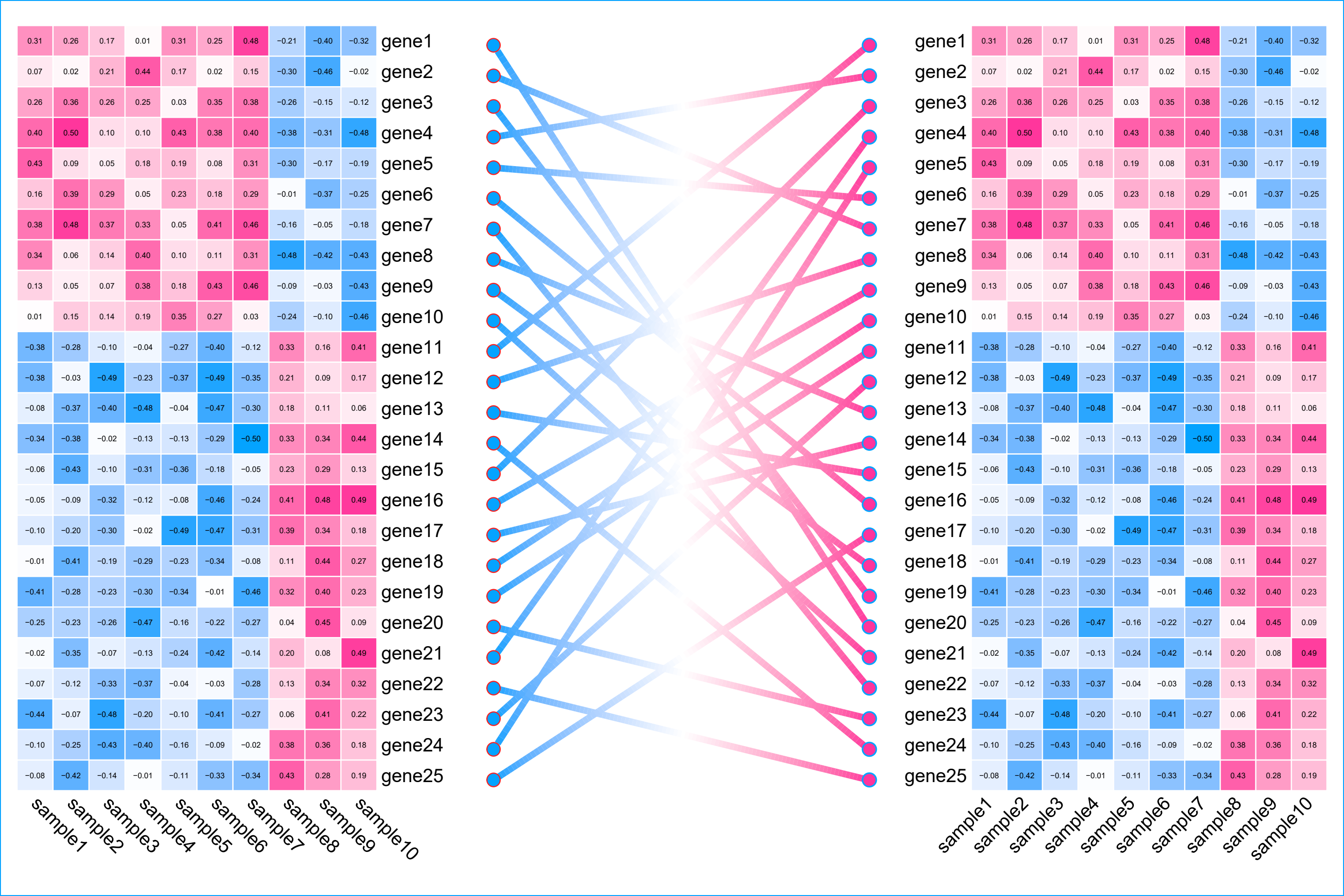
示例数据完全虚拟构建,无实际意义!此外这次的图形在AI中进行了细微的调整,代码复现后,大家也可以手动尝试一下!
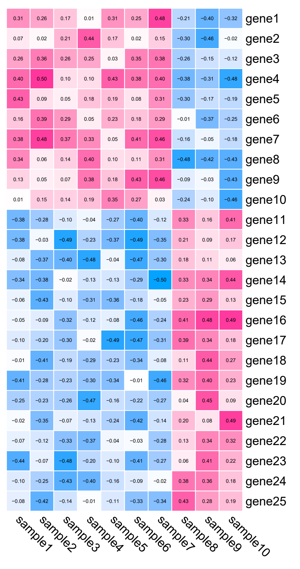
数据构建
library(ggplot2)
library(ComplexHeatmap)
library(ggforce)

# 构建示例数据:
LU_matrix <- matrix(runif(70, 0, 0.5), nrow = 10, ncol = 7)
RD_matrix <- matrix(runif(105, -0.5, 0), nrow = 15, ncol = 7)
RU_matrix <- matrix(runif(30, -0.5, 0), nrow = 10, ncol = 3)
LD_matrix <- matrix(runif(45, 0, 0.5), nrow = 15, ncol = 3)

data <- rbind(cbind(LU_matrix, RU_matrix), cbind(RD_matrix, LD_matrix))
rownames(data) <- paste0("gene", 1:nrow(data))
colnames(data) <- paste0("sample", 1:ncol(data))

data[1:5, 1:5]
#         sample1    sample2    sample3    sample4    sample5
# gene1 0.3131575 0.25730166 0.16792109 0.01307018 0.30757497
# gene2 0.0686659 0.02419527 0.21418035 0.43881553 0.17062910
# gene3 0.2613189 0.36180567 0.26212484 0.25380708 0.02827532
# gene4 0.4033809 0.49797550 0.09943902 0.09800037 0.42676588
# gene5 0.4266993 0.09472528 0.04880730 0.17731476 0.19154542
热图
# 设置颜色:
library(circlize)
col_fun <- colorRamp2(c(-0.5, 0, 0.5), c("#04a3ff", "#ffffff","#ff349c"))

# 绘制热图:
# 由于只是示例,左右采用相同的矩阵:
p1 <- Heatmap(data,
        # 设置颜色:
        col = col_fun,
        # 调整热图格子的边框颜色和粗细:
        rect_gp = gpar(col = "white", lwd = 1),
        # 去掉聚类树:
        cluster_columns = F,
        cluster_rows = F,
        # show_row_dend = F,
        # show_column_dend = F,
        # 列标题旋转角度:
        column_names_rot = -45,
        # 添加文字
        cell_fun = function(j, i, x, y, width, height, fill) {
          grid.text(sprintf("%.2f", data[i, j]), x, y, gp = gpar(fontsize = 5))},
        # 去掉图例:
        show_heatmap_legend = F
        )

# 绘制热图:
# 由于只是示例,左右采用相同的矩阵:
p2 <- Heatmap(data,
              # 设置颜色:
              col = col_fun,
              # 调整热图格子的边框颜色和粗细:
              rect_gp = gpar(col = "white", lwd = 1),
              # 去掉聚类树:
              cluster_columns = F,
              cluster_rows = F,
              # show_row_dend = F,
              # show_column_dend = F,
              # 列标题旋转角度:
              column_names_rot = 45,
              # 添加文字
              cell_fun = function(j, i, x, y, width, height, fill) {
                grid.text(sprintf("%.2f", data[i, j]), x, y, gp = gpar(fontsize = 5))},
              # 去掉图例:
              show_heatmap_legend = F,
              # 行名靠左:
              row_names_side = "left"
)
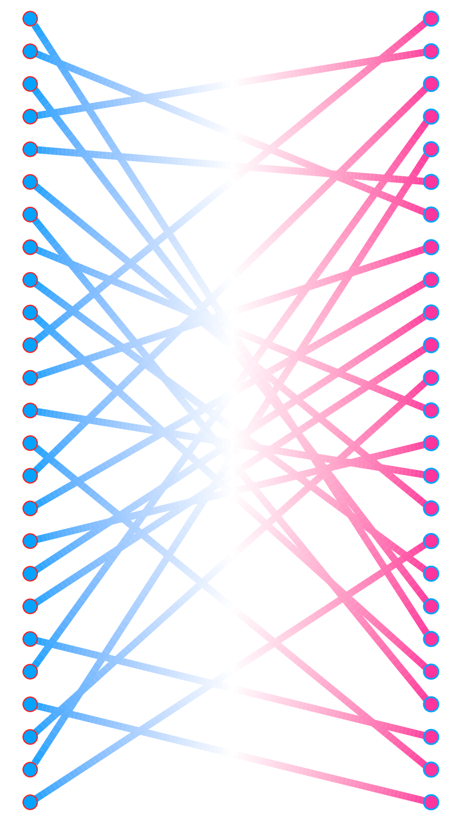
基因连线
# 构建基因连线数据:
lines <- data.frame(
  x = as.character(c(rep(1, 25),rep(2,25))),
  y = c(sample(1:25), sample(1:25)),
  group = rep(1:25, 2)
)

p3 <- ggplot(lines) +
  geom_link2(aes(x = x, y = y, group = group,
                colour = stat(index)
                ), size = 2)+
  scale_colour_gradient2(low = "#04a3ff", mid = "#ffffff", high = "#ff349c",
                         midpoint = 0.5)+
  geom_point(aes(x, y, group = group, fill = x), shape = 21, color = "#fc1e1e", size = 4)+
  scale_fill_manual(values = c("#04a3ff", "#ff349c"))+
  # 空白主题:
  theme_minimal() +
  theme(
    legend.position = "none",
    axis.title.x = element_blank(),
    axis.title.y = element_blank(),
    panel.border = element_blank(),
    panel.grid=element_blank(),
    axis.ticks = element_blank(),
    axis.text = element_blank(),
    plot.title=element_text(size=0, face="bold")
  )
拼图
# 拼图
library(patchwork)
library(ggplotify)

layout <- c(
  area(t = 1, l = 1, b = 6, r = 3),
  area(t = 1, l = 3, b = 6, r = 7),
  area(t = 1, l = 7, b = 6, r = 9)
)

as.ggplot(p1) + p3 + as.ggplot(p2) + plot_layout(design = layout)

ggsave("heatmap.pdf",height = 8, width = 12)
结果展示
示例数据和代码获取
以上就是本期的全部内容啦!**欢迎点赞,点在看!**师兄会尽快更新哦!制作不易,你的打赏将成为师兄继续更新的十足动力!
往期文章
1. 跟着Nature Medicine学作图–箱线图+散点图
2. 跟着Nature Communications学作图–渐变火山图
3. 跟着Nature Communications学作图–气泡图+相关性热图
4. 跟着Nature Communications学作图 – 复杂提琴图
5. 跟着Nature Medicine学作图–复杂热图
6. 跟着Nature Communications学作图–复杂散点图
7. 跟着Nature Communications学作图 – 复杂百分比柱状图
8. 跟着Molecular Cancer学作图 – 分半小提琴图


 6874
6874


 被折叠的 条评论
为什么被折叠?
被折叠的 条评论
为什么被折叠?
 到【灌水乐园】发言


