


为了做好运维面试路上的助攻手,特整理了上百道 【运维技术栈面试题集锦】 ,让你面试不慌心不跳,高薪offer怀里抱!
这次整理的面试题,小到shell、MySQL,大到K8s等云原生技术栈,不仅适合运维新人入行面试需要,还适用于想提升进阶跳槽加薪的运维朋友。

本份面试集锦涵盖了
- 174 道运维工程师面试题
- 128道k8s面试题
- 108道shell脚本面试题
- 200道Linux面试题
- 51道docker面试题
- 35道Jenkis面试题
- 78道MongoDB面试题
- 17道ansible面试题
- 60道dubbo面试题
- 53道kafka面试
- 18道mysql面试题
- 40道nginx面试题
- 77道redis面试题
- 28道zookeeper
总计 1000+ 道面试题, 内容 又全含金量又高
- 174道运维工程师面试题
1、什么是运维?
2、在工作中,运维人员经常需要跟运营人员打交道,请问运营人员是做什么工作的?
3、现在给你三百台服务器,你怎么对他们进行管理?
4、简述raid0 raid1raid5二种工作模式的工作原理及特点
5、LVS、Nginx、HAproxy有什么区别?工作中你怎么选择?
6、Squid、Varinsh和Nginx有什么区别,工作中你怎么选择?
7、Tomcat和Resin有什么区别,工作中你怎么选择?
8、什么是中间件?什么是jdk?
9、讲述一下Tomcat8005、8009、8080三个端口的含义?
10、什么叫CDN?
11、什么叫网站灰度发布?
12、简述DNS进行域名解析的过程?
13、RabbitMQ是什么东西?
14、讲一下Keepalived的工作原理?
15、讲述一下LVS三种模式的工作过程?
16、mysql的innodb如何定位锁问题,mysql如何减少主从复制延迟?
17、如何重置mysql root密码?
网上学习资料一大堆,但如果学到的知识不成体系,遇到问题时只是浅尝辄止,不再深入研究,那么很难做到真正的技术提升。
一个人可以走的很快,但一群人才能走的更远!不论你是正从事IT行业的老鸟或是对IT行业感兴趣的新人,都欢迎加入我们的的圈子(技术交流、学习资源、职场吐槽、大厂内推、面试辅导),让我们一起学习成长!
in_pathway_uro=append_cp(cp, pid=include,name="new_name"),
x=NULL, y=NULL,
in_pathway_rptec=append_cp(cp2, pid=include,name = “new_name”),
id=convert_id(“hsa”,name = “new_name”)) |>
morph(to_subgraph, type!=“group”) |>
mutate(deg=centrality_degree(mode=“all”)) |>
unmorph() |>
filter(deg>0)
在这里,我们还将基于图的聚类结果分配给图,并缩放节点的大小,以便节点可以通过散点图可视化。
V(g2_2) w a l k t r a p < − i g r a p h : : w a l k t r a p . c o m m u n i t y ( g 2 2 ) walktrap <- igraph::walktrap.community(g2_2) walktrap<−igraph::walktrap.community(g22)membership
Scale the node size
sizeMin <- 0.1
sizeMax <- 0.3
rawMin <- min(V(g2_2)
d
e
g
)
r
a
w
M
a
x
<
−
m
a
x
(
V
(
g
2
2
)
deg) rawMax <- max(V(g2_2)
deg)rawMax<−max(V(g22)deg)
scf <- (sizeMax-sizeMin)/(rawMax-rawMin)
V(g2_2)
s
i
z
e
<
−
s
c
f
∗
V
(
g
2
2
)
size <- scf * V(g2_2)
size<−scf∗V(g22)deg + sizeMin - scf * rawMin
Make base graph
g3 <- ggraph(g2_2, layout=“nicely”)+
geom_edge_parallel(alpha=0.9,
arrow=arrow(length=unit(1,“mm”)),
aes(color=subtype_name),
start_cap=circle(3,“mm”),
end_cap=circle(8,“mm”))+
scale_edge_color_discrete(name=“Edge type”)
graphdata <- g3$data
最后,我们用于可视化。背景散点表示基因是否在通路中,前景表示基因是否在多个数据集中差异表达。我们突出显示了在两个数据集中通过金色差异表达的基因。`geom_scatterpie`
g4 <- g3+
ggforce::geom_mark_rect(aes(x=x, y=y, group=walktrap),color=“grey”)+
geom_scatterpie(aes(x=x, y=y, r=size+0.1),
color=“transparent”,
legend_name=“Pathway”,
data=graphdata,
cols=c(“hsa04110”, “hsa03440”,“hsa03460”)) +
geom_scatterpie(aes(x=x, y=y, r=size),
color=“transparent”,
data=graphdata, legend_name=“enrich”,
cols=c(“in_pathway_rptec”,“in_pathway_uro”))+
ggfx::with_outer_glow(geom_scatterpie(aes(x=x, y=y, r=size),
color=“transparent”,
data=graphdata[graphdataKaTeX parse error: Expected 'EOF', got '&' at position 18: …_pathway_rptec &̲ graphdatain_pathway_uro,],
cols=c(“in_pathway_rptec”,“in_pathway_uro”)), colour=“gold”, expand=3)+
geom_node_point(shape=19, size=3, aes(filter=!in_pathway_uro & !in_pathway_rptec & type!=“map”))+
geom_node_shadowtext(aes(label=id, y=y-0.5), size=3, family=“sans”, bg.colour=“white”, colour=“black”)+
theme_void()+coord_fixed()
g4

### 5.4 在KEGG图谱上投影基因调控网络
使用此软件包,可以将推断的网络(例如基因调控网络或由其他软件推断的 KO 网络)投射到 KEGG 图谱上。以下是使用 将 CBNplot 推断的通路内的 KO 网络子集投影到相应通路的参考图上的示例。当然,也可以投影使用其他方法创建的网络。`MicrobiomeProfiler`
library(dplyr)
library(igraph)
library(tidygraph)
library(CBNplot)
library(ggkegg)
library(MicrobiomeProfiler)
data(Rat_data)
ko.res <- enrichKO(Rat_data)
exp.dat <- matrix(abs(rnorm(910)), 91, 10) %>% magrittr::set_rownames(value=Rat_data) %>% magrittr::set_colnames(value=paste0(‘S’, seq_len(ncol(.))))
returnnet <- bngeneplot(ko.res, exp=exp.dat, pathNum=1, orgDb=NULL,returnNet = TRUE)
pg <- pathway(“ko00650”)
joined <- combine_with_bnlearn(pg, returnnet
s
t
r
,
r
e
t
u
r
n
n
e
t
str, returnnet
str,returnnetav)
绘制生成的地图。在此示例中,估计的强度首先用彩色边缘显示,然后参考图的边缘在其顶部以黑色绘制。此外,两个图形中包含的边缘都以黄色突出显示。`CBNplot`
Summarize duplicate edges including strength attribute
number <- joined |> activate(edges) |> data.frame() |> group_by(from,to) |>
summarise(n=n(), incstr=sum(!is.na(strength)))
Annotate them
joined <- joined |> activate(edges) |> full_join(number) |> mutate(both=n>1&incstr>0)
joined |>
activate(nodes) |>
filter(!is.na(type)) |>
mutate(convertKO=convert_id(“ko”)) |>
activate(edges) |>
ggraph(x=x, y=y) +
geom_edge_link0(width=0.5,aes(filter=!is.na(strength),
color=strength), linetype=1)+
ggfx::with_outer_glow(
geom_edge_link0(width=0.5,aes(filter=!is.na(strength) & both,
color=strength), linetype=1),
colour=“yellow”, sigma=1, expand=1)+
geom_edge_link0(width=0.1, aes(filter=is.na(strength)))+
scale_edge_color_gradient(low=“blue”,high=“red”)+
geom_node_rect(color=“black”, aes(fill=type))+
geom_node_text(aes(label=convertKO), size=2)+
geom_node_text(aes(label=ifelse(grepl(“:”, graphics_name), strsplit(graphics_name, “:”) |>
sapply(“[”,2) |> stringr::str_wrap(22), stringr::str_wrap(graphics_name, 22)),
filter=!is.na(type) & type==“map”), family=“serif”,
size=2, na.rm=TRUE)+
theme_void()

#### 5.4.1 投影到原始 KEGG 地图上
您可以直接将推断网络投影到原始 PATHWAY 地图上,这样可以直接比较您自己的数据集中精选数据库和推断网络的知识。
raws <- joined |>
ggraph(x=x, y=y) +
geom_edge_link(width=0.5,aes(filter=!is.na(strength),
color=strength),
linetype=1,
arrow=arrow(length=unit(1,“mm”),type=“closed”),
end_cap=circle(5,“mm”))+
scale_edge_color_gradient2()+
overlay_raw_map(transparent_colors = c(“#ffffff”))+
theme_void()
raws

### 5.5 分析单细胞转录组学中的簇标记基因
该软件包也可应用于单细胞分析。例如,考虑将簇之间的标记基因映射到 KEGG 通路上,并将它们与降维图一起绘制。在这里,我们使用包。我们进行基本面分析。`Seurat`
library(Seurat)
library(dplyr)
dir = “…/filtered_gene_bc_matrices/hg19”
pbmc.data <- Read10X(data.dir = dir)
pbmc <- CreateSeuratObject(counts = pbmc.data, project = “pbmc3k”,
min.cells=3, min.features=200)
pbmc <- NormalizeData(pbmc)
pbmc <- FindVariableFeatures(pbmc, selection.method = “vst”)
pbmc <- ScaleData(pbmc, features = row.names(pbmc))
pbmc <- RunPCA(pbmc, features = VariableFeatures(object = pbmc))
pbmc <- FindNeighbors(pbmc, dims = 1:10, verbose = FALSE)
pbmc <- FindClusters(pbmc, resolution = 0.5, verbose = FALSE)
markers <- FindAllMarkers(pbmc)
save(pbmc, markers, file=“…/sc_data.rda”)
To reduce file size, pre-calculated RDA will be loaded
load(“…/sc_data.rda”)
随后,我们绘制了PCA降维的结果。
 其中,在本研究中,我们对簇 1 和 5 的标记基因进行了富集分析。
library(clusterProfiler)
Directly access slots in Seurat
pcas <- data.frame(
pbmc@reductions
p
c
a
@
c
e
l
l
.
e
m
b
e
d
d
i
n
g
s
[
,
1
]
,
p
b
m
c
@
r
e
d
u
c
t
i
o
n
s
pca@cell.embeddings[,1], pbmc@reductions
pca@cell.embeddings[,1],pbmc@reductionspca@cell.embeddings[,2],
pbmc@active.ident,
pbmc@meta.data$seurat_clusters) |>
colnames<-(c(“PC_1”,“PC_2”,“Cell”,“group”))
aa <- (pcas %>% group_by(Cell) %>%
mutate(meanX=mean(PC_1), meanY=mean(PC_2))) |>
select(Cell, meanX, meanY)
label <- aa[!duplicated(aa),]
dd <- ggplot(pcas)+
geom_point(aes(x=PC_1, y=PC_2, color=Cell))+
shadowtext::geom_shadowtext(x=label
m
e
a
n
X
,
y
=
l
a
b
e
l
meanX,y=label
meanX,y=labelmeanY,label=label$Cell, data=label,
bg.colour=“white”, colour=“black”)+
theme_minimal()+
theme(legend.position=“none”)
marker_1 <- clusterProfiler::bitr((markers |> filter(cluster==“1” & p_val_adj < 1e-50) |>
dplyr::select(gene))
g
e
n
e
,
f
r
o
m
T
y
p
e
=
"
S
Y
M
B
O
L
"
,
t
o
T
y
p
e
=
"
E
N
T
R
E
Z
I
D
"
,
O
r
g
D
b
=
o
r
g
.
H
s
.
e
g
.
d
b
)
gene,fromType="SYMBOL",toType="ENTREZID",OrgDb = org.Hs.eg.db)
gene,fromType="SYMBOL",toType="ENTREZID",OrgDb=org.Hs.eg.db)ENTREZID
marker_5 <- clusterProfiler::bitr((markers |> filter(cluster==“5” & p_val_adj < 1e-50) |>
dplyr::select(gene))
g
e
n
e
,
f
r
o
m
T
y
p
e
=
"
S
Y
M
B
O
L
"
,
t
o
T
y
p
e
=
"
E
N
T
R
E
Z
I
D
"
,
O
r
g
D
b
=
o
r
g
.
H
s
.
e
g
.
d
b
)
gene,fromType="SYMBOL",toType="ENTREZID",OrgDb = org.Hs.eg.db)
gene,fromType="SYMBOL",toType="ENTREZID",OrgDb=org.Hs.eg.db)ENTREZID
mk1_enrich <- enrichKEGG(marker_1)
mk5_enrich <- enrichKEGG(marker_5)
从中获取颜色信息,并使用 获取通路。在这里,我们选择了 ,节点根据降维图中的颜色着色,两个聚类中的标记都按指定的颜色 () 着色。这促进了通路信息(如KEGG)与单细胞分析数据之间的联系,从而能够创建直观且易于理解的视觉表示。`ggplot2``ggkegg``Osteoclast differentiation (hsa04380)``ggfx``tomato`
Make color map
built <- ggplot_build(dd)
d
a
t
a
[
[
1
]
]
c
o
l
s
<
−
b
u
i
l
t
data[[1]] cols <- built
data[[1]]cols<−builtcolour
names(cols) <- as.character(as.numeric(built$group)-1)
gr_cols <- cols[!duplicated(cols)]
g <- pathway(“hsa04380”) |> mutate(marker_1=append_cp(mk1_enrich),
marker_5=append_cp(mk5_enrich))
gg <- ggraph(g, layout=“manual”, x=x, y=y)+
geom_node_rect(aes(filter=marker_1&marker_5), fill=“tomato”)+ ## Marker 1 & 5
geom_node_rect(aes(filter=marker_1&!marker_5), fill=gr_cols[“1”])+ ## Marker 1
geom_node_rect(aes(filter=marker_5&!marker_1), fill=gr_cols[“5”])+ ## Marker 5
overlay_raw_map(“hsa04380”, transparent_colors = c(“#cccccc”,“#FFFFFF”,“#BFBFFF”,“#BFFFBF”))+
theme_void()
gg+dd+plot_layout(widths=c(0.6,0.4))

#### 5.5.1 组成多个通路的示例
我们可以在多种途径中检查标记基因,以更好地了解标记基因的作用。
library(clusterProfiler)
library(org.Hs.eg.db)
subset_lab <- label[label
C
e
l
l
d
d
<
−
g
g
p
l
o
t
(
p
c
a
s
)
+
g
g
f
x
:
:
w
i
t
h
o
u
t
e
r
g
l
o
w
(
g
e
o
m
n
o
d
e
p
o
i
n
t
(
s
i
z
e
=
1
,
a
e
s
(
x
=
P
C
1
,
y
=
P
C
2
,
f
i
l
t
e
r
=
g
r
o
u
p
=
=
"
1
"
,
c
o
l
o
r
=
g
r
o
u
p
)
)
,
c
o
l
o
u
r
=
"
t
o
m
a
t
o
"
,
e
x
p
a
n
d
=
3
)
+
g
g
f
x
:
:
w
i
t
h
o
u
t
e
r
g
l
o
w
(
g
e
o
m
n
o
d
e
p
o
i
n
t
(
s
i
z
e
=
1
,
a
e
s
(
x
=
P
C
1
,
y
=
P
C
2
,
f
i
l
t
e
r
=
g
r
o
u
p
=
=
"
5
"
,
c
o
l
o
r
=
g
r
o
u
p
)
)
,
c
o
l
o
u
r
=
"
t
o
m
a
t
o
"
,
e
x
p
a
n
d
=
3
)
+
g
g
f
x
:
:
w
i
t
h
o
u
t
e
r
g
l
o
w
(
g
e
o
m
n
o
d
e
p
o
i
n
t
(
s
i
z
e
=
1
,
a
e
s
(
x
=
P
C
1
,
y
=
P
C
2
,
f
i
l
t
e
r
=
g
r
o
u
p
=
=
"
4
"
,
c
o
l
o
r
=
g
r
o
u
p
)
)
,
c
o
l
o
u
r
=
"
g
o
l
d
"
,
e
x
p
a
n
d
=
3
)
+
g
g
f
x
:
:
w
i
t
h
o
u
t
e
r
g
l
o
w
(
g
e
o
m
n
o
d
e
p
o
i
n
t
(
s
i
z
e
=
1
,
a
e
s
(
x
=
P
C
1
,
y
=
P
C
2
,
f
i
l
t
e
r
=
g
r
o
u
p
=
=
"
6
"
,
c
o
l
o
r
=
g
r
o
u
p
)
)
,
c
o
l
o
u
r
=
"
g
o
l
d
"
,
e
x
p
a
n
d
=
3
)
+
s
h
a
d
o
w
t
e
x
t
:
:
g
e
o
m
s
h
a
d
o
w
t
e
x
t
(
x
=
s
u
b
s
e
t
l
a
b
Cell %in% c("1","4","5","6"),] dd <- ggplot(pcas) + ggfx::with_outer_glow(geom_node_point(size=1, aes(x=PC_1, y=PC_2, filter=group=="1", color=group)), colour="tomato", expand=3)+ ggfx::with_outer_glow(geom_node_point(size=1, aes(x=PC_1, y=PC_2, filter=group=="5", color=group)), colour="tomato", expand=3)+ ggfx::with_outer_glow(geom_node_point(size=1, aes(x=PC_1, y=PC_2, filter=group=="4", color=group)), colour="gold", expand=3)+ ggfx::with_outer_glow(geom_node_point(size=1, aes(x=PC_1, y=PC_2, filter=group=="6", color=group)), colour="gold", expand=3)+ shadowtext::geom_shadowtext(x=subset_lab
Celldd<−ggplot(pcas)+ggfx::withouterglow(geomnodepoint(size=1,aes(x=PC1,y=PC2,filter=group=="1",color=group)),colour="tomato",expand=3)+ggfx::withouterglow(geomnodepoint(size=1,aes(x=PC1,y=PC2,filter=group=="5",color=group)),colour="tomato",expand=3)+ggfx::withouterglow(geomnodepoint(size=1,aes(x=PC1,y=PC2,filter=group=="4",color=group)),colour="gold",expand=3)+ggfx::withouterglow(geomnodepoint(size=1,aes(x=PC1,y=PC2,filter=group=="6",color=group)),colour="gold",expand=3)+shadowtext::geomshadowtext(x=subsetlabmeanX,
y=subset_lab
m
e
a
n
Y
,
l
a
b
e
l
=
s
u
b
s
e
t
l
a
b
meanY, label=subset_lab
meanY,label=subsetlabCell,
data=subset_lab,
bg.colour=“white”, colour=“black”)+
theme_minimal()
marker_1 <- clusterProfiler::bitr((markers |> filter(cluster==“1” & p_val_adj < 1e-50) |>
dplyr::select(gene))
g
e
n
e
,
f
r
o
m
T
y
p
e
=
"
S
Y
M
B
O
L
"
,
t
o
T
y
p
e
=
"
E
N
T
R
E
Z
I
D
"
,
O
r
g
D
b
=
o
r
g
.
H
s
.
e
g
.
d
b
)
gene,fromType="SYMBOL",toType="ENTREZID",OrgDb = org.Hs.eg.db)
gene,fromType="SYMBOL",toType="ENTREZID",OrgDb=org.Hs.eg.db)ENTREZID
marker_5 <- clusterProfiler::bitr((markers |> filter(cluster==“5” & p_val_adj < 1e-50) |>
dplyr::select(gene))
g
e
n
e
,
f
r
o
m
T
y
p
e
=
"
S
Y
M
B
O
L
"
,
t
o
T
y
p
e
=
"
E
N
T
R
E
Z
I
D
"
,
O
r
g
D
b
=
o
r
g
.
H
s
.
e
g
.
d
b
)
gene,fromType="SYMBOL",toType="ENTREZID",OrgDb = org.Hs.eg.db)
gene,fromType="SYMBOL",toType="ENTREZID",OrgDb=org.Hs.eg.db)ENTREZID
marker_6 <- clusterProfiler::bitr((markers |> filter(cluster==“6” & p_val_adj < 1e-50) |>
dplyr::select(gene))
g
e
n
e
,
f
r
o
m
T
y
p
e
=
"
S
Y
M
B
O
L
"
,
t
o
T
y
p
e
=
"
E
N
T
R
E
Z
I
D
"
,
O
r
g
D
b
=
o
r
g
.
H
s
.
e
g
.
d
b
)
gene,fromType="SYMBOL",toType="ENTREZID",OrgDb = org.Hs.eg.db)
gene,fromType="SYMBOL",toType="ENTREZID",OrgDb=org.Hs.eg.db)ENTREZID
marker_4 <- clusterProfiler::bitr((markers |> filter(cluster==“4” & p_val_adj < 1e-50) |>
dplyr::select(gene))
g
e
n
e
,
f
r
o
m
T
y
p
e
=
"
S
Y
M
B
O
L
"
,
t
o
T
y
p
e
=
"
E
N
T
R
E
Z
I
D
"
,
O
r
g
D
b
=
o
r
g
.
H
s
.
e
g
.
d
b
)
gene,fromType="SYMBOL",toType="ENTREZID",OrgDb = org.Hs.eg.db)
gene,fromType="SYMBOL",toType="ENTREZID",OrgDb=org.Hs.eg.db)ENTREZID
mk1_enrich <- enrichKEGG(marker_1)
mk5_enrich <- enrichKEGG(marker_5)
mk6_enrich <- enrichKEGG(marker_6)
mk4_enrich <- enrichKEGG(marker_4)
g1 <- pathway(“hsa04612”) |> mutate(marker_4=append_cp(mk4_enrich),
marker_6=append_cp(mk6_enrich),
gene_name=convert_id(“hsa”))
gg1 <- ggraph(g1, layout=“manual”, x=x, y=y)+
overlay_raw_map(“hsa04612”, transparent_colors = c(“#FFFFFF”, “#BFBFFF”, “#BFFFBF”))+
ggfx::with_outer_glow(
geom_node_rect(aes(filter=marker_4&marker_6), fill=“white”),
colour=“gold”)+
ggfx::with_outer_glow(
geom_node_rect(aes(filter=marker_4&!marker_6), fill=“white”),
colour=gr_cols[“4”])+
ggfx::with_outer_glow(
geom_node_rect(aes(filter=marker_6&!marker_4), fill=“white”),
colour=gr_cols[“6”], expand=3)+
overlay_raw_map(“hsa04612”, transparent_colors = c(“#B3B3B3”, “#FFFFFF”, “#BFBFFF”, “#BFFFBF”))+
theme_void()
g2 <- pathway(“hsa04380”) |> mutate(marker_1=append_cp(mk1_enrich),
marker_5=append_cp(mk5_enrich))
gg2 <- ggraph(g2, layout=“manual”, x=x, y=y)+
ggfx::with_outer_glow(
geom_node_rect(aes(filter=marker_1&marker_5),
fill=“white”), ## Marker 1 & 5
colour=“tomato”)+
ggfx::with_outer_glow(
geom_node_rect(aes(filter=marker_1&!marker_5),
fill=“white”), ## Marker 1
colour=gr_cols[“1”])+
ggfx::with_outer_glow(
geom_node_rect(aes(filter=marker_5&!marker_1),
fill=“white”), ## Marker 5
colour=gr_cols[“5”])+
overlay_raw_map(“hsa04380”,
transparent_colors = c(“#cccccc”,“#FFFFFF”,“#BFBFFF”,“#BFFFBF”))+
theme_void()
left <- (gg2 + ggtitle(“Marker 1 and 5”)) /
(gg1 + ggtitle(“Marker 4 and 6”))
final <- left + dd + plot_layout(design="
AAAAA###
AAAAACCC
BBBBBCCC
BBBBB###
")
final

#### 5.5.2 原始地图上数值的条形图
对于它们在多个聚类中丰富的节点,我们可以绘制数值的条形图。引用的代码由 inscaven [提供]( )。
Assign lfc to graph
mark_4 <- clusterProfiler::bitr((markers |> filter(cluster==“4” & p_val_adj < 1e-50) |>
dplyr::select(gene))KaTeX parse error: Expected 'EOF', got '&' at position 128: …r(cluster=="6" &̲ p_val_adj < 1e…gene,fromType=“SYMBOL”,toType=“ENTREZID”,OrgDb = org.Hs.eg.db)
mark_4
l
f
c
<
−
m
a
r
k
e
r
s
[
m
a
r
k
e
r
s
lfc <- markers[markers
lfc<−markers[markerscluster==“4” & markers
g
e
n
e
gene %in% mark_4
geneSYMBOL,]
a
v
g
l
o
g
2
F
C
m
a
r
k
4
avg_log2FC mark_4
avglog2FCmark4hsa <- paste0(“hsa:”,mark_4
E
N
T
R
E
Z
I
D
)
m
a
r
k
6
ENTREZID) mark_6
ENTREZID)mark6lfc <- markers[markersKaTeX parse error: Expected 'EOF', got '&' at position 14: cluster=="6" &̲ markersgene %in% mark_4
S
Y
M
B
O
L
,
]
SYMBOL,]
SYMBOL,]avg_log2FC
mark_6
h
s
a
<
−
p
a
s
t
e
0
(
"
h
s
a
:
"
,
m
a
r
k
6
hsa <- paste0("hsa:",mark_6
hsa<−paste0("hsa:",mark6ENTREZID)
mk4lfc <- mark_4
l
f
c
n
a
m
e
s
(
m
k
4
l
f
c
)
<
−
m
a
r
k
4
lfc names(mk4lfc) <- mark_4
lfcnames(mk4lfc)<−mark4hsa
mk6lfc <- mark_6
l
f
c
n
a
m
e
s
(
m
k
6
l
f
c
)
<
−
m
a
r
k
6
lfc names(mk6lfc) <- mark_6
lfcnames(mk6lfc)<−mark6hsa
g1 <- g1 |> mutate(mk4lfc=node_numeric(mk4lfc),
mk6lfc=node_numeric(mk6lfc))
Make data frame containing necessary data from node
subset_df <- g1 |> activate(nodes) |> data.frame() |>
dplyr::filter(marker_4 & marker_6) |>
dplyr::select(orig.id, mk4lfc, mk6lfc, x, y, xmin, xmax, ymin, ymax) |>
tidyr::pivot_longer(cols=c(“mk4lfc”,“mk6lfc”))
Actually we dont need position list
pos_list <- list()
annot_list <- list()
for (i in subset_dfKaTeX parse error: Expected '}', got 'EOF' at end of input: …et_df[subset_dforig.id==i,]
ymin <- tmp
y
m
i
n
∣
>
u
n
i
q
u
e
(
)
y
m
a
x
<
−
t
m
p
ymin |> unique() ymax <- tmp
ymin∣>unique()ymax<−tmpymax |> unique()
xmin <- tmp
x
m
i
n
∣
>
u
n
i
q
u
e
(
)
x
m
a
x
<
−
t
m
p
xmin |> unique() xmax <- tmp
xmin∣>unique()xmax<−tmpxmax |> unique()
pos_list[[as.character(i)]] <- c(xmin, xmax,
ymin, ymax)
barp <- tmp |>
ggplot(aes(x=name, y=value, fill=name))+
geom_col(width=1)+
scale_fill_manual(values=c(gr_cols[“4”] |> as.character(),
gr_cols[“6”] |> as.character()))+
labs(x = NULL, y = NULL) +
coord_cartesian(expand = FALSE) +
theme(
legend.position = “none”,
panel.background = element_rect(fill = “transparent”, colour = NA),
line = element_blank(),
text = element_blank()
)
gbar <- ggplotGrob(barp)
panel_coords <- gbar
l
a
y
o
u
t
[
g
b
a
r
layout[gbar
layout[gbarlayout
n
a
m
e
=
=
"
p
a
n
e
l
"
,
]
g
b
a
r
m
o
d
<
−
g
b
a
r
[
p
a
n
e
l
c
o
o
r
d
s
name == "panel", ] gbar_mod <- gbar[panel_coords
name=="panel",]gbarmod<−gbar[panelcoordst:panel_coords
b
,
p
a
n
e
l
c
o
o
r
d
s
b, panel_coords
b,panelcoordsl:panel_coords$r]
annot_list[[as.character(i)]] <- annotation_custom(gbar_mod,
xmin=xmin, xmax=xmax,
ymin=ymin, ymax=ymax)
}
Make ggraph, annotate barplot, and overlay raw map.
graph_tmp <- ggraph(g1, layout=“manual”, x=x, y=y)+
geom_node_rect(aes(filter=marker_4&marker_6),
fill=“gold”)+
geom_node_rect(aes(filter=marker_4&!marker_6),
fill=gr_cols[“4”])+
geom_node_rect(aes(filter=marker_6&!marker_4),
fill=gr_cols[“6”])+
theme_void()
final_bar <- Reduce(“+”, annot_list, graph_tmp)+
overlay_raw_map(“hsa04612”,
transparent_colors = c(“#FFFFFF”,
“#BFBFFF”,
“#BFFFBF”))
final_bar

#### 5.5.3 所有聚类的条形图
通过迭代上述代码,我们可以将所有聚类的定量数据绘制在图上。虽然最好使用 ggplot2 映射来生成图例,但这里我们从降维图中获取图例。
g1 <- pathway(“hsa04612”)
for (cluster_num in seq_len(9)) {
cluster_num <- as.character(cluster_num - 1)
mark <- clusterProfiler::bitr((markers |> filter(cluster==cluster_num & p_val_adj < 1e-50) |>
dplyr::select(gene))
g
e
n
e
,
f
r
o
m
T
y
p
e
=
"
S
Y
M
B
O
L
"
,
t
o
T
y
p
e
=
"
E
N
T
R
E
Z
I
D
"
,
O
r
g
D
b
=
o
r
g
.
H
s
.
e
g
.
d
b
)
m
a
r
k
gene,fromType="SYMBOL",toType="ENTREZID",OrgDb = org.Hs.eg.db) mark
gene,fromType="SYMBOL",toType="ENTREZID",OrgDb=org.Hs.eg.db)marklfc <- markers[markersKaTeX parse error: Expected 'EOF', got '&' at position 22: …r==cluster_num &̲ markersgene %in% mark
S
Y
M
B
O
L
,
]
SYMBOL,]
SYMBOL,]avg_log2FC
mark
h
s
a
<
−
p
a
s
t
e
0
(
"
h
s
a
:
"
,
m
a
r
k
hsa <- paste0("hsa:",mark
hsa<−paste0("hsa:",markENTREZID)
coln <- paste0(“marker”,cluster_num,“lfc”)
g1 <- g1 |> mutate(!!coln := node_numeric(mark
l
f
c
∣
>
s
e
t
N
a
m
e
s
(
m
a
r
k
lfc |> setNames(mark
lfc∣>setNames(markhsa)))
}
做。`[ggplotGrob()]( )")`
subset_df <- g1 |> activate(nodes) |> data.frame() |>
dplyr::select(orig.id, paste0(“marker”,seq_len(9)-1,“lfc”), x, y, xmin, xmax, ymin, ymax) |>
tidyr::pivot_longer(cols=paste0(“marker”,seq_len(9)-1,“lfc”))
pos_list <- list()
annot_list <- list()
all_gr_cols <- gr_cols
names(all_gr_cols) <- paste0(“marker”,names(all_gr_cols),“lfc”)
for (i in subset_dfKaTeX parse error: Expected '}', got 'EOF' at end of input: …et_df[subset_dforig.id==i,]
ymin <- tmp
y
m
i
n
∣
>
u
n
i
q
u
e
(
)
y
m
a
x
<
−
t
m
p
ymin |> unique() ymax <- tmp
ymin∣>unique()ymax<−tmpymax |> unique()
xmin <- tmp
x
m
i
n
∣
>
u
n
i
q
u
e
(
)
x
m
a
x
<
−
t
m
p
xmin |> unique() xmax <- tmp
xmin∣>unique()xmax<−tmpxmax |> unique()
pos_list[[as.character(i)]] <- c(xmin, xmax,
ymin, ymax)
if ((tmp |> filter(!is.na(value)) |> dim())[1]!=0) {
barp <- tmp |> filter(!is.na(value)) |>
ggplot(aes(x=name, y=value, fill=name))+
geom_col(width=1)+
scale_fill_manual(values=all_gr_cols)+
## We add horizontal line to show the direction of bar
geom_hline(yintercept=0, linewidth=1, colour=“grey”)+
labs(x = NULL, y = NULL) +
coord_cartesian(expand = FALSE) +
theme(
legend.position = “none”,
panel.background = element_rect(fill = “transparent”, colour = NA),
text = element_blank()
)
gbar <- ggplotGrob(barp)
panel_coords <- gbar
l
a
y
o
u
t
[
g
b
a
r
layout[gbar
layout[gbarlayout
n
a
m
e
=
=
"
p
a
n
e
l
"
,
]
g
b
a
r
m
o
d
<
−
g
b
a
r
[
p
a
n
e
l
c
o
o
r
d
s
name == "panel", ] gbar_mod <- gbar[panel_coords
name=="panel",]gbarmod<−gbar[panelcoordst:panel_coords
b
,
p
a
n
e
l
c
o
o
r
d
s
b, panel_coords
b,panelcoordsl:panel_coords$r]
annot_list[[as.character(i)]] <- annotation_custom(gbar_mod,
xmin=xmin, xmax=xmax,
ymin=ymin, ymax=ymax)
}
}
获取图例并进行修改。
Take scplot legend, make it rectangle
Make pseudo plot
dd2 <- ggplot(pcas) +
geom_node_point(aes(x=PC_1, y=PC_2, color=group)) +
guides(color = guide_legend(override.aes = list(shape=15, size=5)))+
theme_minimal()
grobs <- ggplot_gtable(ggplot_build(dd2))
num <- which(sapply(grobs
g
r
o
b
s
,
f
u
n
c
t
i
o
n
(
x
)
x
grobs, function(x) x
grobs,function(x)xname) == “guide-box”)
legendGrob <- grobs$grobs[[num]]
Show it
ggplotify::as.ggplot(legendGrob)

Make dummy legend by fill
graph_tmp <- ggraph(g1, layout=“manual”, x=x, y=y)+
geom_node_rect(aes(fill=“transparent”))+
scale_fill_manual(values=“transparent” |> setNames(“transparent”))+
theme_void()
Overlaid the raw map
overlaid <- Reduce(“+”, annot_list, graph_tmp)+
overlay_raw_map(“hsa04612”,
transparent_colors = c(“#FFFFFF”,
“#BFBFFF”,
“#BFFFBF”))
Replace the guides
overlaidGtable <- ggplot_gtable(ggplot_build(overlaid))
num2 <- which(sapply(overlaidGtable
g
r
o
b
s
,
f
u
n
c
t
i
o
n
(
x
)
x
grobs, function(x) x
grobs,function(x)xname) == “guide-box”)
overlaidGtable$grobs[[num2]] <- legendGrob
ggplotify::as.ggplot(overlaidGtable)

### 5.6 自定义全局地图可视化
使用的一个优点是利用 和 的强大功能有效地可视化全球地图。在这里,我展示了一个可视化从全球地图中的一些微生物组实验中获得的 log2 倍数变化值的示例。首先,我们加载必要的数据,这些数据可以从调查 KO 的数据集中获得,这些数据是从管道中获得的,例如 .`ggkegg``ggplot2``ggraph``HUMAnN3`
load(“…/lfcs.rda”) ## Storing named vector of KOs storing LFCs and significant KOs
load(“…/func_cat.rda”) ## Functional categories for hex values in ko01100
lfcs |> head()
#> ko:K00013 ko:K00018 ko:K00031 ko:K00042 ko:K00065
#> -0.2955686 -0.4803597 -0.3052872 0.9327130 1.0954976
#> ko:K00087
#> 0.8713860
signame |> head()
#> [1] “ko:K00013” “ko:K00018” “ko:K00031” “ko:K00042”
#> [5] “ko:K00065” “ko:K00087”
func_cat |> head()
#> # A tibble: 6 × 3
#> hex class top
#>
#> 1 #B3B3E6 Metabolism; Carbohydrate metabolism Amin…
#> 2 #F06292 Metabolism; Biosynthesis of other secondary… Bios…
#> 3 #FFB3CC Metabolism; Metabolism of cofactors and vit… Bios…
#> 4 #FF8080 Metabolism; Nucleotide metabolism Puri…
#> 5 #6C63F6 Metabolism; Carbohydrate metabolism Glyc…
#> 6 #FFCC66 Metabolism; Amino acid metabolism Bios…
Named vector for Assigning functional category
hex <- func_cat
h
e
x
∣
>
s
e
t
N
a
m
e
s
(
f
u
n
c
c
a
t
hex |> setNames(func_cat
hex∣>setNames(funccathex)
class <- func_cat
c
l
a
s
s
∣
>
s
e
t
N
a
m
e
s
(
f
u
n
c
c
a
t
class |> setNames(func_cat
class∣>setNames(funccathex)
hex |> head()
#> #B3B3E6 #F06292 #FFB3CC #FF8080 #6C63F6 #FFCC66
#> “#B3B3E6” “#F06292” “#FFB3CC” “#FF8080” “#6C63F6” “#FFCC66”
class |> head()
#> #B3B3E6
#> “Metabolism; Carbohydrate metabolism”
#> #F06292
#> “Metabolism; Biosynthesis of other secondary metabolites”
#> #FFB3CC
#> “Metabolism; Metabolism of cofactors and vitamins”
#> #FF8080
#> “Metabolism; Nucleotide metabolism”
#> #6C63F6
#> “Metabolism; Carbohydrate metabolism”
#> #FFCC66
#> “Metabolism; Amino acid metabolism”
####  预处理


我们得到了 ko01100,并处理了图形。首先,我们附加与化合物间关系相对应的边。尽管大多数反应是可逆的,并且默认情况下会在 中添加两条边,但我们在此处指定用于可视化。此外,转换化合物 ID 和 KO ID 并将属性附加到图形中。`tbl_graph``process_reaction``single_edge=TRUE`
g <- ggkegg::pathway(“ko01100”)
g <- g |> process_reaction(single_edge=TRUE)
g <- g |> mutate(x=NULL, y=NULL)
g <- g |> activate(nodes) |> mutate(compn=convert_id(“compound”,
first_arg_comma = FALSE))
g <- g |> activate(edges) |> mutate(kon=convert_id(“ko”,edge=TRUE))
接下来,我们将 KO 和度数等值附加到图表中。此外,在这里,我们将其他属性(例如哪些物种具有酶)附加到图表中。此类信息可以从 的分层输出中获得。`HUMAnN3`
g2 <- g |> activate(edges) |>
mutate(kolfc=edge_numeric(lfcs), ## Pre-computed LFCs
siglgl=.data$name %in% signame) |> ## Whether the KO is significant
activate(nodes) |>
filter(type==“compound”) |> ## Subset to compound nodes and
mutate(Degree=centrality_degree(mode=“all”)) |> ## Calculate degree
activate(nodes) |>
filter(Degree>2) |> ## Filter based on degree
activate(edges) |>
mutate(Species=ifelse(kon==“lyxK”, “Escherichia coli”, “Others”))
接下来,我们根据 ko01100 检查这些 KO 的总体类别,KO 数量最多的类别是碳水化合物代谢。
class_table <- (g |> activate(edges) |>
mutate(siglgl=name %in% signame) |>
filter(siglgl) |>
data.frame())$fgcolor |>
table() |> sort(decreasing=TRUE)
names(class_table) <- class[names(class_table)]
class_table
#> Metabolism; Carbohydrate metabolism
#> 20
#> Metabolism; Glycan biosynthesis and metabolism
#> 16
#> Metabolism; Metabolism of cofactors and vitamins
#> 11
#> Metabolism; Amino acid metabolism
#> 8
#> Metabolism; Nucleotide metabolism
#> 7
#> Metabolism; Metabolism of terpenoids and polyketides
#> 3
#> Metabolism; Energy metabolism
#> 3
#> Metabolism; Xenobiotics biodegradation and metabolism
#> 3
#> Metabolism; Carbohydrate metabolism
#> 2
#> Metabolism; Lipid metabolism
#> 1
#> Metabolism; Biosynthesis of other secondary metabolites
#> 1
#> Metabolism; Metabolism of other amino acids
#> 1
#### 绘图


我们首先使用 和 计算度的默认值可视化整个全球地图。`ko01100`
ggraph(g2, layout=“fr”)+
geom_edge_link0(aes(color=I(fgcolor)), width=0.1)+
geom_node_point(aes(fill=I(fgcolor), size=Degree), color=“black”, shape=21)+
theme_graph()

我们可以将各种几何形状应用于KEGG PATHWAY中的组件,以实现有效的可视化。在此示例中,我们突出显示了由其 LFC 着色的有效边 (KO),点大小对应于网络中的度数,并显示了有效 KO 名称的边缘标签。KO名称按属性着色。这一次,我们将其设置为 和 。`ggfx``Species``Escherichia coli``Others`
ggraph(g2, layout=“fr”) +
geom_edge_diagonal(color=“grey50”, width=0.1)+ ## Base edge
ggfx::with_outer_glow(
geom_edge_diagonal(aes(color=kolfc,filter=siglgl),
angle_calc = “along”,
label_size=2.5),
colour=“gold”, expand=3
)+ ## Highlight significant edges
scale_edge_color_gradient2(midpoint = 0, mid = “white”,
low=scales::muted(“blue”),
high=scales::muted(“red”),
name=“LFC”)+ ## Set gradient color
geom_node_point(aes(fill=bgcolor,size=Degree),
shape=21,
color=“black”)+ ## Node size set to degree
scale_size(range=c(1,4))+
geom_edge_label_diagonal(aes(
label=kon,
label_colour=Species,
filter=siglgl
),
angle_calc = “along”,
label_size=2.5)+ ## Showing edge label, label color is Species attribute
scale_label_colour_manual(values=c(“tomato”,“black”),
name=“Species”)+ ## Scale color for edge label
scale_fill_manual(values=hex,labels=class,name=“Class”)+ ## Show legend based on HEX
theme_graph()+
guides(fill = guide_legend(override.aes = list(size=5))) ## Change legend point size

如果我们想调查特定的类,则按图中的十六进制值进行子集。
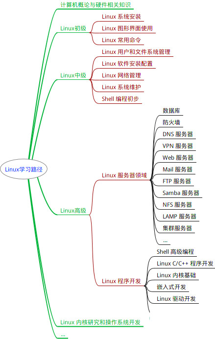
最全的Linux教程,Linux从入门到精通
======================
1. **linux从入门到精通(第2版)**
2. **Linux系统移植**
3. **Linux驱动开发入门与实战**
4. **LINUX 系统移植 第2版**
5. **Linux开源网络全栈详解 从DPDK到OpenFlow**

第一份《Linux从入门到精通》466页
====================
内容简介
====
本书是获得了很多读者好评的Linux经典畅销书**《Linux从入门到精通》的第2版**。本书第1版出版后曾经多次印刷,并被51CTO读书频道评为“最受读者喜爱的原创IT技术图书奖”。本书第﹖版以最新的Ubuntu 12.04为版本,循序渐进地向读者介绍了Linux 的基础应用、系统管理、网络应用、娱乐和办公、程序开发、服务器配置、系统安全等。本书附带1张光盘,内容为本书配套多媒体教学视频。另外,本书还为读者提供了大量的Linux学习资料和Ubuntu安装镜像文件,供读者免费下载。

**本书适合广大Linux初中级用户、开源软件爱好者和大专院校的学生阅读,同时也非常适合准备从事Linux平台开发的各类人员。**
> 需要《Linux入门到精通》、《linux系统移植》、《Linux驱动开发入门实战》、《Linux开源网络全栈》电子书籍及教程的工程师朋友们劳烦您转发+评论
**网上学习资料一大堆,但如果学到的知识不成体系,遇到问题时只是浅尝辄止,不再深入研究,那么很难做到真正的技术提升。**
**[需要这份系统化的资料的朋友,可以点击这里获取!](https://bbs.csdn.net/forums/4f45ff00ff254613a03fab5e56a57acb)**
**一个人可以走的很快,但一群人才能走的更远!不论你是正从事IT行业的老鸟或是对IT行业感兴趣的新人,都欢迎加入我们的的圈子(技术交流、学习资源、职场吐槽、大厂内推、面试辅导),让我们一起学习成长!**
img_convert/59742364bb1338737fe2d315a9e2ec54.png)
第一份《Linux从入门到精通》466页
====================
内容简介
====
本书是获得了很多读者好评的Linux经典畅销书**《Linux从入门到精通》的第2版**。本书第1版出版后曾经多次印刷,并被51CTO读书频道评为“最受读者喜爱的原创IT技术图书奖”。本书第﹖版以最新的Ubuntu 12.04为版本,循序渐进地向读者介绍了Linux 的基础应用、系统管理、网络应用、娱乐和办公、程序开发、服务器配置、系统安全等。本书附带1张光盘,内容为本书配套多媒体教学视频。另外,本书还为读者提供了大量的Linux学习资料和Ubuntu安装镜像文件,供读者免费下载。

**本书适合广大Linux初中级用户、开源软件爱好者和大专院校的学生阅读,同时也非常适合准备从事Linux平台开发的各类人员。**
> 需要《Linux入门到精通》、《linux系统移植》、《Linux驱动开发入门实战》、《Linux开源网络全栈》电子书籍及教程的工程师朋友们劳烦您转发+评论
**网上学习资料一大堆,但如果学到的知识不成体系,遇到问题时只是浅尝辄止,不再深入研究,那么很难做到真正的技术提升。**
**[需要这份系统化的资料的朋友,可以点击这里获取!](https://bbs.csdn.net/forums/4f45ff00ff254613a03fab5e56a57acb)**
**一个人可以走的很快,但一群人才能走的更远!不论你是正从事IT行业的老鸟或是对IT行业感兴趣的新人,都欢迎加入我们的的圈子(技术交流、学习资源、职场吐槽、大厂内推、面试辅导),让我们一起学习成长!**


 1603
1603


 被折叠的 条评论
为什么被折叠?
被折叠的 条评论
为什么被折叠?
 到【灌水乐园】发言


