


可视化 DESeq2 中的数值属性
通过提供通常用于转录组分析的 DESeq2 软件包的结果,可以在图形的节点中反映数值结果。该函数可用于此目的。通过将要在图形中反映的数值(例如,)指定为参数,可以将该值分配给节点。如果命中多个基因,则参数指定如何组合多个值(默认值为 )。assign_deseq2log2FoldChangecolumnnumeric_combinemean
在这里,我们使用RNA-Seq数据集,该数据集分析了感染BK多瘤病毒的人尿路上皮细胞的转录组变化(Baker等人,2022)。从 Sequence Read Archive 获得的原始序列由 nf-core 处理,随后使用 和 进行分析。tximportsalmonDESeq2
library(ggkegg)
library(DESeq2)
library(org.Hs.eg.db)
library(dplyr)
## The file stores DESeq() result on transcriptomic dataset deposited by Baker et al. 2022.
load("uro.deseq.res.rda")
res
#> class: DESeqDataSet
#> dim: 29744 26
#> metadata(1): version
#> assays(8): counts avgTxLength ... replaceCounts
#> replaceCooks
#> rownames(29744): A1BG A1BG-AS1 ... ZZEF1 ZZZ3
#> rowData names(27): baseMean baseVar ... maxCooks
#> replace
#> colnames(26): SRR14509882 SRR14509883 ... SRR14509906
#> SRR14509907
#> colData names(27): Assay.Type AvgSpotLen ...
#> viral_infection replaceable
vinf <- results(res, contrast=c("viral_infection","BKPyV (Dunlop) MOI=1","No infection"))
## LFC
g <- pathway("hsa04110") |> mutate(deseq2=assign_deseq2(vinf),
padj=assign_deseq2(vinf, column="padj"),
converted_name=convert_id("hsa"))
ggraph(g, layout="manual", x=x, y=y) +
geom_edge_parallel(width=0.5, arrow = arrow(length = unit(1, 'mm')),
start_cap = square(1, 'cm'),
end_cap = square(1.5, 'cm'), aes(color=subtype_name))+
geom_node_rect(aes(fill=deseq2, filter=type=="gene"), color="black")+
ggfx::with_outer_glow(geom_node_text(aes(label=converted_name, filter=type!="group"), size=2.5), colour="white", expand=1)+
scale_fill_gradient(low="blue",high="red", name="LFC")+
theme_void()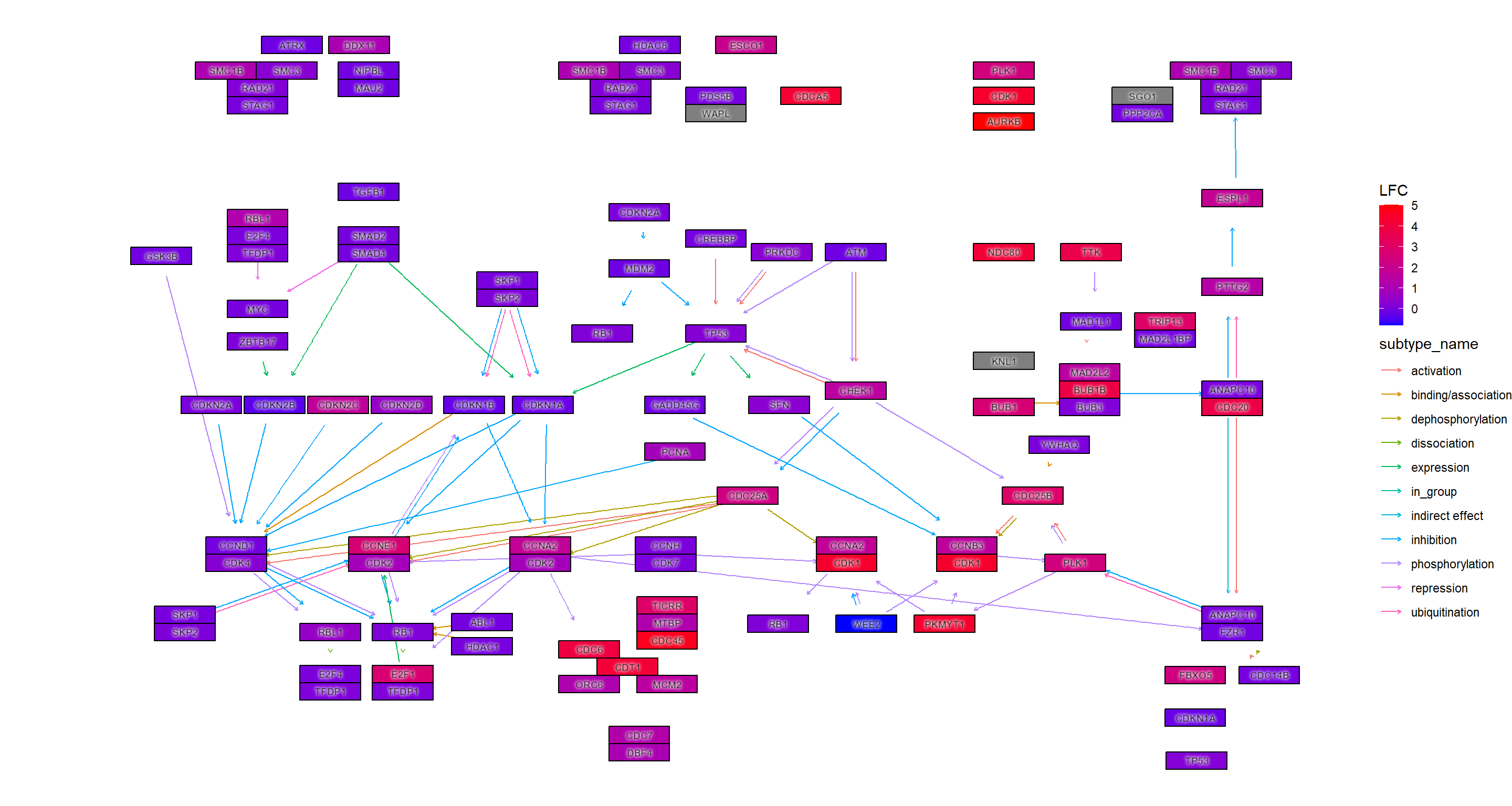
## Adjusted p-values
ggraph(g, layout="manual", x=x, y=y) +
  geom_edge_parallel(width=0.5, arrow = arrow(length = unit(1, 'mm')),
                 start_cap = square(1, 'cm'),
                 end_cap = square(1.5, 'cm'), aes(color=subtype_name))+
  geom_node_rect(aes(fill=padj, filter=type=="gene"), color="black")+
  ggfx::with_outer_glow(geom_node_text(aes(label=converted_name, filter=type!="group"), size=2.5), colour="white", expand=1)+
  scale_fill_gradient(name="padj")+
  theme_void()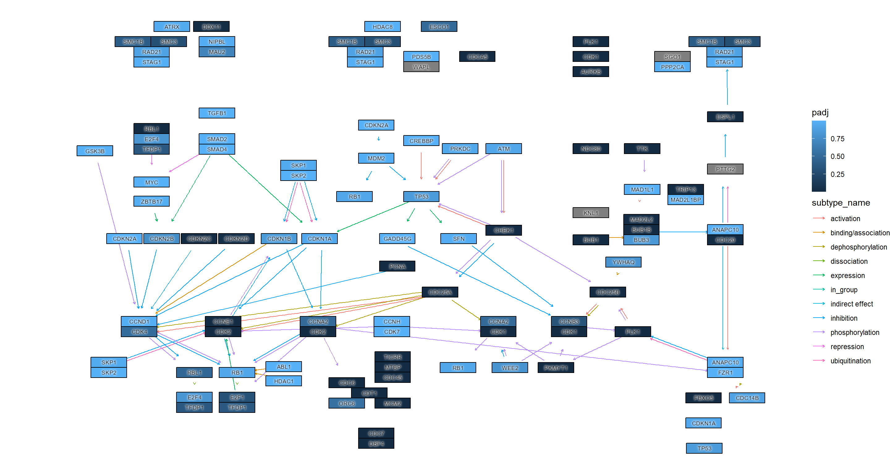
用于进一步自定义可视化ggfx
## Highlighting differentially expressed genes at adjusted p-values < 0.05 with coloring of adjusted p-values on raw KEGG map
gg <- ggraph(g, layout="manual", x=x, y=y)+
  geom_node_rect(aes(fill=padj, filter=type=="gene"))+
  ggfx::with_outer_glow(geom_node_rect(aes(fill=padj, filter=!is.na(padj) & padj<0.05)),
                        colour="yellow", expand=2)+
  overlay_raw_map("hsa04110", transparent_colors = c("#cccccc","#FFFFFF","#BFBFFF","#BFFFBF"))+
  scale_fill_gradient(low="pink",high="steelblue") + theme_void()
gg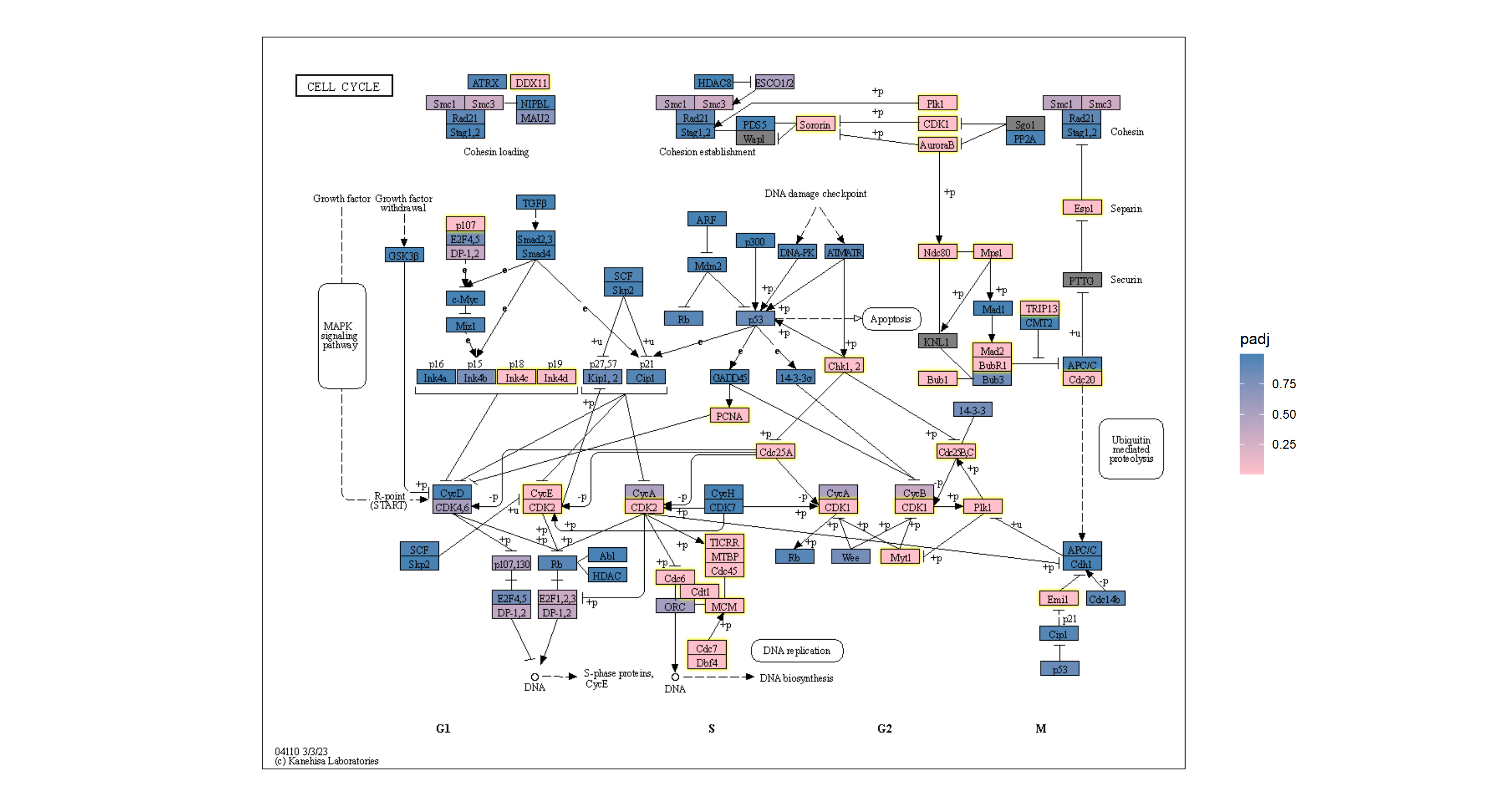
使用多个几何添加信息
您可以使用自己喜欢的几何图形及其扩展来添加信息。在此示例中,我们使用 geomtextpath 将 log2 折叠更改添加为轮廓,并使用 Monocraft 自定义字体。ggplot2
g <- g |> mutate(lfc=assign_deseq2(vinf, column="log2FoldChange"))

## Make contour data
df <- g |> data.frame()
df <- df[!is.na(df$lfc),]
cont <- akima::interp2xyz(interp::interp(df$x, df$y, df$lfc)) |>
    data.frame() |> `colnames<-`(c("x","y","z"))

##
sysfonts::font_add(family="monocraft",regular="Monocraft.ttf")
gg <- ggraph(g, layout="manual", x=x, y=y)+
    geom_edge_parallel(arrow=arrow(length=unit(1,"mm")),
                       aes(color=subtype_name),
                       end_cap=circle(7.5,"mm"),
                       alpha=0.5)+
    geomtextpath::geom_textcontour(aes(x=x, y=y, z=z,color=after_stat(level)),
                                   size=3, linetype=2,
                                   linewidth=0.1, data=cont)+
    geom_node_rect(aes(fill=padj, filter=type=="gene"))+
    ggfx::with_outer_glow(geom_node_rect(aes(fill=padj, filter=!is.na(padj) & padj<0.05)),
                          colour="yellow", expand=2)+
    geom_node_text(aes(label=converted_name), family="monocraft")+
    scale_color_gradient2(low=scales::muted("blue"),
                          high=scales::muted("red"),
                          name="LFC")+
    scale_edge_color_manual(values=viridis::viridis(11), name="Edge type")+
    scale_fill_gradient(low="pink",high="steelblue") +
    theme_void()
gg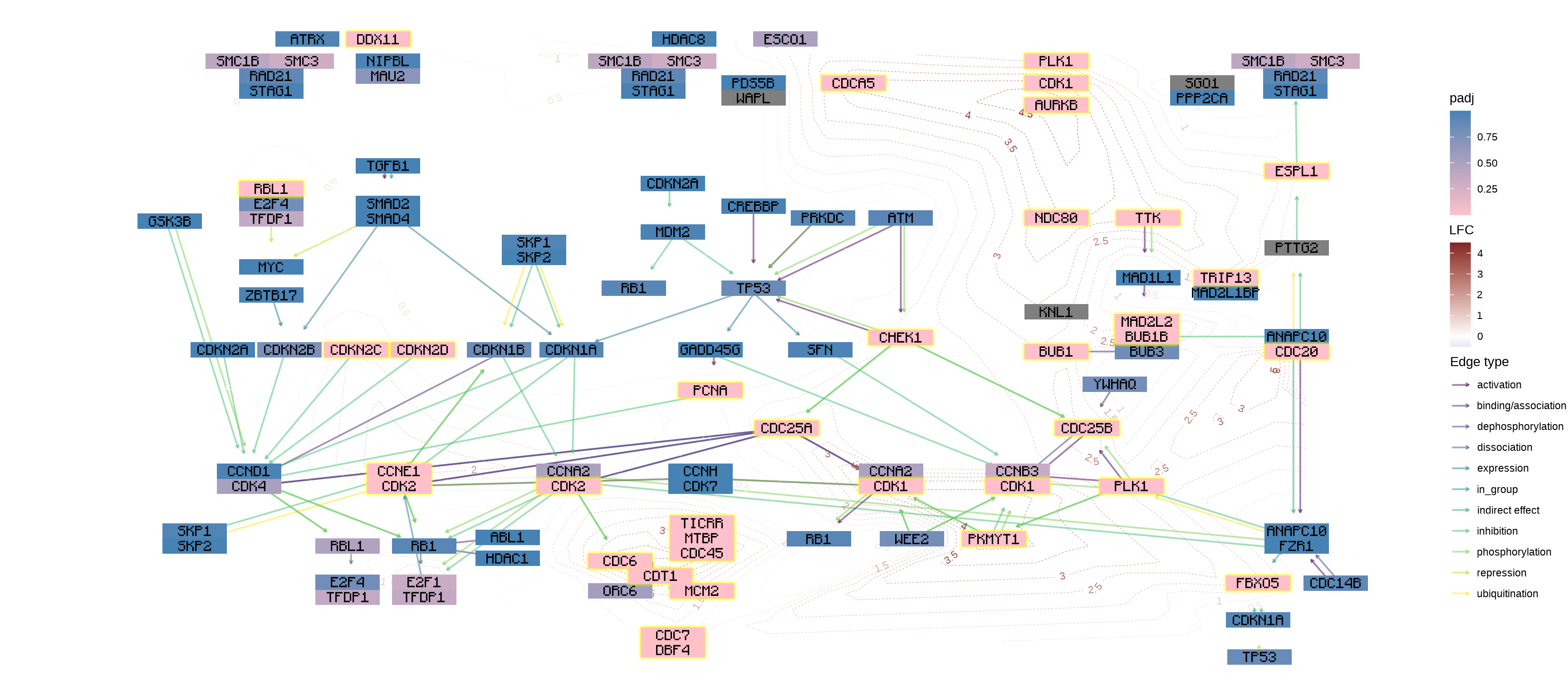
将数值积分到tbl_graph
将数值向量积分到tbl_graph
数值可以反映在节点或边表中,利用 或 函数。输入可以是命名向量,也可以是包含 id 和 value 列的 tibble。node_numericedge_numeric
vec <- 1
names(vec) <- c("hsa:51343")
new_g <- g |> mutate(num=node_numeric(vec))
new_g
#> # A tbl_graph: 134 nodes and 157 edges
#> #
#> # A directed acyclic multigraph with 40 components
#> #
#> # A tibble: 134 × 23
#>   name        type  reaction graphics_name     x     y width
#>   <chr>       <chr> <chr>    <chr>         <dbl> <dbl> <dbl>
#> 1 hsa:1029    gene  <NA>     CDKN2A, ARF,…   532  -218    46
#> 2 hsa:51343   gene  <NA>     FZR1, CDC20C…   981  -630    46
#> 3 hsa:4171 h… gene  <NA>     MCM2, BM28, …   553  -681    46
#> 4 hsa:23594 … gene  <NA>     ORC6, ORC6L.…   494  -681    46
#> 5 hsa:10393 … gene  <NA>     ANAPC10, APC…   981  -392    46
#> 6 hsa:10393 … gene  <NA>     ANAPC10, APC…   981  -613    46
#> # ℹ 128 more rows
#> # ℹ 16 more variables: height <dbl>, fgcolor <chr>,
#> #   bgcolor <chr>, graphics_type <chr>, coords <chr>,
#> #   xmin <dbl>, xmax <dbl>, ymin <dbl>, ymax <dbl>,
#> #   orig.id <chr>, pathway_id <chr>, deseq2 <dbl>,
#> #   padj <dbl>, converted_name <chr>, lfc <dbl>, num <dbl>
#> #
#> # A tibble: 157 × 6
#>    from    to type  subtype_name    subtype_value pathway_id
#>   <int> <int> <chr> <chr>           <chr>         <chr>
#> 1   118    39 GErel expression      -->           hsa04110
#> 2    50    61 PPrel inhibition      --|           hsa04110
#> 3    50    61 PPrel phosphorylation +p            hsa04110
#> # ℹ 154 more rows 将矩阵积分到tbl_graph
如果要在图形中反映表达式矩阵,则 和 函数可能很有用。通过指定基质和基因 ID,您可以将每个样品的数值分配给 . 分配由边连接的两个节点的总和,忽略组节点(Adnan 等人,2020 年)。edge_matrixnode_matrixtbl_graphedge_matrix
mat <- assay(vst(res))
new_g <- g |> edge_matrix(mat) |> node_matrix(mat)
new_g
#> # A tbl_graph: 134 nodes and 157 edges
#> #
#> # A directed acyclic multigraph with 40 components
#> #
#> # A tibble: 134 × 48
#>   name        type  reaction graphics_name     x     y width
#>   <chr>       <chr> <chr>    <chr>         <dbl> <dbl> <dbl>
#> 1 hsa:1029    gene  <NA>     CDKN2A, ARF,…   532  -218    46
#> 2 hsa:51343   gene  <NA>     FZR1, CDC20C…   981  -630    46
#> 3 hsa:4171 h… gene  <NA>     MCM2, BM28, …   553  -681    46
#> 4 hsa:23594 … gene  <NA>     ORC6, ORC6L.…   494  -681    46
#> 5 hsa:10393 … gene  <NA>     ANAPC10, APC…   981  -392    46
#> 6 hsa:10393 … gene  <NA>     ANAPC10, APC…   981  -613    46
#> # ℹ 128 more rows
#> # ℹ 41 more variables: height <dbl>, fgcolor <chr>,
#> #   bgcolor <chr>, graphics_type <chr>, coords <chr>,
#> #   xmin <dbl>, xmax <dbl>, ymin <dbl>, ymax <dbl>,
#> #   orig.id <chr>, pathway_id <chr>, deseq2 <dbl>,
#> #   padj <dbl>, converted_name <chr>, lfc <dbl>,
#> #   SRR14509882 <dbl>, SRR14509883 <dbl>, …
#> #
#> # A tibble: 157 × 34
#>    from    to type  subtype_name    subtype_value pathway_id
#>   <int> <int> <chr> <chr>           <chr>         <chr>
#> 1   118    39 GErel expression      -->           hsa04110
#> 2    50    61 PPrel inhibition      --|           hsa04110
#> 3    50    61 PPrel phosphorylation +p            hsa04110
#> # ℹ 154 more rows
#> # ℹ 28 more variables: from_nd <chr>, to_nd <chr>,
#> #   SRR14509882 <dbl>, SRR14509883 <dbl>,
#> #   SRR14509884 <dbl>, SRR14509885 <dbl>,
#> #   SRR14509886 <dbl>, SRR14509887 <dbl>,
#> #   SRR14509888 <dbl>, SRR14509889 <dbl>,
#> #   SRR14509890 <dbl>, SRR14509891 <dbl>, …
边值
相同的效果可以通过 获得,使用命名数值向量作为输入。此函数根据节点值添加边值。以下示例显示了将 LFC 组合到边缘。这与 的行为不同。edge_matrixedge_numeric_sumedge_numeric
## Numeric vector (name is SYMBOL)
vinflfc <- vinf$log2FoldChange |> setNames(row.names(vinf))

g |>
  ## Use graphics_name to merge
  mutate(grname=strsplit(graphics_name, ",") |> vapply("[", 1, FUN.VALUE="a")) |>
  activate(edges) |>
  mutate(summed = edge_numeric_sum(vinflfc, name="grname")) |>
  filter(!is.na(summed)) |>
  activate(nodes) |>
  mutate(x=NULL, y=NULL, deg=centrality_degree(mode="all")) |>
  filter(deg>0) |>
  ggraph(layout="nicely")+
  geom_edge_parallel(aes(color=summed, width=summed,
                         linetype=subtype_name),
                     arrow=arrow(length=unit(1,"mm")),
                     start_cap=circle(2,"mm"),
                     end_cap=circle(2,"mm"))+
  geom_node_point(aes(fill=I(bgcolor)))+
  geom_node_text(aes(label=grname,
                     filter=type=="gene"),
                 repel=TRUE, bg.colour="white")+
  scale_edge_width(range=c(0.1,2))+
  scale_edge_color_gradient(low="blue", high="red", name="Edge")+
  theme_void()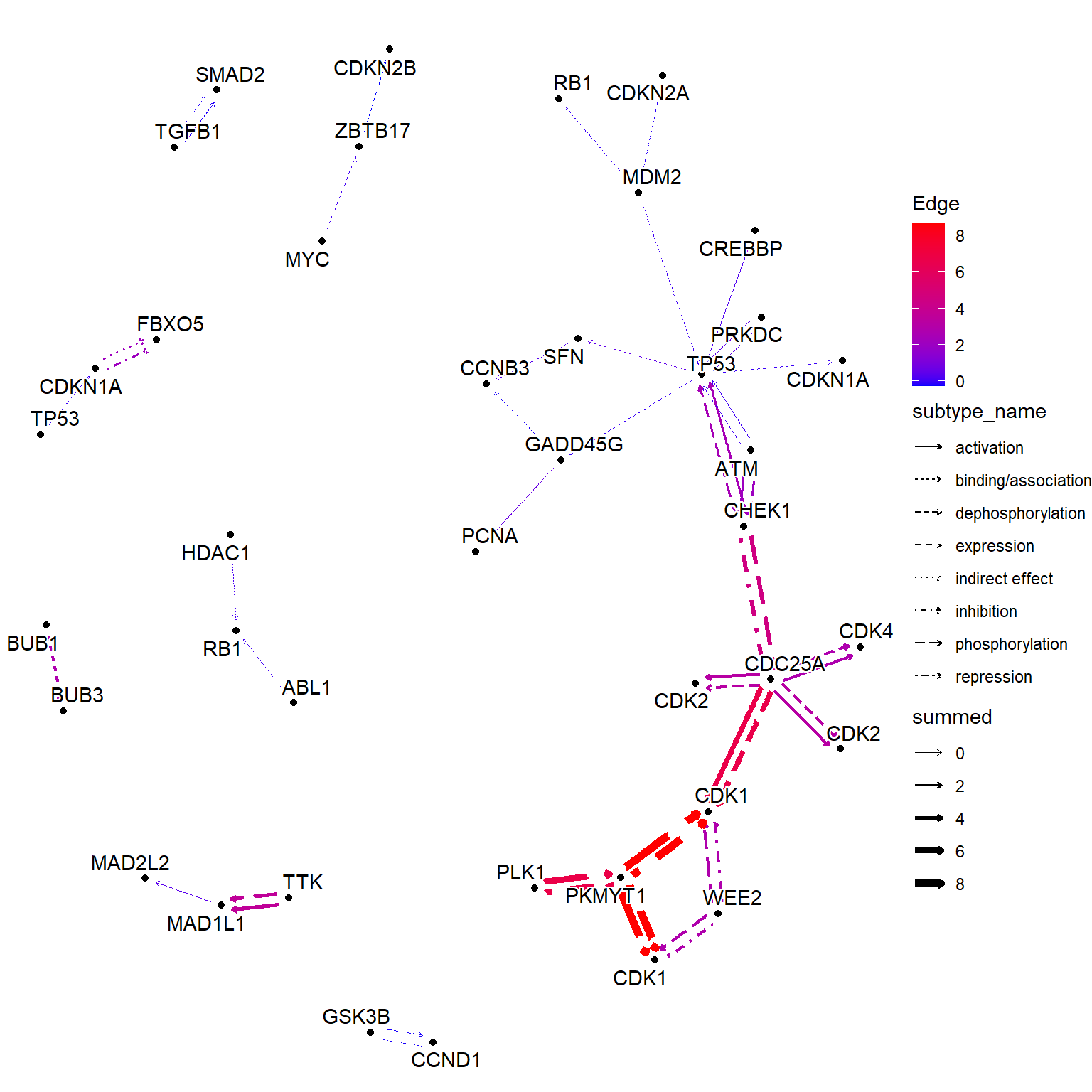
可视化多重富集结果
您可以可视化多个富集分析的结果。与将函数与类一起使用类似,可以在函数中使用一个函数。通过向此功能提供对象,如果结果中存在可视化的通路,则通路内的基因信息可以反映在图中。在这个例子中,除了上面提到的尿路上皮细胞的变化外,还比较了肾近端肾小管上皮细胞的变化(Assetta等人,2016)。ggkeggenrichResultappend_cpmutateenrichResult
## These are RDAs storing DEGs
load("degListRPTEC.rda")
load("degURO.rda")

library(org.Hs.eg.db);
library(clusterProfiler);
input_uro <- bitr(uroUp, ## DEGs in urothelial cells
              fromType = "SYMBOL",
              toType = "ENTREZID",
              OrgDb = org.Hs.eg.db)$ENTREZID
input_rptec <- bitr(gls$day3_up_rptec, ## DEGs at 3 days post infection in RPTECs
              fromType = "SYMBOL",
              toType = "ENTREZID",
              OrgDb = org.Hs.eg.db)$ENTREZID

ekuro <- enrichKEGG(gene = input_uro)
ekrptec <- enrichKEGG(gene = input_rptec)

g1 <- pathway("hsa04110") |> mutate(uro=append_cp(ekuro, how="all"),
                                    rptec=append_cp(ekrptec, how="all"),
                                    converted_name=convert_id("hsa"))
ggraph(g1, layout="manual", x=x, y=y) +
  geom_edge_parallel(width=0.5, arrow = arrow(length = unit(1, 'mm')),
                 start_cap = square(1, 'cm'),
                 end_cap = square(1.5, 'cm'), aes(color=subtype_name))+
  geom_node_rect(aes(fill=uro, xmax=x,  filter=type=="gene"))+
  geom_node_rect(aes(fill=rptec, xmin=x, filter=type=="gene"))+
  scale_fill_manual(values=c("steelblue","tomato"), name="urothelial|rptec")+
  ggfx::with_outer_glow(geom_node_text(aes(label=converted_name, filter=type!="group"), size=2), colour="white", expand=1)+
  theme_void()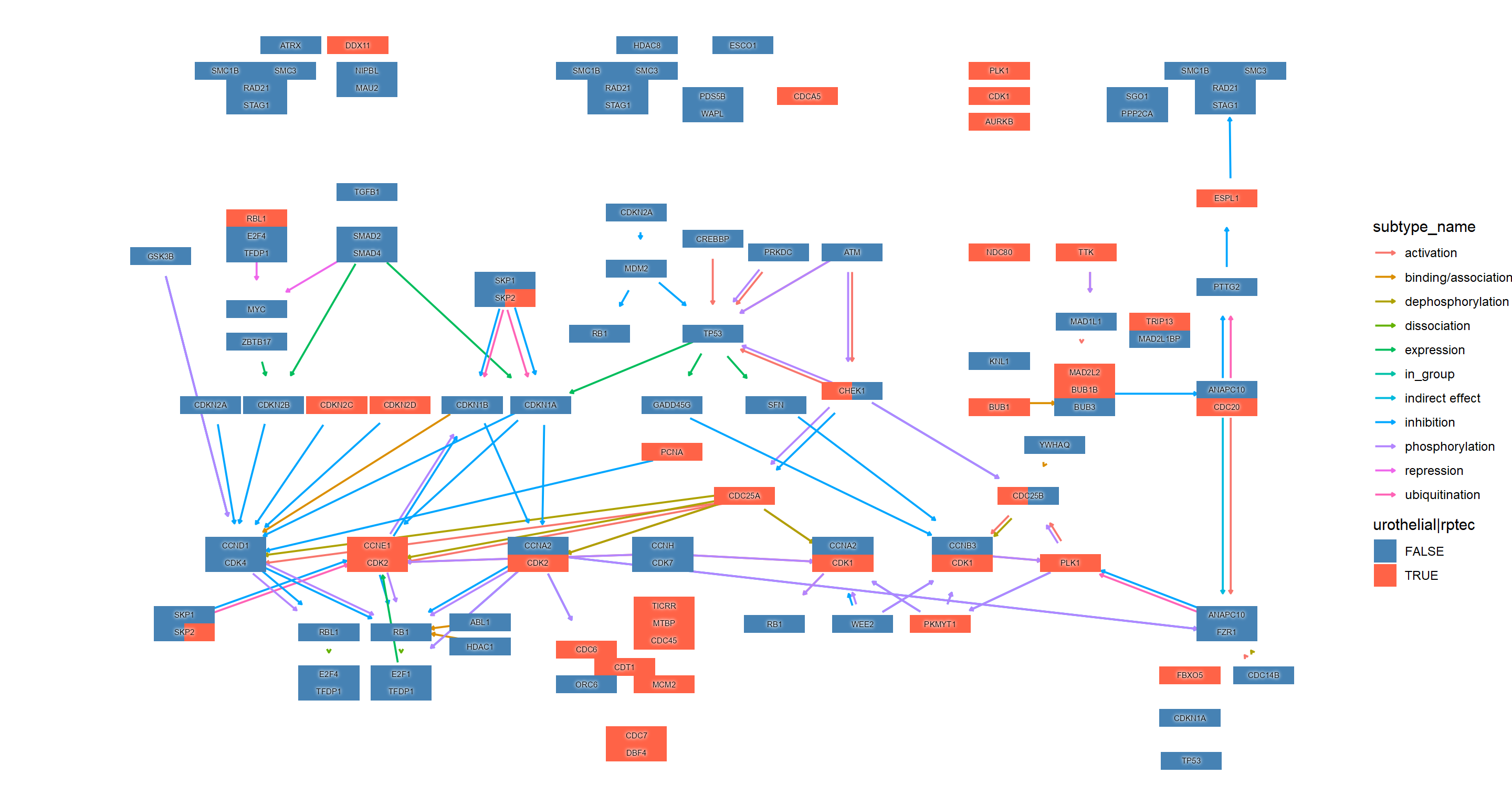
我们可以按 组合多个图。rawMappatchwork
library(patchwork)
comb <- rawMap(list(ekuro, ekrptec), fill_color=c("tomato","tomato"), pid="hsa04110") +
rawMap(list(ekuro, ekrptec), fill_color=c("tomato","tomato"),
  pid="hsa03460")
comb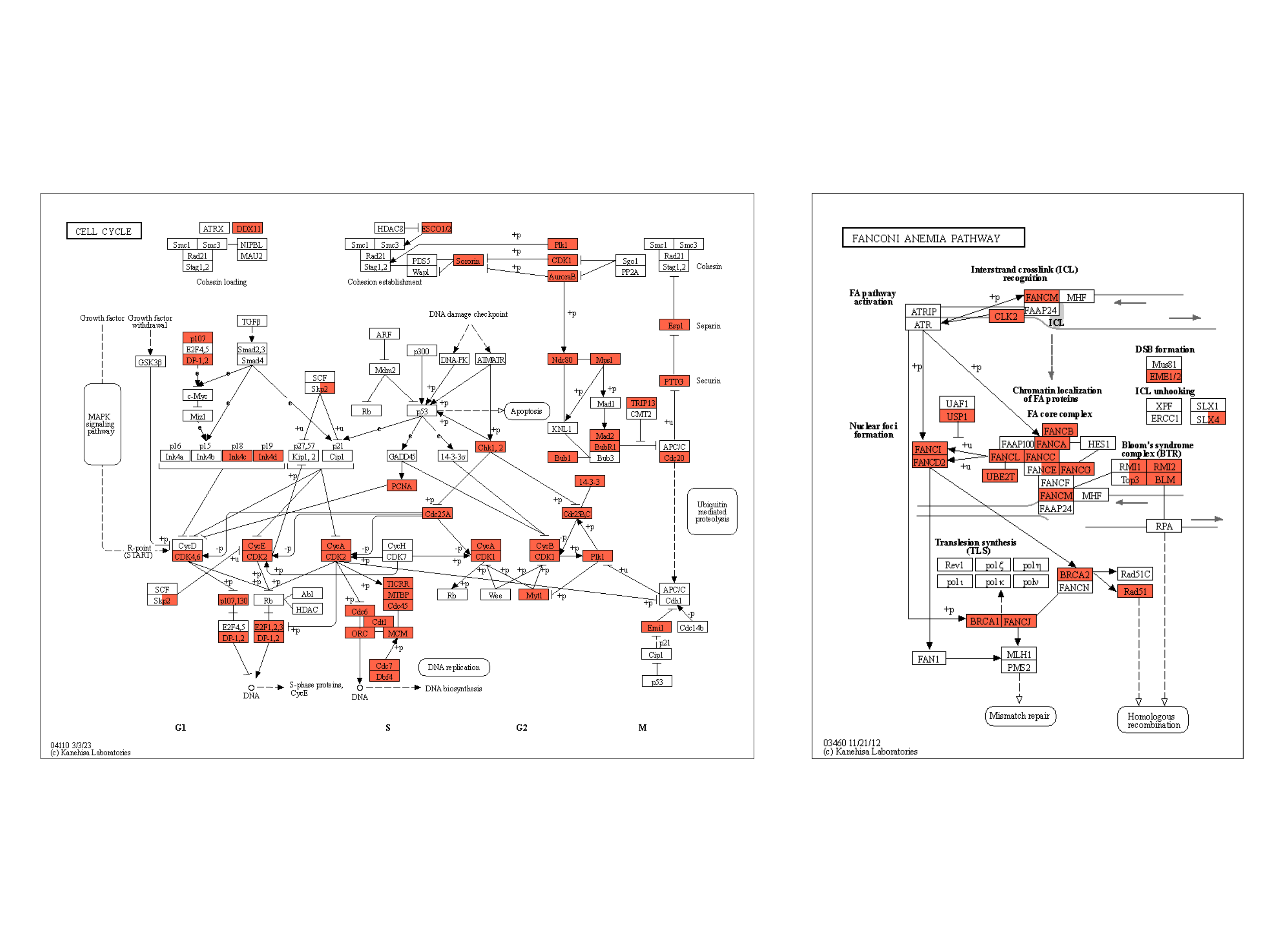
下面的示例将类似的反射应用于原始 KEGG 图谱,并突出显示在两种条件下都显示出统计学显着变化的基因,使用黄色外光,由 clusterProfiler 生成的组成,富集结果为 。ggfxdotplotpatchwork
right <- (dotplot(ekuro) + ggtitle("Urothelial")) /
(dotplot(ekrptec) + ggtitle("RPTECs"))

g1 <- pathway("hsa03410") |>
  mutate(uro=append_cp(ekuro, how="all"),
        rptec=append_cp(ekrptec, how="all"),
        converted_name=convert_id("hsa"))
gg <- ggraph(g1, layout="manual", x=x, y=y)+
  ggfx::with_outer_glow(
    geom_node_rect(aes(filter=uro&rptec),
                   color="gold", fill="transparent"),
    colour="gold", expand=5, sigma=10)+
  geom_node_rect(aes(fill=uro, filter=type=="gene"))+
  geom_node_rect(aes(fill=rptec, xmin=x, filter=type=="gene")) +
  overlay_raw_map("hsa03410", transparent_colors = c("#cccccc","#FFFFFF","#BFBFFF","#BFFFBF"))+
  scale_fill_manual(values=c("steelblue","tomato"),
                    name="urothelial|rptec")+
  theme_void()
gg2 <- gg + right + plot_layout(design="
AAAA###
AAAABBB
AAAABBB
AAAA###
"
)
gg2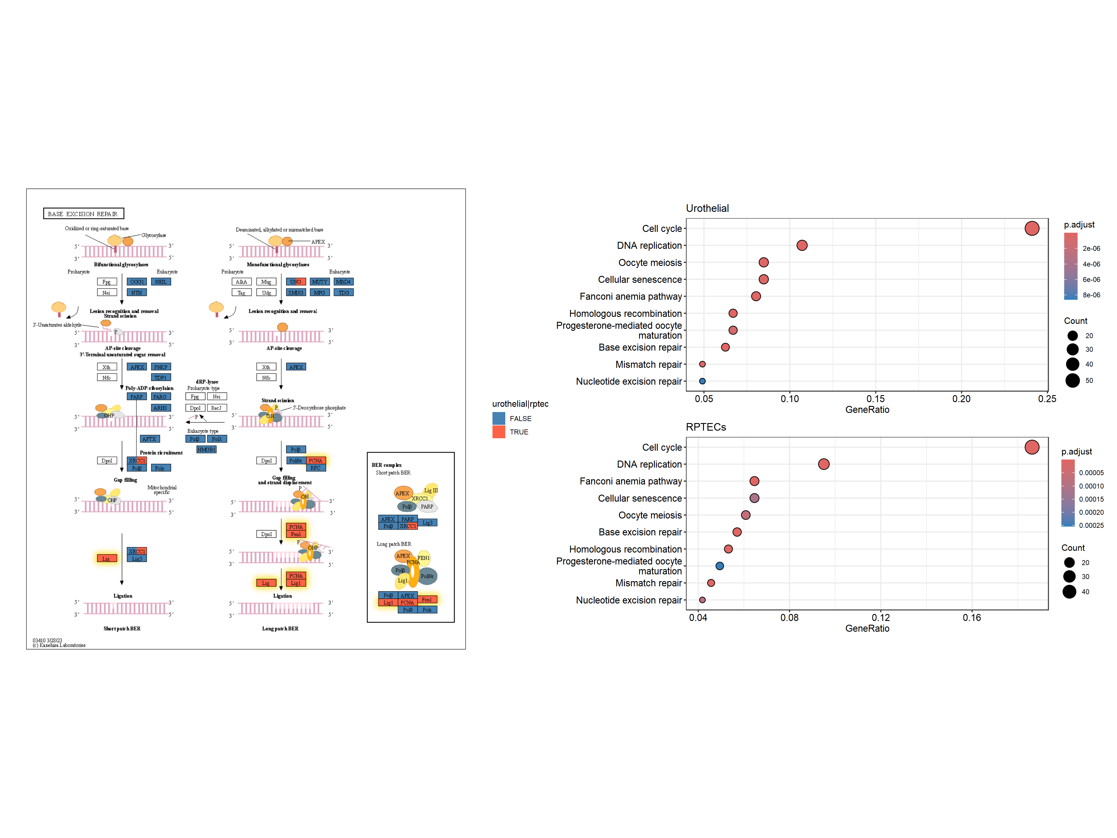
跨多个通路的多重富集分析结果
除了天然布局外,有时还可以在多个通路中显示有趣的基因,例如DEGs。在这里,我们使用散点图库来可视化跨多个途径的多个富集分析结果。
library(scatterpie)
## Obtain enrichment analysis results
entrezid <- uroUp |>
  clusterProfiler::bitr("SYMBOL","ENTREZID",org.Hs.eg.db)
cp <- clusterProfiler::enrichKEGG(entrezid$ENTREZID)

entrezid2 <- gls$day3_up_rptec |>
  clusterProfiler::bitr("SYMBOL","ENTREZID",org.Hs.eg.db)
cp2 <- clusterProfiler::enrichKEGG(entrezid2$ENTREZID)


## Filter to interesting pathways
include <- (data.frame(cp) |> row.names())[c(1,3,4)]
pathways <- data.frame(cp)[include,"ID"]
pathways
#> [1] "hsa04110" "hsa03460" "hsa03440"
我们获得多个通路数据(该函数返回原生坐标,但我们忽略它们)。
g1 <- multi_pathway_native(pathways, row_num=1)
g2 <- g1 |> mutate(new_name=
                    ifelse(name=="undefined",
                           paste0(name,"_",pathway_id,"_",orig.id),
                           name)) |>
  convert(to_contracted, new_name, simplify=FALSE) |>
  activate(nodes) |>
  mutate(purrr::map_vec(.orig_data,function (x) x[1,] )) |>
  mutate(pid1 = purrr::map(.orig_data,function (x) unique(x["pathway_id"]) )) |>
  mutate(hsa03440 = purrr:::map_lgl(pid1, function(x) "hsa03440" %in% x$pathway_id) ,
         hsa04110 = purrr:::map_lgl(pid1, function(x) "hsa04110" %in% x$pathway_id),
         hsa03460 = purrr:::map_lgl(pid1, function(x) "hsa03460" %in% x$pathway_id))

nds <- g2 |> activate(nodes) |> data.frame()
eds <- g2 |> activate(edges) |> data.frame()
rmdup_eds <- eds[!duplicated(eds[,c("from","to","subtype_name")]),]

g2_2 <- tbl_graph(nodes=nds, edges=rmdup_eds)
g2_2 <- g2_2 |>  activate(nodes) |>
  mutate(
    in_pathway_uro=append_cp(cp, pid=include,name="new_name"),
    x=NULL, y=NULL,
   in_pathway_rptec=append_cp(cp2, pid=include,name = "new_name"),
   id=convert_id("hsa",name = "new_name")) |>
  morph(to_subgraph, type!="group") |>
  mutate(deg=centrality_degree(mode="all")) |>
  unmorph() |>
  filter(deg>0)
在这里,我们还将基于图的聚类结果分配给图,并缩放节点的大小,以便节点可以通过散点图可视化。
V(g2_2)$walktrap <- igraph::walktrap.community(g2_2)$membership

## Scale the node size
sizeMin <- 0.1
sizeMax <- 0.3
rawMin <- min(V(g2_2)$deg)
rawMax <- max(V(g2_2)$deg)
scf <- (sizeMax-sizeMin)/(rawMax-rawMin)
V(g2_2)$size <- scf * V(g2_2)$deg + sizeMin - scf * rawMin


## Make base graph
g3 <- ggraph(g2_2, layout="nicely")+
  geom_edge_parallel(alpha=0.9,
                 arrow=arrow(length=unit(1,"mm")),
                 aes(color=subtype_name),
                 start_cap=circle(3,"mm"),
                 end_cap=circle(8,"mm"))+
  scale_edge_color_discrete(name="Edge type")
graphdata <- g3$data最后,我们用于可视化。背景散点表示基因是否在通路中,前景表示基因是否在多个数据集中差异表达。我们突出显示了在两个数据集中通过金色差异表达的基因。geom_scatterpie
g4 <- g3+
  ggforce::geom_mark_rect(aes(x=x, y=y, group=walktrap),color="grey")+
  geom_scatterpie(aes(x=x, y=y, r=size+0.1),
                  color="transparent",
                  legend_name="Pathway",
                  data=graphdata,
                  cols=c("hsa04110", "hsa03440","hsa03460")) +
  geom_scatterpie(aes(x=x, y=y, r=size),
                           color="transparent",
                           data=graphdata, legend_name="enrich",
                           cols=c("in_pathway_rptec","in_pathway_uro"))+
  ggfx::with_outer_glow(geom_scatterpie(aes(x=x, y=y, r=size),
                  color="transparent",
                  data=graphdata[graphdata$in_pathway_rptec & graphdata$in_pathway_uro,],
                  cols=c("in_pathway_rptec","in_pathway_uro")), colour="gold", expand=3)+
  geom_node_point(shape=19, size=3, aes(filter=!in_pathway_uro & !in_pathway_rptec & type!="map"))+
  geom_node_shadowtext(aes(label=id, y=y-0.5), size=3, family="sans", bg.colour="white", colour="black")+
  theme_void()+coord_fixed()
g4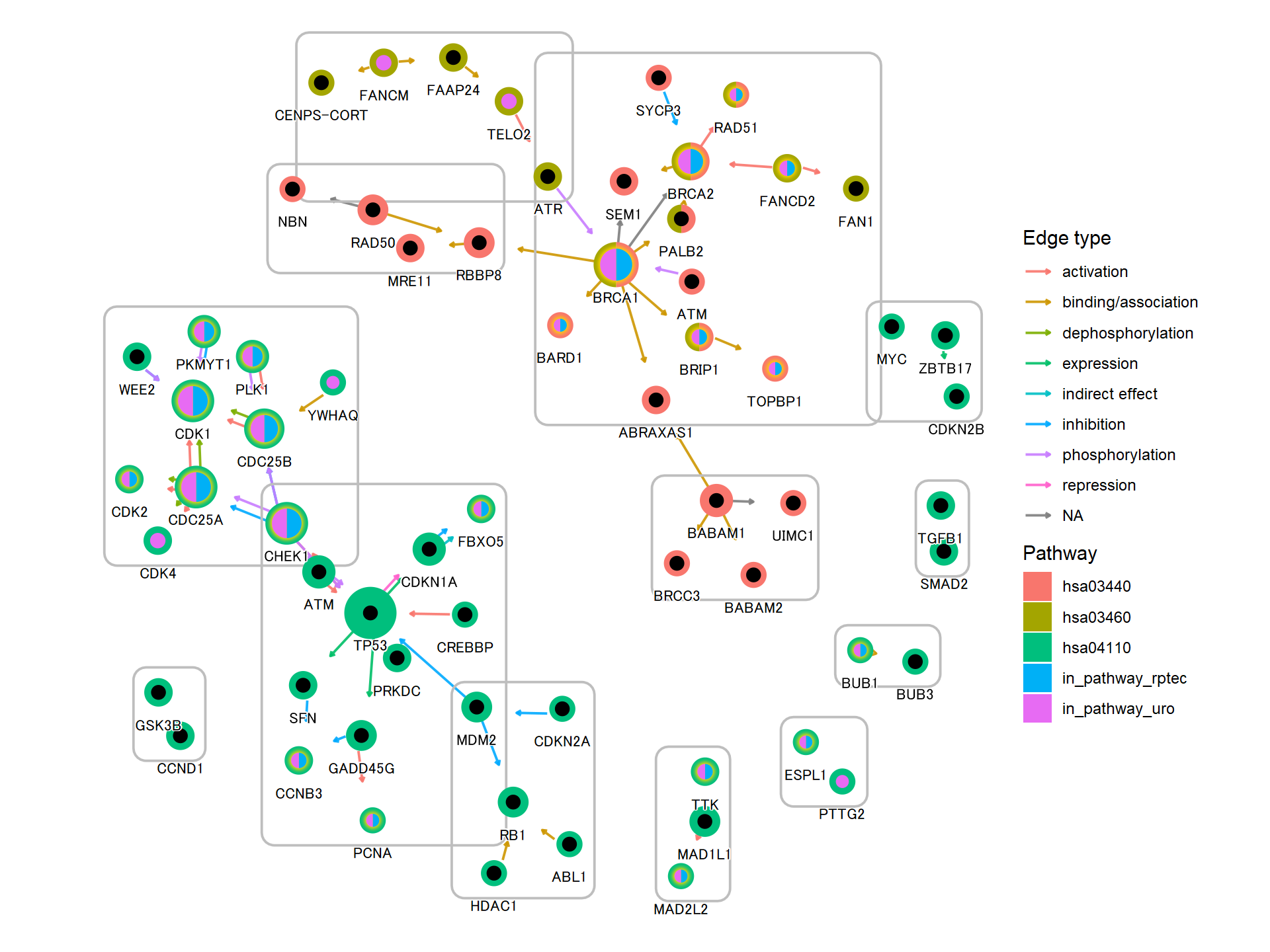
5.4 在KEGG图谱上投影基因调控网络
使用此软件包,可以将推断的网络(例如基因调控网络或由其他软件推断的 KO 网络)投射到 KEGG 图谱上。以下是使用 将 CBNplot 推断的通路内的 KO 网络子集投影到相应通路的参考图上的示例。当然,也可以投影使用其他方法创建的网络。MicrobiomeProfiler
library(dplyr)
library(igraph)
library(tidygraph)
library(CBNplot)
library(ggkegg)
library(MicrobiomeProfiler)
data(Rat_data)
ko.res <- enrichKO(Rat_data)
exp.dat <- matrix(abs(rnorm(910)), 91, 10) %>% magrittr::set_rownames(value=Rat_data) %>% magrittr::set_colnames(value=paste0('S', seq_len(ncol(.))))
returnnet <- bngeneplot(ko.res, exp=exp.dat, pathNum=1, orgDb=NULL,returnNet = TRUE)
pg <- pathway("ko00650")
joined <- combine_with_bnlearn(pg, returnnet$str, returnnet$av)绘制生成的地图。在此示例中,估计的强度首先用彩色边缘显示,然后参考图的边缘在其顶部以黑色绘制。此外,两个图形中包含的边缘都以黄色突出显示。CBNplot
## Summarize duplicate edges including `strength` attribute
number <- joined |> activate(edges) |> data.frame() |> group_by(from,to) |>
  summarise(n=n(), incstr=sum(!is.na(strength)))

## Annotate them
joined <- joined |> activate(edges) |> full_join(number) |> mutate(both=n>1&incstr>0)

joined |>
  activate(nodes) |>
  filter(!is.na(type)) |>
  mutate(convertKO=convert_id("ko")) |>
  activate(edges) |>
  ggraph(x=x, y=y) +
  geom_edge_link0(width=0.5,aes(filter=!is.na(strength),
                              color=strength), linetype=1)+
  ggfx::with_outer_glow(
    geom_edge_link0(width=0.5,aes(filter=!is.na(strength) & both,
                                  color=strength), linetype=1),
    colour="yellow", sigma=1, expand=1)+
  geom_edge_link0(width=0.1, aes(filter=is.na(strength)))+
  scale_edge_color_gradient(low="blue",high="red")+
  geom_node_rect(color="black", aes(fill=type))+
  geom_node_text(aes(label=convertKO), size=2)+
  geom_node_text(aes(label=ifelse(grepl(":", graphics_name), strsplit(graphics_name, ":") |>
                                    sapply("[",2) |> stringr::str_wrap(22), stringr::str_wrap(graphics_name, 22)),
                     filter=!is.na(type) & type=="map"), family="serif",
                 size=2, na.rm=TRUE)+
  theme_void()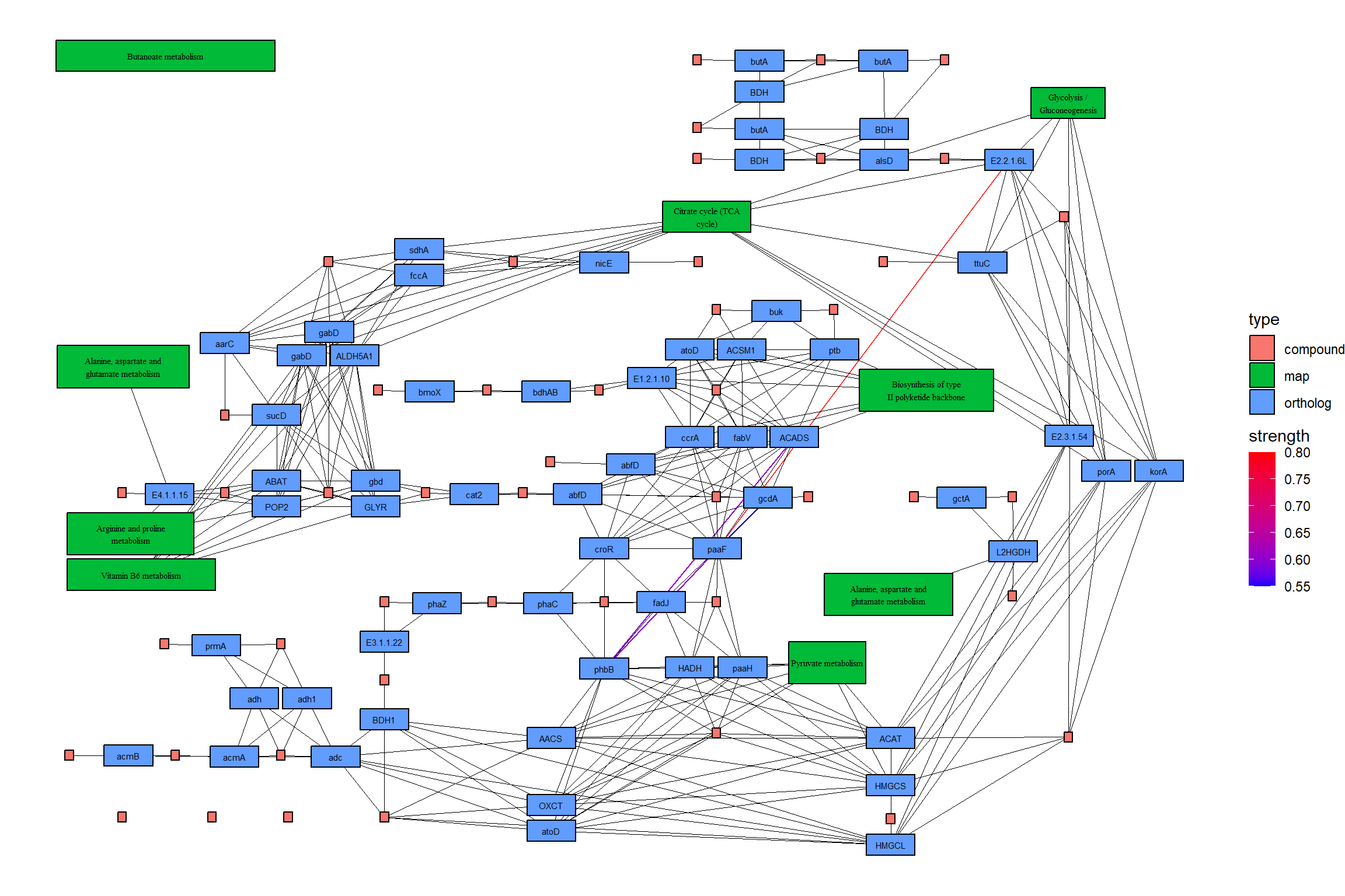
5.4.1 投影到原始 KEGG 地图上
您可以直接将推断网络投影到原始 PATHWAY 地图上,这样可以直接比较您自己的数据集中精选数据库和推断网络的知识。
raws <- joined |>
  ggraph(x=x, y=y) +
  geom_edge_link(width=0.5,aes(filter=!is.na(strength),
                                color=strength),
                 linetype=1,
                 arrow=arrow(length=unit(1,"mm"),type="closed"),
                 end_cap=circle(5,"mm"))+
  scale_edge_color_gradient2()+
  overlay_raw_map(transparent_colors = c("#ffffff"))+
  theme_void()
raws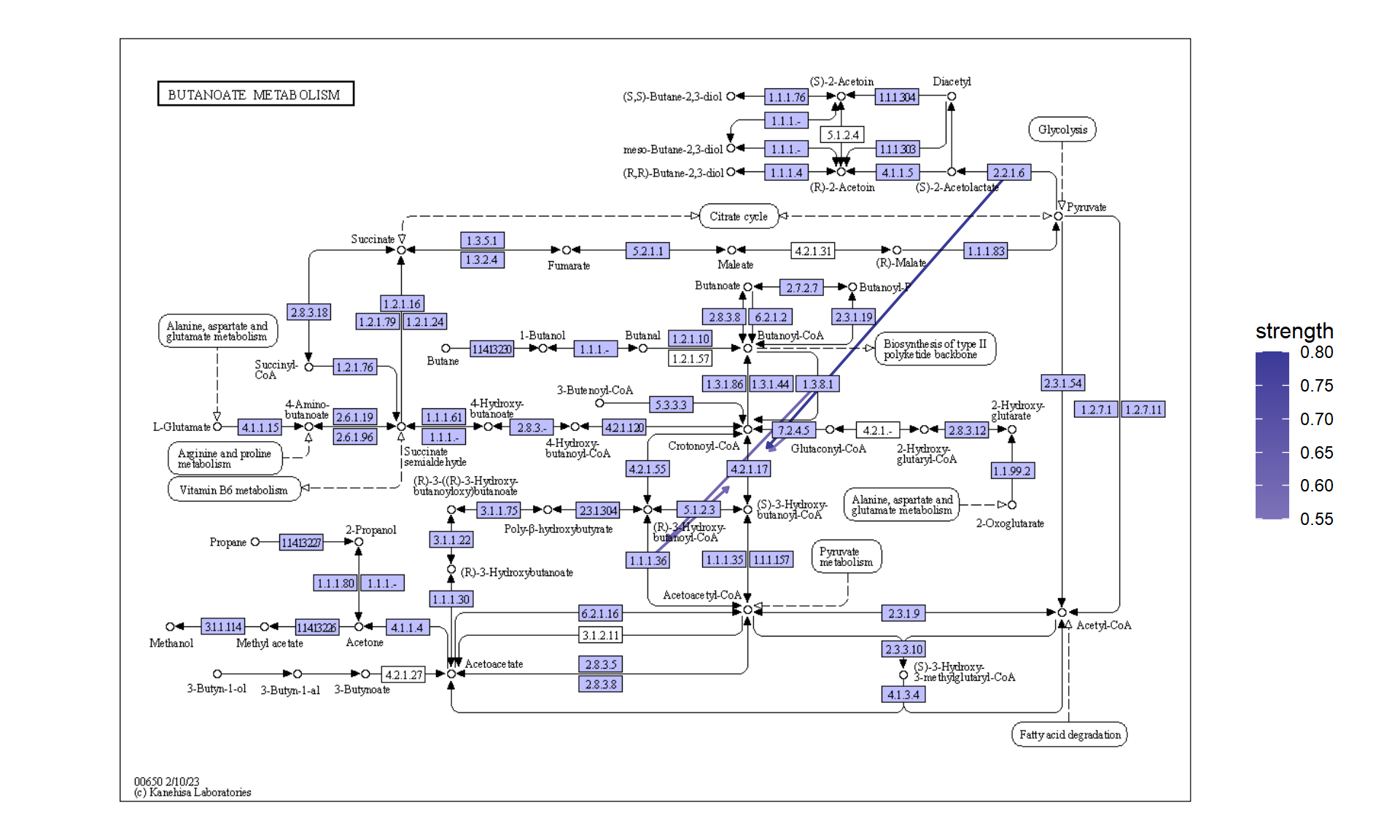
5.5 分析单细胞转录组学中的簇标记基因
该软件包也可应用于单细胞分析。例如,考虑将簇之间的标记基因映射到 KEGG 通路上,并将它们与降维图一起绘制。在这里,我们使用包。我们进行基本面分析。Seurat
library(Seurat)
library(dplyr)
# dir = "../filtered_gene_bc_matrices/hg19"
# pbmc.data <- Read10X(data.dir = dir)
# pbmc <- CreateSeuratObject(counts = pbmc.data, project = "pbmc3k",
#                            min.cells=3, min.features=200)
# pbmc <- NormalizeData(pbmc)
# pbmc <- FindVariableFeatures(pbmc, selection.method = "vst")
# pbmc <- ScaleData(pbmc, features = row.names(pbmc))
# pbmc <- RunPCA(pbmc, features = VariableFeatures(object = pbmc))
# pbmc <- FindNeighbors(pbmc, dims = 1:10, verbose = FALSE)
# pbmc <- FindClusters(pbmc, resolution = 0.5, verbose = FALSE)
# markers <- FindAllMarkers(pbmc)
# save(pbmc, markers, file="../sc_data.rda")

## To reduce file size, pre-calculated RDA will be loaded
load("../sc_data.rda")
随后,我们绘制了PCA降维的结果。
其中,在本研究中,我们对簇 1 和 5 的标记基因进行了富集分析。
library(clusterProfiler)

## Directly access slots in Seurat
pcas <- data.frame(
    pbmc@reductions$pca@cell.embeddings[,1],
    pbmc@reductions$pca@cell.embeddings[,2],
    pbmc@active.ident,
    pbmc@meta.data$seurat_clusters) |>
    `colnames<-`(c("PC_1","PC_2","Cell","group"))

aa <- (pcas %>% group_by(Cell) %>%
    mutate(meanX=mean(PC_1), meanY=mean(PC_2))) |>
    select(Cell, meanX, meanY)
label <- aa[!duplicated(aa),]

dd <- ggplot(pcas)+
    geom_point(aes(x=PC_1, y=PC_2, color=Cell))+
    shadowtext::geom_shadowtext(x=label$meanX,y=label$meanY,label=label$Cell, data=label,
                            bg.colour="white", colour="black")+
    theme_minimal()+
    theme(legend.position="none")

marker_1 <- clusterProfiler::bitr((markers |> filter(cluster=="1" & p_val_adj < 1e-50) |>
                                     dplyr::select(gene))$gene,fromType="SYMBOL",toType="ENTREZID",OrgDb = org.Hs.eg.db)$ENTREZID
marker_5 <- clusterProfiler::bitr((markers |> filter(cluster=="5" & p_val_adj < 1e-50) |>
                                     dplyr::select(gene))$gene,fromType="SYMBOL",toType="ENTREZID",OrgDb = org.Hs.eg.db)$ENTREZID
mk1_enrich <- enrichKEGG(marker_1)
mk5_enrich <- enrichKEGG(marker_5)
从中获取颜色信息,并使用 获取通路。在这里,我们选择了 ,节点根据降维图中的颜色着色,两个聚类中的标记都按指定的颜色 () 着色。这促进了通路信息(如KEGG)与单细胞分析数据之间的联系,从而能够创建直观且易于理解的视觉表示。ggplot2ggkeggOsteoclast differentiation (hsa04380)ggfxtomato
## Make color map
built <- ggplot_build(dd)$data[[1]]
cols <- built$colour
names(cols) <- as.character(as.numeric(built$group)-1)
gr_cols <- cols[!duplicated(cols)]

g <- pathway("hsa04380") |> mutate(marker_1=append_cp(mk1_enrich),
                                   marker_5=append_cp(mk5_enrich))
gg <- ggraph(g, layout="manual", x=x, y=y)+
    geom_node_rect(aes(filter=marker_1&marker_5), fill="tomato")+ ## Marker 1 & 5
    geom_node_rect(aes(filter=marker_1&!marker_5), fill=gr_cols["1"])+ ## Marker 1
    geom_node_rect(aes(filter=marker_5&!marker_1), fill=gr_cols["5"])+ ## Marker 5
  overlay_raw_map("hsa04380", transparent_colors = c("#cccccc","#FFFFFF","#BFBFFF","#BFFFBF"))+
  theme_void()
gg+dd+plot_layout(widths=c(0.6,0.4))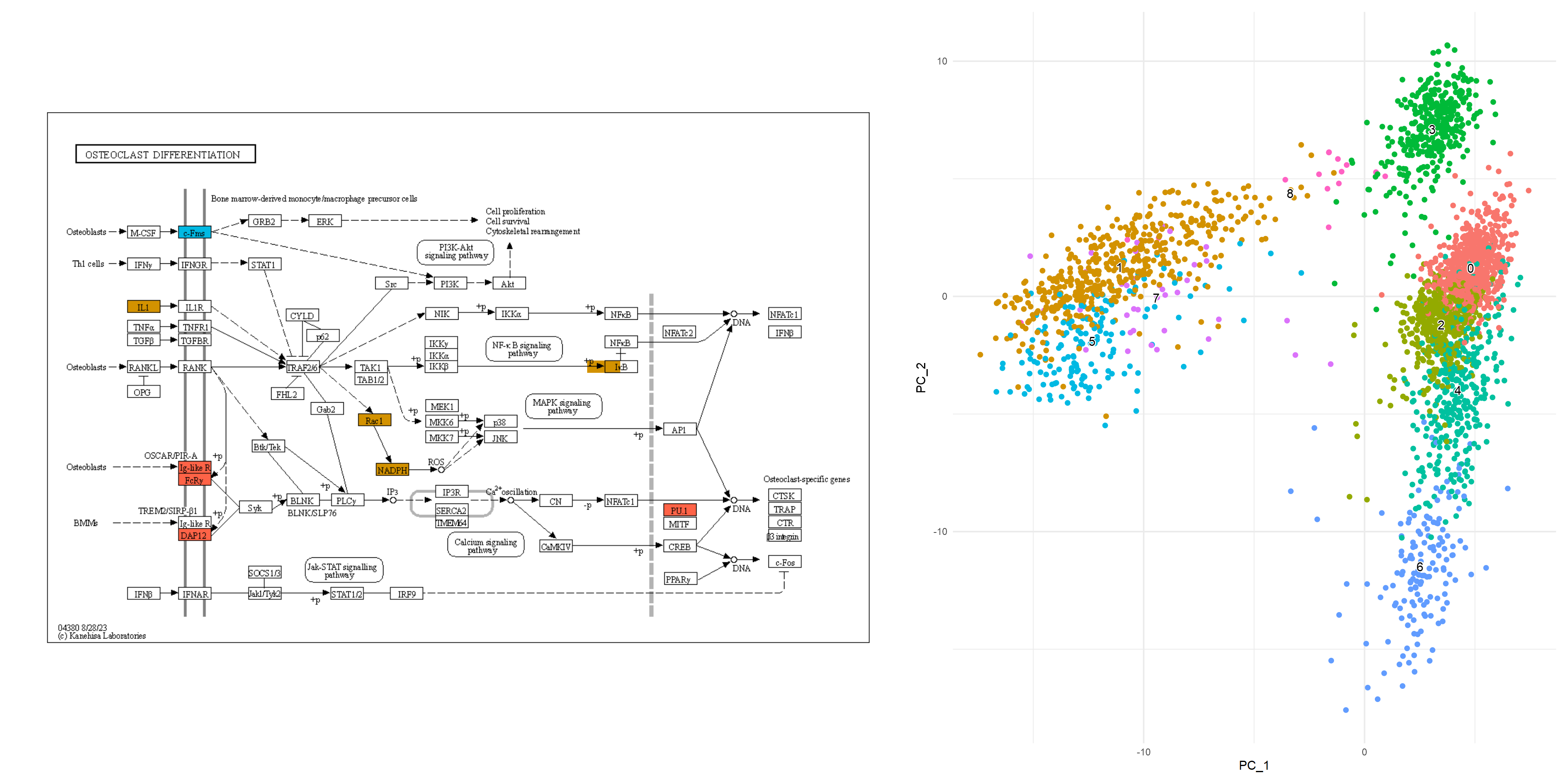
5.5.1 组成多个通路的示例
我们可以在多种途径中检查标记基因,以更好地了解标记基因的作用。
library(clusterProfiler)
library(org.Hs.eg.db)

subset_lab <- label[label$Cell %in% c("1","4","5","6"),]
dd <- ggplot(pcas) +
  ggfx::with_outer_glow(geom_node_point(size=1,
      aes(x=PC_1, y=PC_2, filter=group=="1", color=group)),
                        colour="tomato", expand=3)+
  ggfx::with_outer_glow(geom_node_point(size=1,
      aes(x=PC_1, y=PC_2, filter=group=="5", color=group)),
                        colour="tomato", expand=3)+
  ggfx::with_outer_glow(geom_node_point(size=1,
      aes(x=PC_1, y=PC_2, filter=group=="4", color=group)),
                        colour="gold", expand=3)+
  ggfx::with_outer_glow(geom_node_point(size=1,
      aes(x=PC_1, y=PC_2, filter=group=="6", color=group)),
                        colour="gold", expand=3)+
  shadowtext::geom_shadowtext(x=subset_lab$meanX,
      y=subset_lab$meanY, label=subset_lab$Cell,
      data=subset_lab,
      bg.colour="white", colour="black")+
  theme_minimal()

marker_1 <- clusterProfiler::bitr((markers |> filter(cluster=="1" & p_val_adj < 1e-50) |>
                                     dplyr::select(gene))$gene,fromType="SYMBOL",toType="ENTREZID",OrgDb = org.Hs.eg.db)$ENTREZID
marker_5 <- clusterProfiler::bitr((markers |> filter(cluster=="5" & p_val_adj < 1e-50) |>
                                     dplyr::select(gene))$gene,fromType="SYMBOL",toType="ENTREZID",OrgDb = org.Hs.eg.db)$ENTREZID
marker_6 <- clusterProfiler::bitr((markers |> filter(cluster=="6" & p_val_adj < 1e-50) |>
                                     dplyr::select(gene))$gene,fromType="SYMBOL",toType="ENTREZID",OrgDb = org.Hs.eg.db)$ENTREZID
marker_4 <- clusterProfiler::bitr((markers |> filter(cluster=="4" & p_val_adj < 1e-50) |>
                                     dplyr::select(gene))$gene,fromType="SYMBOL",toType="ENTREZID",OrgDb = org.Hs.eg.db)$ENTREZID
mk1_enrich <- enrichKEGG(marker_1)
mk5_enrich <- enrichKEGG(marker_5)
mk6_enrich <- enrichKEGG(marker_6)
mk4_enrich <- enrichKEGG(marker_4)

g1 <- pathway("hsa04612") |> mutate(marker_4=append_cp(mk4_enrich),
                                    marker_6=append_cp(mk6_enrich),
                                    gene_name=convert_id("hsa"))
gg1 <- ggraph(g1, layout="manual", x=x, y=y)+
  overlay_raw_map("hsa04612", transparent_colors = c("#FFFFFF", "#BFBFFF", "#BFFFBF"))+
  ggfx::with_outer_glow(
    geom_node_rect(aes(filter=marker_4&marker_6), fill="white"),
    colour="gold")+
  ggfx::with_outer_glow(
    geom_node_rect(aes(filter=marker_4&!marker_6), fill="white"),
    colour=gr_cols["4"])+
  ggfx::with_outer_glow(
    geom_node_rect(aes(filter=marker_6&!marker_4), fill="white"),
    colour=gr_cols["6"], expand=3)+
  overlay_raw_map("hsa04612", transparent_colors = c("#B3B3B3", "#FFFFFF", "#BFBFFF", "#BFFFBF"))+
  theme_void()

g2 <- pathway("hsa04380") |> mutate(marker_1=append_cp(mk1_enrich),
                                    marker_5=append_cp(mk5_enrich))
gg2 <- ggraph(g2, layout="manual", x=x, y=y)+
  ggfx::with_outer_glow(
    geom_node_rect(aes(filter=marker_1&marker_5),
                   fill="white"), ## Marker 1 & 5
    colour="tomato")+
  ggfx::with_outer_glow(
    geom_node_rect(aes(filter=marker_1&!marker_5),
                   fill="white"), ## Marker 1
    colour=gr_cols["1"])+
  ggfx::with_outer_glow(
    geom_node_rect(aes(filter=marker_5&!marker_1),
                   fill="white"), ## Marker 5
    colour=gr_cols["5"])+
  overlay_raw_map("hsa04380",
                  transparent_colors = c("#cccccc","#FFFFFF","#BFBFFF","#BFFFBF"))+
  theme_void()
left <-  (gg2 + ggtitle("Marker 1 and 5")) /
  (gg1 + ggtitle("Marker 4 and 6"))

final <- left + dd + plot_layout(design="
            AAAAA###
            AAAAACCC
            BBBBBCCC
            BBBBB###
            ")

final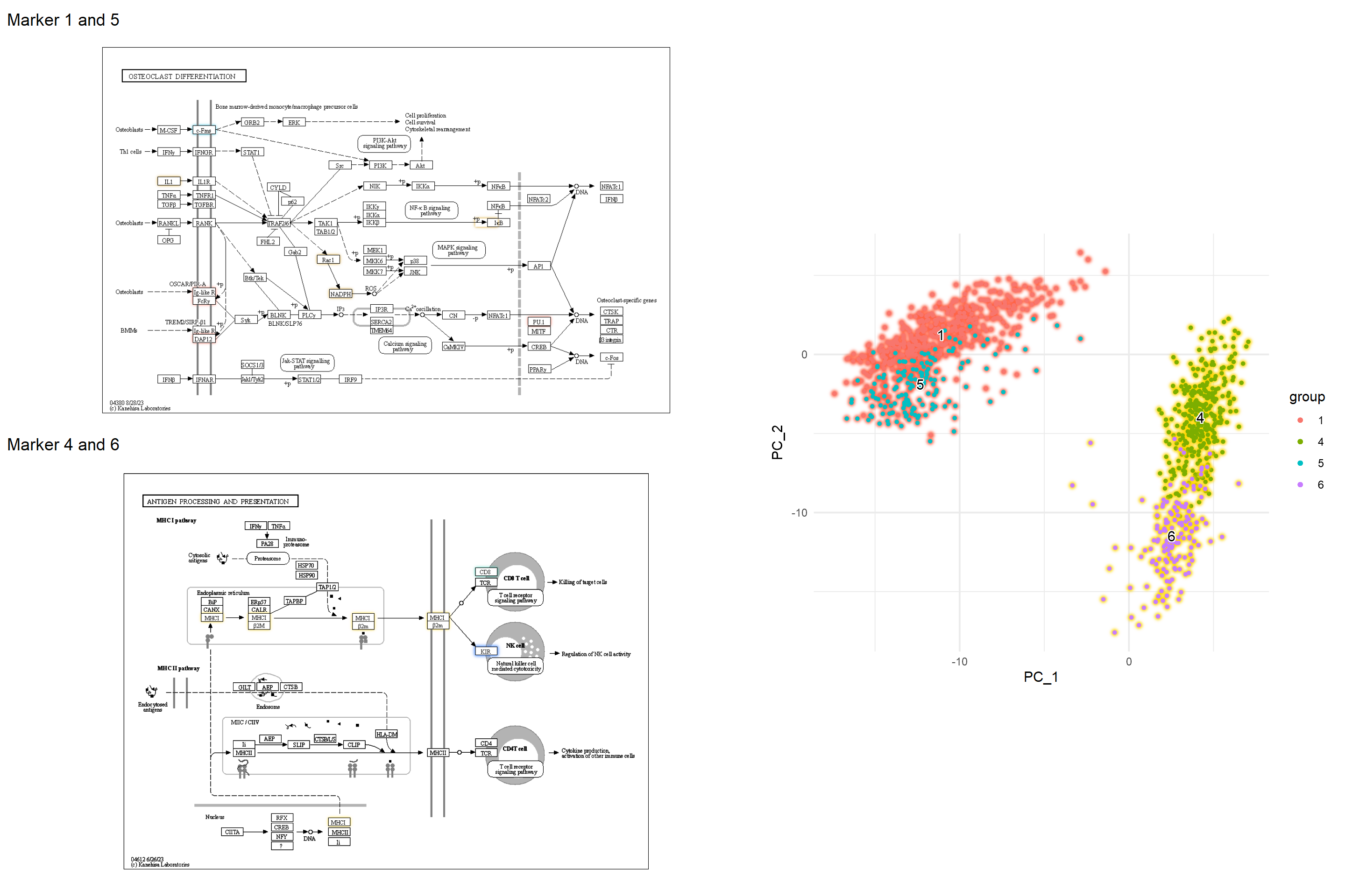
5.5.2 原始地图上数值的条形图
对于它们在多个聚类中丰富的节点,我们可以绘制数值的条形图。引用的代码由 inscaven 提供。
## Assign lfc to graph
mark_4 <- clusterProfiler::bitr((markers |> filter(cluster=="4" & p_val_adj < 1e-50) |>
                                     dplyr::select(gene))$gene,fromType="SYMBOL",toType="ENTREZID",OrgDb = org.Hs.eg.db)
mark_6 <- clusterProfiler::bitr((markers |> filter(cluster=="6" & p_val_adj < 1e-50) |>
                                   dplyr::select(gene))$gene,fromType="SYMBOL",toType="ENTREZID",OrgDb = org.Hs.eg.db)
mark_4$lfc <- markers[markers$cluster=="4" & markers$gene %in% mark_4$SYMBOL,]$avg_log2FC
mark_4$hsa <- paste0("hsa:",mark_4$ENTREZID)
mark_6$lfc <- markers[markers$cluster=="6" & markers$gene %in% mark_4$SYMBOL,]$avg_log2FC
mark_6$hsa <- paste0("hsa:",mark_6$ENTREZID)
mk4lfc <- mark_4$lfc
names(mk4lfc) <- mark_4$hsa
mk6lfc <- mark_6$lfc
names(mk6lfc) <- mark_6$hsa

g1 <- g1 |> mutate(mk4lfc=node_numeric(mk4lfc),
             mk6lfc=node_numeric(mk6lfc))

## Make data frame containing necessary data from node
subset_df <- g1 |> activate(nodes) |> data.frame() |>
    dplyr::filter(marker_4 & marker_6) |>
    dplyr::select(orig.id, mk4lfc, mk6lfc, x, y, xmin, xmax, ymin, ymax) |>
    tidyr::pivot_longer(cols=c("mk4lfc","mk6lfc"))

## Actually we dont need position list
pos_list <- list()
annot_list <- list()
for (i in subset_df$orig.id |> unique()) {
    tmp <- subset_df[subset_df$orig.id==i,]
    ymin <- tmp$ymin |> unique()
    ymax <- tmp$ymax |> unique()
    xmin <- tmp$xmin |> unique()
    xmax <- tmp$xmax |> unique()
    pos_list[[as.character(i)]] <- c(xmin, xmax,
                                     ymin, ymax)
    barp <- tmp |>
        ggplot(aes(x=name, y=value, fill=name))+
        geom_col(width=1)+
        scale_fill_manual(values=c(gr_cols["4"] |> as.character(),
                                   gr_cols["6"] |> as.character()))+
        labs(x = NULL, y = NULL) +
        coord_cartesian(expand = FALSE) +
        theme(
            legend.position = "none",
            panel.background = element_rect(fill = "transparent", colour = NA),
            line = element_blank(),
            text = element_blank()
        )
    gbar <- ggplotGrob(barp)
    panel_coords <- gbar$layout[gbar$layout$name == "panel", ]
    gbar_mod <- gbar[panel_coords$t:panel_coords$b, panel_coords$l:panel_coords$r]
    annot_list[[as.character(i)]] <- annotation_custom(gbar_mod,
                                                      xmin=xmin, xmax=xmax,
                                                      ymin=ymin, ymax=ymax)
}

## Make ggraph, annotate barplot, and overlay raw map.
graph_tmp <- ggraph(g1, layout="manual", x=x, y=y)+
    geom_node_rect(aes(filter=marker_4&marker_6),
                   fill="gold")+
    geom_node_rect(aes(filter=marker_4&!marker_6),
                   fill=gr_cols["4"])+
    geom_node_rect(aes(filter=marker_6&!marker_4),
                   fill=gr_cols["6"])+
    theme_void()
final_bar <- Reduce("+", annot_list, graph_tmp)+
overlay_raw_map("hsa04612",
                transparent_colors = c("#FFFFFF",
                                       "#BFBFFF",
                                       "#BFFFBF"))
final_bar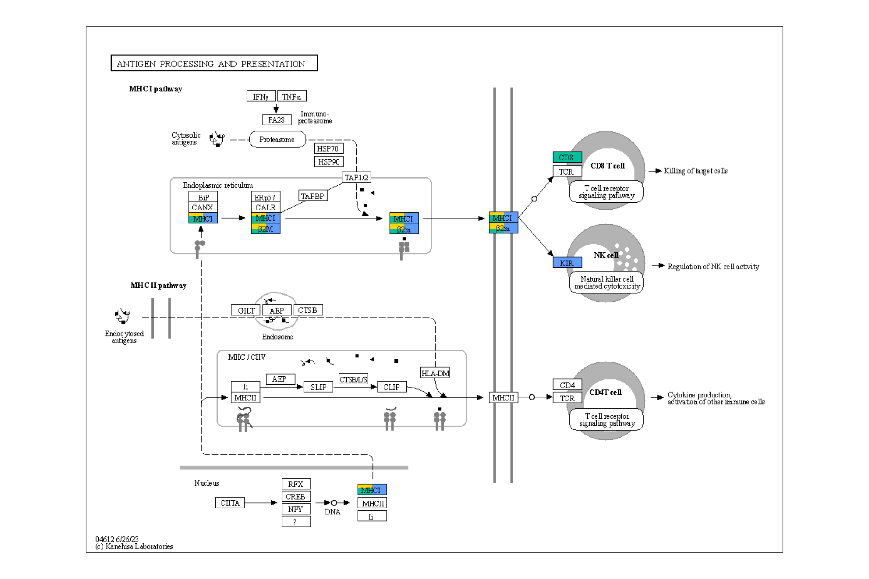
5.5.3 所有聚类的条形图
通过迭代上述代码,我们可以将所有聚类的定量数据绘制在图上。虽然最好使用 ggplot2 映射来生成图例,但这里我们从降维图中获取图例。
g1 <- pathway("hsa04612")
for (cluster_num in seq_len(9)) {
    cluster_num <- as.character(cluster_num - 1)
    mark <- clusterProfiler::bitr((markers |> filter(cluster==cluster_num & p_val_adj < 1e-50) |>
                                         dplyr::select(gene))$gene,fromType="SYMBOL",toType="ENTREZID",OrgDb = org.Hs.eg.db)
    mark$lfc <- markers[markers$cluster==cluster_num & markers$gene %in% mark$SYMBOL,]$avg_log2FC
    mark$hsa <- paste0("hsa:",mark$ENTREZID)
    coln <- paste0("marker",cluster_num,"lfc")
    g1 <- g1 |> mutate(!!coln := node_numeric(mark$lfc |> setNames(mark$hsa)))
}
subset_df <- g1 |> activate(nodes) |> data.frame() |>
    dplyr::select(orig.id, paste0("marker",seq_len(9)-1,"lfc"), x, y, xmin, xmax, ymin, ymax) |>
    tidyr::pivot_longer(cols=paste0("marker",seq_len(9)-1,"lfc"))
pos_list <- list()
annot_list <- list()
all_gr_cols <- gr_cols
names(all_gr_cols) <- paste0("marker",names(all_gr_cols),"lfc")
for (i in subset_df$orig.id |> unique()) {
    tmp <- subset_df[subset_df$orig.id==i,]
    ymin <- tmp$ymin |> unique()
    ymax <- tmp$ymax |> unique()
    xmin <- tmp$xmin |> unique()
    xmax <- tmp$xmax |> unique()
    pos_list[[as.character(i)]] <- c(xmin, xmax,
                                     ymin, ymax)
    if ((tmp |> filter(!is.na(value)) |> dim())[1]!=0) {
        barp <- tmp |> filter(!is.na(value)) |>
            ggplot(aes(x=name, y=value, fill=name))+
            geom_col(width=1)+
            scale_fill_manual(values=all_gr_cols)+
            ## We add horizontal line to show the direction of bar
            geom_hline(yintercept=0, linewidth=1, colour="grey")+
            labs(x = NULL, y = NULL) +
            coord_cartesian(expand = FALSE) +
            theme(
                legend.position = "none",
                panel.background = element_rect(fill = "transparent", colour = NA),
                text = element_blank()
            )
        gbar <- ggplotGrob(barp)
        panel_coords <- gbar$layout[gbar$layout$name == "panel", ]
        gbar_mod <- gbar[panel_coords$t:panel_coords$b, panel_coords$l:panel_coords$r]
        annot_list[[as.character(i)]] <- annotation_custom(gbar_mod,
                                                           xmin=xmin, xmax=xmax,
                                                           ymin=ymin, ymax=ymax)
    }
}
获取图例并进行修改。
## Take scplot legend, make it rectangle
## Make pseudo plot
dd2 <- ggplot(pcas) +
  geom_node_point(aes(x=PC_1, y=PC_2, color=group)) +
  guides(color = guide_legend(override.aes = list(shape=15, size=5)))+
  theme_minimal()

grobs <- ggplot_gtable(ggplot_build(dd2))
num <- which(sapply(grobs$grobs, function(x) x$name) == "guide-box")
legendGrob <- grobs$grobs[[num]]

## Show it
ggplotify::as.ggplot(legendGrob)
## Make dummy legend by `fill`
graph_tmp <- ggraph(g1, layout="manual", x=x, y=y)+
    geom_node_rect(aes(fill="transparent"))+
    scale_fill_manual(values="transparent" |> setNames("transparent"))+
    theme_void()

## Overlaid the raw map
overlaid <- Reduce("+", annot_list, graph_tmp)+
    overlay_raw_map("hsa04612",
                    transparent_colors = c("#FFFFFF",
                                           "#BFBFFF",
                                           "#BFFFBF"))

## Replace the guides
overlaidGtable <- ggplot_gtable(ggplot_build(overlaid))
num2 <- which(sapply(overlaidGtable$grobs, function(x) x$name) == "guide-box")
overlaidGtable$grobs[[num2]] <- legendGrob

ggplotify::as.ggplot(overlaidGtable)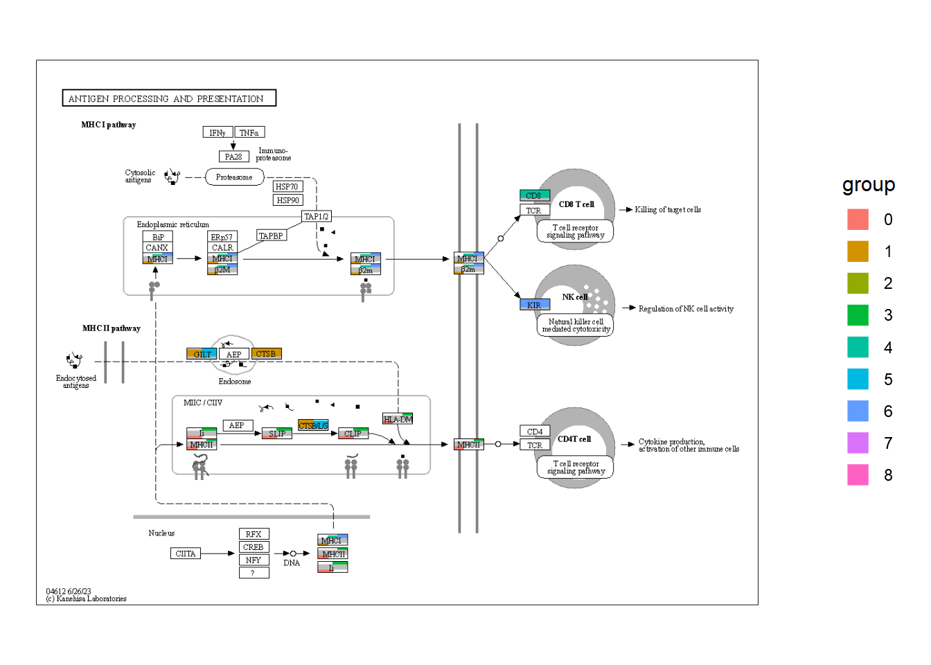
5.6 自定义全局地图可视化
使用的一个优点是利用 和 的强大功能有效地可视化全球地图。在这里,我展示了一个可视化从全球地图中的一些微生物组实验中获得的 log2 倍数变化值的示例。首先,我们加载必要的数据,这些数据可以从调查 KO 的数据集中获得,这些数据是从管道中获得的,例如 .ggkeggggplot2ggraphHUMAnN3
load("../lfcs.rda") ## Storing named vector of KOs storing LFCs and significant KOs
load("../func_cat.rda") ## Functional categories for hex values in ko01100

lfcs |> head()
#>  ko:K00013  ko:K00018  ko:K00031  ko:K00042  ko:K00065
#> -0.2955686 -0.4803597 -0.3052872  0.9327130  1.0954976
#>  ko:K00087
#>  0.8713860
signame |> head()
#> [1] "ko:K00013" "ko:K00018" "ko:K00031" "ko:K00042"
#> [5] "ko:K00065" "ko:K00087"
func_cat |> head()
#> # A tibble: 6 × 3
#>   hex     class                                        top
#>   <chr>   <chr>                                        <chr>
#> 1 #B3B3E6 Metabolism; Carbohydrate metabolism          Amin…
#> 2 #F06292 Metabolism; Biosynthesis of other secondary… Bios…
#> 3 #FFB3CC Metabolism; Metabolism of cofactors and vit… Bios…
#> 4 #FF8080 Metabolism; Nucleotide metabolism            Puri…
#> 5 #6C63F6 Metabolism; Carbohydrate metabolism          Glyc…
#> 6 #FFCC66 Metabolism; Amino acid metabolism            Bios…

## Named vector for Assigning functional category
hex <- func_cat$hex |> setNames(func_cat$hex)
class <- func_cat$class |> setNames(func_cat$hex)
hex |> head()
#>   #B3B3E6   #F06292   #FFB3CC   #FF8080   #6C63F6   #FFCC66
#> "#B3B3E6" "#F06292" "#FFB3CC" "#FF8080" "#6C63F6" "#FFCC66"
class |> head()
#>                                                   #B3B3E6
#>                     "Metabolism; Carbohydrate metabolism"
#>                                                   #F06292
#> "Metabolism; Biosynthesis of other secondary metabolites"
#>                                                   #FFB3CC
#>        "Metabolism; Metabolism of cofactors and vitamins"
#>                                                   #FF8080
#>                       "Metabolism; Nucleotide metabolism"
#>                                                   #6C63F6
#>                     "Metabolism; Carbohydrate metabolism"
#>                                                   #FFCC66
#>                       "Metabolism; Amino acid metabolism"
预处理
我们得到了 ko01100,并处理了图形。首先,我们附加与化合物间关系相对应的边。尽管大多数反应是可逆的,并且默认情况下会在 中添加两条边,但我们在此处指定用于可视化。此外,转换化合物 ID 和 KO ID 并将属性附加到图形中。tbl_graphprocess_reactionsingle_edge=TRUE
g <- ggkegg::pathway("ko01100")
g <- g |> process_reaction(single_edge=TRUE)
g <- g |> mutate(x=NULL, y=NULL)
g <- g |> activate(nodes) |> mutate(compn=convert_id("compound",
                                          first_arg_comma = FALSE))
g <- g |> activate(edges) |> mutate(kon=convert_id("ko",edge=TRUE))
接下来,我们将 KO 和度数等值附加到图表中。此外,在这里,我们将其他属性(例如哪些物种具有酶)附加到图表中。此类信息可以从 的分层输出中获得。HUMAnN3
g2 <- g |> activate(edges) |>
  mutate(kolfc=edge_numeric(lfcs), ## Pre-computed LFCs
         siglgl=.data$name %in% signame) |> ## Whether the KO is significant
  activate(nodes) |>
  filter(type=="compound") |> ## Subset to compound nodes and
  mutate(Degree=centrality_degree(mode="all")) |> ## Calculate degree
  activate(nodes) |>
  filter(Degree>2) |> ## Filter based on degree
  activate(edges) |>
  mutate(Species=ifelse(kon=="lyxK", "Escherichia coli", "Others"))
接下来,我们根据 ko01100 检查这些 KO 的总体类别,KO 数量最多的类别是碳水化合物代谢。
class_table <- (g |> activate(edges) |>
  mutate(siglgl=name %in% signame) |>
  filter(siglgl) |>
  data.frame())$fgcolor |>
  table() |> sort(decreasing=TRUE)
names(class_table) <- class[names(class_table)]
class_table
#>                     Metabolism; Carbohydrate metabolism
#>                                                      20
#>          Metabolism; Glycan biosynthesis and metabolism
#>                                                      16
#>        Metabolism; Metabolism of cofactors and vitamins
#>                                                      11
#>                       Metabolism; Amino acid metabolism
#>                                                       8
#>                       Metabolism; Nucleotide metabolism
#>                                                       7
#>    Metabolism; Metabolism of terpenoids and polyketides
#>                                                       3
#>                           Metabolism; Energy metabolism
#>                                                       3
#>   Metabolism; Xenobiotics biodegradation and metabolism
#>                                                       3
#>                     Metabolism; Carbohydrate metabolism
#>                                                       2
#>                            Metabolism; Lipid metabolism
#>                                                       1
#> Metabolism; Biosynthesis of other secondary metabolites
#>                                                       1
#>             Metabolism; Metabolism of other amino acids
#>                                                       1
绘图
我们首先使用 和 计算度的默认值可视化整个全球地图。ko01100
ggraph(g2, layout="fr")+
  geom_edge_link0(aes(color=I(fgcolor)), width=0.1)+
  geom_node_point(aes(fill=I(fgcolor), size=Degree), color="black", shape=21)+
  theme_graph()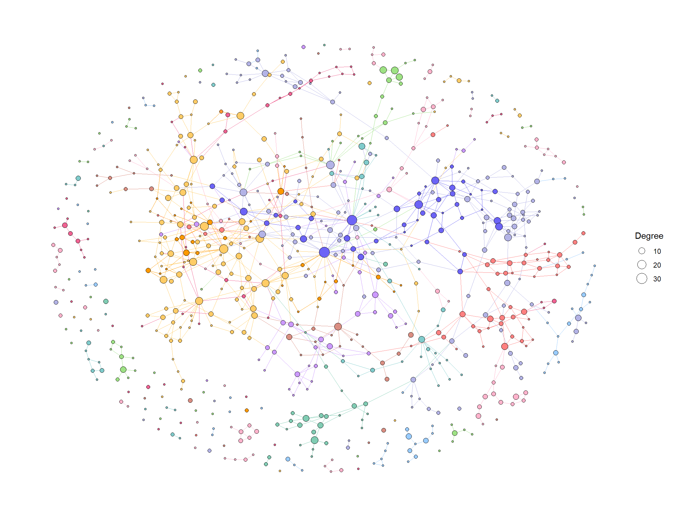
我们可以将各种几何形状应用于KEGG PATHWAY中的组件,以实现有效的可视化。在此示例中,我们突出显示了由其 LFC 着色的有效边 (KO),点大小对应于网络中的度数,并显示了有效 KO 名称的边缘标签。KO名称按属性着色。这一次,我们将其设置为 和 。ggfxSpeciesEscherichia coliOthers
ggraph(g2, layout="fr") +
  geom_edge_diagonal(color="grey50", width=0.1)+ ## Base edge
  ggfx::with_outer_glow(
    geom_edge_diagonal(aes(color=kolfc,filter=siglgl),
                       angle_calc = "along",
                       label_size=2.5),
    colour="gold", expand=3
  )+ ## Highlight significant edges
  scale_edge_color_gradient2(midpoint = 0, mid = "white",
                                    low=scales::muted("blue"),
                                    high=scales::muted("red"),
                                    name="LFC")+ ## Set gradient color
  geom_node_point(aes(fill=bgcolor,size=Degree),
                  shape=21,
                  color="black")+ ## Node size set to degree
  scale_size(range=c(1,4))+
  geom_edge_label_diagonal(aes(
    label=kon,
    label_colour=Species,
    filter=siglgl
  ),
  angle_calc = "along",
  label_size=2.5)+ ## Showing edge label, label color is Species attribute
  scale_label_colour_manual(values=c("tomato","black"),
                            name="Species")+ ## Scale color for edge label
  scale_fill_manual(values=hex,labels=class,name="Class")+ ## Show legend based on HEX
  theme_graph()+
  guides(fill = guide_legend(override.aes = list(size=5))) ## Change legend point size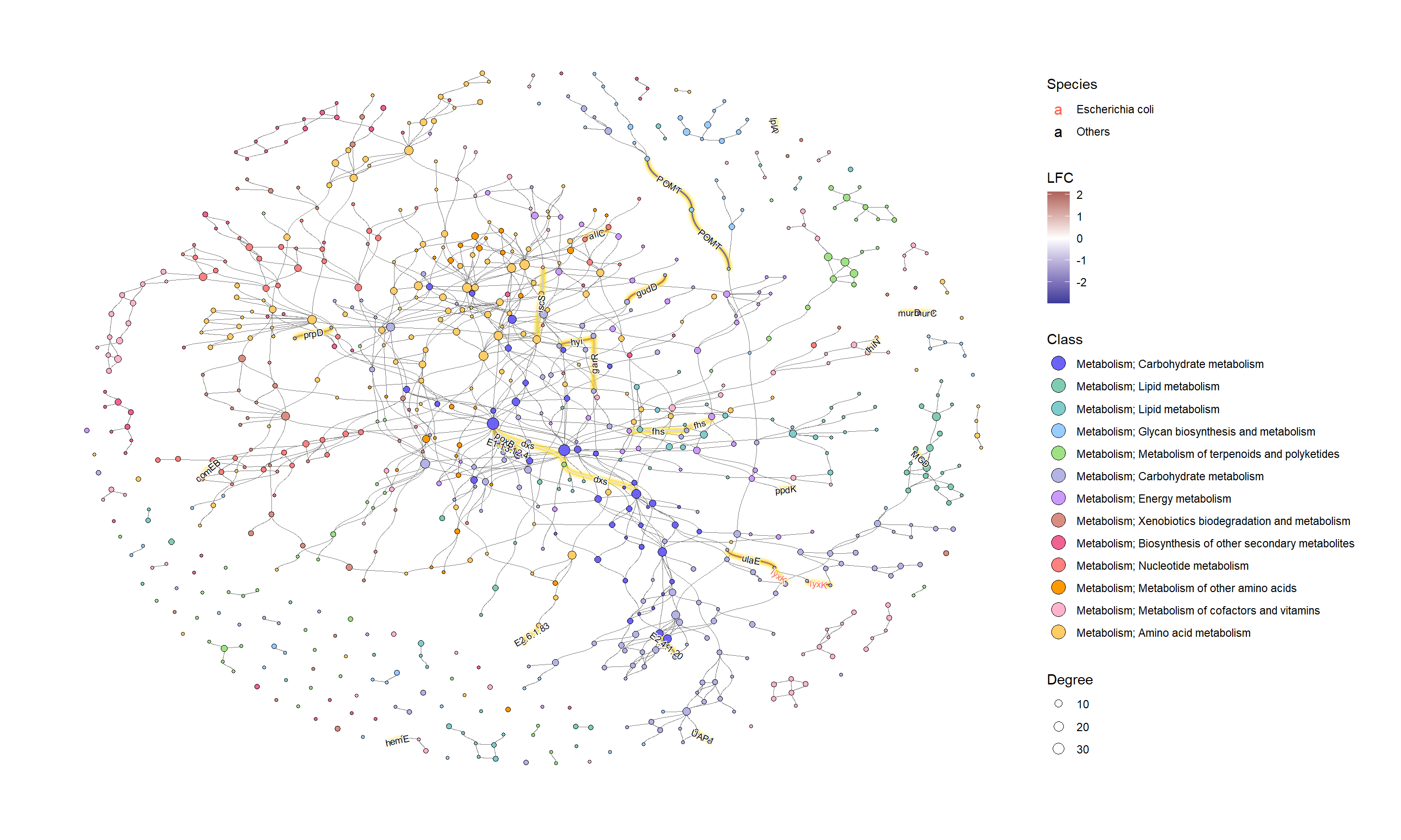
如果我们想调查特定的类,则按图中的十六进制值进行子集。
## Subset and do the same thing
g2 |>
  morph(to_subgraph, siglgl) |>
  activate(nodes) |>
  mutate(tmp=centrality_degree(mode="all")) |>
  filter(tmp>0) |>
  mutate(subname=compn) |>
  unmorph() |>
  activate(nodes) |>
  filter(bgcolor=="#B3B3E6") |>
  mutate(Degree=centrality_degree(mode="all")) |> ## Calculate degree
  filter(Degree>0) |>
ggraph(layout="fr") +
  geom_edge_diagonal(color="grey50", width=0.1)+ ## Base edge
  ggfx::with_outer_glow(
    geom_edge_diagonal(aes(color=kolfc,filter=siglgl),
                       angle_calc = "along",
                       label_size=2.5),
    colour="gold", expand=3
  )+
  scale_edge_color_gradient2(midpoint = 0, mid = "white",
                             low=scales::muted("blue"),
                             high=scales::muted("red"),
                             name="LFC")+
  geom_node_point(aes(fill=bgcolor,size=Degree),
                  shape=21,
                  color="black")+
  scale_size(range=c(1,4))+
  geom_edge_label_diagonal(aes(
    label=kon,
    label_colour=Species,
    filter=siglgl
  ),
  angle_calc = "along",
  label_size=2.5)+ ## Showing edge label
  scale_label_colour_manual(values=c("tomato","black"),
                            name="Species")+ ## Scale color for edge label
  geom_node_text(aes(label=stringr::str_wrap(subname,10,whitespace_only = FALSE)),
    repel=TRUE, bg.colour="white", size=2)+
  scale_fill_manual(values=hex,labels=class,name="Class")+
  theme_graph()+
  guides(fill = guide_legend(override.aes = list(size=5)))


 4092
4092

 被折叠的 条评论
为什么被折叠?
被折叠的 条评论
为什么被折叠?
 到【灌水乐园】发言


