


🧑 博主简介:曾任某智慧城市类企业
算法总监,目前在美国市场的物流公司从事高级算法工程师一职,深耕人工智能领域,精通python数据挖掘、可视化、机器学习等,发表过AI相关的专利并多次在AI类比赛中获奖。CSDN人工智能领域的优质创作者,提供AI相关的技术咨询、项目开发和个性化解决方案等服务,如有需要请站内私信或者联系任意文章底部的的VX名片(ID:xf982831907)
💬 博主粉丝群介绍:① 群内初中生、高中生、本科生、研究生、博士生遍布,可互相学习,交流困惑。② 热榜top10的常客也在群里,也有数不清的万粉大佬,可以交流写作技巧,上榜经验,涨粉秘籍。③ 群内也有职场精英,大厂大佬,可交流技术、面试、找工作的经验。④ 进群免费赠送写作秘籍一份,助你由写作小白晋升为创作大佬。⑤ 进群赠送CSDN评论防封脚本,送真活跃粉丝,助你提升文章热度。有兴趣的加文末联系方式,备注自己的CSDN昵称,拉你进群,互相学习共同进步。

【数据可视化-52】2023年度数据科学薪水数据可视化
一、引言
在科技飞速发展的当下,数据科学领域正吸引着全球的关注。随着企业数字化转型的深入,数据科学家等专业人才的需求日益增长。为了深入了解数据科学领域中的薪资状况,我们对2023年的数据科学薪资数据集进行了全面的可视化分析。这份数据集详细记录了数据科学家在不同国家、不同公司规模、不同经验水平下的薪资水平,为行业内外的决策者和求职者提供了重要的参考依据。

二、数据集介绍
数据科学薪资2023数据集涵盖了以下信息:
work_year: 支付工资的年份,均为2023年experience_level: 当年工作的经验水平,包括初级(EN)、中级(MI)、高级(SE)和主管(EX)employment_type: 职位的雇佣类型,分为全职(FT)、兼职(PT)、约聘(CT)和独立咨询(FL)job_title: 职位名称salary: 支付的工资总额salary_currency: 工资货币的ISO 4217代码salary_in_usd: 以美元计价的薪水employee_residence: 员工主要居住国家/地区的ISO 3166代码remote_ratio: 远程工作比例,分为0%(全现场)、50%(半远程)、100%(全远程)company_location: 公司主要办事处所在的国家/地区company_size: 当年公司员工人数的中位数规模,分为小型(S)、中型(M)和大型(L)
三、导入数据与预处理
我们使用Python的pandas库来加载数据,并进行初步的预处理:
import pandas as pd
import matplotlib.pyplot as plt
from wordcloud import WordCloud
from collections import Counter
import string
# 导入数据
df = pd.read_csv('ds_salaries.csv')
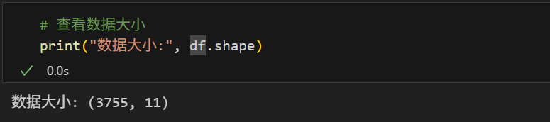
# 查看数据大小
print("数据大小:", df.shape)
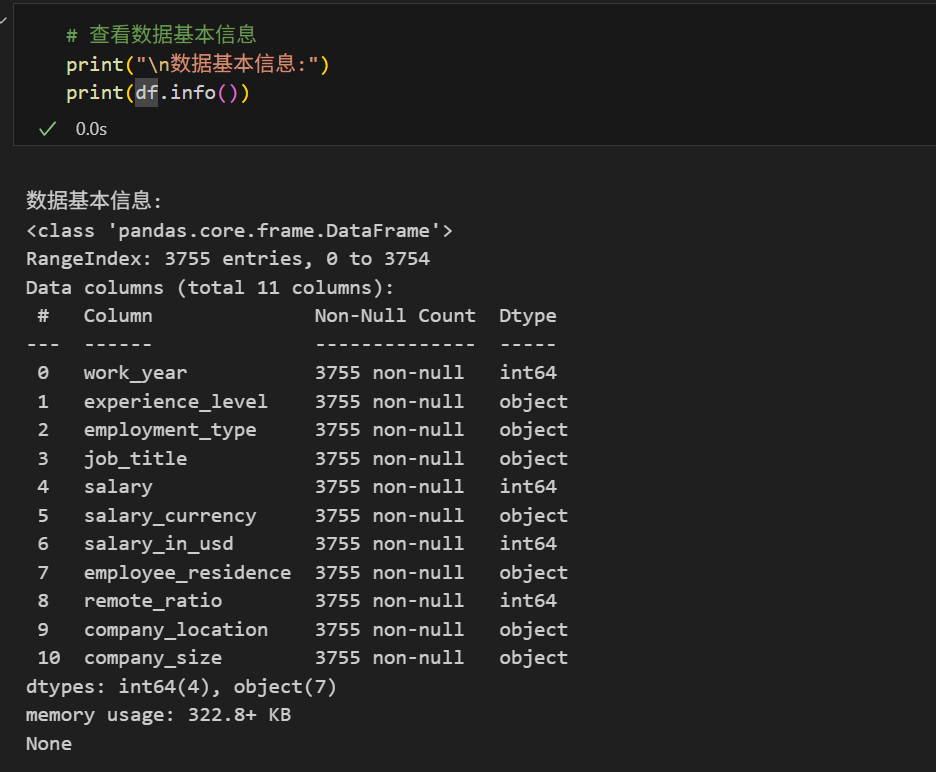
# 查看数据基本信息
print("\n数据基本信息:")
print(df.info())
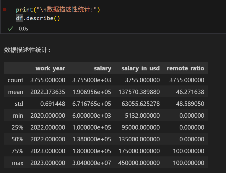
print("\n数据描述性统计:")
print(df.describe())
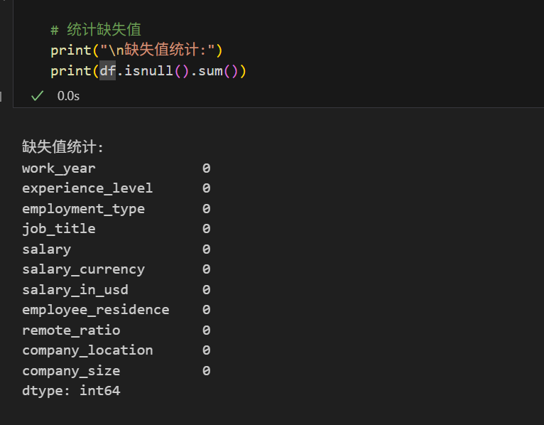
# 统计缺失值
print("\n缺失值统计:")
print(df.isnull().sum())
# 统计重复值
print("\n重复值数量:", df.duplicated().sum())
删除重复值:
data = df.drop_duplicates()
四、单变量分析
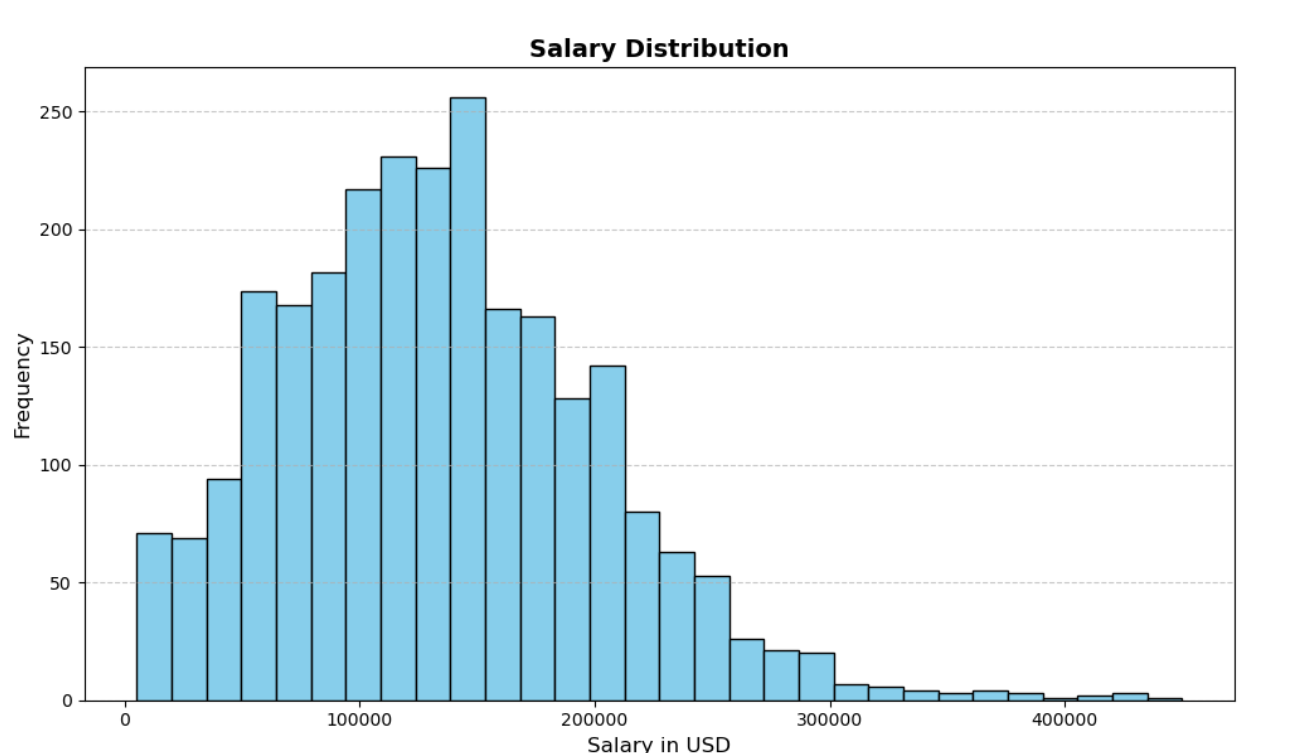
4.1 薪资分布
我们首先绘制薪资分布的直方图,了解数据科学领域的薪资水平:
plt.figure(figsize=(10, 6))
plt.hist(df['salary_in_usd'], bins=30, color='skyblue', edgecolor='black')
plt.title('Salary Distribution', fontsize=14, fontweight='bold')
plt.xlabel('Salary in USD', fontsize=12)
plt.ylabel('Frequency', fontsize=12)
plt.grid(axis='y', linestyle='--', alpha=0.7)
plt.tight_layout()
plt.show()
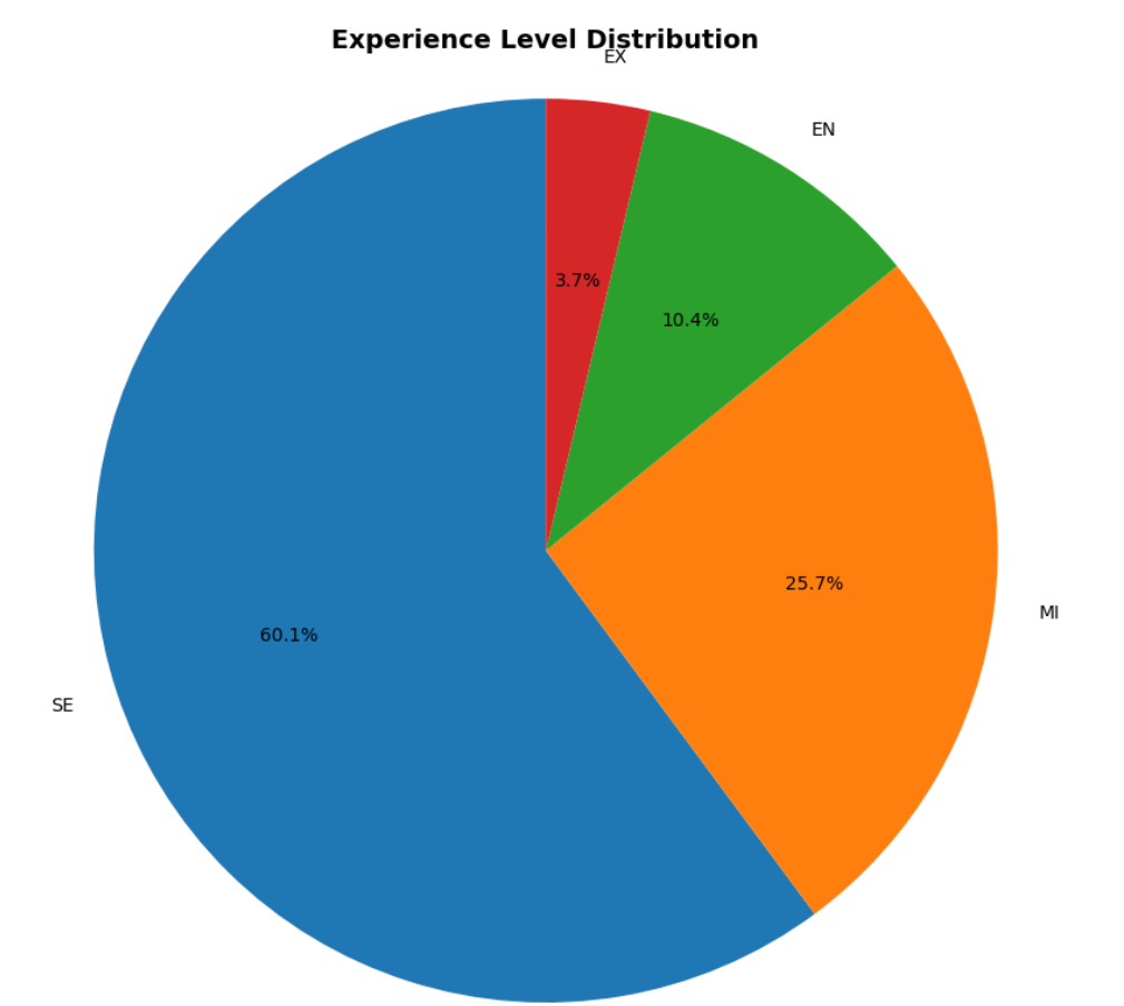
4.2 经验水平分布
分析不同经验水平的分布情况:
experience_counts = df['experience_level'].value_counts()

plt.figure(figsize=(8, 8))
plt.pie(experience_counts, labels=experience_counts.index, autopct='%1.1f%%', startangle=90)
plt.title('Experience Level Distribution', fontsize=14, fontweight='bold')
plt.axis('equal')
plt.tight_layout()
plt.show()
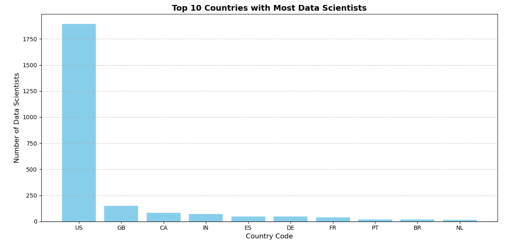
4.3 员工居住地分布
展示不同国家/地区数据科学家的分布:
top_countries = df['employee_residence'].value_counts().nlargest(10)

plt.figure(figsize=(12, 6))
plt.bar(top_countries.index, top_countries.values, color='skyblue')
plt.title('Top 10 Countries with Most Data Scientists', fontsize=14, fontweight='bold')
plt.xlabel('Country Code', fontsize=12)
plt.ylabel('Number of Data Scientists', fontsize=12)
plt.grid(axis='y', linestyle='--', alpha=0.7)
plt.tight_layout()
plt.show()
五、多变量分析
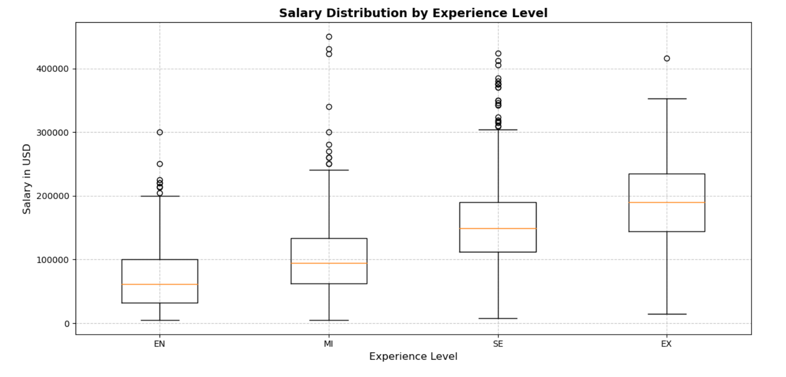
5.1 经验水平与薪资的关系
分析不同经验水平下的薪资差异:
plt.figure(figsize=(12, 6))
plt.boxplot([df[df['experience_level'] == 'EN']['salary_in_usd'],
             df[df['experience_level'] == 'MI']['salary_in_usd'],
             df[df['experience_level'] == 'SE']['salary_in_usd'],
             df[df['experience_level'] == 'EX']['salary_in_usd']],
            labels=['EN', 'MI', 'SE', 'EX'])
plt.title('Salary Distribution by Experience Level', fontsize=14, fontweight='bold')
plt.xlabel('Experience Level', fontsize=12)
plt.ylabel('Salary in USD', fontsize=12)
plt.grid(linestyle='--', alpha=0.7)
plt.tight_layout()
plt.show()
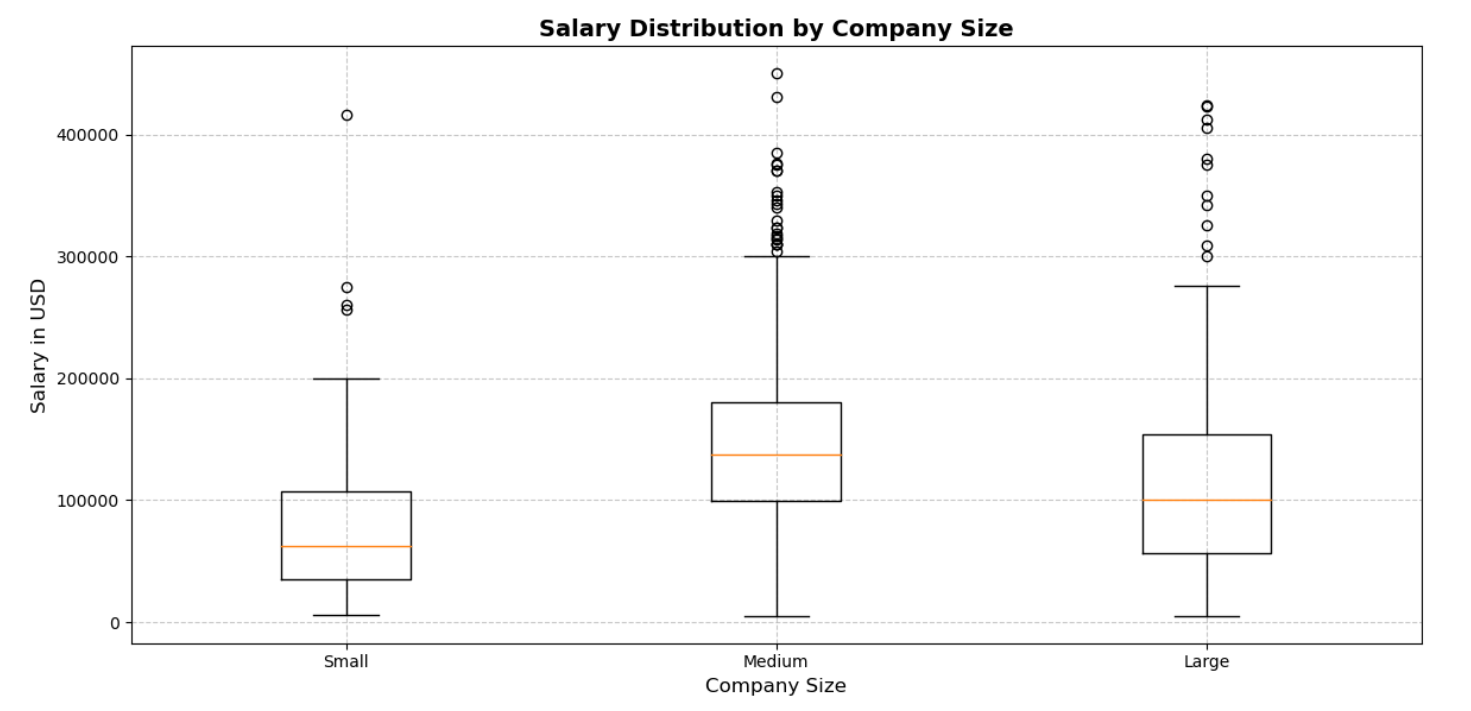
5.2 公司规模与薪资的关系
探讨不同规模公司的薪资水平:
plt.figure(figsize=(12, 6))
plt.boxplot([df[df['company_size'] == 'S']['salary_in_usd'],
             df[df['company_size'] == 'M']['salary_in_usd'],
             df[df['company_size'] == 'L']['salary_in_usd']],
            labels=['Small', 'Medium', 'Large'])
plt.title('Salary Distribution by Company Size', fontsize=14, fontweight='bold')
plt.xlabel('Company Size', fontsize=12)
plt.ylabel('Salary in USD', fontsize=12)
plt.grid(linestyle='--', alpha=0.7)
plt.tight_layout()
plt.show()
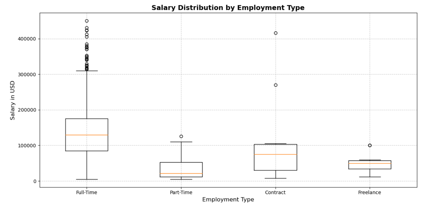
5.3 工作类型与薪资的关系
分析不同雇佣类型下的薪资差异:
plt.figure(figsize=(12, 6))
plt.boxplot([df[df['employment_type'] == 'FT']['salary_in_usd'],
             df[df['employment_type'] == 'PT']['salary_in_usd'],
             df[df['employment_type'] == 'CT']['salary_in_usd'],
             df[df['employment_type'] == 'FL']['salary_in_usd']],
            labels=['Full-Time', 'Part-Time', 'Contract', 'Freelance'])
plt.title('Salary Distribution by Employment Type', fontsize=14, fontweight='bold')
plt.xlabel('Employment Type', fontsize=12)
plt.ylabel('Salary in USD', fontsize=12)
plt.grid(linestyle='--', alpha=0.7)
plt.tight_layout()
plt.show()
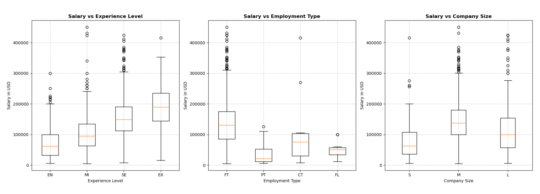
六、组合图表
6.1 多维度薪资分析
结合经验水平、工作类型和公司规模三个维度,分析它们对薪资的影响:
fig, axes = plt.subplots(1, 3, figsize=(18, 6))

# 经验水平与薪资
axes[0].boxplot([df[df['experience_level'] == 'EN']['salary_in_usd'],
                 df[df['experience_level'] == 'MI']['salary_in_usd'],
                 df[df['experience_level'] == 'SE']['salary_in_usd'],
                 df[df['experience_level'] == 'EX']['salary_in_usd']],
                labels=['EN', 'MI', 'SE', 'EX'])
axes[0].set_title('Salary vs Experience Level', fontsize=12, fontweight='bold')
axes[0].set_xlabel('Experience Level', fontsize=10)
axes[0].set_ylabel('Salary in USD', fontsize=10)
axes[0].grid(linestyle='--', alpha=0.7)

# 工作类型与薪资
axes[1].boxplot([df[df['employment_type'] == 'FT']['salary_in_usd'],
                 df[df['employment_type'] == 'PT']['salary_in_usd'],
                 df[df['employment_type'] == 'CT']['salary_in_usd'],
                 df[df['employment_type'] == 'FL']['salary_in_usd']],
                labels=['FT', 'PT', 'CT', 'FL'])
axes[1].set_title('Salary vs Employment Type', fontsize=12, fontweight='bold')
axes[1].set_xlabel('Employment Type', fontsize=10)
axes[1].set_ylabel('Salary in USD', fontsize=10)
axes[1].grid(linestyle='--', alpha=0.7)

# 公司规模与薪资
axes[2].boxplot([df[df['company_size'] == 'S']['salary_in_usd'],
                 df[df['company_size'] == 'M']['salary_in_usd'],
                 df[df['company_size'] == 'L']['salary_in_usd']],
                labels=['S', 'M', 'L'])
axes[2].set_title('Salary vs Company Size', fontsize=12, fontweight='bold')
axes[2].set_xlabel('Company Size', fontsize=10)
axes[2].set_ylabel('Salary in USD', fontsize=10)
axes[2].grid(linestyle='--', alpha=0.7)

plt.tight_layout()
plt.show()
七、总结
通过对2023年数据科学薪资数据集的深入可视化分析,我们获得以下洞察:
- 数据科学领域的薪资呈现出明显的分层现象,与经验水平、公司规模和工作类型密切相关
- 高级和主管职位的薪资显著高于初级和中级职位
- 大型公司的薪资水平普遍高于中小型公司
- 全职员工的薪资通常高于兼职、约聘和自由职业者
这些发现不仅为数据科学从业者提供了薪资参考,也为人力资源部门和企业管理者在制定薪资策略时提供了数据支持。数据可视化的力量在于它能够将复杂的数据关系直观地呈现出来,帮助我们更好地理解和决策。
注: 博主目前收集了6900+份相关数据集,有想要的可以领取部分数据:


 1万+
1万+

 被折叠的 条评论
为什么被折叠?
被折叠的 条评论
为什么被折叠?
 到【灌水乐园】发言


