


前言
本文为数据可视化组队学习:《Task02 - 艺术画笔见乾坤》笔记。
1 概述
1.1 matplotlib的使用逻辑
跟人类绘图一样,用matplotlib也是一样的步骤:
- 准备一块画布或画纸
- 准备好颜料、画笔等制图工具
- 作画
1.2 matplotlib的三层api
就如房子一般,是从地基一直往屋顶建的,在matplotlib中,也有类似的层次结构:
matplotlib.backend_bases.FigureCanvas
代表了绘图区,所有的图像都是在绘图区完成的matplotlib.backend_bases.Renderer
代表了渲染器,可以近似理解为画笔,控制如何在 FigureCanvas 上画图。matplotlib.artist.Artist
代表了具体的图表组件,即调用了Renderer的接口在Canvas上作图。
1、2 处理程序和计算机的底层交互的事项,3 Artist就是具体的调用接口来做出我们想要的图,比如图形、文本、线条的设定。所以通常来说,我们95%的时间,都是用来和 matplotlib.artist.Artist 类打交道的。
1.3 Artist类的结构
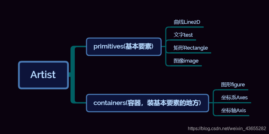
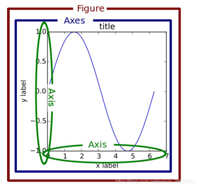
其中图形figure、坐标系Axes和坐标轴Axis的关系如下图所示:
1.4 matplotlib标准用法
由图形figure、坐标系Axes和坐标轴Axis的关系,可以得到matplotlib画图的标准方法,还是以建房子为例,从地基到房顶建造:
- 创建一个Figure实例
- 使用Figure实例创建一个或者多个Axes或Subplot实例
- 使用Axes实例的辅助方法来创建primitive
import matplotlib.pyplot as plt
import numpy as np

# step 1
# 我们用 matplotlib.pyplot.figure() 创建了一个Figure实例
fig = plt.figure()

# step 2
# 然后用Figure实例创建了一个两行一列(即可以有两个subplot)的绘图区,并同时在第一个位置创建了一个subplot
ax = fig.add_subplot(2, 1, 1) # two rows, one column, first plot

# step 3
# 然后用Axes实例的方法画了一条曲线
t = np.arange(0.0, 1.0, 0.01)
s = np.sin(2*np.pi*t)
line, = ax.plot(t, s, color='blue', lw=2)

2 自定义你的Artist对象
2.1 Artist属性
在图形中的每一个元素都对应着一个matplotlib Artist,且都有其对应的配置属性列表。
每个matplotlib Artist都有以下常用属性:
- .alpha属性:透明度。值为0—1之间的浮点数
- .axes属性:返回这个Artist所属的axes,可能为None
- .figure属性:该Artist所属的Figure,可能为None
- .label:一个text label
- .visible:布尔值,控制Artist是否绘制
补充,完整属性列表:
| Property | Description |
|---|---|
| alpha | The transparency - a scalar from 0-1 |
| animated | A boolean that is used to facilitate animated drawing |
| axes | The axes that the Artist lives in, possibly None |
| clip_box | The bounding box that clips the Artist |
| clip_on | Whether clipping is enabled |
| clip_path | The path the artist is clipped to |
| contains | A picking function to test whether the artist contains the pick point |
| figure | The figure instance the artist lives in, possibly None |
| label | A text label (e.g., for auto-labeling) |
| picker | A python object that controls object picking |
| transform | The transformation |
| visible | A boolean whether the artist should be drawn |
| zorder | A number which determines the drawing order |
| rasterized | Boolean; Turns vectors into raster graphics (for compression & eps transparency) |
特别有Figure、Axes本身具有一个Rectangle,使用 Figure.patch 和 Axes.patch 可以查看:
# .patch
plt.figure().patch
plt.axes().patch

2.2 属性调用的方式
既然每个Artist对象都有属性,那么该如何去查看和修改这些属性呢?
Artist对象的所有属性都通过相应的 get_* 和 set_* 函数进行读写。
- 例如下面的语句将alpha属性设置为当前值的一半:
a = o.get_alpha()
o.set_alpha(0.5*a)
- 如果想一次设置多个属性,也可以用set方法:
o.set(alpha=0.5, zorder=2)
- 可以使用 matplotlib.artist.getp(o,“alpha”) 来获取属性,如果指定属性名,则返回对象的该属性值;如果不指定属性名,则返回对象的所有的属性和值。
import matplotlib
# Figure rectangle的属性
matplotlib.artist.getp(fig.patch)
  	agg_filter = None
    alpha = None
    animated = False
    antialiased or aa = False
    bbox = Bbox(x0=0.0, y0=0.0, x1=1.0, y1=1.0)
    capstyle = butt
    children = []
    clip_box = None
    clip_on = True
    clip_path = None
    contains = None
    data_transform = BboxTransformTo(     TransformedBbox(         Bbox...
    edgecolor or ec = (1.0, 1.0, 1.0, 0.0)
    extents = Bbox(x0=0.0, y0=0.0, x1=432.0, y1=288.0)
    facecolor or fc = (1.0, 1.0, 1.0, 0.0)
    figure = Figure(432x288)
    fill = True
    gid = None
    hatch = None
    height = 1
    in_layout = False
    joinstyle = miter
    label =
    linestyle or ls = solid
    linewidth or lw = 0.0
    patch_transform = CompositeGenericTransform(     BboxTransformTo(   ...
    path = Path(array([[0., 0.],        [1., 0.],        [1.,...
    path_effects = []
    picker = None
    rasterized = None
    sketch_params = None
    snap = None
    transform = CompositeGenericTransform(     CompositeGenericTra...
    transformed_clip_path_and_affine = (None, None)
    url = None
    verts = [[  0.   0.]  [432.   0.]  [432. 288.]  [  0. 288....
    visible = True
    width = 1
    window_extent = Bbox(x0=0.0, y0=0.0, x1=432.0, y1=288.0)
    x = 0
    xy = (0, 0)
    y = 0
    zorder = 1
3 基本元素 - primitives

3.1 Line2D
在matplotlib中曲线的绘制,主要是通过类 matplotlib.lines.Line2D 来完成的。
它的基类: matplotlib.artist.Artist
3.1.1 如何设置Line2D的属性
有三种方法。
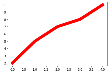
- 直接在plot()函数中设置
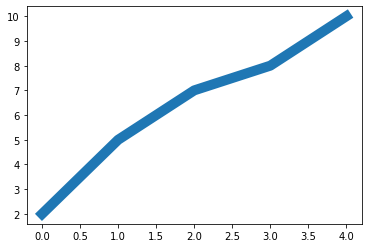
import matplotlib.pyplot as plt
x = range(0,5)
y = [2,5,7,8,10]
plt.plot(x,y, linewidth=10) # 设置线的粗细参数为10
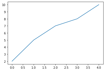
- 通过获得线对象,对线对象进行设置
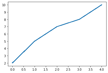
x = range(0,5)
y = [2,5,7,8,10]
line, = plt.plot(x, y, '-')
line.set_antialiased(False) # 关闭抗锯齿功能
- 获得线属性,使用setp()函数设置
x = range(0,5)
y = [2,5,7,8,10]
lines = plt.plot(x, y)
plt.setp(lines, color='r', linewidth=10)
3.1.2 绘制Line2D
绘制直线line常用的方法有两种。
- pyplot方法绘制
- Line2D对象绘制
常用参数:
- xdata:需要绘制的line中点的在x轴上的取值,若忽略,则默认为range(1,len(ydata)+1)
- ydata:需要绘制的line中点的在y轴上的取值
- linewidth:线条的宽度
- linestyle:线型
- color:线条的颜色
- marker:点的标记,详细可参考markers API 1
- markersize:标记的size
- pyplot方法绘制
这种方法更加简便。
import matplotlib.pyplot as plt
x = range(0,5)
y = [2,5,7,8,10]
plt.plot(x,y)
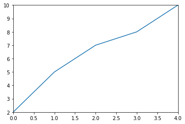
- Line2D对象绘制
这种方法完美地诠释了matplotlib画图的figure→axes→axis结构。
import matplotlib.pyplot as plt
from matplotlib.lines import Line2D

# figure
fig = plt.figure()

# axes
ax = fig.add_subplot(111)

x = range(0,5)
y = [2,5,7,8,10]
line = Line2D(x, y)
ax.add_line(line)

# axis
ax.set_xlim(min(x), max(x))
ax.set_ylim(min(y), max(y))

plt.show()
上述代码也可用下面的代替:
import matplotlib.pyplot as plt
from matplotlib.lines import Line2D

fig = plt.figure()
ax = fig.add_subplot(111) # 1×1网格,第1子图

x = range(0,5)
y = [2,5,7,8,10]
line = Line2D(x, y)
ax.add_line(line)

ax.set(xlim=(min(x), max(x)), ylim=(min(y), max(y)))

plt.show()
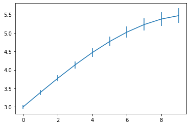
3.1.3 errorbar绘制误差折线图
构造方法如下:
matplotlib.pyplot.errorbar(x, y, yerr=None, xerr=None, fmt=’’, ecolor=None, elinewidth=None, capsize=None, barsabove=False, lolims=False, uplims=False, xlolims=False, xuplims=False, errorevery=1, capthick=None, *, data=None, **kwargs)
主要参数:
- x:需要绘制的line中点的在x轴上的取值
- y:需要绘制的line中点的在y轴上的取值
- yerr:指定y轴水平的误差
- xerr:指定x轴水平的误差
- fmt:指定折线图中某个点的颜色,形状,线条风格,例如‘co–’
- ecolor:指定error bar的颜色
- elinewidth:指定error bar的线条宽度
errorbar的基类是matplotlib.pyplot,所以不需要plot.show().
import numpy as np
import matplotlib.pyplot as plt
x = np.arange(10)
y = 2.5 * np.sin(x / 20 * np.pi)
yerr = np.linspace(0.05, 0.2, 10)
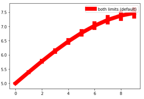
plt.errorbar(x, y + 3, yerr=yerr, label='both limits (default)')
加个 linewidth=10, color='r':
import numpy as np
import matplotlib.pyplot as plt
x = np.arange(10)
y = 2.5 * np.sin(x / 20 * np.pi)
yerr = np.linspace(0.05, 0.2, 10)
plt.errorbar(x, y + 5,linewidth=10,color='r', yerr=yerr, label='both limits (default)')
plt.legend() # 输出label
3.2 patches
matplotlib.patches.Patch类是二维图形类。它的基类是matplotlib.artist.Artist。
3.2.1 绘制Rectangle-矩形
Rectangle矩形类在官网中的定义是: 通过锚点xy及其宽度和高度生成。
Rectangle本身的主要比较简单,即xy控制锚点,width和height分别控制宽和高。它的构造函数:
class matplotlib.patches.Rectangle(xy, width, height, angle=0.0, **kwargs)
在实际中最常见的矩形图是hist直方图和bar条形图。
- hist-直方图
两种绘制方法:
- 使用plt.hist绘制
- 使用Rectangle矩形类绘制直方图
- 使用plt.hist绘制
非常简便。
matplotlib.pyplot.hist(x,bins=None,range=None, density=None, bottom=None, histtype=‘bar’, align=‘mid’, log=False, color=None, label=None, stacked=False, normed=None)
常用的参数:
- x: 数据集,最终的直方图将对数据集进行统计
- bins: 统计的区间分布
- range: tuple, 显示的区间,range在没有给出bins时生效
- density: bool,默认为false,显示的是频数统计结果,为True则显示频率统计结果,这里需要注意,频率统计结果=区间数目/(总数*区间宽度),和>- normed效果一致,官方推荐使用density
- histtype: 可选{‘bar’, ‘barstacked’, ‘step’, ‘stepfilled’}之一,默认为bar,推荐使用默认配置,step使用的是梯状,stepfilled则会对梯状内部进行填充,效果与bar类似
- align: 可选{‘left’, ‘mid’, ‘right’}之一,默认为’mid’,控制柱状图的水平分布,left或者right,会有部分空白区域,推荐使用默认
- log: bool,默认False,即y坐标轴是否选择指数刻度
- stacked: bool,默认为False,是否为堆积状图
import matplotlib.pyplot as plt
import numpy as np
# 落入每个范围的x数据集中的数据个数
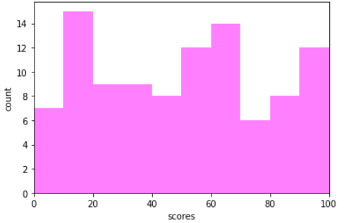
x=np.random.randint(0,100,100) #生成[0-100)之间的100个数据,即数据集
bins=np.arange(0,101,10) #设置连续的边界值,即直方图的分布区间[0,10),[10,20)...
plt.hist(x,bins,color='fuchsia',alpha=0.5)#alpha设置透明度,0为完全透明
plt.xlabel('scores')
plt.ylabel('count')
plt.xlim(0,100)#设置x轴分布范围
plt.show()
import matplotlib.pyplot as plt
import numpy as np
# 落入每个范围的x数据集中的数据个数
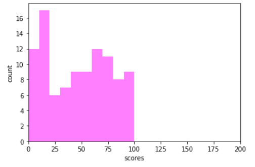
x=np.random.randint(0,100,100) #生成[0-100)之间的100个数据,即数据集
bins=np.arange(0,101,10) #设置连续的边界值,即直方图的分布区间[0,10),[10,20)...
plt.hist(x,bins,color='fuchsia',alpha=0.5)#alpha设置透明度,0为完全透明
plt.xlabel('scores')
plt.ylabel('count')
# plt.xlim(0,100)
plt.xlim(0,200)#设置x轴分布范围
- 使用Rectangle矩形类绘制直方图
个人感觉比较麻烦。
import pandas as pd
import re
df = pd.DataFrame(columns = ['data'])
df.loc[:,'data'] = x
df['fenzu'] = pd.cut(df['data'], bins=bins, right = False,include_lowest=True)

df_cnt = df['fenzu'].value_counts().reset_index()
df_cnt.loc[:,'mini'] = df_cnt['index'].astype(str).map(lambda x:re.findall('\[(.*)\,',x)[0]).astype(int)
df_cnt.loc[:,'maxi'] = df_cnt['index'].astype(str).map(lambda x:re.findall('\,(.*)\)',x)[0]).astype(int)
df_cnt.loc[:,'width'] = df_cnt['maxi']- df_cnt['mini']
df_cnt.sort_values('mini',ascending = True,inplace = True)
df_cnt.reset_index(inplace = True,drop = True)

#用Rectangle把hist绘制出来
import matplotlib.pyplot as plt

fig = plt.figure()
ax1 = fig.add_subplot(111)
#rect1 = plt.Rectangle((0,0),10,10)
#ax1.add_patch(rect)

#ax2 = fig.add_subplot(212)
for i in df_cnt.index:
    rect =  plt.Rectangle((df_cnt.loc[i,'mini'],0),df_cnt.loc[i,'width'],df_cnt.loc[i,'fenzu'])
#rect2 = plt.Rectangle((10,0),10,5)
    ax1.add_patch(rect)
#ax1.add_patch(rect2)
ax1.set_xlim(0, 100)
ax1.set_ylim(0, 16)
plt.show()

- bar-柱状图
两种绘制方法:
- 使用plt.bar()绘制
- 使用Rectangle矩形类绘制柱状图
- 使用plt.bar()绘制
非常简便。
matplotlib.pyplot.bar(left, height, alpha=1, width=0.8, color=, edgecolor=, label=, lw=3)
常用的参数:
- left:x轴的位置序列,一般采用range函数产生一个序列,但是有时候可以是字符串
- height:y轴的数值序列,也就是柱形图的高度,一般就是我们需要展示的数据;
- alpha:透明度,值越小越透明
- width:为柱形图的宽度,一般这是为0.8即可;
- color或facecolor:柱形图填充的颜色;
- edgecolor:图形边缘颜色
- label:解释每个图像代表的含义,这个参数是为legend()函数做铺垫的,表示该次bar的标签
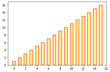
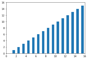
import matplotlib.pyplot as plt
y = range(1,17)
plt.bar(np.arange(16), y, alpha=0.5, width=0.5, color='yellow', edgecolor='red', label='The First Bar', lw=3)
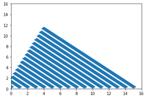
- 使用Rectangle矩形类绘制柱状图
个人感觉比较麻烦。
#import matplotlib.pyplot as plt
fig = plt.figure()
ax1 = fig.add_subplot(111)

"""class matplotlib.patches.Rectangle(
    xy, width, height, angle=0.0, **kwargs)

    x y:分别为矩形左下角的坐标
"""
for i in range(1,17):
    rect =  plt.Rectangle((i+0.25,0),0.5,i)
    ax1.add_patch(rect)
ax1.set_xlim(0, 16)
ax1.set_ylim(0, 16)
plt.show()
#import matplotlib.pyplot as plt
fig = plt.figure()
ax1 = fig.add_subplot(111)

"""class matplotlib.patches.Rectangle(
    xy, width, height, angle=0.0, **kwargs)

    x y:分别为矩形左下角的坐标
"""
for i in range(1,17):
    rect =  plt.Rectangle((i-1,0),0.5,i,angle=45)
    ax1.add_patch(rect)
ax1.set_xlim(0, 16)
ax1.set_ylim(0, 16)
plt.show()
3.2.3 绘制Polygon-多边形
matplotlib.patches.Polygon类是多边形类。其基类是matplotlib.patches.Patch。
构造函数:
class matplotlib.patches.Polygon(xy, closed=True, **kwargs)
参数说明:
- xy:是一个N×2的numpy array,为多边形的顶点。
- closed:为True则指定多边形将起点和终点重合从而显式关闭多边形
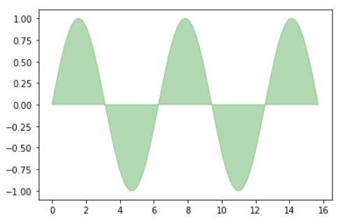
在使用中,我们直接通过matplotlib.pyplot.fill()来绘制多边形:
import matplotlib.pyplot as plt
x = np.linspace(0, 5 * np.pi, 1000)
y1 = np.sin(x)
y2 = np.sin(2 * x)
plt.fill(x, y1, color = "g", alpha = 0.3)
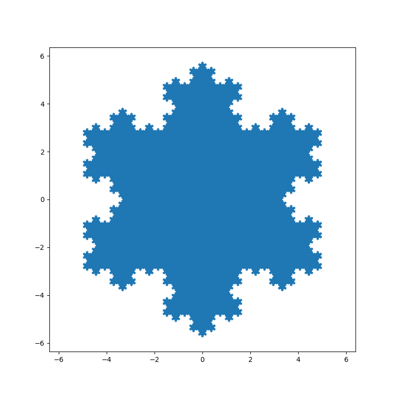
再用一个例子来说明plt.fill能用于绘制多边形:
import numpy as np
import matplotlib.pyplot as plt


def koch_snowflake(order, scale=10):
    """
    Return two lists x, y of point coordinates of the Koch snowflake.

    Arguments
    ---------
    order : int
        The recursion depth.
    scale : float
        The extent of the snowflake (edge length of the base triangle).
    """
    def _koch_snowflake_complex(order):
        if order == 0:
            # initial triangle
            angles = np.array([0, 120, 240]) + 90
            return scale / np.sqrt(3) * np.exp(np.deg2rad(angles) * 1j)
        else:
            ZR = 0.5 - 0.5j * np.sqrt(3) / 3

            p1 = _koch_snowflake_complex(order - 1)  # start points
            p2 = np.roll(p1, shift=-1)  # end points
            dp = p2 - p1  # connection vectors

            new_points = np.empty(len(p1) * 4, dtype=np.complex128)
            new_points[::4] = p1
            new_points[1::4] = p1 + dp / 3
            new_points[2::4] = p1 + dp * ZR
            new_points[3::4] = p1 + dp / 3 * 2
            return new_points

    points = _koch_snowflake_complex(order)
    x, y = points.real, points.imag # 返回实部和虚部
    return x, y

x, y = koch_snowflake(order=5)

plt.figure(figsize=(8, 8))
plt.axis('equal') # 把单位长度都变的一样。这样做的好处就是对于圆来说更像圆
plt.fill(x, y)
plt.show()
3.2.3 绘制Wedge-契形
matplotlib.patches.Polygon类是多边形类。其基类是matplotlib.patches.Patch。
在使用中,我们直接通过matplotlib.pyplot.pie()来绘制契形:
matplotlib.pyplot.pie(x, explode=None, labels=None, colors=None, autopct=None, pctdistance=0.6, shadow=False, labeldistance=1.1, startangle=0, radius=1, counterclock=True, wedgeprops=None, textprops=None, center=0, 0, frame=False, rotatelabels=False, *, normalize=None, data=None)
常用参数:
- x:契型的形状,一维数组。
- explode:如果不是等于None,则是一个len(x)数组,它指定用于偏移每个楔形块的半径的分数。
- labels:用于指定每个契型块的标记,取值是列表或为None。
- colors:饼图循环使用的颜色序列。如果取值为>- None,将使用当前活动循环中的颜色。
- startangle:饼状图开始的绘制的角度。
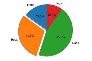
- 使用plt.pie()绘制饼状图
import matplotlib.pyplot as plt
labels = 'Frogs', 'Hogs', 'Dogs', 'Logs'
x = [15, 30, 45, 10]
explode = (0, 0.1, 0, 0)
plt.pie(x, explode=explode, labels=labels, autopct='%1.1f%%', shadow=True, startangle=90)
plt.axis('equal') # Equal aspect ratio ensures that pie is drawn as a circle.
plt.show()
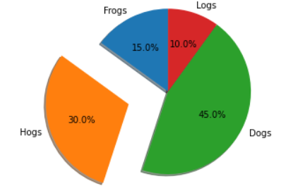
figure→axes→axis结构绘制饼状图
import matplotlib.pyplot as plt
labels = 'Frogs', 'Hogs', 'Dogs', 'Logs'
x = [15, 30, 45, 10]
explode = (0, 0.5, 0, 0)
fig1, ax1 = plt.subplots()
ax1.pie(x, explode=explode, labels=labels, autopct='%1.1f%%', shadow=True, startangle=90)
ax1.axis('equal') # Equal aspect ratio ensures that pie is drawn as a circle.
plt.show()
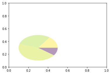
- wedge绘制饼图
import matplotlib.pyplot as plt
from matplotlib.patches import Circle, Wedge
from matplotlib.collections import PatchCollection

fig = plt.figure()
ax1 = fig.add_subplot(111)
theta1 = 0
sizes = [15, 30, 45, 10]
patches = []
patches += [
    Wedge((0.3, 0.3), .2, 0, 54),             # Full circle
    Wedge((0.3, 0.3), .2, 54, 162),  # Full ring
    Wedge((0.3, 0.3), .2, 162, 324),              # Full sector
    Wedge((0.3, 0.3), .2, 324, 360),  # Ring sector
]
colors = 100 * np.random.rand(len(patches))
p = PatchCollection(patches, alpha=0.4)
p.set_array(colors)
ax1.add_collection(p)
plt.show()
3.3 collections-绘制一组对象的集合
collections类是用来绘制一组对象的集合,collections有许多不同的子类,如RegularPolyCollection, CircleCollection, Pathcollection, 分别对应不同的集合子类型。其中比较常用的就是散点图,它是属于PathCollection子类,scatter方法提供了该类的封装,根据x与y绘制不同大小或颜色标记的散点图。
3.3.1 scatter绘制散点图
最主要的参数:
- x:数据点x轴的位置
- y:数据点y轴的位置
- s:尺寸大小
- c:可以是单个颜色格式的字符串,也可以是一系列颜色
- marker: 标记的类型
其中marker是点的样式,如圆形、矩形,甚至是字母之类的,详情请看官网🔗matplotlib.markers
- 使用Axes.scatter()绘制
import matplotlib.pyplot as plt
import numpy as np

# Fixing random state for reproducibility
np.random.seed(19680801)

# unit area ellipse
rx, ry = 3., 1.
area = rx * ry * np.pi
theta = np.arange(0, 2 * np.pi + 0.01, 0.1)
verts = np.column_stack([rx / area * np.cos(theta), ry / area * np.sin(theta)])

x, y, s, c = np.random.rand(4, 30)
s *= 10**2.

fig, ax = plt.subplots()
ax.scatter(x, y, s, c, marker=verts)

plt.show()
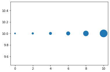
- 使用plt.scatter()绘制
x = [0,2,4,6,8,10]
y = [10]*len(x)
s = [20*2**n for n in range(len(x))]
plt.scatter(x,y,s=s)
plt.show()
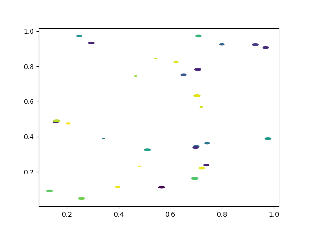
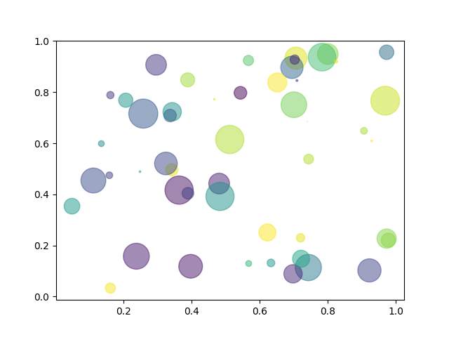
import numpy as np
import matplotlib.pyplot as plt

# Fixing random state for reproducibility
np.random.seed(19680801)


N = 50
x = np.random.rand(N)
y = np.random.rand(N)
colors = np.random.rand(N)
area = (30 * np.random.rand(N))**2  # 0 to 15 point radii

plt.scatter(x, y, s=area, c=colors, alpha=0.5)
plt.show()
3.4 images
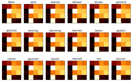
images是matplotlib中绘制image图像的类,其中最常用的imshow可以根据数组绘制成图像。
matplotlib.pyplot.imshow(X, cmap=None, norm=None, aspect=None, interpolation=None, alpha=None, vmin=None, vmax=None, origin=None, extent=None, shape=, filternorm=1, filterrad=4.0, imlim=, resample=None, url=None, *, data=None, **kwargs)
使用imshow画图时首先需要传入一个数组,数组对应的是空间内的像素位置和像素点的值,其中参数interpolation参数可以设置不同的差值方法,具体效果如下:
import matplotlib.pyplot as plt
import numpy as np
methods = [None, 'none', 'nearest', 'bilinear', 'bicubic', 'spline16',
           'spline36', 'hanning', 'hamming', 'hermite', 'kaiser', 'quadric',
           'catrom', 'gaussian', 'bessel', 'mitchell', 'sinc', 'lanczos']


grid = np.random.rand(4, 4) # 4×4大小的图片

fig, axs = plt.subplots(nrows=3, ncols=6, figsize=(9, 6),
                        subplot_kw={'xticks': [], 'yticks': []})

for ax, interp_method in zip(axs.flat, methods):
    ax.imshow(grid, interpolation=interp_method, cmap='afmhot')
    ax.set_title(str(interp_method))

plt.tight_layout()
plt.show()
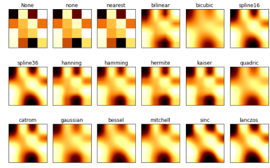
interpolation='antialiased'时,有抗锯齿效果:
import matplotlib.pyplot as plt
import numpy as np
methods = [None, 'none', 'nearest', 'bilinear', 'bicubic', 'spline16',
           'spline36', 'hanning', 'hamming', 'hermite', 'kaiser', 'quadric',
           'catrom', 'gaussian', 'bessel', 'mitchell', 'sinc', 'lanczos']

grid = np.random.rand(4, 4)

fig, axs = plt.subplots(nrows=3, ncols=6, figsize=(9, 6),
                        subplot_kw={'xticks': [], 'yticks': []})

for ax, interp_method in zip(axs.flat, methods):
    """
    interpolation = 'none' works well when a big image is scaled down,
    while interpolation = 'nearest' works well when a small image is scaled up.
    default: 'antialiased'
    """
    ax.imshow(grid, interpolation='antialiased', cmap='afmhot') # cmap: colormap,图像的颜色样式
    ax.set_title(str(interp_method))

plt.tight_layout() # 输出的图像看起来更舒服
plt.show()
参数cmap代表着不同的颜色,举些例子:

将上文的代码的cmap='afmhot'修改为cmap='plasma',图像颜色改变:

4 对象容器 - Object container
容器会包含一些primitives,并且容器还有它自身的属性。
4.1 Figure容器
注意Figure默认的坐标系是以像素为单位,你可能需要转换成figure坐标系:(0,0)表示左下点,(1,1)表示右上点。
Figure容器的常见属性:
- Figure.patch属性:Figure的背景矩形
- Figure.axes属性:一个Axes实例的列表(包括Subplot)
- Figure.images属性:一个FigureImages patch列表
- Figure.lines属性:一个Line2D实例的列表(很少使用)
- Figure.legends属性:一个Figure Legend实例列表(不同于Axes.legends)
- Figure.texts属性:一个Figure Text实例列表
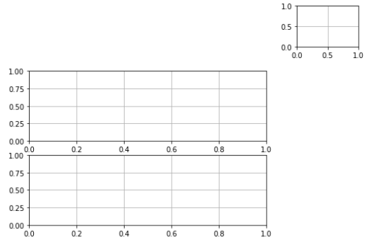
当我们向图表添加Figure.add_subplot()或者Figure.add_axes()元素时,这些都会被添加到Figure.axes列表中。
import matplotlib.pyplot as plt
fig = plt.figure()
ax1 = fig.add_subplot(211) # 作一幅2*1的图,选择第1个子图
ax2 = fig.add_axes([0.1, 0.1, 0.5, 0.3]) # 位置参数,四个数分别代表了(left,bottom,width,height)
#print(ax1) #包含了subplot和axes两个实例, 刚刚添加的
print(fig.axes) # fig.axes 中包含了subplot和axes两个实例, 刚刚添加的
import matplotlib.pyplot as plt
fig = plt.figure()
ax1 = fig.add_subplot(211) # 作一幅2*1的图,选择第1个子图
ax2 = fig.add_axes([0.1, 0.1, 0.5, 0.3]) # 位置参数,四个数分别代表了(left,bottom,width,height)
print(ax1) #包含了subplot和axes两个实例, 刚刚添加的
#print(fig.axes) # fig.axes 中包含了subplot和axes两个实例, 刚刚添加的
既然Figure.axes里面存有subplot和axes,那我们遍历看看:
import matplotlib.pyplot as plt
fig = plt.figure()
ax1 = fig.add_subplot(211) # Add an Axes to the figure as part of a subplot arrangement.
ax2 = fig.add_axes([1,1,0.2,0.2])
ax3 = fig.add_subplot(212)

for ax in fig.axes:
    ax.grid(True)
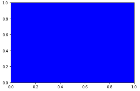
4.2 Axes容器
matplotlib.axes.Axes是matplotlib的核心。大量的用于绘图的Artist存放在它内部,并且它有许多辅助方法来创建和添加Artist给它自己。
Axes有许多方法用于绘图,如.plot()、.text()、.hist()、.imshow()等方法用于创建大多数常见的primitive(如Line2D,Rectangle,Text,Image等等)
和Figure容器类似,Axes包含了一个patch属性:
import numpy as np
import matplotlib.pyplot as plt
import matplotlib

fig = plt.figure()
ax = fig.add_subplot(111) ## Add an Axes to the figure as part of a subplot
rect = ax.patch  # axes的patch是一个Rectangle实例
rect.set_facecolor('blue')
不应该直接通过Axes.lines和Axes.patches列表来添加图表,还记得吗?Axes是从Artist来的,所以可以用add_*,使用Axes的辅助方法.add_line()和.add_patch()方法来直接添加。
4.2.1 Subplot和Axes的区别
Subplot就是一个特殊的Axes,其实例是位于网格中某个区域的Subplot实例,Figure.add_subplot(),通过Figure.add_axes([left,bottom,width,height])可以创建一个任意区域的Axes。
4.3 Axis容器
每个Axis都有一个label属性,也有主刻度列表和次刻度列表。这些ticks是axis.XTick和axis.YTick实例,它们包含着line primitive以及text primitive用来渲染刻度线以及刻度文本。
刻度是动态创建的,只有在需要创建的时候才创建(比如缩放的时候)。Axis也提供了一些辅助方法来获取刻度文本、刻度线位置等等:
常见的如下:
# 不用print,直接显示结果
from IPython.core.interactiveshell import InteractiveShell
InteractiveShell.ast_node_interactivity = "all"

fig, ax = plt.subplots()
x = range(0,5)
y = [2,5,7,8,10]
plt.plot(x, y, '-')

axis = ax.xaxis # axis为X轴对象
axis.get_ticklocs()     # 获取刻度线位置
axis.get_ticklabels()   # 获取刻度label列表(一个Text实例的列表)。 可以通过minor=True|False关键字参数控制输出minor还是major的tick label。
axis.get_ticklines()    # 获取刻度线列表(一个Line2D实例的列表)。 可以通过minor=True|False关键字参数控制输出minor还是major的tick line。
axis.get_data_interval()# 获取轴刻度间隔
axis.get_view_interval()# 获取轴视角(位置)的间隔
下面的例子展示了如何调整一些轴和刻度的属性(忽略美观度,仅作调整参考):
fig = plt.figure() # 创建一个新图表
rect = fig.patch   # 矩形实例并将其设为黄色
rect.set_facecolor('lightgoldenrodyellow')

ax1 = fig.add_axes([0.1, 0.3, 0.4, 0.4]) # 创一个axes对象,从(0.1,0.3)的位置开始,宽和高都为0.4,
rect = ax1.patch   # ax1的矩形设为灰色
rect.set_facecolor('lightslategray')


for label in ax1.xaxis.get_ticklabels():
    # 调用x轴刻度标签实例,是一个text实例
    label.set_color('red') # 颜色
    label.set_rotation(45) # 旋转角度
    label.set_fontsize(16) # 字体大小

for line in ax1.yaxis.get_ticklines():
    # 调用y轴刻度线条实例, 是一个Line2D实例
    line.set_color('green')    # 颜色
    line.set_markersize(25)    # marker大小
    line.set_markeredgewidth(2)# marker粗细

plt.show()

4.4 Tick容器
matplotlib.axis.Tick是从Figure到Axes到Axis到Tick中最末端的容器对象。
y轴分为左右两个,因此tick1对应左侧的轴;tick2对应右侧的轴。
x轴分为上下两个,因此tick1对应下侧的轴;tick2对应上侧的轴。
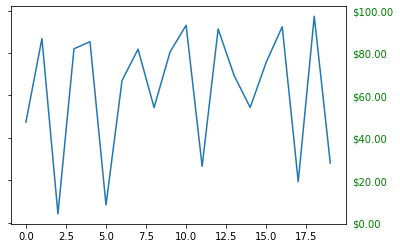
下面的例子展示了,如何将Y轴右边轴设为主轴,并将标签设置为美元符号且为绿色:
import numpy as np
import matplotlib.pyplot as plt
import matplotlib

fig, ax = plt.subplots()
ax.plot(100*np.random.rand(20))

# 设置ticker的显示格式
formatter = matplotlib.ticker.FormatStrFormatter('$%3.2f') # 3.3f:整数部分随便填(?不太清楚),小数保留2位
ax.yaxis.set_major_formatter(formatter)

# 设置ticker的参数,右侧为主轴,颜色为绿色
# which=['major','minor','both']
ax.yaxis.set_tick_params(which='major',
						labelcolor='green',
						labelleft=False,
						labelright=True)

plt.show()
作业
思考题
- primitives 和 container的区别和联系是什么?
primitives是各种基本元素,而container是装基本元素的容器。相同点在于它们都是Artist的子类,都可以通过add_*和set_*来添加和设置属性。 - 四个容器的联系和区别是么?他们分别控制一张图表的哪些要素?
figure axes axis tick是”由大到小“的,就跟画画一样,figure是画布,axes是画笔,axis就是画的正方形轮廓,tick就是上面的刻度。如图所示:

绘图题
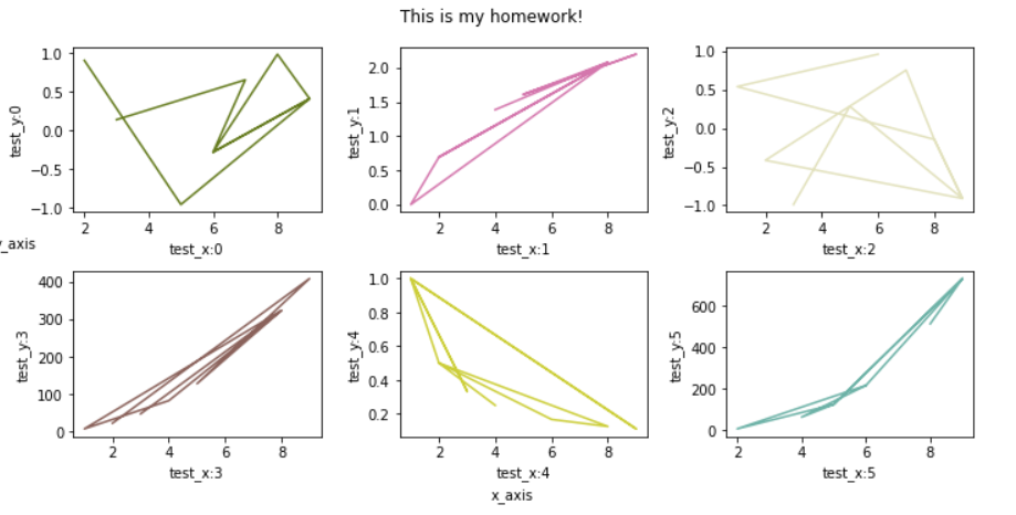
- 教程中展示的案例都是单一图,请自行创建数据,画出包含6个子图的线图,要求:
子图排布是 2 * 3 (2行 3列);
线图可用教程中line2D方法绘制;
需要设置每个子图的横坐标和纵坐标刻度;
并设置整个图的标题,横坐标名称,以及纵坐标名称
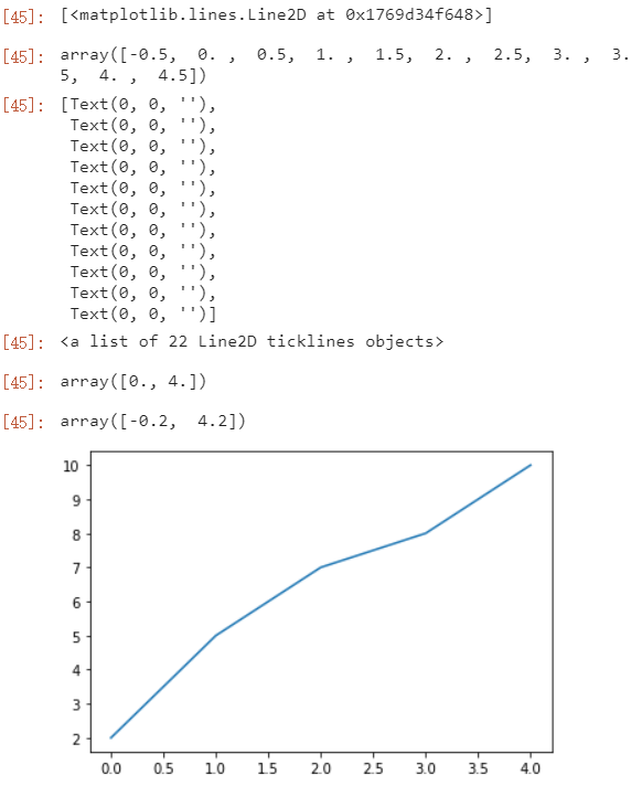
import matplotlib.pyplot as plot
from matplotlib.lines import Line2D
import matplotlib.ticker as ticker
import numpy as np

fig,axs = plt.subplots(2,3,figsize=(10,5))

def f(x,i):
    function = [np.sin(x),np.log(x),np.cos(x),5*x**2+3,1/x,x**3]
    return function[i]


for i in range(6):
    print(i)
    row_index = i // 3
    col_index = i % 3
    x = np.random.randint(1,10,10)
    y = f(x,i)
    color = np.random.rand(3) # R G B 图片

    #line = Line2D(x,y)
    #line.set_color(color)
    axs[row_index,col_index].plot(x,y,color=color)
    #axs[row_index,col_index].add_line(line)
    axs[row_index,col_index].set_ylabel("test_y:"+str(i))
    axs[row_index,col_index].set_xlabel("test_x:"+str(i))

    axs[row_index,col_index].xaxis.set_major_locator(ticker.AutoLocator())
    axs[row_index,col_index].yaxis.set_major_locator(ticker.AutoLocator())

fig.suptitle("This is my homework!")
fig.text(0,0.5,'y_axis',horizontalalignment='left')
fig.text(0.5,0,'x_axis',verticalalignment='center')
plt.tight_layout()
- 分别用一组长方形柱和填充面积的方式模仿画出下图,函数 y = -1 * (x - 2) * (x - 8) +10 在区间[2,9]的积分面积
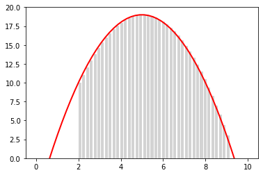
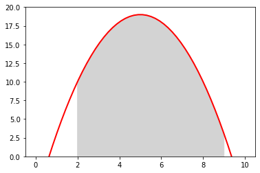
import matplotlib.pyplot as plt
import numpy as np

def f(x):
    y = -1 * (x - 2) * (x - 8) +10
    return y

fig, axs = plt.subplots(2,1,figsize=(6,8))


for i in np.arange(2,9,0.2):
    rect =  plt.Rectangle((i,0),0.1,f(i),color='lightgray')
    axs[0].add_patch(rect)

x = np.arange(0,11,0.1)
y = f(x)

axs[0].plot(x,y,'r')
axs[0].set_ylim(0,20)

axs[1].plot(x,y,'r')
axs[1].fill_between(x,y,where=(x>=2)&(x<=9),facecolor='lightgray')
axs[1].set_ylim(0,20)


 1162
1162

 被折叠的 条评论
为什么被折叠?
被折叠的 条评论
为什么被折叠?
 到【灌水乐园】发言


