


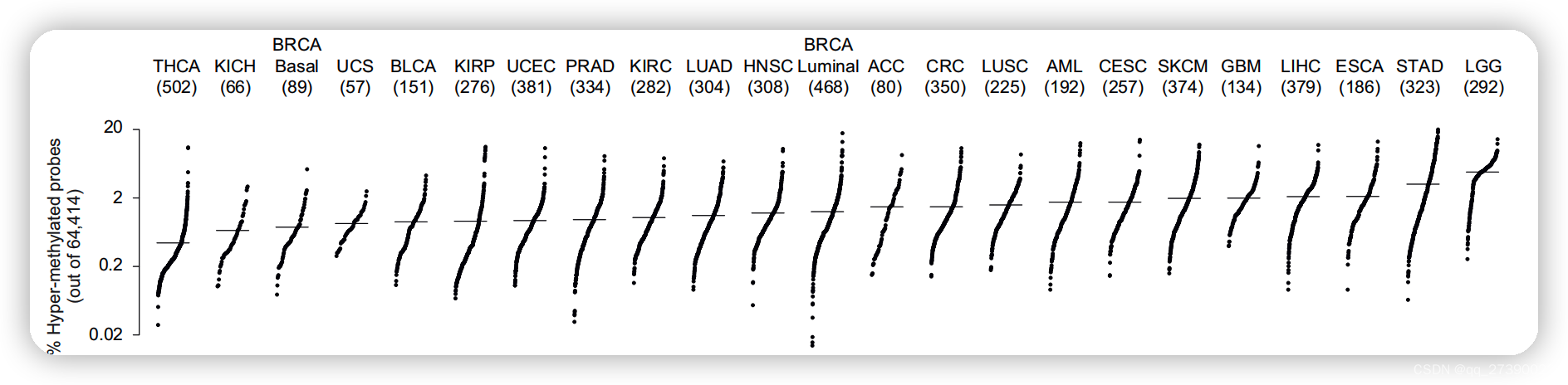
展示不同数据集中各样品的突变频率,免疫分数等,数据按大小顺序排列。
最终结果如图
1. 构造数据
scores1 <- rnorm(1000,0,10)
scores1 <- sort(scores1)
x1 <- runif(length(scores1),1,1.5)
x1 <- sort(x1)

scores2 <- rnorm(1000,10,20)
scores2 <- sort(scores2)
x2 <- runif(length(scores2),2,2.5)
x2 <- sort(x2)
2. plot函数作图
# plot(x1,scores1)
# plot(x1,scores1)
# plot(x1,scores1,xaxt ="n",bty="n")

plot(c(x1,x2),c(scores1,scores2),xaxt ="n",bty="n",ylab="scores") # 不要x轴,不要边框
# abline(a=mean(scores1), b= 0 ,lwd=4,col="blue")
# abline(a=mean(scores2), b= 0 ,lwd=4,col="red")

abline(segments(x0=1, y0=mean(scores1), x1=1.5, y1=mean(scores1),lwd=4,col="black"))
abline(segments(x0=2, y0=mean(scores2), x1=2.5, y1=mean(scores2),lwd=4,col="black"))
text(1.2, 50,"scores1")
text(2.2, 50,"scores2")
3. ggplot函数作图
### ggplot实现
library(ggplot2)
data_df <- data.frame(x1=x1,scores1=scores1,x2=x2,scores2=scores2)
ggplot(data_df,aes())  + #定义x,y轴顺序,防止被默认改变
  geom_point(aes(x=x1,y=scores1)) +
  geom_segment(aes(x =min(x1), y = mean(scores1),
                   xend = max(x1), yend = mean(scores1)),lwd=1) +

  annotate("text", label = "scores1",
            x = 1.1, y = 50, size = 6, colour = "black") +
  geom_point(aes(x=x2,y=scores2)) +
  geom_segment(aes(x =min(x2), y = mean(scores2),
                   xend = max(x2), yend = mean(scores2)),lwd=1) +
  #geom_text() +
  annotate( "text", label = "scores2",
           x = 2.1, y = 50, size = 6, colour = "black") +
  theme_classic()+
  labs(x="") + # no xlab
  theme(axis.ticks.x = element_blank(),
        axis.text.x = element_blank(),
        axis.line.x = element_blank())


 1271
1271


 被折叠的 条评论
为什么被折叠?
被折叠的 条评论
为什么被折叠?
 到【灌水乐园】发言


