


权衡参数
Introduced more than five years ago, Google’s Material Design guidelines have become the signature look of their websites and app-based services. They’re immediately recognizable as affiliated with Google, a boon for the company’s branding.
Google的Material Design指南于5年前推出,已成为其网站和基于应用程序的服务的标志性外观。 他们立即被认作是Google的会员,这是该公司品牌的福音。
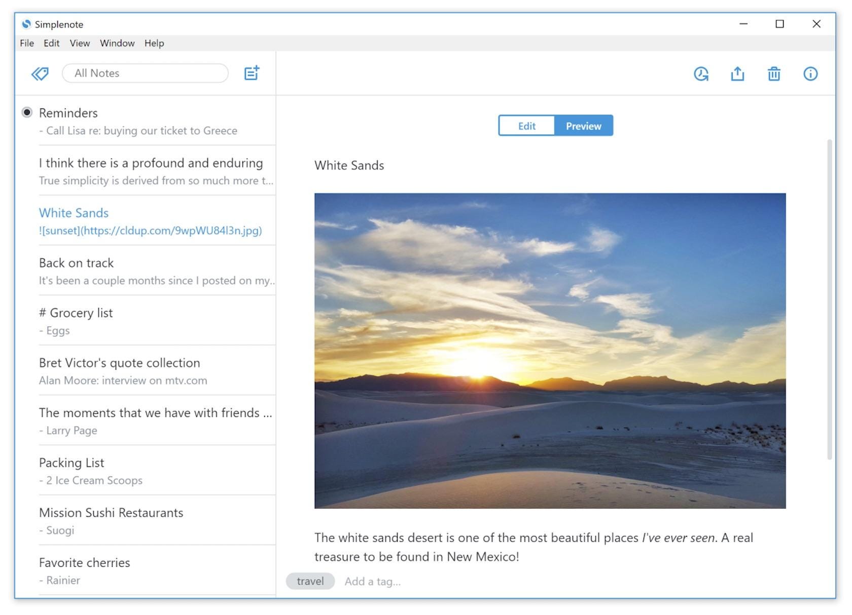
Material Design has also been adopted by the wider design community and can now be found on websites and apps far outside of Google’s native platforms (and even on competing platforms). Simplenote, for example, uses a Material Design aesthetic across its apps for desktop and mobile platforms. It’s just one example of why Material Design is an excellent choice for a variety of design implementations.
Material Design也已为更广泛的设计社区所采用,现在可以在Google本机平台之外的网站和应用程序上找到,甚至在竞争平台上也可以找到。 例如,Simplenote在其针对台式机和移动平台的应用程序中使用了Material Design美学。 这只是材料设计为什么是各种设计实现的绝佳选择的一个例子。
什么是材料设计? (What Is Material Design?)
Material Design was created by Google in 2014, based in part on the card-based layout utilized in Google Now. The nod to paper-based design styles differentiated it from the flat design style that was widely used at the time.
Material Design由Google于2014年创建,部分基于Google Now中基于卡片的布局。 对基于纸张的设计风格的认同使它与当时广泛使用的平面设计风格有所不同。
Like most design systems, Material Design was created to bring a unified user experience across various devices, platforms, and input methods. Similar to the way that Apple implemented flat design principles as their standard, Google used Material Design to ensure that, regardless of how users were accessing their products, they would have a consistent user experience.
像大多数设计系统一样,Material Design的创建是为了在各种设备,平台和输入方法上带来统一的用户体验。 与苹果公司将平面设计原则作为其标准的方式类似,谷歌使用Material Design来确保无论用户如何访问其产品,他们都将获得一致的用户体验。
The Material Design specification includes guidelines for everything: typography, grids, space, scale, color, and imagery. But Material Design goes a step further than just telling designers how to make things look. It enables designers to create intentional designs with hierarchy, meaning, and focus in their end result.
材料设计规范包括所有内容的指南:版式,网格,空间,比例,颜色和图像。 但是Material Design比告诉设计师如何使外观看起来更进了一步。 它使设计师能够创建具有层次结构,含义并专注于最终结果的有意设计。

为什么要使用材料设计? (Why Use Material Design?)
As with any well-established design system, there are some major pros to using Material Design that designers should consider.
与任何完善的设计系统一样,设计人员应考虑使用材料设计的一些主要优点。
Material Design is effectively an entire design ecosystem, rather than just a set of style guidelines. If there’s a potential design situation that exists, Material Design likely has a comprehensive set of rules for how to handle it. That includes complex use cases that are often overlooked by less comprehensive design systems. This can be very comforting for designers who want that kind of structure.
材料设计实际上是整个设计生态系统,而不仅仅是一组样式准则。 如果存在潜在的设计情况,则Material Design可能具有一组有关如何处理它的全面规则。 其中包括复杂的用例,而这些情况通常被不太全面的设计系统所忽略。 对于想要这种结构的设计师来说,这可能会非常令人安慰。
Google maintains Material Design and keeps extensive documentation for how to use and implement it. This kind of support and documentation can be lacking for many modern design systems.
Google维护Material Design并保留有关如何使用和实施它的大量文档。 许多现代设计系统可能缺少这种支持和文档。

Despite all this comprehensiveness and documentation, Material Design remains a fairly flexible design library. Within the guidelines, much of the specifics of how to implement the design are left entirely up to the designer.
尽管具有如此全面的内容和文档,但是Material Design仍然是一个相当灵活的设计库。 在指南中,如何实施设计的许多细节完全由设计者决定。
More granular advantages for Material Design include things like subtle skeuomorphism, which sets it apart from flat design and makes it more intuitive for many users. Another user-friendly feature is that user feedback in the form of haptic feedback, subtle animations, and similar things are built into the guidelines. It has a very simplified sense of physics, too, which makes interactions more intuitive.
Material Design的更多细化优点包括细微的拟态,这使它不同于平面设计,并使许多用户更直观。 另一个用户友好的功能是,以触觉反馈,细微动画和类似内容的形式提供了用户反馈。 它也具有非常简化的物理意义,这使得交互更加直观。
Material Design was built on a mobile-first sensibility, which makes sense considering its original purpose was for designing Android apps. It also promotes animation in designs, both for user feedback and to hint at how different features function.
Material Design建立在移动优先的敏感性之上,考虑到其最初的目的是设计Android应用,这是有道理的。 它还可以促进设计中的动画效果,以获取用户反馈并暗示不同功能的功能。
Finally, dark theme options have been made available, adding even more visual flexibility for designers. Originally, Material Design was very light and bright, which didn’t work well with the aesthetics of some brands. The addition of a dark theme guideline fixes that issue.
最终,提供了深色主题选项,为设计师提供了更大的视觉灵活性。 最初,Material Design非常轻便明亮,与某些品牌的美学风格并不一致。 添加深色主题指南可解决此问题。

使用材料设计的缺点 (Drawbacks of Using Material Design)
While Material Design has very obvious pros, that doesn’t mean there aren’t cons that go along with using it.
尽管Material Design具有非常明显的优点,但这并不意味着使用它没有缺点。
First up, Material Design is immediately identifiable and is strongly associated with Google and, specifically, Android. While this isn’t necessarily a bad thing for everyone, it’s potentially a negative for some.
首先,Material Design是可立即识别的,并且与Google(尤其是Android)紧密相关。 虽然这不一定对每个人都是坏事,但对某些人来说可能是负面的。
One big reason that it might be a negative is that it limits the effectiveness of other branding while using the design system. Yes, designers can incorporate logos, color palettes (within the Material Design guidelines), and other differentiating factors to support the brand identity, but a product following the Material Design specifications will almost always also be associated with Google.
可能是负面的一个重要原因是,它限制了使用设计系统时其他商标的有效性。 是的,设计师可以结合徽标,调色板(在Material Design准则内)和其他与众不同的因素来支持品牌标识,但遵循Material Design规范的产品几乎也总是与Google关联。
Since motion and animation are promoted within the Material Design guidelines, sites or apps that don’t incorporate it can seem to users as if they’re missing something. People associate the motion characteristics of Material Design with the visual characteristics, which can leave designs without motion lacking.
由于运动和动画是在“材料设计”准则中进行推广的,因此未合并运动和动画的网站或应用程序在用户看来就好像他们缺少了某些东西。 人们将“材料设计”的运动特征与视觉特征相关联,从而可以使设计缺少运动。
Sure, one solution is to always incorporate motion in designs that follow the Material Design specs. But extensive animations can be very resource-heavy on mobile devices, resulting in higher data usage and faster battery depletion. It’s a balancing act designers have to consider when working within the Material Design guidelines.
当然,一种解决方案是始终将运动纳入符合材料设计规范的设计中。 但是,大量的动画可能会在移动设备上占用大量资源,从而导致更高的数据使用率和更快的电池消耗。 在材料设计准则内工作时,设计人员必须考虑这是一种平衡行为。
Beginners may find that the Material Design specification is more complicated and harder to implement than other styles like flat design. Because the Material Design system is so comprehensive, there are a lot more things to consider and adhere to than many new designers may be comfortable with.
初学者可能会发现“材料设计”规范比诸如平面设计的其他样式更复杂且更难以实现。 由于“材料设计”系统是如此全面,因此要考虑和遵守的东西比许多新设计师可能会愿意接受的要多。

Its comprehensiveness can also lead to some designers feeling constrained and unable to fully realize their own creativity. It can also stifle innovation, since virtually any design challenge has been planned for and solutions offered. While being helpful in many cases, this can prevent designers from taking new approaches to problems, while also limiting the number of new ideas that may occur.
它的全面性还可能导致某些设计师感到束缚,无法完全实现自己的创造力。 由于实际上已经针对任何设计挑战进行了计划并提供了解决方案,因此它也可以扼杀创新。 尽管在许多情况下很有用,但这可以防止设计人员采用新方法解决问题,同时还限制了可能出现的新想法的数量。
There are also some usability issues in Material Design that can make websites and apps very user- unfriendly. One of the biggest issues is with the so-called “mystery meat” navigation encountered on many mobile design apps. Icons are often used in place of text, and while sometimes the icons are immediately recognizable and fairly usable, at other times they’re not.
还有在材料设计一些可用性问题,可以使网站和应用程序非常用户友好联合国 。 最大的问题之一是在许多移动设计应用程序中遇到的所谓“ 神秘肉 ”导航。 图标通常用于代替文本,并且有时图标可以立即识别并且相当有用,而在其他时候则不能。
A circle to indicate “Home” is significantly harder to identify than the house icon that was previously used in most Android interfaces. This is a prime example of placing form over function, which is a holdover from Material Design’s flat design roots.
与以前大多数Android界面中使用的房屋图标相比,标识“房屋”的圆圈要难得多。 这是将表单置于功能之上的主要示例,它是Material Design 平面设计根源的保留。
And it’s not just in the lower navigation bar. Material Design’s preference for including circular floating action buttons is also a usability issue. These circular buttons only include space for an icon, with no assistive text included. And because icons can be so open to interpretation, in many cases, users are left questioning what these buttons actually do.
它不仅在下部导航栏中。 Material Design对于包括圆形浮动按钮的偏好也是一个可用性问题。 这些圆形按钮仅包含图标空间,不包含辅助文本。 而且由于图标可以解释,因此在很多情况下,用户不得不质疑这些按钮的实际作用。

结论 (Conclusion)
If an app is being built primarily for the Android platform, then using Material Design is an easy choice. Because of Google’s widespread adoption, any app based on Material Design principles is going to feel like a native app.
如果主要为Android平台构建应用,那么使用Material Design是一个简单的选择。 由于Google的广泛采用,任何基于Material Design原理的应用程序都将感觉像是本机应用程序。
That said, there are plenty of other use cases outside of the Android platform where Material Design is a solid choice. As the design system matures even further, those situations are bound to increase. Designers should, at the very least, familiarize themselves with the guidelines so that they can determine for themselves when it’s appropriate to use Material Design, and when other systems might be better suited.
也就是说,除了Android平台之外,还有很多其他用例,其中Material Design是不错的选择。 随着设计系统的进一步成熟,这些情况必将增加。 设计人员至少应熟悉准则,以便他们可以自己确定何时适合使用Material Design,以及何时可能更适合使用其他系统。
Originally published at https://www.toptal.com
最初发布在 https://www.toptal.com
翻译自: https://medium.com/swlh/why-use-material-design-weighing-the-pros-and-cons-a00a9bf6c5ac
权衡参数


 扫一扫
扫一扫
 817
817

 被折叠的 条评论
为什么被折叠?
被折叠的 条评论
为什么被折叠?
 到【灌水乐园】发言


