


R语言数据可视化绘图教程已经不断的更新快30个教程,基本满足绘制 CNS 级别图形,只要深入研究肯定都会解决的,今天我们就说一下 SCI 文章中常见的误差图,总结归纳一下,包括线图,条形图都可以加入 errorbar,下面就来学习吧!
桓峰基因公众号推出基于R语言数据可视化绘图教程并配有视频在线教程,目前整理出来的教程目录如下:
FigDraw 1. SCI 文章的灵魂 之 简约优雅的图表配色
FigDraw 4. SCI 文章绘图之散点图 (Scatter)
FigDraw 5. SCI 文章绘图之柱状图 (Barplot)
FigDraw 6. SCI 文章绘图之箱线图 (Boxplot)
FigDraw 7. SCI 文章绘图之折线图 (Lineplot)
FigDraw 8. SCI 文章绘图之饼图 (Pieplot)
FigDraw 9. SCI 文章绘图之韦恩图 (Vennplot)
FigDraw 10. SCI 文章绘图之直方图 (HistogramPlot)
FigDraw 11. SCI 文章绘图之小提琴图 (ViolinPlot)
FigDraw 12. SCI 文章绘图之相关性矩阵图(Correlation Matrix)
FigDraw 13. SCI 文章绘图之桑葚图及文章复现(Sankey)
FigDraw 14. SCI 文章绘图之和弦图及文章复现(Chord Diagram)
FigDraw 15. SCI 文章绘图之多组学圈图(OmicCircos)
FigDraw 16. SCI 文章绘图之树形图(Dendrogram)
FigDraw 17. SCI 文章绘图之主成分绘图(pca3d)
FigDraw 18. SCI 文章绘图之矩形树状图 (treemap)
FigDraw 19. SCI 文章中绘图之坡度图(Slope Chart)
FigDraw 20. SCI文章中绘图之马赛克图 (mosaic)
FigDraw 21. SCI文章中绘图之三维散点图 (plot3D)
FigDraw 22. SCI文章中绘图之核密度及山峦图 (ggridges)
FigDraw 23. SCI文章中绘图二维散点图与统计图组合
FigDraw 26. SCI文章中绘图词云图 (wordcloud)
简 介
误差线 (误差线:通常用在统计或科学记数法数据中,误差线显示相对序列中的每个数据标记的潜在误差或不确定度。)表示图形上相对于数据系列 (数据系列:在图表中绘制的相关数据点,这些数据源自数据表的行或列。图表中的每个数据系列具有唯一的颜色或图案并且在图表的图例中表示。可以在图表中绘制一个或多个数据系列。饼图只有一个数据系列。)中每个数据点 (数据点:在图表中绘制的单个值,这些值由条形、柱形、折线、饼图或圆环图的扇面、圆点和其他被称为数据标记的图形表示。相同颜色的数据标记组成一个数据系列。)或数据标记 (数据标记:图表中的条形、面积、圆点、扇面或其他符号,代表源于数据表单元格的单个数据点或值。图表中的相关数据标记构成了数据系列。)的潜在误差量。

软件包安装
if(!require(Rmisc))
  install.packages('Rmisc')
if(!require(ggplot2))
  install.packages('ggplot2')
数据格式
数据格式可以是长数据类型,也可以是宽数据类型,可以根据实际绘图情况选择数据的格式。
tg <- ToothGrowth
head(tg)
##    len supp dose
## 1  4.2   VC  0.5
## 2 11.5   VC  0.5
## 3  7.3   VC  0.5
## 4  5.8   VC  0.5
## 5  6.4   VC  0.5
## 6 10.0   VC  0.5
实例操作
如果你处理的仅仅是组间变量,那么 summarySE() 是你代码中唯一需要使用的函数。如果你的数据里有组内变量,并且你想要矫正误差线使得组间的变异被移除,就像 Loftus and Masson (1994) 里的那样,那么 normDataWithin() 和 summarySEwithin() 这两个函数必须加入你的代码中,然后调用 summarySEwithin() 函数进行计算。
library(ggplot2)
library(Rmisc)
# summarySE 函数提供了标准差、标准误以及 95% 的置信区间
tgc <- summarySE(tg, measurevar = "len", groupvars = c("supp", "dose"))
tgc
##   supp dose  N   len       sd        se       ci
## 1   OJ  0.5 10 13.23 4.459709 1.4102837 3.190283
## 2   OJ  1.0 10 22.70 3.910953 1.2367520 2.797727
## 3   OJ  2.0 10 26.06 2.655058 0.8396031 1.899314
## 4   VC  0.5 10  7.98 2.746634 0.8685620 1.964824
## 5   VC  1.0 10 16.77 2.515309 0.7954104 1.799343
## 6   VC  2.0 10 26.14 4.797731 1.5171757 3.432090
1. 线图
均值的标准误
ggplot(tgc, aes(x = dose, y = len, colour = supp)) + geom_errorbar(aes(ymin = len -
    se, ymax = len + se), width = 0.1) + geom_line() + geom_point()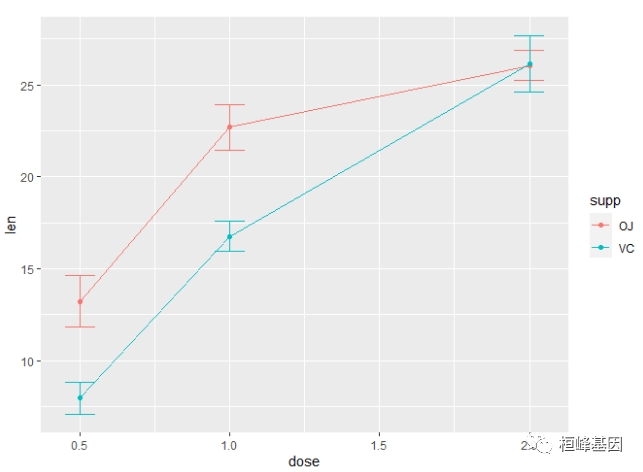
发现误差线重叠(dose=2.0),我们使用 position_dodge 将它们进行水平移动
pd <- position_dodge(0.1)  # move them .05 to the left and right
ggplot(tgc, aes(x = dose, y = len, colour = supp)) + geom_errorbar(aes(ymin = len -
    se, ymax = len + se), width = 0.1, position = pd) + geom_line(position = pd) +
    geom_point(position = pd)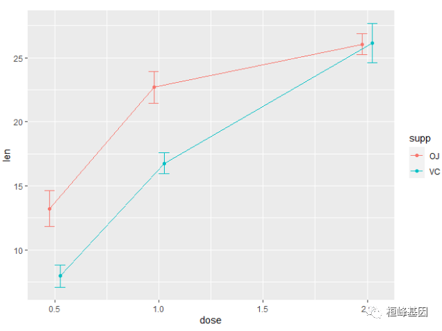
使用 95% 置信区间替换标准误
ggplot(tgc, aes(x = dose, y = len, colour = supp)) + geom_errorbar(aes(ymin = len -
    ci, ymax = len + ci), width = 0.1, position = pd) + geom_line(position = pd) +
    geom_point(position = pd)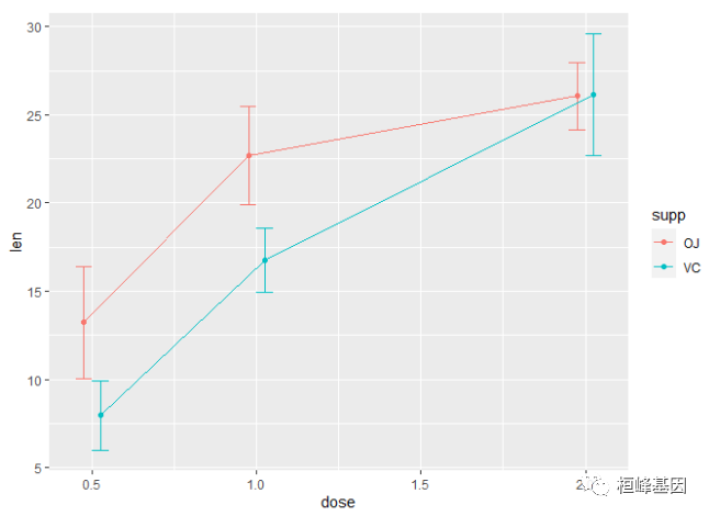
黑色的误差线 - 注意 'group=supp' 的映射 -- 没有它,误差线将不会避开(就是会重叠)。
ggplot(tgc, aes(x = dose, y = len, colour = supp, group = supp)) + geom_errorbar(aes(ymin = len -
    ci, ymax = len + ci), colour = "black", width = 0.1, position = pd) + geom_line(position = pd) +
    geom_point(position = pd, size = 3)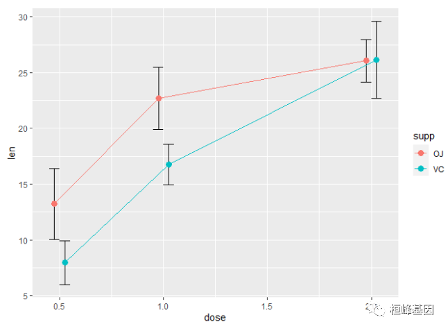
一张完成的带误差线(代表均值的标准误)的图形可能像下面显示的那样。最后画点,这样白色将会在线和误差线的上面(这个需要理解图层概念,顺序不同展示的效果是不一样的)
ggplot(tgc, aes(x=dose, y=len, colour=supp, group=supp)) +
  geom_errorbar(aes(ymin=len-se, ymax=len+se), colour="black", width=.1, position=pd) +
  geom_line(position=pd) +
  geom_point(position=pd, size=3, shape=21, fill="white") + # 21的填充的圆
  xlab("Dose (mg)") +
  ylab("Tooth length") +
  scale_colour_hue(name="Supplement type",    # 图例标签使用暗色
                   breaks=c("OJ", "VC"),
                   labels=c("Orange juice", "Ascorbic acid"),
                   l=40) +                    # 使用暗色,亮度为40
  ggtitle("The Effect of Vitamin C on\nTooth Growth in Guinea Pigs") +
  expand_limits(y=0) +                        # 扩展范围
  scale_y_continuous(breaks=0:20*4) +         # 每4个单位设置标记(y轴)
  theme_bw() +
  theme(legend.justification=c(1,0),
        legend.position=c(1,0))               # 右下方放置图例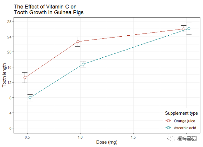
# Default line plot
p1 <- ggplot(tgc, aes(x = dose, y = len, group = supp, color = supp)) + geom_line() +
    geom_point() + geom_errorbar(aes(ymin = len - sd, ymax = len + sd), width = 0.2,
    position = position_dodge(0.05))

# Finished line plot
p2 <- p1 + labs(title = "Tooth length per dose", x = "Dose (mg)", y = "Length") +
    theme_classic() + scale_color_manual(values = c("#999999", "#E69F00"))

library(cowplot)
plot_grid(p1, p2)
条形图
条形图绘制误差线也非常相似。注意 tgc$dose 必须是一个因子。如果它是一个数值向量,将会不起作用。
将dose转换为因子变量
tgc2 <- tgc
tgc2$dose <- factor(tgc2$dose)
误差线代表了均值的标准误
ggplot(tgc2, aes(x=dose, y=len, fill=supp)) +
  geom_bar(position=position_dodge(), stat="identity") +
  geom_errorbar(aes(ymin=len-se, ymax=len+se),
                width=.2,                    # 误差线的宽度
                position=position_dodge(.9))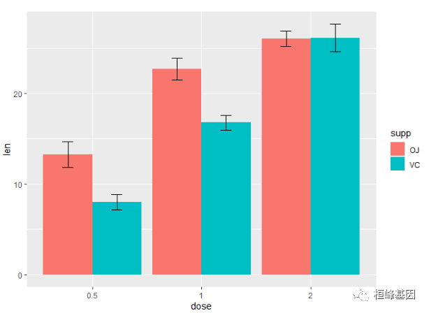
使用95%的置信区间替换标准误
ggplot(tgc2, aes(x=dose, y=len, fill=supp)) +
  geom_bar(position=position_dodge(), stat="identity") +
  geom_errorbar(aes(ymin=len-ci, ymax=len+ci),
                width=.2,                    # 误差线的宽度
                position=position_dodge(.9))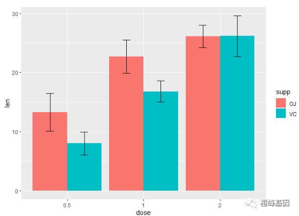
一张绘制完成的图片像下面这样
ggplot(tgc2, aes(x=dose, y=len, fill=supp)) +
  geom_bar(position=position_dodge(), stat="identity",
           colour="black", # 使用黑色边框,
           size=.3) +      # 将线变细
  geom_errorbar(aes(ymin=len-se, ymax=len+se),
                size=.3,    # 将线变细
                width=.2,
                position=position_dodge(.9)) +
  xlab("Dose (mg)") +
  ylab("Tooth length") +
  scale_fill_hue(name="Supplement type", # Legend label, use darker colors
                 breaks=c("OJ", "VC"),
                 labels=c("Orange juice", "Ascorbic acid")) +
  ggtitle("The Effect of Vitamin C on\nTooth Growth in Guinea Pigs") +
  scale_y_continuous(breaks=0:20*4) +
  theme_bw()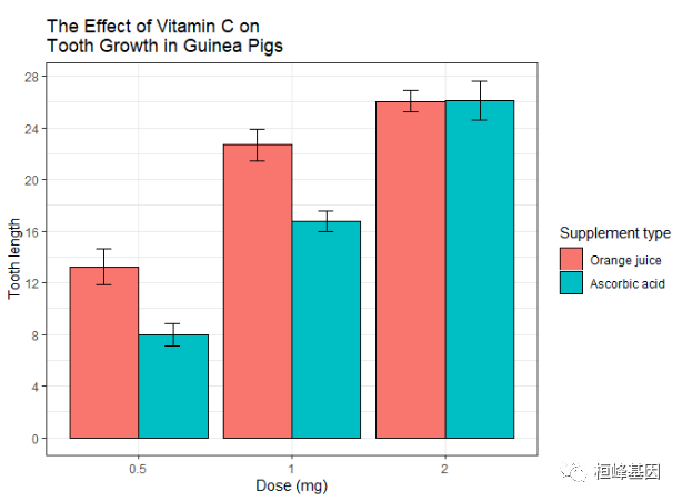
为组内变量添加误差线
当所有的变量都属于不同组别时,我们画标准误或者置信区间会显得非常简单直观。然而,当我们描绘的是组内变量(重复测量),那么添加标准误或者通常的置信区间可能会对不同条件下差异的推断产生误导作用。
下面的方法来自 Morey (2008),它是对 Cousineau (2005)的矫正,而它所做的就是 提供比 Loftus and Masson (1994)更简单的方法。你可以查看这些文章,以获得更多对组内变量误差线问题的详细探讨和方案。
这里有一个组内变量的数据集 (来自 Morey 2008),包含 pre/post-test。
dfw <- read.table(header = TRUE, text = "
 subject pretest posttest
     1    59.4     64.5
     2    46.4     52.4
     3    46.0     49.7
     4    49.0     48.7
     5    32.5     37.4
     6    45.2     49.5
     7    60.3     59.9
     8    54.3     54.1
     9    45.4     49.6
    10    38.9     48.5
 ")
将物体的 ID 作为因子变量对待
dfw$subject <- factor(dfw$subject)第一步是将该数据集转换为长格式:
library(reshape2)
dfw_long <- melt(dfw, id.vars = "subject", measure.vars = c("pretest", "posttest"),
    variable.name = "condition")
dfw_long
##    subject condition value
## 1        1   pretest  59.4
## 2        2   pretest  46.4
## 3        3   pretest  46.0
## 4        4   pretest  49.0
## 5        5   pretest  32.5
## 6        6   pretest  45.2
## 7        7   pretest  60.3
## 8        8   pretest  54.3
## 9        9   pretest  45.4
## 10      10   pretest  38.9
## 11       1  posttest  64.5
## 12       2  posttest  52.4
## 13       3  posttest  49.7
## 14       4  posttest  48.7
## 15       5  posttest  37.4
## 16       6  posttest  49.5
## 17       7  posttest  59.9
## 18       8  posttest  54.1
## 19       9  posttest  49.6
## 20      10  posttest  48.5
使用 summarySEwithin() 函数拆解数据:
dfwc <- summarySEwithin(dfw_long, measurevar = "value", withinvars = "condition",
    idvar = "subject", na.rm = FALSE, conf.interval = 0.95)
dfwc
##   condition  N value       sd        se       ci
## 1   pretest 10 47.74 2.262361 0.7154214 1.618396
## 2  posttest 10 51.43 2.262361 0.7154214 1.618396
创建带 95% 置信区间的图形,value 和 value_norm 列代表了未标准化和标准化后的值。
ggplot(dfwc, aes(x = condition, y = value, group = 1)) + geom_line() + geom_errorbar(width = 0.1,
    aes(ymin = value - ci, ymax = value + ci)) + geom_point(shape = 21, size = 3,
    fill = "white") + ylim(40, 60)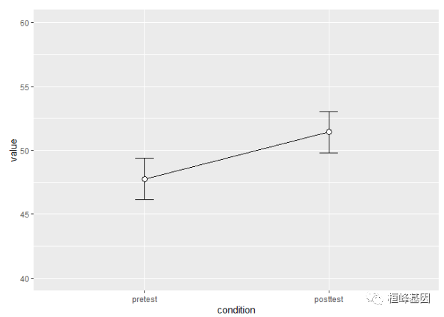
理解组内变量的误差线
使用一致的 y 轴范围
ymax <- max(dfw_long$value)
ymin <- min(dfw_long$value)
绘制个体数据
ggplot(dfw_long, aes(x = condition, y = value, colour = subject, group = subject)) +
    geom_line() + geom_point(shape = 21, fill = "white") + ylim(ymin, ymax)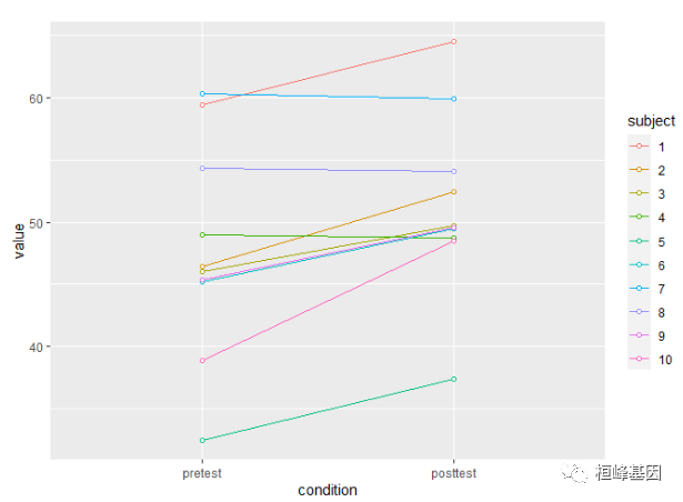
创造标准化的版本
dfwNorm.long <- normDataWithin(data = dfw_long, idvar = "subject", measurevar = "value")
dfwNorm.long
##    subject condition value valueNormed
## 1        1   pretest  59.4      47.035
## 2        1  posttest  64.5      52.135
## 3       10   pretest  38.9      44.785
## 4       10  posttest  48.5      54.385
## 5        2   pretest  46.4      46.585
## 6        2  posttest  52.4      52.585
## 7        3  posttest  49.7      51.435
## 8        3   pretest  46.0      47.735
## 9        4  posttest  48.7      49.435
## 10       4   pretest  49.0      49.735
## 11       5   pretest  32.5      47.135
## 12       5  posttest  37.4      52.035
## 13       6   pretest  45.2      47.435
## 14       6  posttest  49.5      51.735
## 15       7  posttest  59.9      49.385
## 16       7   pretest  60.3      49.785
## 17       8  posttest  54.1      49.485
## 18       8   pretest  54.3      49.685
## 19       9   pretest  45.4      47.485
## 20       9  posttest  49.6      51.685
绘制标准化的个体数据
ggplot(dfwNorm.long, aes(x = condition, y = valueNormed, colour = subject, group = subject)) +
    geom_line() + geom_point(shape = 21, fill = "white") + ylim(ymin, ymax)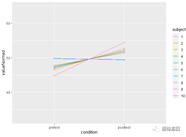
针对正常(组间)方法和组内方法的误差线差异在下面呈现。正常的方法计算出的误差线用红色表示,组内方法的误差线用黑色表示。
dfwc_between <- summarySE(data = dfw_long, measurevar = "value", groupvars = "condition",
    na.rm = FALSE, conf.interval = 0.95)
dfwc_between
##   condition  N value       sd       se       ci
## 1   pretest 10 47.74 8.598992 2.719240 6.151348
## 2  posttest 10 51.43 7.253972 2.293907 5.189179

ggplot(dfwc_between, aes(x = condition, y = value, group = 1)) + geom_line() + geom_errorbar(width = 0.1,
    aes(ymin = value - ci, ymax = value + ci), colour = "red") + geom_errorbar(width = 0.1,
    aes(ymin = value - ci, ymax = value + ci), data = dfwc) + geom_point(shape = 21,
    size = 3, fill = "white") + ylim(ymin, ymax)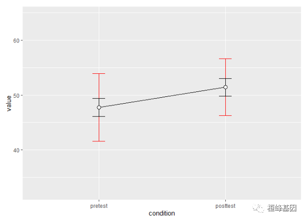
两个组内变量
如果存在超过一个的组内变量,我们可以使用相同的函数 summarySEwithin。下面的数据集来自 Hays (1994),在 Rouder and Morey (2005) 中用来绘制这类的组内误差线。
data <- read.table(header = TRUE, text = "
 Subject RoundMono SquareMono RoundColor SquareColor
     1        41         40         41          37
     2        57         56         56          53
     3        52         53         53          50
     4        49         47         47          47
     5        47         48         48          47
     6        37         34         35          36
     7        47         50         47          46
     8        41         40         38          40
     9        48         47         49          45
    10        37         35         36          35
    11        32         31         31          33
    12        47         42         42          42")
转换为长格式
library(reshape2)
data_long <- melt(data = data, id.var = "Subject", measure.vars = c("RoundMono",
    "SquareMono", "RoundColor", "SquareColor"), variable.name = "Condition")
names(data_long)[names(data_long) == "value"] <- "Time"
拆分 Condition 列为 Shape 和 ColorScheme
data_long$Shape <- NA
data_long$Shape[grepl("^Round", data_long$Condition)] <- "Round"
data_long$Shape[grepl("^Square", data_long$Condition)] <- "Square"
data_long$Shape <- factor(data_long$Shape)
data_long$ColorScheme <- NA
data_long$ColorScheme[grepl("Mono$", data_long$Condition)] <- "Monochromatic"
data_long$ColorScheme[grepl("Color$", data_long$Condition)] <- "Colored"
data_long$ColorScheme <- factor(data_long$ColorScheme, levels = c("Monochromatic",
    "Colored"))
删除 Condition 列
data_long$Condition <- NULL检查数据
head(data_long)
##   Subject Time Shape   ColorScheme
## 1       1   41 Round Monochromatic
## 2       2   57 Round Monochromatic
## 3       3   52 Round Monochromatic
## 4       4   49 Round Monochromatic
## 5       5   47 Round Monochromatic
## 6       6   37 Round Monochromatic
datac <- summarySEwithin(data_long, measurevar = "Time", withinvars = c("Shape",
    "ColorScheme"), idvar = "Subject")
datac
##    Shape   ColorScheme  N     Time       sd        se        ci
## 1  Round Monochromatic 12 44.58333 1.331438 0.3843531 0.8459554
## 2  Round       Colored 12 43.58333 1.212311 0.3499639 0.7702654
## 3 Square Monochromatic 12 43.58333 1.261312 0.3641095 0.8013997
## 4 Square       Colored 12 42.58333 1.461630 0.4219364 0.9286757

ggplot(datac, aes(x = Shape, y = Time, fill = ColorScheme)) + geom_bar(position = position_dodge(0.9),
    colour = "black", stat = "identity") + geom_errorbar(position = position_dodge(0.9),
    width = 0.25, aes(ymin = Time - ci, ymax = Time + ci)) + coord_cartesian(ylim = c(40,
    46)) + scale_fill_manual(values = c("#CCCCCC", "#FFFFFF")) + scale_y_continuous(breaks = seq(1:100)) +
    theme_bw() + geom_hline(yintercept = 38)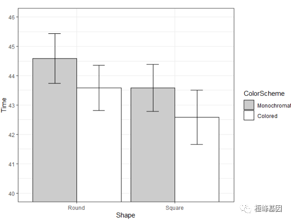
dat <- read.table(header = TRUE, text = "
id trial gender dv
 A     0   male  2
 A     1   male  4
 B     0   male  6
 B     1   male  8
 C     0 female 22
 C     1 female 24
 D     0 female 26
 D     1 female 28
")
标准化和未标准化的均值是不同的
summarySEwithin(dat, measurevar = "dv", withinvars = "trial", betweenvars = "gender",
    idvar = "id")
##   gender trial N dv sd se ci
## 1 female     0 2 14  0  0  0
## 2 female     1 2 16  0  0  0
## 3   male     0 2 14  0  0  0
## 4   male     1 2 16  0  0  0
桓峰基因,铸造成功的您!
未来桓峰基因公众号将不间断的推出转录组系列生信分析教程,
敬请期待!!
有想进生信交流群的老师可以扫最后一个二维码加微信,备注“单位+姓名+目的”,有些想发广告的就免打扰吧,还得费力气把你踢出去!

References:
Wahdan, S.F.M., Ji, L., Schädler, M. et al. Future climate conditions accelerate wheat straw decomposition alongside altered microbial community composition, assembly patterns, and interaction networks. ISME J 17, 238–251 (2023).
2. https://www.bookstack.cn/read/Cookbook-for-R-Chinese/spilt.6.e60bc81e0aa8be5b.md
3. ggplot2 error bars : Quick start guide - R software and data visualization - Easy Guides - Wiki - STHDA
桓峰基因和投必得合作,文章润色优惠85折,需要文章润色的老师可以直接到网站输入领取桓峰基因专属优惠券码:KYOHOGENE,然后上传,付款时选择桓峰基因优惠券即可享受85折优惠哦!https://www.topeditsci.com/


 1853
1853

 被折叠的 条评论
为什么被折叠?
被折叠的 条评论
为什么被折叠?
 到【灌水乐园】发言


