


 本文介绍如何使用Python的Matplotlib库调整图表中标签字体大小的方法,以解决因图表过大而导致的标签文字过小问题。
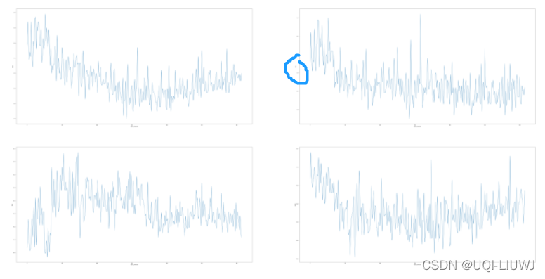
有的时候,当我们figure 过于大的时候,默认的字体可能就太小了,以至于看不到。
import matplotlib.pyplot as plt
plt.figure(figsize=(100,50))

plt.subplot(2,2,1)
plt.plot(RMSE)
plt.xlabel('epoch_theshold')
plt.ylabel('RMSE')
plt.subplot(2,2,2)
plt.plot(MAE)
plt.xlabel('epoch_theshold')
plt.ylabel('MAE')
plt.subplot(2,2,3)
plt.plot(MAX)
plt.xlabel('epoch_theshold')
plt.ylabel('MAX')
plt.subplot(2,2,4)
plt.plot(MAEP)
plt.xlabel('epoch_theshold')
plt.ylabel('MAPE')
比如我们上述代码画出来的图如下所示,的的确确是有label的,就是太小了看不出来
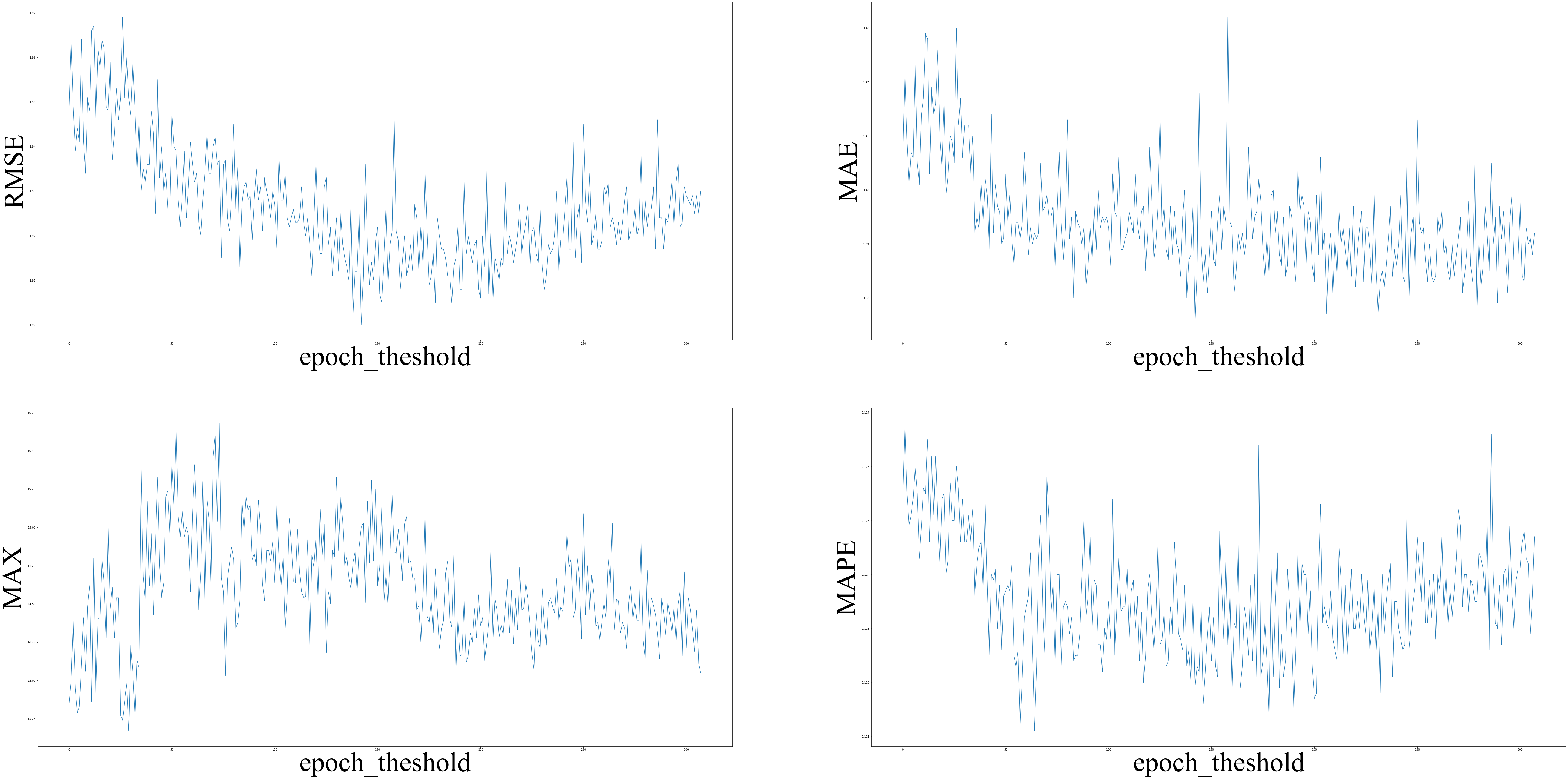
这时候我们可以手动设置xlabel和ylabel的字体:
import matplotlib.pyplot as plt
plt.figure(figsize=(100,50))

font = {'family' : 'Times New Roman',
'weight' : 'normal',
'size'   : 100,
        }

plt.subplot(2,2,1)
plt.plot(RMSE)
plt.xlabel('epoch_theshold',font)
plt.ylabel('RMSE',font)
plt.subplot(2,2,2)
plt.plot(MAE)
plt.xlabel('epoch_theshold',font)
plt.ylabel('MAE',font)
plt.subplot(2,2,3)
plt.plot(MAX)
plt.xlabel('epoch_theshold',font)
plt.ylabel('MAX',font)
plt.subplot(2,2,4)
plt.plot(MAEP)
plt.xlabel('epoch_theshold',font)
plt.ylabel('MAPE',font)
此时图像的标签就大很多了


 7514
7514

 被折叠的 条评论
为什么被折叠?
被折叠的 条评论
为什么被折叠?
 到【灌水乐园】发言


