


大家好,欢迎来到单细胞图片美化专辑!
第一期我们分享了如何使用标准流程获取单细胞的seurat对象,也就是pbmc.rds单细胞数据pbmc数据下载,标准处理流程获取seurat对象
第二期我们分享了如何美化featureplot单细胞featureplot美化修改-自定义修改图片样式-umap密度图画等高线
本期将分享如何美化dotplot,继续使用pbmc示例,第一期获得的pbmc对象
首先读取数据,并分组、通过findallmarkers计算marker基因
pbmc=readRDS("~/gzh/featureplot_dotplot_vlnplot/pbmc3k_final.rds")

#养成好习惯,每次setseed 在某些步骤可确保每次分析结果一致
set.seed(123)

head(pbmc@meta.data)

#我们把数据集随机分成两组 如果是你自己的数据,就按照自己的分组来。
#我这里只是为了演示不同组别的图怎么画,所以就随机分组了哈
# 随机取样1000个细胞
sampled_cells <- sample(colnames(pbmc), size = 1000, replace = FALSE)

# 将随机取样的细胞命名为'con',其余细胞命名为'exp'
# add groups
pbmc$groups <- ifelse(colnames(pbmc) %in% sampled_cells ,'con','exp')
table(pbmc$groups)
# add celltype
pbmc$celltype <- Seurat::Idents(pbmc)
pbmc.markers=FindAllMarkers(pbmc,logfc.threshold = 1,only.pos = TRUE,densify = TRUE)
top3pbmc.markers= pbmc.markers %>%
group_by(cluster) %>%
slice_max(n = 3, order_by = avg_log2FC) #%>%dplyr::select(gene)
top3pbmc.markers1 最简单的气泡图dotplot
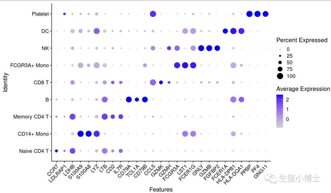
DotPlot(pbmc,features = top3pbmc.markers$gene)+RotatedAxis()
1.0 split()拆分画dotplot个性化图
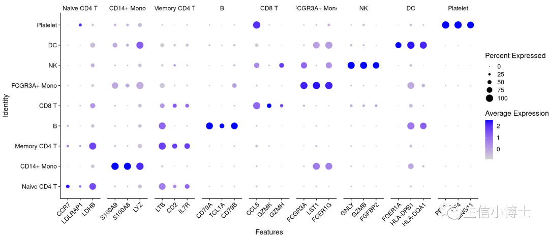
1.0# split() 返回的是一个按照cluster拆分的gene list,格式参考下文自定义 gene listDotPlot(pbmc, features = split(top3pbmc.markers$gene, top3pbmc.markers$cluster) )+RotatedAxis()
1.0.1 自定义dotplot marker gene list 作为输入。同时修改颜色为红-灰色渐变,对行进行聚类.顺序大家可以自行调整一下。
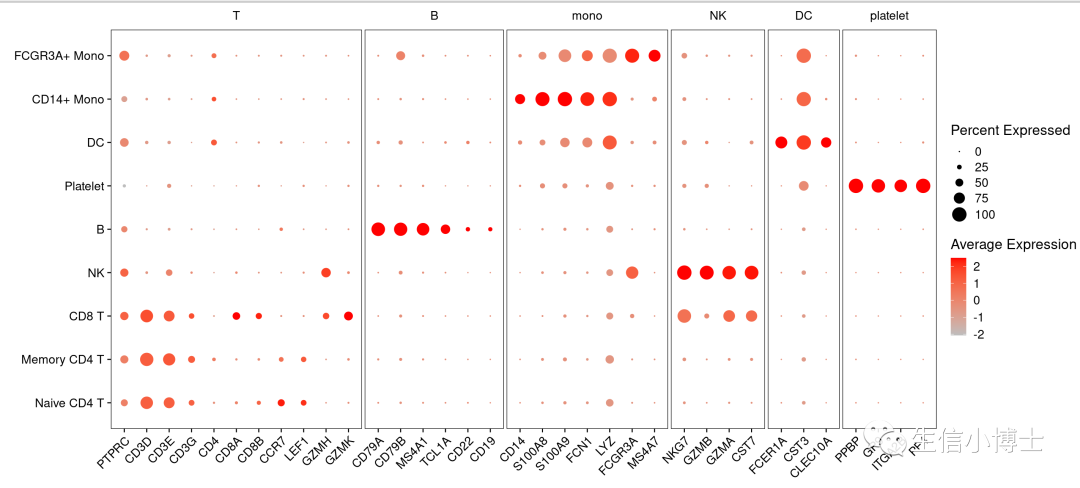
1.01library(ggplot2)# list_genes=split(topN$gene, topN$cluster)list_genes=list(T=c("PTPRC","CD3D","CD3E", "CD3G", "CD4", "CD8A","CD8B","CCR7", "LEF1", "GZMH", "GZMK"),B=c("CD79A", "CD79B", "MS4A1", "TCL1A", "CD22", "CD19"),mono=c("CD14", "S100A8", "S100A9", "FCN1",'LYZ',"FCGR3A", "MS4A7" ),NK=c("NKG7","GZMB", "GZMA", "CST7"),DC=c("FCER1A", "CST3", "CLEC10A"),platelet=c("PPBP","GP9","ITGA2B","PF4" ) )p1=DotPlot(pbmc,features=list_genes,cols = c("grey", "red"),cluster.idents = T)+RotatedAxis()+theme(# 面板panel.border = element_rect(color="black"), #面板边框panel.spacing = unit(1, "mm"), #面板间距# 分面标题#strip.background = element_rect(color="red"),strip.text = element_text(margin=margin(b=3, unit="mm")),strip.placement = 'outlet', ## 坐标轴线axis.line = element_blank(),)+labs(x="", y="")p1
1.0.2 美化上面的dotplot
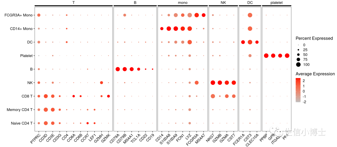
# https://stackoverflow.com/questions/54471816/remove-three-sides-of-border-around-ggplot-facet-strip-label

library(grid)
p <- ggplotGrob(p1)
lg <- linesGrob(x=unit(c(0,1),"npc"), y=unit(c(0,0)+0.2,"npc"),
                gp=gpar(col="black", lwd=4))

grid.newpage(); #grid.draw(lg)
for (k in grep("strip-t",p$layout$name)) {
  p$grobs[[k]]$grobs[[1]]$children[[1]] <- lg
}

grid.draw(p)
1.1dotplot修改配色颜色 横纵坐标轴翻转
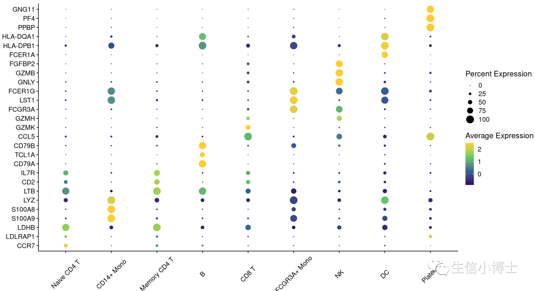
p <- DotPlot(pbmc, features = unique(top3pbmc.markers$gene) ,assay='RNA' ) +coord_flip() + #翻转theme(panel.grid = element_blank(),axis.text.x=element_text(angle = 45, hjust = 0.5,vjust=0.5))+ #轴标签labs(x=NULL,y=NULL) +guides(size = guide_legend("Percent Expression") )+ #legendscale_color_gradientn(colours = c('#330066','#336699','#66CC66','#FFCC33')) #颜色p
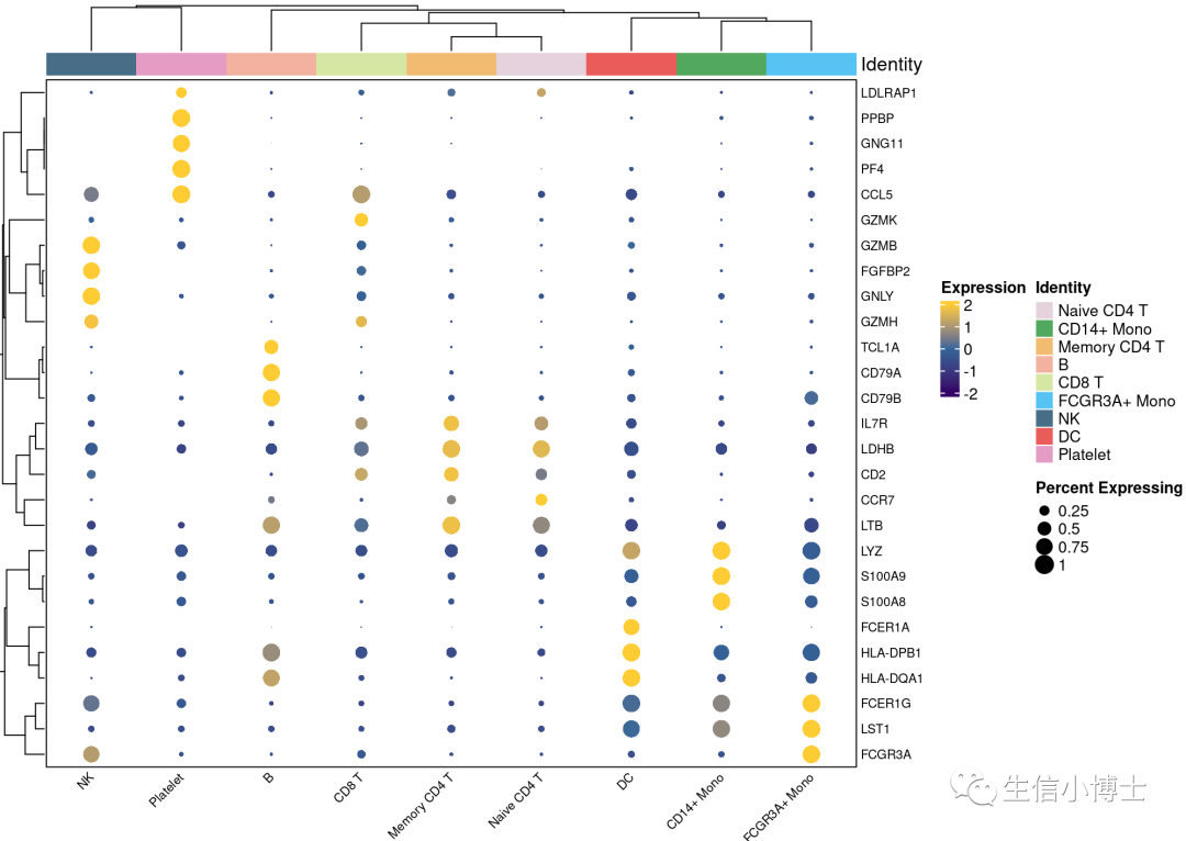
1.2scCustomize包画美化的dotplot
2.分面气泡图dotplot
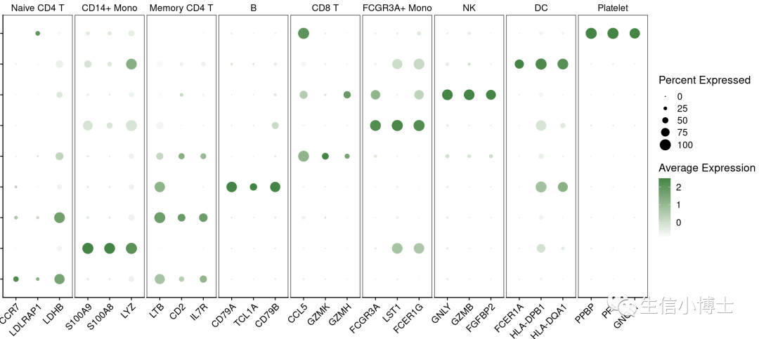
p1 <- DotPlot(pbmc,features = split(top3pbmc.markers$gene, top3pbmc.markers$cluster),cols = c("#ffffff", "#448444")) +RotatedAxis() + # 来自Seurattheme(panel.border = element_rect(color = "black"),panel.spacing = unit(1, "mm"),axis.title = element_blank(),axis.text.y = element_blank(),)p1


 1298
1298

 被折叠的 条评论
为什么被折叠?
被折叠的 条评论
为什么被折叠?
 到【灌水乐园】发言


