


扫码关注下方公粽号,回复推文合集,获取400页单细胞学习资源!

本文共计1359字,阅读大约需要4分钟。
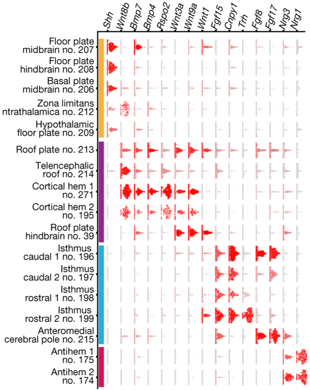
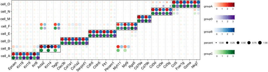
Sten Linnarsson大神的单细胞绘图堪称极致美学,在这里,小编选择了发表在nature上展示marker基因的绘图进行复现。
本文目录如下:
- 准备数据
- 常规小提琴图展示
- 使用geom_beeswarm()绘制
- 使用geom_quasirandom()绘制
- 更换配色
- 更换主题
- 获取代码和数据
- 参考
- 往期回顾
准备数据
首先处理单细胞数据为ggplot2绘图所需格式,准备的数据包括marker基因名(gene),单个细胞编号名(CB),细胞分群命名(celltype),基因表达量(exp)作为输入数据,进行melt转换后得到如下展示的数据表(vln.df)
library(tidyverse)
library(ggplot2)
library(ggbeeswarm)
library(scales)
library(reshape2)
vln.df <- read.csv(file = 'vln.df.0319.csv',row.names = 1)
vln.df$gene = factor(
  vln.df$gene,
  levels = c(
    "Krt18","Krt14","Mbp","Cd34","Pdgfra","Cldn5","Pecam1","Acta2","Myh11","Ly6g",
    "S100a8","Kit","Ms4a2","Mki67","Stmn1","Lyz2","Retnla","Cd74","Cd83","Jchain",
    "Mzb1","Cd19","Cd79a","Cd3d","Cd3g","Klrd1","Nkg7"
  )
)
head(vln.df)

> head(vln.df)
    gene                     CB       exp celltype
1  Krt18 Brep4_TAGACTGCACTTGGGC 0.7077087   cell_B
2  Krt14 Brep4_TAGACTGCACTTGGGC 3.2859138   cell_B
3    Mbp Brep4_TAGACTGCACTTGGGC 0.0000000   cell_B
4   Cd34 Brep4_TAGACTGCACTTGGGC 0.0000000   cell_B
5 Pdgfra Brep4_TAGACTGCACTTGGGC 0.0000000   cell_B
6  Cldn5 Brep4_TAGACTGCACTTGGGC 0.0000000   cell_B
从上图观察发现,作者并没有用传统的dotplot或者violinplot进行marker基因展示,而像是用散点图绘制而来,因此我们尝试是否可以在小提琴图的基础上进行改进。
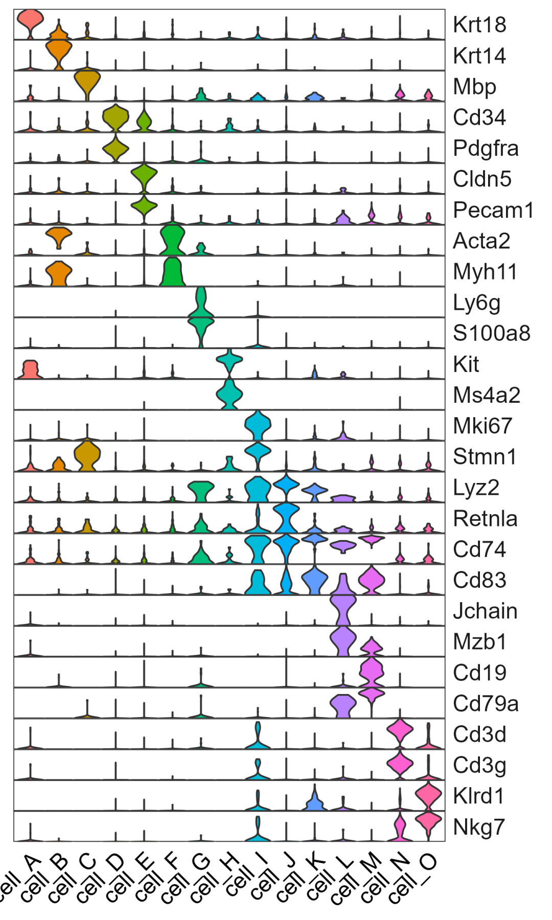
常规小提琴图展示
先看一下小提琴图的展示效果
p1 <- vln.df%>%ggplot(aes(celltype,exp),color=factor(celltype))+
  geom_violin(aes(fill=celltype),scale = "width")+
  facet_grid(gene~.,scales = "free_y")+
  scale_y_continuous(expand = c(0,0))+
  theme_bw()+
  theme(
    panel.grid = element_blank(),

    axis.title.x.bottom = element_blank(),
    axis.ticks.x.bottom = element_blank(),
    axis.text.x.bottom = element_text(angle = 45,hjust = 1,vjust = NULL,color = "black",size = 14),
    axis.title.y.left = element_blank(),
    axis.ticks.y.left = element_blank(),
    axis.text.y.left = element_blank(),

    legend.position = "none",

    panel.spacing.y = unit(0, "cm"),
    strip.text.y = element_text(angle=0,size = 14,hjust = 0),
    strip.background.y = element_blank()
  )
p1
ggsave("图01.png",width = 12,height = 20,units = "cm")
使用geom_beeswarm()绘制
通过一番搜寻发现,可以用ggbeeswarm包绘制散点图,ggbeeswarm提供了两种使用ggplot2创建蜂群图的方法。一个是geom_beeswarm(),另一个是geom_quasirandom(),我们分别进行尝试
首先使用geom_beeswarm()试一试。注意!散点图的绘制会比较慢,需要等待一段时间
p2 <- vln.df%>%ggplot(aes(celltype,exp,color=factor(celltype)))+
  geom_beeswarm(cex = 0.1)+  #用蜂巢图替代小提琴图
  facet_grid(gene~.,scales = "free_y")+
  scale_y_continuous(expand = c(0,0))+
  theme_bw()+
  theme(
    panel.grid = element_blank(),

    axis.title.x.bottom = element_blank(),
    axis.ticks.x.bottom = element_blank(),
    axis.text.x.bottom = element_text(angle = 45,hjust = 1,vjust = NULL,color = "black",size = 14),
    axis.title.y.left = element_blank(),
    axis.ticks.y.left = element_blank(),
    axis.text.y.left = element_blank(),

    legend.position = "none",

    panel.spacing.y = unit(0, "cm"),
    strip.text.y = element_text(angle=0,size = 14,hjust = 0),
    strip.background.y = element_blank()
  )
ggsave("图02.pdf",plot = p2,width = 12,height = 20,units = "cm")
p2=ggrastr::rasterise(p2, dpi = 300)#得到的图太大使用ggrastr包降低分辨率进行保存
ggsave("图02b.pdf",plot = p2,width = 12,height = 20,units = "cm")
这里有一个小技巧:单细胞的点非常多,直接保存文件很大,可以使用ggrastr::rasterise()降低分辨率进行保存。
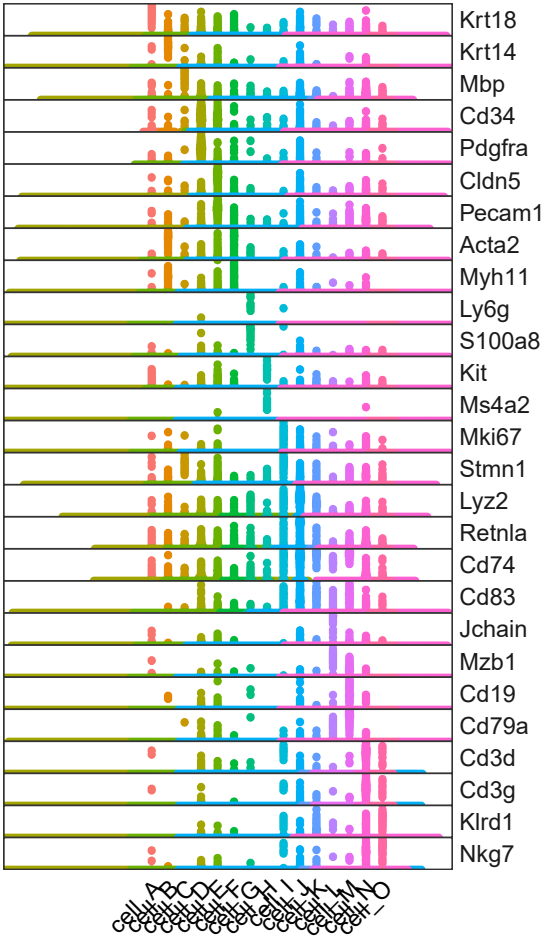
图片效果并不好,原因是ggbeeswarm会横向展开所有点。单细胞数据点太多,图片装不下,point往两边无限展开,字就往中间挤。
所有点少的时候可以用ggbeeswarm这个函数画蜂巢图。
使用geom_quasirandom()绘制
我们来看看另一个函数geom_quasirandom,当点很多的时候,该函数可以处理过度绘图(overplotting)的问题。
p3 <- vln.df%>%ggplot(aes(celltype,exp,color=factor(celltype)))+
  geom_quasirandom(size=0.02,method = "smiley")+ #设置散点大小,因为单细胞测序数量很多,点可以尽量小一点,否则看不出效果
  facet_grid(gene~.,scales = "free_y")+
  scale_y_continuous(expand = c(0,0))+
  theme_bw()+
  theme(
    panel.grid = element_blank(),

    axis.title.x.bottom = element_blank(),
    axis.ticks.x.bottom = element_blank(),
    axis.text.x.bottom = element_text(angle = 45,hjust = 1,vjust = NULL,color = "black",size = 14),
    axis.title.y.left = element_blank(),
    axis.ticks.y.left = element_blank(),
    axis.text.y.left = element_blank(),

    legend.position = "none",

    panel.spacing.y = unit(0, "cm"),
    strip.text.y = element_text(angle=0,size = 14,hjust = 0),
    strip.background.y = element_blank()
  )
ggsave("图03.pdf",plot = p3,width = 12,height = 20,units = "cm")
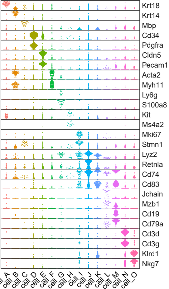
与原图有些接近了,下一步修改颜色,原图采用了单一的红色配色,表达量用透明度进行区分,这里我们采用黄蓝渐变的配色方案,如果不会配色可以问chatGPT哒
更换配色
my_colors <- colorRampPalette(c("#1A5276", "#F7DC6F"))(15)

p4 <- vln.df%>%ggplot(aes(celltype,exp,color=factor(celltype),alpha=abs(exp)))+ #用透明度映射基因表达量
  geom_quasirandom(size=0.02,method = "smiley")+
  facet_grid(gene~.,scales = "free_y")+
  scale_y_continuous(expand = c(0,0))+
  scale_color_manual(values = my_colors)+ #给每个celltype添加颜色
  theme_bw()+
  theme(
    panel.grid = element_blank(),

    axis.title.x.bottom = element_blank(),
    axis.ticks.x.bottom = element_blank(),
    axis.text.x.bottom = element_text(angle = 90,hjust = 1,vjust = 0.5,color = "black",size = 14),
    axis.title.y.left = element_blank(),
    axis.ticks.y.left = element_blank(),
    axis.text.y.left = element_blank(),

    legend.position = "none",

    panel.spacing.y = unit(0, "cm"),
    strip.text.y = element_text(angle=180,size = 14,hjust = 1),
    strip.background.y = element_blank()
  )
ggsave("图04.pdf",plot = p4,width = 12,height = 20,units = "cm")
[外链图片转存失败,源站可能有防盗链机制,建议将图片保存下来直接上传(img-PVitPKU1-1684650313266)(data:image/svg+xml,%3C%3Fxml version=‘1.0’ encoding=‘UTF-8’%3F%3E%3Csvg width=‘1px’ height=‘1px’ viewBox=‘0 0 1 1’ version=‘1.1’ xmlns=‘http://www.w3.org/2000/svg’ xmlns:xlink=‘http://www.w3.org/1999/xlink’%3E%3Ctitle%3E%3C/title%3E%3Cg stroke=‘none’ stroke-width=‘1’ fill=‘none’ fill-rule=‘evenodd’ fill-opacity=‘0’%3E%3Cg transform=‘translate(-249.000000, -126.000000)]’ fill=‘%23FFFFFF’%3E%3Crect x=‘249’ y=‘126’ width=‘1’ height=‘1’%3E%3C/rect%3E%3C/g%3E%3C/g%3E%3C/svg%3E)
更换主题
最后,更换theme去掉分面网格线,就得到美美的图啦~
p5 <- vln.df%>%ggplot(aes(celltype,exp,color=factor(celltype),alpha=abs(exp)))+
  geom_quasirandom(size=0.02,method = "smiley")+
  facet_grid(gene~.,scales = "free_y")+
  scale_y_continuous(expand = c(0,0))+
  scale_color_manual(values = my_colors)+
  theme_classic()+ #更换theme主题
  theme(
    axis.title.x.bottom = element_blank(),
    #axis.ticks.x.bottom = element_blank(),#添加刻度
    axis.text.x.bottom = element_text(angle = 90,hjust = 1,vjust = 0.5,color = "black",size = 14),
    axis.title.y.left = element_blank(),
    axis.ticks.y.left = element_blank(),
    axis.text.y.left = element_blank(),

    legend.position = "none",

    panel.spacing.y = unit(0, "cm"),
    strip.text.y = element_text(angle=180,size = 14,hjust = 1),
    strip.background.y = element_blank()
  )
ggsave("图05.pdf",plot = p5,width = 12,height = 20,units = "cm")
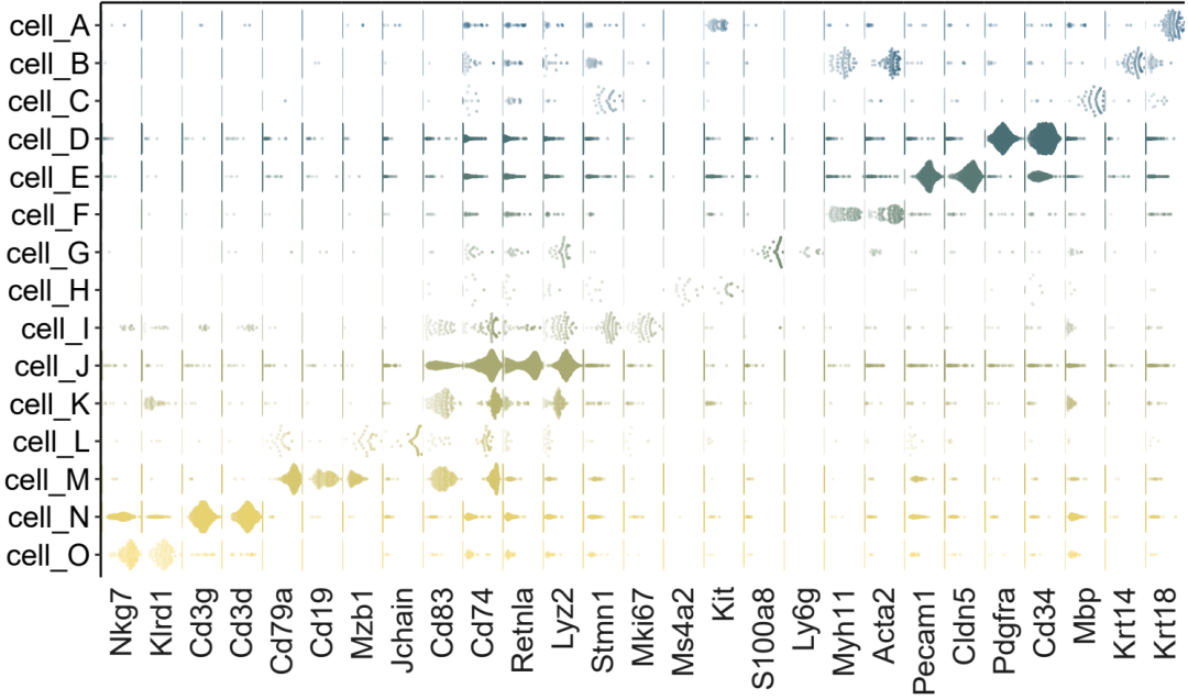
需要注意的是,细胞量太大会导致散点图看起来不明显,因此该绘图方法更适合细胞数量较少的单细胞marker基因展示
获取代码和数据
代码和测试数据请关注公粽号获取
参考
原图来自文献:Molecular architecture of the developing mouse brain
绘图代码参考:
https://r-charts.com/distribution/ggbeeswarm/ https://github.com/eclarke/ggbeeswarm
往期回顾
01.marker展示_聚类和热图组合
 01.marker展示_聚类和热图组合
02.marker展示_堆叠小提琴图
 02.marker展示_堆叠小提琴图
03.两组比较_差异基因数目展示
 03.两组比较_差异基因数目展示
04.两组比较_差异基因展示
 04.两组比较_差异基因展示
05.两组比较_基因集分数添加显著性
 05.两组比较_基因集分数添加显著性
06.feature展示
 06.feature展示
07.KEGG富集柱形图,并添加通路注释信息
 07.KEGG富集结果展示
08.细胞通讯_两组比较_气泡图
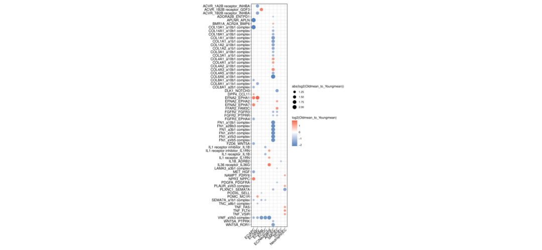 08.细胞通讯_两组比较_气泡图
09.细胞通讯_两组比较_连线图
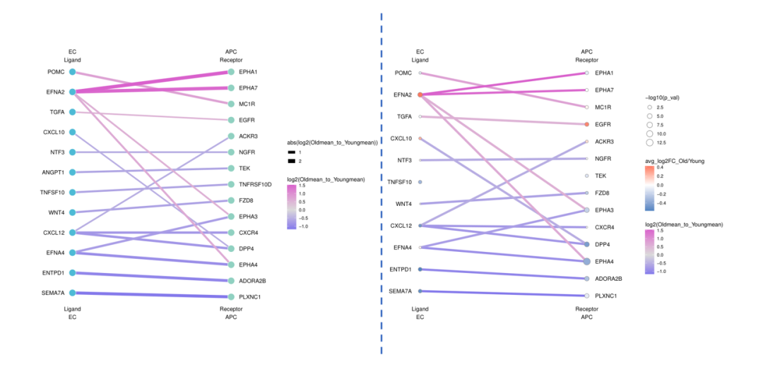 09.细胞通讯_两组比较_连线图
10.KEGG富集结果的圆圈图
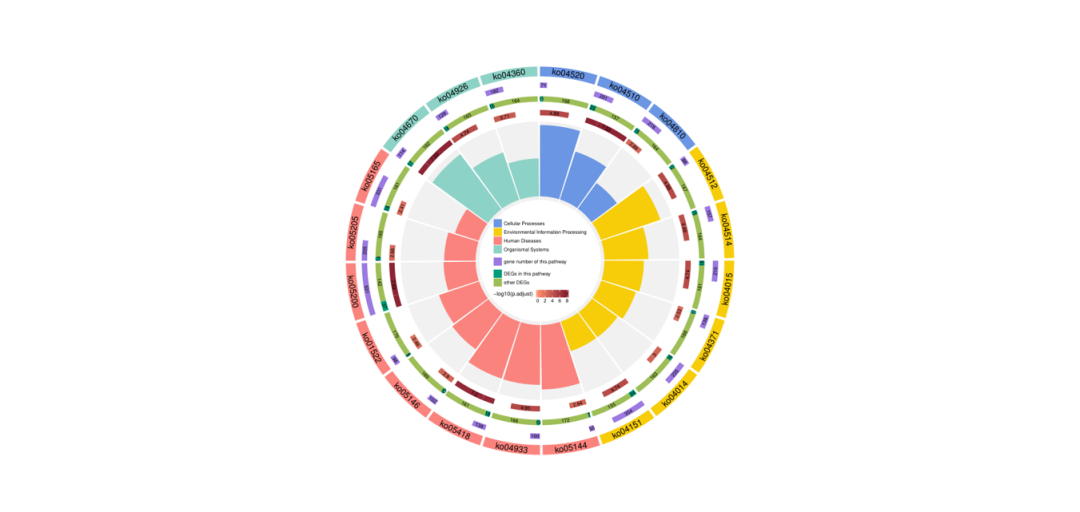 10.KEGG富集结果的圆圈图
11.marker展示_分组气泡图


 1万+
1万+


 被折叠的 条评论
为什么被折叠?
被折叠的 条评论
为什么被折叠?
 到【灌水乐园】发言


