


 这篇博客介绍了如何利用R语言的Seurat、ggplot2、dplyr和ggalluvial等库,结合实际项目数据,绘制单细胞细胞比例的堆叠柱状图,并添加面积连线,形成桑基图。通过分组计算、数据转换和图形定制,展示了如何有效地展示不同样本中细胞类型的分布比例。
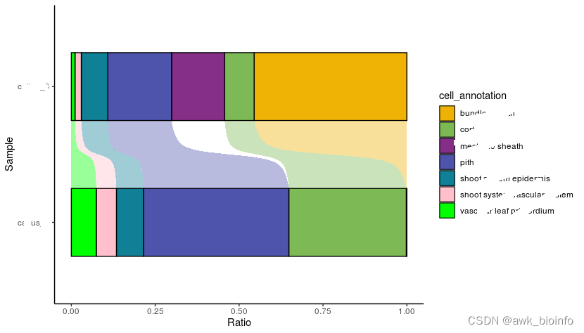
使用R绘制单细胞 细胞比例堆叠柱状图加面积连线(桑基图)
library(Seurat)
library(ggplot2)
library(dplyr)
library(ggalluvial)
#构建数据
Ratio <- sce.integrated@meta.data %>%
  group_by(orig.ident, cell_annotation) %>% # 分组
  summarise(n=n()) %>%
  mutate(relative_freq = n/sum(n))


#堆叠柱状图
mycolor = c('#efb306',
            '#7db954',
            '#852f88',
            '#4e54ac',
            '#0f8096',
            'pink',
            'green')

ggplot(Ratio, aes(x =orig.ident, y= relative_freq, fill = cell_annotation,
                  stratum=cell_annotation, alluvium=cell_annotation)) +
  geom_col(width = 0.5, color='black')+
  geom_flow(width=0.5,alpha=0.4, knot.pos=0.5)+ # 参数knot.pos设置为0.5使连接为曲线面积,就像常见的桑基图
  theme_classic() +
  labs(x='Sample',y = 'Ratio')+
  coord_flip()+
  scale_fill_manual(values = mycolor)
最终成图如下(我这里是真是项目数据做了部分信息涂抹处理):


 654
654

 被折叠的 条评论
为什么被折叠?
被折叠的 条评论
为什么被折叠?
 到【灌水乐园】发言


