


二、差异基因富集GOKEGG–超全可视化!
差异基因GO、KEGG富集
1、获取差异表达上下调基因
2、bitr()进行ID转换为entrez ID
3、clusterProfile+enrichplot+GOplot富集可视化
本文是对上文章:一、TCGA数据分析流程,从数据下载到差异可视化!-- UCSC xena的承接,主要是对差异基因进行富集可视化!本文没有过多的话语,直接上代码教程!具体R包计算原理需要自行去理解!
1、差异基因获取和ID转换、富集分析
library(clusterProfiler)
library(org.Hs.eg.db)
gene.df <- bitr(data_deg$Genes,fromType="SYMBOL",toType="ENTREZID", OrgDb = org.Hs.eg.db)
gene <- gene.df$ENTREZID
ego_ALL <- enrichGO(gene = gene, OrgDb="org.Hs.eg.db", keyType = "ENTREZID",
                    ont = "ALL",#富集的GO类型
                    pAdjustMethod = "BH", # 一般用BH
                    minGSSize = 1, pvalueCutoff = 0.05,
                    qvalueCutoff = 0.05,  readable = TRUE)

ego_BP <- enrichGO(gene = gene, OrgDb="org.Hs.eg.db", keyType = "ENTREZID",
                    ont = "BP",#富集的GO类型
                    pAdjustMethod = "BH", # 一般用BH
                    minGSSize = 1, pvalueCutoff = 0.05,
                    qvalueCutoff = 0.05, readable = TRUE)

ego_CC <- enrichGO(gene = gene, OrgDb="org.Hs.eg.db", keyType = "ENTREZID",
                   ont = "CC",#富集的GO类型
                   pAdjustMethod = "BH", # 一般用BH
                   minGSSize = 1, pvalueCutoff = 0.05,
                   qvalueCutoff = 0.05, readable = TRUE)

ego_MF <- enrichGO(gene = gene, OrgDb="org.Hs.eg.db", keyType = "ENTREZID",
                   ont = "MF",#富集的GO类型
                   pAdjustMethod = "BH", # 一般用BH
                   minGSSize = 1, pvalueCutoff = 0.05,
                   qvalueCutoff = 0.05, readable = TRUE)

ekegg <- enrichKEGG(gene = gene, organism = 'hsa')
2、富集可视化enrichplot
library(enrichplot)
library(patchwork)
# 柱状图和点图展示所有的富集结果--15个展示
barplot(ego_ALL, showCategory=15, title = "Enrichment GO") | dotplot(ego_ALL, showCategory=15, title = "Enrichment GO")

# 分组展示BP CC MF
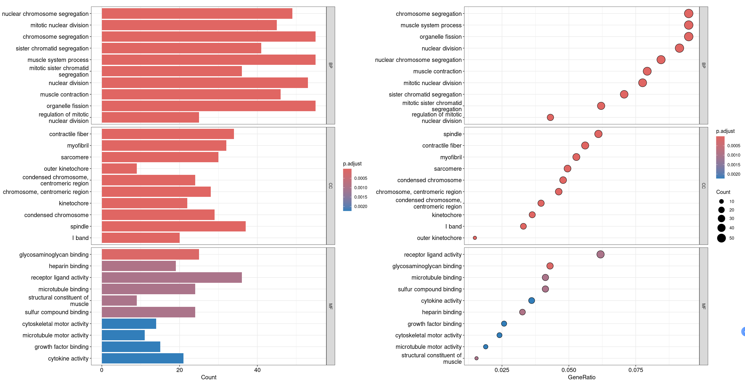
barplot(ego_ALL, drop = TRUE, showCategory =10,split="ONTOLOGY") + facet_grid(ONTOLOGY~., scale='free')|
dotplot(ego_ALL,showCategory = 10,split="ONTOLOGY") + facet_grid(ONTOLOGY~., scale='free')
#  展示所有的GO以及BP CC MF
(barplot(ego_ALL, showCategory=10, title = "Enrichment GO") | dotplot(ego_BP, showCategory=10, title = "Enrichment BP") )/
  (dotplot(ego_CC, showCategory=10, title = "Enrichment CC")|dotplot(ego_MF, showCategory=10, title = "Enrichment MF"))

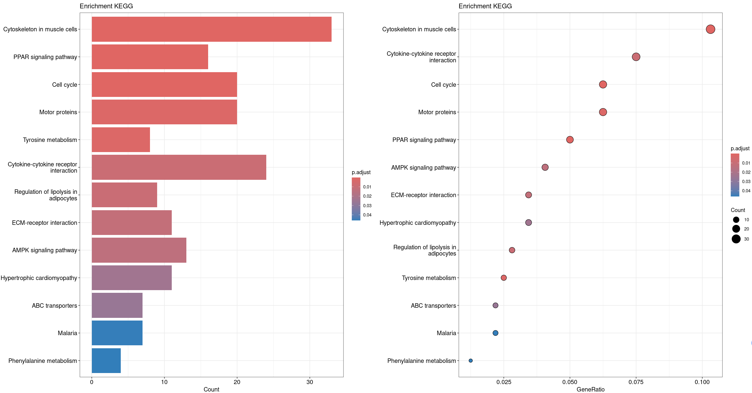
barplot(ekegg, showCategory=15, title = "Enrichment KEGG") | dotplot(ekegg, showCategory=15, title = "Enrichment KEGG")
# 展示KEGG富集--柱状图和点图
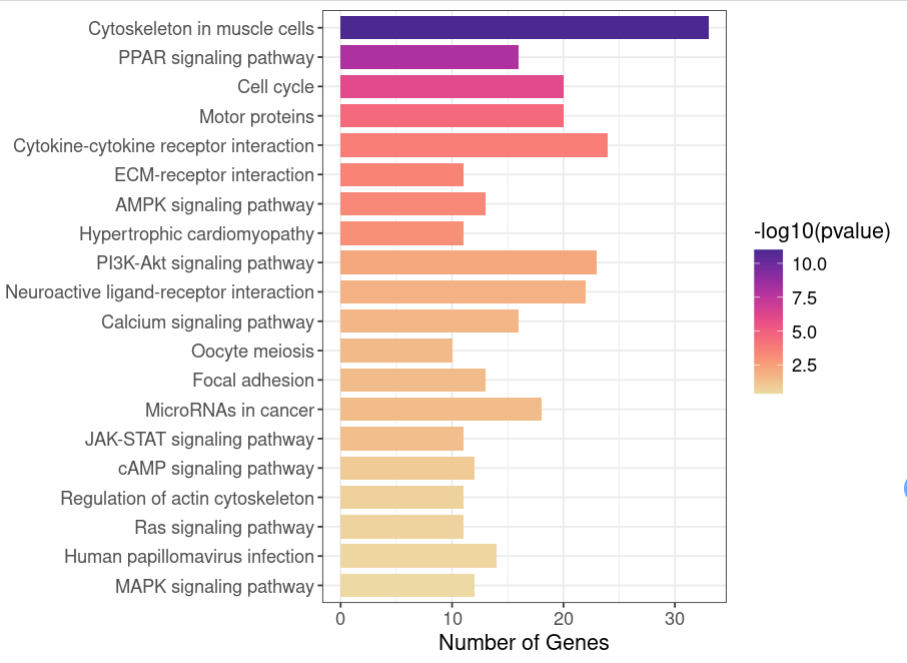
3、KEGG富集美化
对于常规的展示虽然能达到所需的目的,但对于文章而言,一个优美好看的图无形当中会给人留下更好的印象
kegg <- ekegg@result
kegg$FoldEnrichment <- apply(kegg,1,function(x){
GeneRatio=eval(parse(text=x["GeneRatio"]))
BgRatio=eval(parse(text=x["BgRatio"]))
enrichment_fold=round(GeneRatio/BgRatio,2)
enrichment_fold
})
# FoldEnrichment富集倍数计算
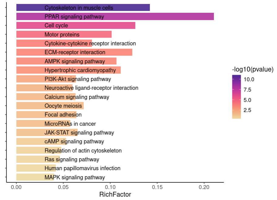
# RichFactor 富集因子计算
kegg <- mutate(kegg, RichFactor= Count / as.numeric(sub("/\d+", "", BgRatio)))
kegg$Description <- factor(kegg$Description,levels= rev(kegg$Description))
library(cols4all)
kegg1 <- kegg[order(kegg$Count, kegg$pvalue, decreasing = T),]
mytheme <- theme(axis.title = element_text(size = 13),
axis.text = element_text(size = 11),
legend.title = element_text(size = 13),
legend.text = element_text(size = 11),
plot.margin = margin(t = 5.5, r = 10, l = 5.5, b = 5.5))
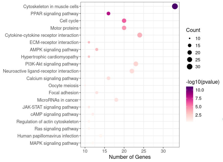
p<- ggplot(data = kegg1[1:20,], aes(x = Count, y = Description, fill = -log10(pvalue))) +
scale_fill_continuous_c4a_seq('ag_sunset') + #自定义配色
geom_bar(stat = 'identity', width = 0.8) + #绘制条形图
labs(x = 'Number of Genes', y = '') +
theme_bw() + mytheme
p
mytheme2 <- mytheme + theme(axis.text.y = element_blank()) #主题中去掉y轴通路标签
p1 <- ggplot(data = kegg1[1:20,], aes(x = RichFactor, y = Description, fill = -log10(pvalue))) +
  scale_fill_continuous_c4a_seq('ag_sunset') +
  geom_bar(stat = 'identity', width = 0.8, alpha = 0.9) +
  labs(x = 'RichFactor', y = '') +
  geom_text(aes(x = 0.03, #用数值向量控制文本标签起始位置
                label= Description),
            hjust= 0)+ #左对齐
  theme_classic() + mytheme2
p1
p2<- ggplot(data = kegg1[1:20,], aes(x = Count, y = Description)) +
  geom_point(aes(size = Count, color = -log10(pvalue))) +
  scale_color_continuous_c4a_seq('rd_pu') +
  labs(x = 'Number of Genes', y = '') +
  theme_bw() + mytheme
p2
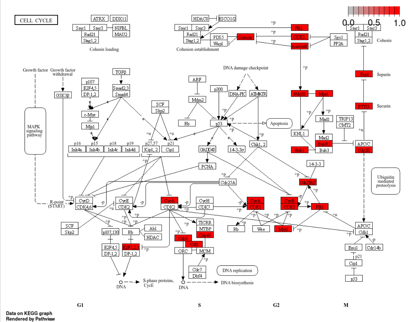
library(pathview)
hsa04110 <- pathview(gene.data  = ekegg@gene,
                     pathway.id = "hsa04110",
                     species = "hsa")
4、富集可视化GOplot
GOplot是一个功能强大其出图很美的R包!
4.1 GOBar
library(GOplot)
go <- data.frame(Category = ego_ALL$ONTOLOGY,
ID = ego_ALL$ID,
Term = ego_ALL$Description,
Genes = gsub("/", ", ", ego_ALL$geneID),
adj_pval = ego_ALL$p.adjust)
# 选择BP CC MF每一组中p值最小的20个作为例子
top20_per_group <- go %>%
group_by(Category) %>% # 按 Group 列分组
slice_min(adj_pval, n = 20) %>% # 每组选择 P.Value 最小的前20个
ungroup() # 取消分组
go <- top20_per_group
genelist <- data.frame(ID = data_deg$Genes, logFC = data_deg$logFC)
circ <- circle_dat(go, genelist)
head(circ)
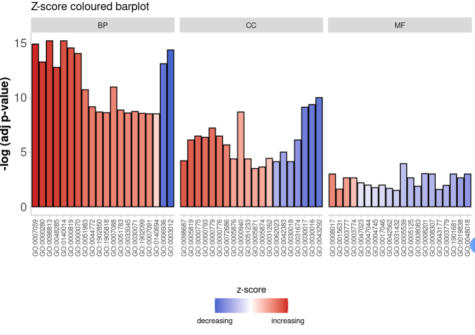
GOBar(circ, display = 'multiple',
title = 'Z-score coloured barplot', ##设置标题
zsc.col = c('firebrick3', 'white', 'royalblue3')##设置颜色
)+theme(axis.text.x = element_text(size=8))
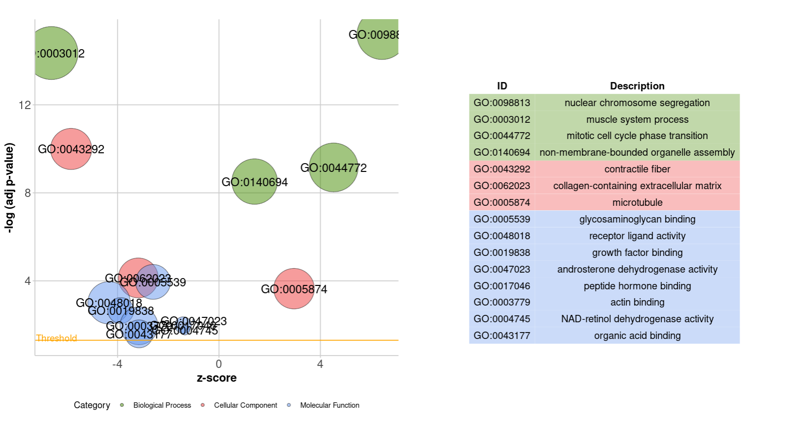
4.2 GOBubble
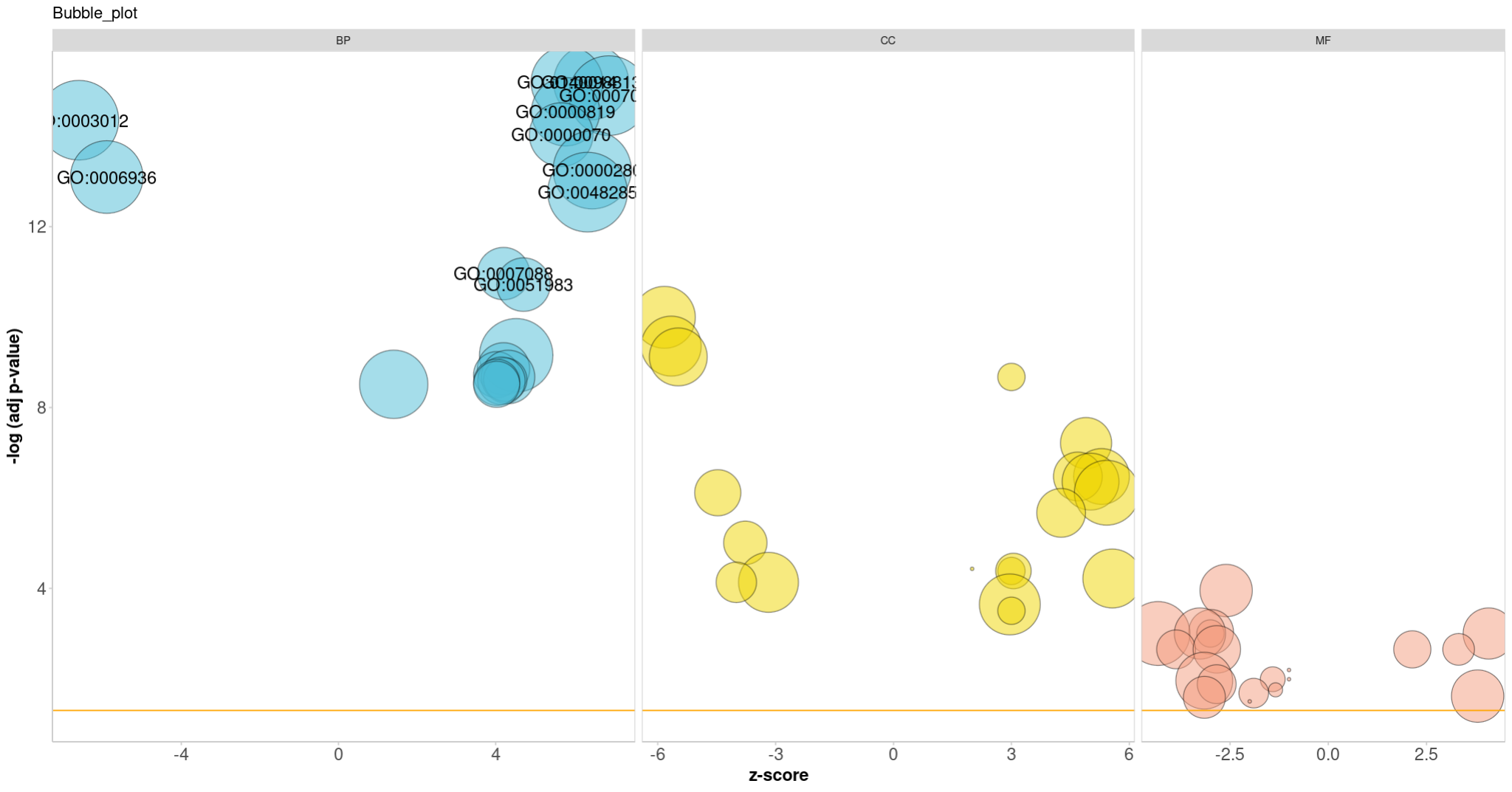
GOBubble(circ, title = 'Bubble_plot',
        colour =  c("#4DBBD5FF","#EFD500FF","#F39B7FFF"),
        display = 'multiple', labels = 10)

reduced_circ <- reduce_overlap(circ, overlap = 0.60)
GOBubble(reduced_circ, labels = 0.5)
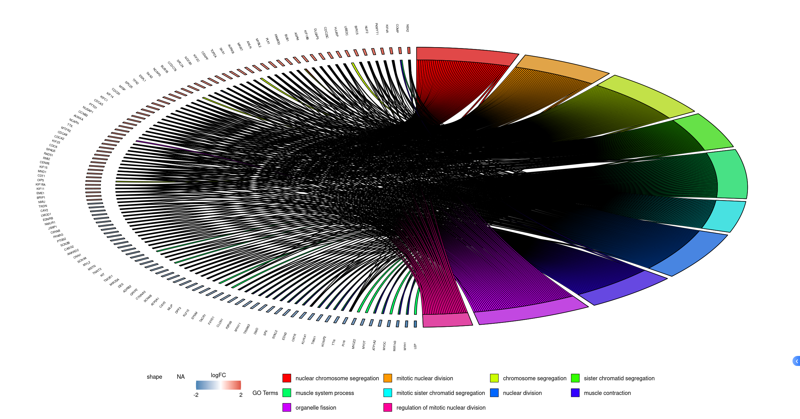
4.3 GOChord
termNum = 10
geneNum = nrow(genelist)
chord <- chord_dat(circ, genelist[1:geneNum,], go$Term[1:termNum])
GOChord(chord,
        space = 0.02,        #Term处间隔大小设置
        gene.order = 'logFC',gene.space = 0.25,gene.size = 2,#基因排序,间隔,名字大小设置
        lfc.col = c('firebrick3', 'white','steelblue'),#上调下调颜色设置
        #ribbon.col= #设置Term颜色 颜色数量与Term数量要对应
)
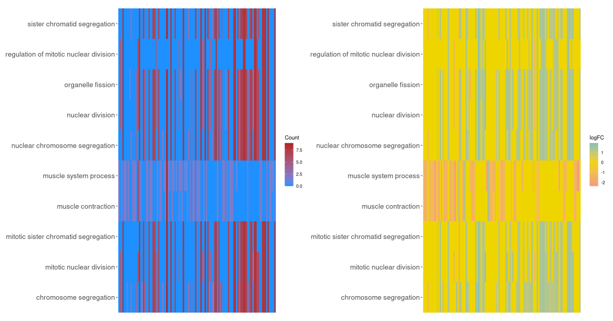
4.4 GOHeat
GOHeat(chord[,-11], # 剔除FC列
       nlfc = 0) |  GOHeat(chord,
       nlfc = 1, # 倒数第一列
       fill.col = c("#4DBBD5FF","#EFD500FF","#F39B7FFF"))
4.5 GOCluster
process<-go$Term[1:10]#选择感兴趣的term
GOCluster(circ,
          process,
          clust.by = 'term',
          lfc.col = c('darkgoldenrod1', 'black', 'cyan1'))+
  theme(legend.position = 'top',legend.direction = 'vertical')

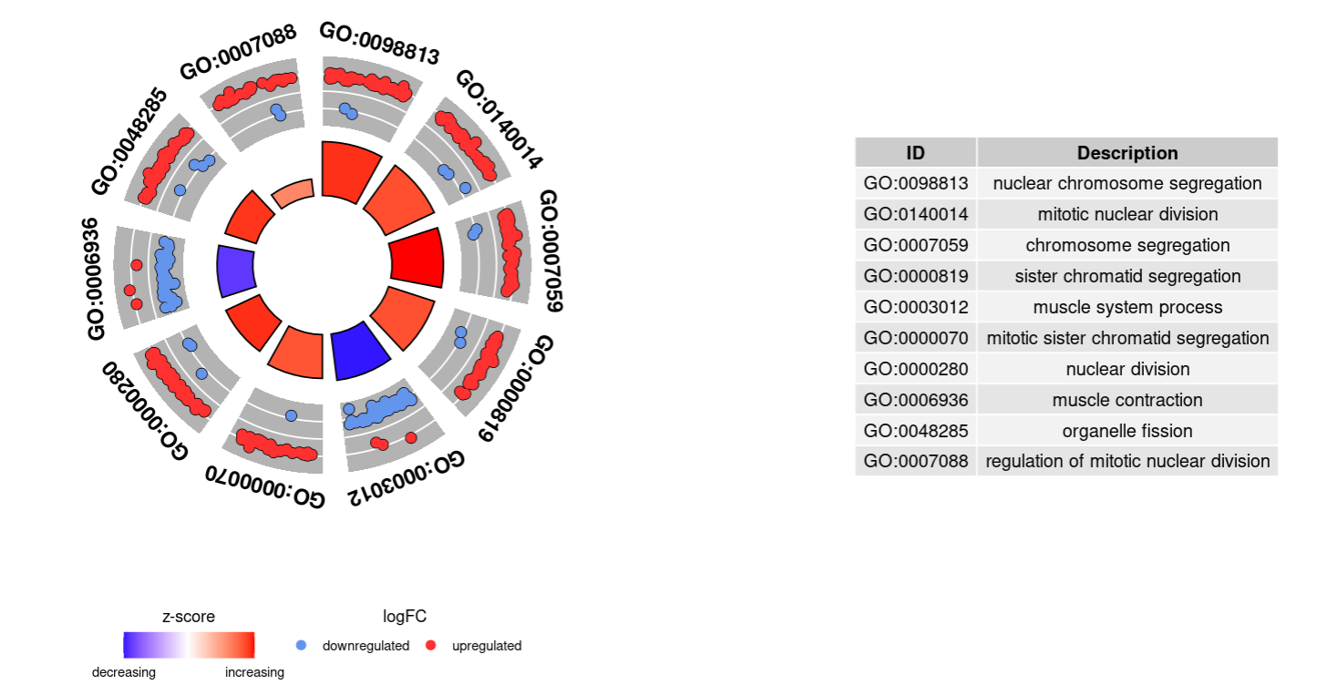
4.6 GOCircle
GOCircle(circ,nsub=10)
4.7 GOVenn
l1 <- subset(circ, term == go$Term[1], c(genes,logFC))
l2 <- subset(circ, term == go$Term[2], c(genes,logFC))
l3 <- subset(circ, term == go$Term[3], c(genes,logFC))
GOVenn(l1,l2,l3,
       lfc.col=c('firebrick3', 'white','royalblue3'),#logFC颜色设置
       circle.col=brewer.pal(3, "Set1"),#Venn颜色设置
       label = c(go$Term[1], go$Term[2],go$Term[3])#标签设置
)

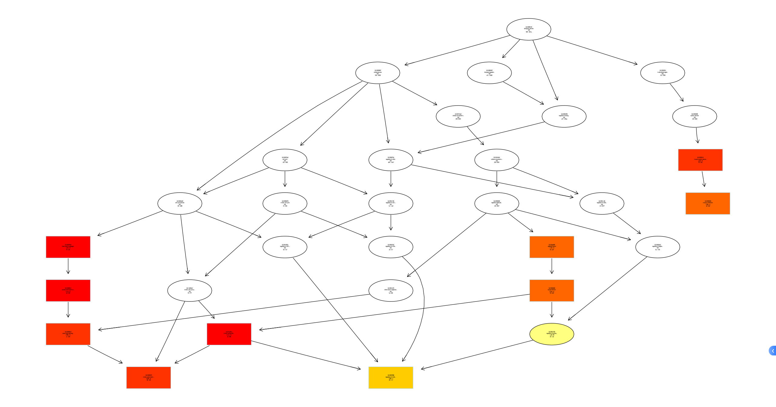
plotGOgraph(ego_BP)
好,本期分享到此结束,接下来我们会更新GESA富集,以及后续单因素多因素cox回归,预后模型等!敬请期待!


 4526
4526

 被折叠的 条评论
为什么被折叠?
被折叠的 条评论
为什么被折叠?
 到【灌水乐园】发言


