


简 介
在许多应用中,理解一个模型为什么会做出某种预测是至关重要的。然而,对于大型现代数据集,最好的准确性通常是通过复杂的模型来实现的,即使专家也很难解释,比如集成或深度学习模型。这造成了准确性和可解释性之间的紧张关系。作为回应,最近提出了各种方法来帮助用户解释复杂模型的预测。在这里,我们提出了一个统一的框架来解释预测,即SHAP (SHapley Additive exPlanations),它为每个特征分配一个特定预测的重要性。SHAP框架的关键新组成部分是识别一类可加性特征重要性度量和理论结果,即该类中存在具有一组期望性质的唯一解。这个类统一了六个现有的方法,并且这个类中的几个最近的方法没有这些所需的属性。这意味着我们的框架可以为解释预测模型的新方法的发展提供信息。我们证明了基于SHAP框架提出的几种新方法比现有方法具有更好的计算性能和与人类直觉的更好一致性。
SHapley加性解释(SHapley Additive explanation)的可视化,例如瀑布图、力图、各种类型的重要性图、依赖性图和相互作用图。这些图作用于由SHAP值矩阵和相应的特征数据集创建的“shapviz”对象。为方便起见,添加了R包的包装器‘xgboost’, ‘lightgbm’, ‘ fastshape ’, ‘shapr’, ‘h2o’, ‘treeshap’, ‘ dalx ’和‘kernel shape ’。通过分离可视化和计算,可以在图中显示因子变量,即使SHAP值是由需要数值特征的模型计算的。
软件包安装
# From CRAN
install.packages("shapviz")

# Or the newest version from GitHub:
# install.packages("devtools")
devtools::install_github("ModelOriented/shapviz")
library(shapviz)
library(xgboost)
library(caret)
library(pROC)
library(tibble)
library(ROCit)数据读取
原始数据
BreastCancer <- read.csv("wisc_bc_data.csv", stringsAsFactors = FALSE)
str(BreastCancer)
## 'data.frame':	568 obs. of  32 variables:
##  $ id                     : int  842517 84300903 84348301 84358402 843786 844359 84458202 844981 84501001 845636 ...
##  $ diagnosis              : chr  "M" "M" "M" "M" ...
##  $ radius_mean            : num  20.6 19.7 11.4 20.3 12.4 ...
##  $ texture_mean           : num  17.8 21.2 20.4 14.3 15.7 ...
##  $ perimeter_mean         : num  132.9 130 77.6 135.1 82.6 ...
##  $ area_mean              : num  1326 1203 386 1297 477 ...
##  $ smoothness_mean        : num  0.0847 0.1096 0.1425 0.1003 0.1278 ...
##  $ compactne_mean         : num  0.0786 0.1599 0.2839 0.1328 0.17 ...
##  $ concavity_mean         : num  0.0869 0.1974 0.2414 0.198 0.1578 ...
##  $ concave_points_mean    : num  0.0702 0.1279 0.1052 0.1043 0.0809 ...
##  $ symmetry_mean          : num  0.181 0.207 0.26 0.181 0.209 ...
##  $ fractal_dimension_mean : num  0.0567 0.06 0.0974 0.0588 0.0761 ...
##  $ radius_se              : num  0.543 0.746 0.496 0.757 0.335 ...
##  $ texture_se             : num  0.734 0.787 1.156 0.781 0.89 ...
##  $ perimeter_se           : num  3.4 4.58 3.44 5.44 2.22 ...
##  $ area_se                : num  74.1 94 27.2 94.4 27.2 ...
##  $ smoothness_se          : num  0.00522 0.00615 0.00911 0.01149 0.00751 ...
##  $ compactne_se           : num  0.0131 0.0401 0.0746 0.0246 0.0335 ...
##  $ concavity_se           : num  0.0186 0.0383 0.0566 0.0569 0.0367 ...
##  $ concave_points_se      : num  0.0134 0.0206 0.0187 0.0188 0.0114 ...
##  $ symmetry_se            : num  0.0139 0.0225 0.0596 0.0176 0.0216 ...
##  $ fractal_dimension_se   : num  0.00353 0.00457 0.00921 0.00511 0.00508 ...
##  $ radius_worst           : num  25 23.6 14.9 22.5 15.5 ...
##  $ texture_worst          : num  23.4 25.5 26.5 16.7 23.8 ...
##  $ perimeter_worst        : num  158.8 152.5 98.9 152.2 103.4 ...
##  $ area_worst             : num  1956 1709 568 1575 742 ...
##  $ smoothness_worst       : num  0.124 0.144 0.21 0.137 0.179 ...
##  $ compactne_worst        : num  0.187 0.424 0.866 0.205 0.525 ...
##  $ concavity_worst        : num  0.242 0.45 0.687 0.4 0.535 ...
##  $ concave_points_worst   : num  0.186 0.243 0.258 0.163 0.174 ...
##  $ symmetry_worst         : num  0.275 0.361 0.664 0.236 0.399 ...
##  $ fractal_dimension_worst: num  0.089 0.0876 0.173 0.0768 0.1244 ...
dim(BreastCancer)
## [1] 568  32
table(BreastCancer$diagnosis)
##
##   B   M
## 357 211
data = na.omit(BreastCancer)
data = data[, -1]
data$diagnosis = factor(data$diagnosis)
sum(is.na(data))  # 检测数据是否有缺失
## [1] 0
data$diagnosis = ifelse(data$diagnosis == "B", 0, 1)
table(data$diagnosis)
##
##   0   1
## 357 211
数据分割
将原始数据分割为训练集和测试集:
library(sampling)
set.seed(123)
# 每层抽取70%的数据
train_id <- strata(data, "diagnosis", size = rev(round(table(data$diagnosis) * 0.7)))$ID_unit
# 训练数据
trainData <- data[train_id, ]
# 测试数据
testData <- data[-train_id, ]
构建输入数据格式
X_pred <- data.matrix(trainData[, -1])
dtrain <- xgboost::xgb.DMatrix(X_pred, label = trainData[, 1], nthread = 1)
实例操作
构建 xgboost 模型
fit <- xgboost::xgb.train(data = dtrain, nrounds = 20, nthread = 1)
summary(fit)
##               Length Class              Mode
## handle            1  xgb.Booster.handle externalptr
## raw           48522  -none-             raw
## niter             1  -none-             numeric
## call              4  -none-             call
## params            2  -none-             list
## callbacks         1  -none-             list
## feature_names    30  -none-             character
## nfeatures         1  -none-             numeric
计算SHAP值
shapValue <- shapviz(fit, X_pred = X_pred, X = trainData)shapValue <- shapviz(fit, X_pred = X_pred, X = trainData, interactions = TRUE)SHAP可视化
sv_importance()
参数说明:kind = c("bar", "beeswarm", "both", "no") 表示绘图样式。
柱状图
经典柱状图。
sv_importance(shapValue, kind = "bar") + theme_bw()
蜂群图
计算每个样本每个特征的SHAP值,可以直观地从全局理解模型。每一行代表一个特征,横坐标为SHAP值。一个点代表一个样本,颜色表示特征值(黄色高,紫色低)。图中可以看出"concave_points_mean","area_worst", "concave_points_worst", "texture_worst","area_se" 特征最重要。
sv_importance(shapValue, kind = "beeswarm") + theme_bw()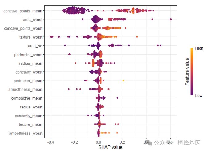
两种图形叠加
sv_importance(shapValue, kind = "both") + theme_bw()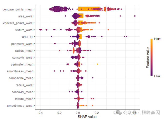
提出重要的特征变量:
shapValue$baseline
## [1] 0.3718869
impor <- sort(colMeans(abs(shapValue$S)), decreasing = T)[1:6]
names(impor)
## [1] "concave_points_mean"  "area_worst"           "concave_points_worst"
## [4] "texture_worst"        "area_se"              "perimeter_worst"
sv_dependence()
依赖图
依赖性图用于研究特征效应和交互作用。依赖图展示的是一个或两个特征对机器学习模型的预测结果的边际效应,可以显示目标和特征之间的关系。展示的是一个特征的值与该特征的SHAP值。依赖图的一个重要假设是第一个特征与第二个特征不相关。有时候特征间存在交互效应,这个时候可以通过加入第二个特征来显示,这里是点的颜色。
sv_dependence(shapValue,v=names(impor))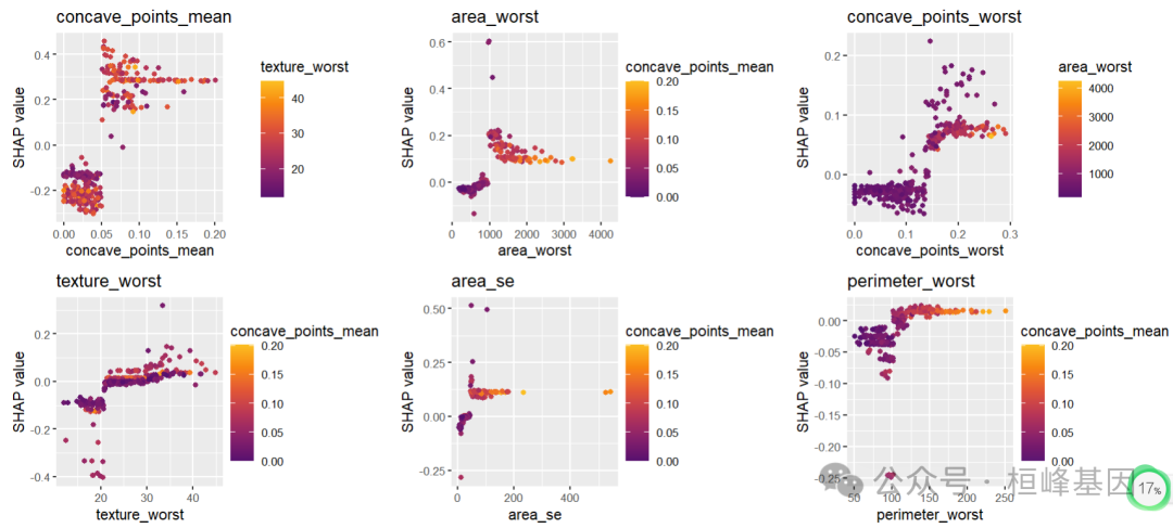
sv_dependence(shapValue, v = "concave_points_mean", color_var = NULL)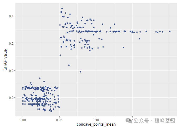
SHAP dependence plots展示特征值大小与SHAP值之间的关系,该图清楚地展示了单个特征是如何影响模型的预测结果的。
sv_waterfall()
瀑布图
用水力瀑布图研究单个或平均预测。
模型估计的值0.987,样本2的预测值为0.372。对模型预测贡献较大的变量为"concave_points_mean","area_worst", "concave_points_worst", "texture_worst","area_se", "perimeter_worst"。
sv_waterfall(shapValue, row_id = 2, max_display = 15)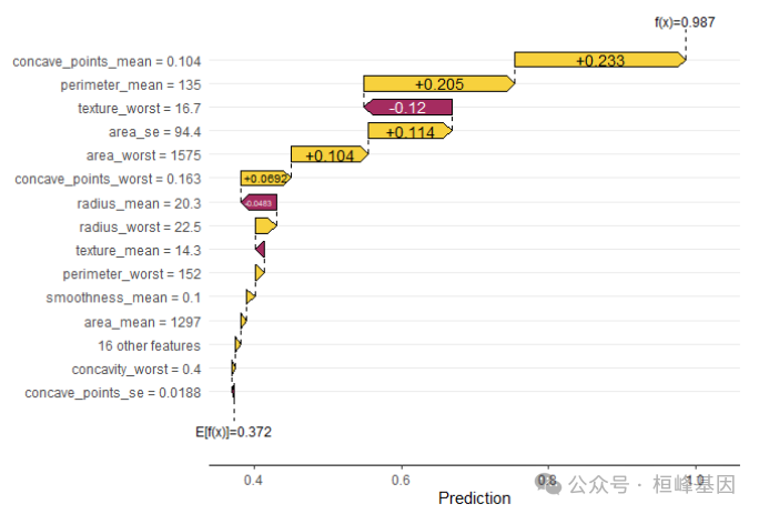
sv_force()
单个样本力图既force plot图是waterfall plot 图的另外一种展示形式,本质上是一样的。
sv_force(shapValue, row_id = 2, max_display = 6)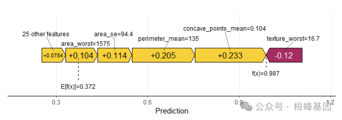
sv_interaction()
互作图是水瀑图的替代方案。interaction value 是 SHAP 值更高阶的一种玩法,完美展示交互效应。
sv_interaction(shapValue, kind = "beeswarm", max_display = 6)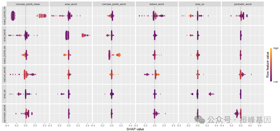
结果解读
通过xgboost建模筛选变量,并计算每个变量的SHAP值,对重要变量进行排序筛选,得到6个较为重要的变量。
Reference
Scott M. Lundberg and Su-In Lee. A Unified Approach to Interpreting Model Predictions. Advances in Neural Information Processing Systems 30 (2017).
桓峰基因,铸造成功的您!
未来桓峰基因公众号将不间断的推出机器学习系列生信分析教程,
敬请期待!!
桓峰基因官网正式上线,请大家多多关注,还有很多不足之处,大家多多指正!http://www.kyohogene.com/
桓峰基因和投必得合作,文章润色优惠85折,需要文章润色的老师可以直接到网站输入领取桓峰基因专属优惠券码:KYOHOGENE,然后上传,付款时选择桓峰基因优惠券即可享受85折优惠哦!https://www.topeditsci.com/


 2398
2398

 被折叠的 条评论
为什么被折叠?
被折叠的 条评论
为什么被折叠?
 到【灌水乐园】发言


